“I do appreciate your concerns about the future, and that current users are not doing enough to support Blender”
EXCUSE ME?
“I do appreciate your concerns about the future, and that current users are not doing enough to support Blender”
EXCUSE ME?
No insult intended to you or anyone in particular.
I meant that since we now constantly hear that Blender has to do this or that to have an easier UI to get more users, new users, professional users, studio users etc… or else - end of Blender. This has become the standard reason for pushing any change through that arouses any protest.
So the logical inference is that the current userbase is not doing enough. As a whole, even though you certainly may be. Please forgive me if I have made an error in my reasoning.
So the logical inference is that the current userbase is not doing enough
The current userbase of blender is a bounce of a few artists.
How many? one or two hundreds? I can’t say.
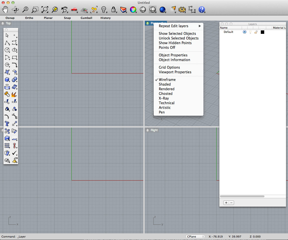
Here is a screenshot of Rhino:
Thus
you have the layer tool once as a window
the tool bar once as a window
And in the toolbar for basic shading view port rotation object visibility
All the elements for viewport shading can also be accessed by RMB onto the viewport name to open
the pull down menu.
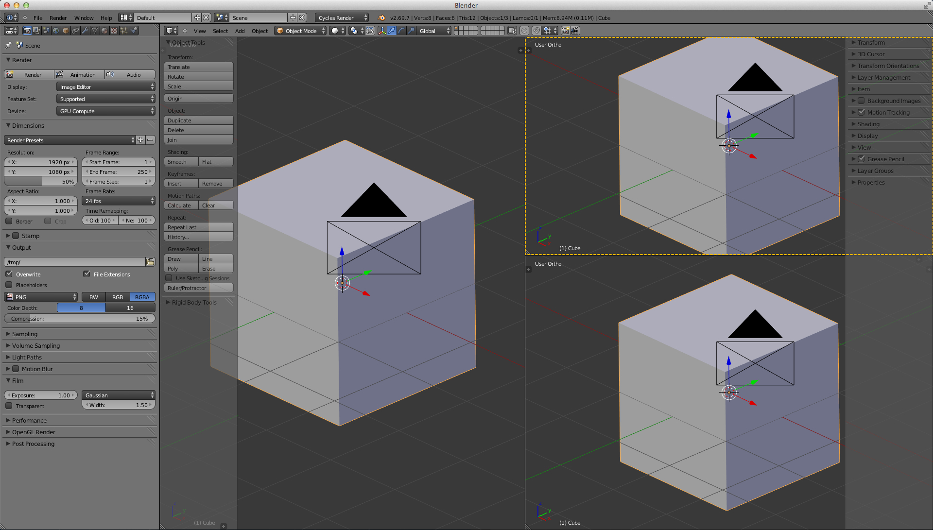
Because Blender has many apps inside you cannot rebuild such a simple interface. But it would be nice
If we could do this:
The doted line marks the active viewport which will react to viewport shading requests in the 3d view port menu bar
But the downside is, you cannot do a layout like this then anymore:
Blenders Quad view is in my opinion pretty useless because it does not allow adjustments of the different views.
@DruBan: No big deal, but I was under the impression that Ton isn’t worried about studios/professionals using Blender as much as everyone else seems to be. He also said something to the effect of “Blender is for artists, not forum trolls”. If I’m not mistaken, he meant that Blender is for people who USE it and make things with it, not people who talk about it all day. Nothing could promote Blender, or any other app, more than people making good art with it, and advocating the use of it to their friends, which I think is the core of any “by the people, for the people” software. We certainly have plenty of that for sure, but we have more people who argue about how it should or shouldn’t be, and what it can and can’t do…and most of those people don’t have any art to show for all of their infinite wisdom…even in their program of choice that isn’t Blender. The latter part of that last sentence is what irritates me the most about people around here, and it certainly isn’t helpful to the community OR the program.
Back on topic, it’s already been said that the UI isn’t getting a major overhaul, just a few tweaks here and there, and some tabs perhaps, which I have no problem with. Anyone who actually makes art with Blender instead of picking it to pieces and comparing it to other 3D software normally doesn’t have an issue with it, aside from a few minor things that might be personal to their own workflow(and probably something that they might have been used to in some other program). I personally JUST got used to 2.49 when the new UI change happened, but it was a change for the better in my humble opinion. Blender isn’t Rhino, or Maya, or 3DS Max, etc., and it shouldn’t be. I don’t think the UI has any major issues myself, and most of the UI discussions I have read are more or less saying “why isn’t the interface like Maya”, or “3DS Max has these cool buttons with symbols on them”, etc. Well, that’s all good, but obviously that person is here on BA, so something is attracting them to this software. I’m not saying it’s perfect, but it’s not so catastrophically bad that it’s unusable, not even close. It’s no small wonder these people never make anything when all they do is stare at the interface and say to themselves “I think this button should be over here instead of where it is”.
I apologize if this is rant-ish, I might start a Vent thread here in the future, so people can just get it all off of their chests. The only requirement to reply to that thread will be a link to a completed piece of artwork, which will certainly weed out quite a few people.
I apologize if this is rant-ish
No, it is not.
Bravo Vicky
+1
By all means!
I think you mean +6000 to vicky post michalis.
lol
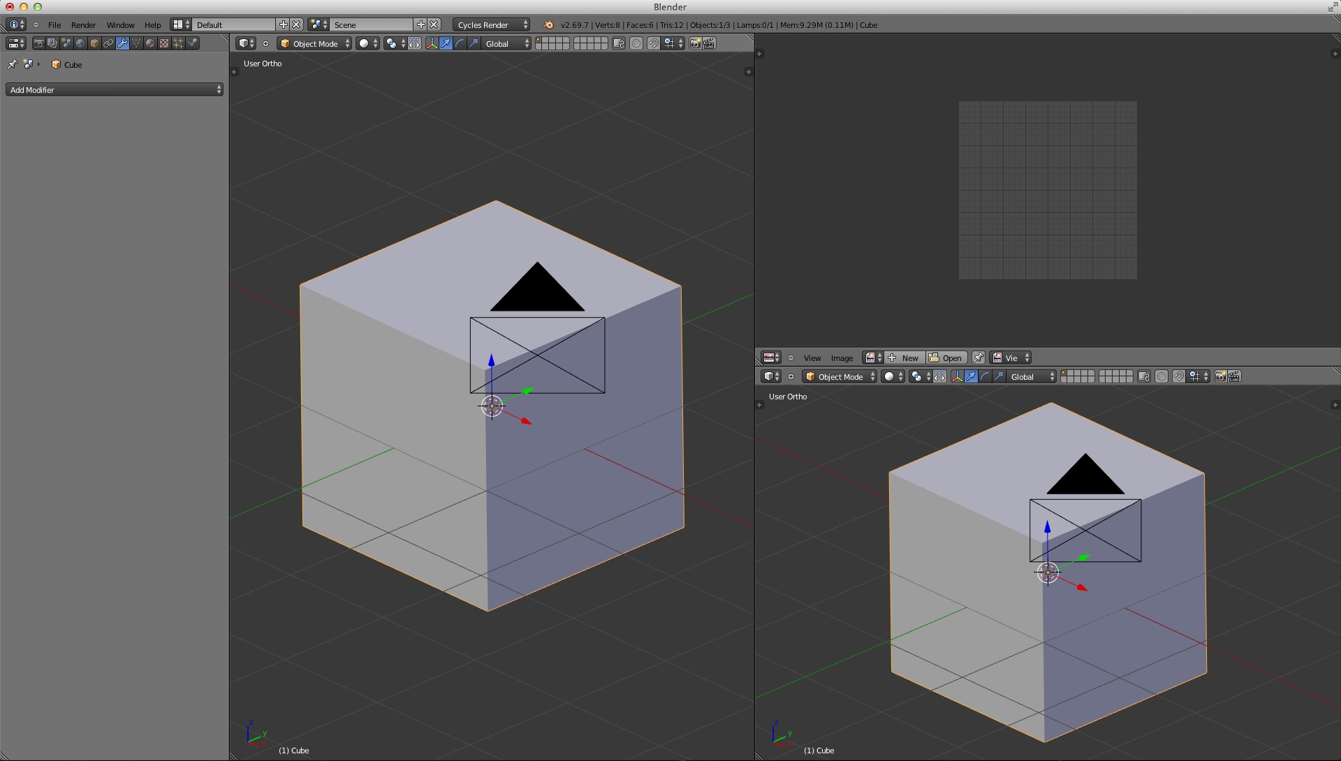
Hi Cekuhnen. Good news (not really news but anyway): the quad view is just as adjustable if you unlock it in the n panel.You can MMB drag to change the view and use the numpad shortcuts to go back to ortho.
hahahahaha 
anyways…the one thing i cannot stand among the features that have been mentioned here is the pop up windows. my hardware doesn’t allow me to use multiple windows on blender. that’s probably an issue with intel, but still. And even if i could use multiple windows, i’d hate it with all my heart.
carry on 
@Vicky I agree with you on everything.
The element of irony in my posts is sometimes lost.
I do feel that Blender’s interface is under attack by people who have no other presence in this forum than in the UI threads - no demos, no help contributions, no materials, no artwork etc. and who also have the time to post tens of thousands of words about how the Ui is defective. The worst part is that I don’t have the time to respond to such trolling and they seem to be gaining some foothold with the developers. It’s a bit frustrating.
I have been using Blender so long that I am customised to the eyeballs ![]() and the UI changes are not that big a deal to me, but look at how much developer time it’s soaking up. That does have an effect on the progress of Blender, and although my contribution to the BF funds is minuscule in comparison to the big guns I still feel that it could have gone to better purpose…
and the UI changes are not that big a deal to me, but look at how much developer time it’s soaking up. That does have an effect on the progress of Blender, and although my contribution to the BF funds is minuscule in comparison to the big guns I still feel that it could have gone to better purpose…
Ranting right back… sorry!
Ah true I forgot that option. Changing views is great. Being able to adjust the layout and much more specific being able to adjust shading for each view port in the quad view would be really needed to make the quad view usable.
@DruBan: Indeed. One thing that comes to mind when 2.49 got the big overhaul, and people were trying to figure out where everything is, was a person that said “OMG! I can’t find the Spin tool, where is it?!!”. Oh, I don’t know, maybe it’s that big button in the tool shelf on the left that says “Spin” on it? Pretty sure Blender’s UI isn’t defective, but some people’s brains. :spin:
When developers don’t acknowledge the problems in UI the chances are that it can change to worse than better.
For left-click select at least, the simplest way would be to just invert all of the mouse controls so right is left and left is right, because if select is now left-click, the right-click would now be a vacant space, which means you can use that control to place the 3D cursor.
+1 on my behalf, Specially on the last bit we will eventually shrink all ui thread.
I teach Blender quite often and noticed among other software packages where the differences are. It has nothing to do with making Blender like Maya or Rhino. Problem is that Blender has not an interface but a consistency and order problem and that big time.
If somebody like you says well I got used to it, you just memories how to use it, like most of us did - me included.
But that does not mean that here is no room of improvement. Main reason why designers use Keyshot a 1000 HDRI IBL only dump render engine is because the interface is plain simple to use and the software also hardly can do anything besides making IBL renderings.
There are for sure workflow and click issues that can be drastically improved so for users unlike us who use it not everyday getting back into the software will be easier. Also Modo or Maya is not a software that is easy to use simply because they hold so many tools.
@cekuhnen: I agree there are consistency issues for sure, like some of the slider values for instance, but I have faith that these things have been reported, and will be resolved. I just don’t see how these things are preventing people from getting anything done. They may be inconsistent, but they work. As I also said before, “catastrophically bad” are not words I would use to describe any of these issues. My other point was that some people who don’t even have the nuts to upload any of their work rule these forum discussions sometimes, and those are not the people I want to have any influence whatsoever in how Blender looks or operates.
EDIT: Found the discussion from Ton, here’s a couple of excerpts:
"WE MAKE BLENDER FOR BLENDER USERS
This is not meant exclusive or to keep people out – everyone can use Blender freely and become a user. I usually state this provocatively to explain that I’m not much interested in “getting more users”. That’s not a sane target to work for. Nor am I much interested in supporting Maya users, Sketch-up users, or the forum trolls who don’t use Blender anyway. Why would we in the first place? Why work for people who are not much interested in your work, if you already have like hundreds of thousands of users who are?
If we work with the people who are around for years, who invested time in Blender, who started a business with it, or training services, or just use it for fun… then we at least get people motivated positively with the right incentives. Positive energy, positive results, and happy users!"
“So! UI changes will happen yes. It’s a matter of improving issues gradually, tackling them one by one. A matter of finding the right people and the right moment to handle this. But we never forget the real target – to make a tool for 3D artists who want to tell stories, make compelling artwork, 3d designs, animation films or games. And – to have a lot of fun together!”
Full discussion:
I understand Ace. This is not what I am making a pest of myself about. This is just moving current functionality from one shortcut to another. As it were. What I have an issue with is the removal of mouse functionality by assigning some unnecessary enhancement to it, viz. Right-context click. This is going to require enough tinkering with the code that we will lose either select (as it is now) or accept (if the buttons are reversed).
[Although it’s not relevant, my clicks are now left click-accept operation, right click select, left double click move 3D cursor, and right double click toggle into edit mode. Mentioned here so there’s no feeling that I think there’s something magical about the default assignments. I even had them exactly reversed from this but I felt it was more finger stress that way.]
While I agree with many of Andrew’s comments I also agree with you here a lot actually and feel there was more negative tension created and facts made worse than they are like the UI being broken. I observed as I wrote few times already that I have two types of students. Those who want to learn and do good work with Blender and those who simply fight it and no great UI will make them love it more. Interestingly I meet many professionals who also said F Blender the UI is silly.
Maybe because I like to teach I also like to learn and thus put aside the time to research an interface. However some also simply really don’t have the time.
However I am very sure that because people like Brecht are very aware of the shortcomings that they will address it most appropriately using resources.
@cekuhnen: I see where you are coming from, and you are right, some people fight it, and some people dive in and learn it. Learning something new is almost as exciting as finishing a picture to me. To put it in the simplest way, all of these programs do the same thing essentially, they just look different, and it’s up to us to figure them out. I use Cinema 4D as well, but prefer using Blender because of the way the 3D viewport operates, but that’s just me. I will NEVER say that Blender should have anything UI related that C4D has though, it’s not the same program. Blender could use some of the tools it has, but not buttons, windows, etc. It’s not like Blender is hiding any of that stuff.
As for Andrew and his UI proposal, well, I must say I do agree with some points of his, but not others. These books he always refers to are sort of ridiculous to me. My brain doesn’t explode when I look at an unfamiliar interface, and I could care less what a UI “should” look like from a psychological point of view, which is what most of these books he quotes from tell you. Not to mention, he makes a living teaching Blender, and instead of just saying “this is where this is”, he wants to overhaul the UI, and really started all of this crap in the first place. I have the utmost respect for him though, without his tutorials I might not be using Blender right now.
I think Blender is on the right track, and like I said before, it’s not perfect, but I have faith in the devs to fix what needs to be fixed. But, it doesn’t require a UI rewrite by any means(although 2.49 DID). If you like 3DS Max/Modo/Maya/Whatever, then just use that. People just shouldn’t expect Blender to be one of those programs, because it is not:)
By the way, I am a fan of your tutorials, and you yourself have taught me a lot, so thank you for that!