I think ultimately the difference between Modo and Blender is that in Modo you have different menus or modes - while Blender has a view port and shows content related tools / menus.
In Maya you mainly change the main menu to show the content for modeling - animation etc. In Blender those menus are all inside the respected window mode.
Thats why I have that for each viewport you have the modeling menu the layer icons etc. It eats up screen space a lot.
But at the same time you can have everything accessible based on the layout you work with.
So there is a drastic downside but also an upside.
From a starting perspective Modo is a clear winner when it comes to visual peace to your eyes.
A nice way would be to be able to slice the view port into sub layouts like a quad view without actually having than the menus quadruplicated.
You just then would need to only have access to shading types and for each view.
I feel the biggest enemy in the interface is it original inception of different apps in on framework and the clutter that grew over time can really be a down turn.
PS: Appreciated you re writing the post. I know how it feels when the app crashed shortly before you hit send …
Ideally, there would be a system where the viewport-specific UI items are only shown once per active scene (because we need to take into account that multiple scenes can be open at the same time). This could perhaps be done by adding a concept to the 3D view window known as a sub-port where you can have it at a different layer or view position, but does not duplicate the bottom bar, the N-key panel, or the toolbar. (or maybe the sub-ports would mean you only have one UI element copy for different layers even and you add a step to click the sub-port you want the operation in after selecting the tool, who knows for now).
Also, I’m curious to how Maya handles things like UV editing without the multi-window concept, because you think it would need to allow the user some editing space when manipulating the UV’s. I suspect they might have large popup windows that is more or less a part of a modal operation, but it might be different.
For sure, though in Modo the tabs do reflect certain mods, but you are also not restricted to just those modes per instance. The user can also create their own combo if they so wish, but the UI is based around context sensitive workflows and it organizes in that manner. On the right hand side you have a region that for the most part remains the same in any mode, though properties and options reflect the context of whats being selected or layout being used. Everything is unified though despite this. It still has pie menus of sorts, and with the 0 key a viewport can be maximized. Using control + tab, the user can flip between layouts/modes. I would say it boils down to being highly organized, half context sensitive in its layout via tabs or goals, and half consistent while wrapped up in one universally consistent unified UI.
This isnt to say I like working in Modo for example, they still managed to mess up the workflow which is very tweak based while making the user jump through hoops to get stuff done, though its less of a UI problem and more of a workflow approach.
Since blender deviates from the unified UI by breaking it up into small islands, mini applications which all have to have their own set of hotkeys tied to mouse location and their own set of menus and panels, it becomes even more dissimilar to Modo. Granted, I do like being able to access everything easily in one instance, but the UI would need to reflect that in a sane manner. Organization can help, no doubt and I find blender more direct along the lines of Maya in regards to how one uses tools and operations. The core issue is in how its split up between so many windows, hotkeys and fractured layout. I think if if there was any drastic change that needed to happen, it would be there.
In Maya you mainly change the main menu to show the content for modeling - animation etc. In Blender those menus are all inside the respected window mode.
With Maya, you only need the space bar as it will give you all menus or let you pick the ones you want to be present. This means you dont have to press any of the F1,2,3 keys to flip between menu modes. Much of its workflow involves selecting something and then telling it what you want to do, either via right click menu or via hotbox. Its so simple and direct thats actually refreshing to use it after working in another app, granted you know how to change perspective and expectation.
From a starting perspective Modo is a clear winner when it comes to visual peace to your eyes.
A nice way would be to be able to slice the view port into sub layouts like a quad view without actually having than the menus quadruplicated.
You just then would need to only have access to shading types and for each view.
Actually you can. I found this not long ago when playing with the Modo Steam Edition which was on sale for about $120 over the holidays.
Each viewport has a little arrow which gives you the viewports properties. You can then split the viewport and then tell it to display whatever you want. It just makes sure its not a key part of the UI as its rarely necessary.
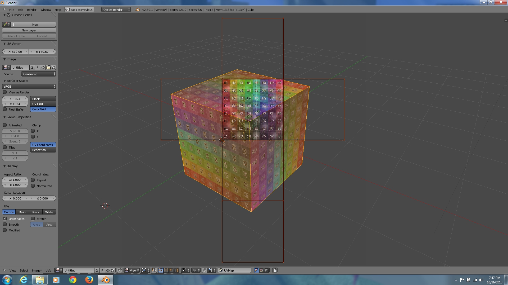
Yep, when you want to access and edit the UVs in Maya, you pop out a window. From there you can use the hotkey to maximize it or quickly make some UV changes then hide it again. For example (google image search):
Some UV plugins allow for a split screen approach I believe, or theres the viewport editor which allows for customization…though to be honest I have never touched so I dont know how much it can change… But really its not that bad, pop out windows are really no different than split windows in my opinion, its only hard to juggle when you have many on the screen at any one time.
Only in a lot of applications, you try to instantly do something in the main creation window and all you get is the popup window blinking and telling you that you have to close it before you can do anything else, I must say that it has become more of an inconvenience to me after getting used to the non-modal workflow of Blender (which allows for rapid switching of tasks in terms of things like UV editing, which in turn means its not blocking the viewport when it updates the textures in real-time).
All in all, I think by now, one would think that promoting a modal, blocking UI system in the name of familiarity and consistency is a non-starter when it comes to discussing the user experience in Blender, and might even lead to the alleged vindication of suspicions from your early appearances in UI discussions that you want Blender to look and feel like a Maya clone.
Though if one really wants to axe the UV editor window, I did at one point come up with some very experimental mockup of the UV editor being a blended overlay on top of the 3D view like so.
Though I still wonder exactly how the controls would work considering you’d have the 3D view camera/editing controls and the UVmap controls in the same space (as in, the design is more novelty than practical).
All in all, I think by now, one would think that promoting a modal, blocking UI system in the name of familiarity and consistency is a non-starter when it comes to discussing the user experience in Blender, and might even lead to the alleged vindication of suspicions from your early appearances in UI discussions that you want Blender to look and feel like a Maya clone.
Well thankfully, Maya isnt like that. What you are thinking of is some sort of prompt or photoshop like effect that tells you to finish using the overlapping window’s function first. In Maya, just like with blender when you pop out a window, clicking off of it or calling upon some other action is ok, there is no prompt or anything that tells you to stop. If anything you just minimize one window to look on another, or drag it off to the side. Its fairly common to work with dual displays these days as well, or with a widescreen, and thus its rarely ever a problem.
Anyways, I never needed to check up on whether or not Maya does a split screen in the UV editor, I never had to. So I loaded up a demo of Maya LT and low and behold, there is an option to do a split screen with the UV editor if someone needs or prefers that method.
Here are some screen caps to show the differences between the two, as well as Blender doing the same thing. I just dont see having it split as part of the 3d viewport that big of a deal over a floating window.
Not much of a functional difference really.
All in all, I think by now, one would think that promoting a modal, blocking UI system in the name of familiarity and consistency is a non-starter when it comes to discussing the user experience in Blender, and might even lead to the alleged vindication of suspicions from your early appearances in UI discussions that you want Blender to look and feel like a Maya clone.
I dont believe I have promoted a modal “blocking UI” system in the name of familiarity and consistency. I’m not sure how you came to that conclusion. Look at the pictures above, they take up the same space. The only thing gained really is the minimizing of such windows, but then Blender already has this.
Perhaps you confuse what I mean when I say “unified” interface. I have pretty much supported the idea of function based layouts as seen in Modo, which by default has a UV mode that shares the viewport with the mesh itself, while allowing the user to do the very same thing which is pop out the window if need be. One of my arguments has been that theres very little to gain by breaking up and or fracturing the user interface into many small mini applications/windows with their own mini UI and hotkeys. If the UI design is good, there is no need to have all those windows fighting for space within the UI, rather it brings very little to the table IF you consider the goal of creating art rather than playing around with different UI layouts.
Though if one really wants to axe the UV editor window, I did at one point come up with some very experimental mockup of the UV editor being a blended overlay on top of the 3D view like so.
I think a UV window is fine, though the way its implemented is some what problematic. Its controls are not in line with that of the 3d viewport. UVs are really just a collection of verts and edges with faces inbetween. Its like skinning a 3d object and laying it out flat and working with it in a top down orthographic viewpoint. Thats ideally how it should be, whether in the 3d viewport itself or in a separate editor.
On one hand, it seems kind of nice to merge the image viewer, the paint window and the UV editor into one, but then theres a conflict in interactivity. It would be better perhaps to have a dedicated UV editor which can act more in line with the 3d viewport and act much more dynamically. Without going that far, a simple fix would be to have the UV editor, regardless of where its located, behave in a 3d viewport like fashion.
That said, I believe dragging the left mouse should result in a box select, clicking on any vert or edge should give the transform widget/gizmo, click off on empty space should deselect. There should be a grid which allows for proper snapping, and even the ability to layout separate sets of UVs within one editor. All the power of the 3d viewport and expectations should naturally carry over to the modifying of UVs.
Though I still wonder exactly how the controls would work considering you’d have the 3D view camera/editing controls and the UVmap controls in the same space (as in, the design is more novelty than practical).
Well there is a more innovative approach that hasnt really been expanded upon… someone made it for maya but I dont think it really got out much as it seemed to have been more of a personal and private project for the individual. That being, having the ability to unwrap a mesh in 3d space in which all the faces flatten out according to the UVs or represent the UVs. Dont forget we have access to top, side, front views, in both perspective and orthographic. If there were a modifier that allowed this, then the artist could actually use cycles nodes to create results that can be rendered in the shape of the UVs, which then can be applied as a bitmap to a non-flattened out 3d mesh.
For just plain ol UV editing, it just needs either the behavior of the 3d viewport, or say the option to view the UVs in the 3d viewport as though it were a top down view.
Small fixes to the UV Image Editor as it stands are much lower fruit than trying to rewrite back to the days when we had UV Edit mode in the 3d view - the current editor serves the image viewing, masking, and painting as well as aligning the uvs and welding them, etc.
As for tearing away windows - we can already do that, I don’t really follow how that is an improvement or a hindrance to getting painting done except that if you paint in both, you will have to click that floating window thing to activate it, and then click the main window again.
I agree, I also feel thats the smartest course of action to start off with. The above discussion just expanded upon alternative directions, not necessarily a request to do before all else.
Have you gone forward with anything over at the developer’s site? They did say that they will listen for UI improvements after all, and small low hanging fruit might be reachable for them in the near future, similar to the tabs and other ui improvements they are working on.
Yes, and the few I have talked to think its a good idea. I just got an email allowing me to post proposals via the Wiki so, thats the first step the second is getting it along with details into the hands of those on the UI team.
For the most part the proposal or request will just be to make the UV editor behave like the viewport. Drag select via left mouse button equals box select, clicking in empty space deselects, and UV verts, edges, faces and islands can be moved, rotated, and scaled via visual transformation widget/gizmo (in addition to having hotkeys for those who just want to use a hotkey to rotate, scale and grab).
A nice way would be to be able to slice the view port into sub layouts like a quad view without actually having than the menus quadruplicated
Do you mean something other than ctrl alt Q, which divides the 3dview window into quadview without duplicating the menus? (Particularly useful in local view) The down side of course is no independent navigation of views, but that would require – menus.
Yep, when you want to access and edit the UVs in Maya, you pop out a window. From there you can use the hotkey to maximize it or quickly make some UV changes then hide it again.
This approach was tried for a long time in Blender and refuted in favor of the current non-overlapping system. Everyone found that a huge step up in accessibility and workflow. As far as I can tell NOT ONE USER says that the former setup was preferable. Anyway you can shift drag out a floating window anytime.
You also said:
For the most part the proposal or request will just be to make the UV editor behave like the viewport. Drag select via left mouse button equals box select, clicking in empty space deselects, and UV verts, edges, faces and islands can be moved, rotated, and scaled via visual transformation widget/gizmo (in addition to having hotkeys for those who just want to use a hotkey to rotate, scale and grab).
Not sure where you get any of these, could you clarify what you mean?
In the 3dviewport, drag with left mouse button down does not do box select. I would be happy to have it be so; right now it seems to be an unused operation. How would you feel about making it lasso select which I prefer to box… then box could be ctrl drag.
Clicking in empty space does not deselect (Nor would I want it to! Although Blender lovingly provides an undo for accidental deselect). This seems a useless feature that mimics 2D programs to no good purpose. Accidental deselect is more of a liability than the A keystroke.
The 2D widget sounds harmless enough (although if I understand correctly it’s always going to be pointing in the same axes i.e. y will always be vertical, and x horizontal, losing the most useful aspect of the 3d widget).
Wouldn’t mind some popup windows in Blender so long as that is not the only way. I do no want to be required to open a popup blocking window just to edit a material but there can be cases where that would be accessible.
I imagine going to the modifier tab and a displace modifier has a texture, I want to click a button to pop up a window which allows me to edit that texture right there and then without switching windows to the texture panel and finding the right texture to change.
The 2D widget sounds harmless enough (although if I understand correctly it’s always going to be pointing in the same axes i.e. y will always be vertical, and x horizontal, losing the most useful aspect of the 3d widget).
I think the usability is that it gives you something to manipulate with instead of the G, S keys maybe, which is handy in some respects
I think you need to re-read the posts above. I already mentioned using SHIFT to drag out windows. Also where did you get the idea I wanted or asked for popped out UV windows from this:
“Yep, when you want to access and edit the UVs in Maya, you pop out a window. From there you can use the hotkey to maximize it or quickly make some UV changes then hide it again.”
Seems like we are clearly talking about how MAYA works, not some request or demand to make the windows pop out by default. In post following the one you are quoting, I also concur with Ace Dragon that keeping the UV window as is with just some slight changes in behavior is the smartest approach.
So I am not sure how you came to that conclusion from that. Just talking about how another app does one method doesnt necessarily make it a request to do so in Blender.
Not sure where you get any of these, could you clarify what you mean?
In the 3dviewport, drag with left mouse button down does not do box select. I would be happy to have it be so; right now it seems to be an unused operation. How would you feel about making it lasso select which I prefer to box… then box could be ctrl drag.
Ah, good thing you asked that. I am familiar with the method to make a lasso selection, but thats not the point. Its not a matter of finding the hotkeys to make the selection, but rather the focus on consistency in behavior between the 3d viewport (or 2d viewport, if you go into orthographic mode from any side or top view) and the UV editor.
I have some good news for you though, the current direction of development has the left mouse select becoming the default for selection. It would make one mouse button behave consistently across the UI, which it currently does not. This doesnt mean legacy controls/users would lose the ability to flip it back, but the left mouse select is where the control scheme seems to be going.
Thus the proposal I am talking about takes that into account. If it didnt, then it would be right mouse drag select instead.
Clicking in empty space does not deselect (Nor would I want it to! Although Blender lovingly provides an undo for accidental deselect). This seems a useless feature that mimics 2D programs to no good purpose. Accidental deselect is more of a liability than the A keystroke.
Clicking off to the side in empty space does not deselect, you are correct. Which is why I am proposing a change in that behavior to begin with. Obviously I wouldnt make such a proposal if it already acted that way.
Also, we just came to the core of your opposition, which I find very odd or rather confusing. You say “This seems a useless feature that mimics 2D programs to no good purpose.” In fact I dont know of any 2D program (not sure what that means) that behaves that way.
Perhaps you are thinking about how other UV editors work. It has nothing to do with the vague classification of 2d programs, but rather UV editors which exist alongside their 3d viewports. Practically all the major 3d applications have a consistent expectation of use between their UV editors and the viewport.
What are UVs but a flattened out mesh? It goes to stand that the behavior in one window that allows for the movement and modification of verts, edges and faces also acts in a consistent manner with the UV window which does the same thing. There is actually no reason for it to be different or not visually communicate to the user whats going to happen. There is no way to communicate to the user that dragging anywhere is the same as grabbing the selection, or any of the actions that follow.
So if anything, the proposal mimics the 3d program itself and others in the field.
The 2D widget sounds harmless enough (although if I understand correctly it’s always going to be pointing in the same axes i.e. y will always be vertical, and x horizontal, losing the most useful aspect of the 3d widget).
Of course, its why we called it a “low hanging fruit” in the above posts. It does not necessarily need to change how current users who are fine with the UV editor interact with it. That said, I get the impression you havent worked with many other 3d applications, which may leave you with nothing concrete to compare it to.
UV really just translates to XY for another type of data. U is the value tied to horizontal space where as V is the values tied to the vertical space. Thus the widget as X and Y make sense since its technically a U and V widget as well. The circle in the widget when grabbed is no different than in the 3D viewport in which the selection can be moved freely along those two axes.
Again this is actually CONSISTENT with most other UV editors out there. So I am not quite getting what you think is being lost or less useful. Blender’s current set up with the UV editor, due to its name, only works in the same space you seem to question the widget as having.
My opinion on this, the issue of having independent navigation in sub-ports within the 3D view window should be easily doable if you know the hotkeys. Also, the sub-port concept can be further expanded by allowing one to have different scenes and layers in each window and having a simple one-click system for selecting which of those ports to invoke an operation in. (though it would still you mean you can’t have object mode in one port and edit mode in another as we get into some really tricky design issues in terms of multiple toolbar display and the like).
Of course, the click system for selecting the port to invoke an operator in would only apply if you’re invoking from the toolbar, doing it via the hotkey would just do the invoke in the port the mouse is over.
I personally believe that the new ui is an improvement that will blow other free/cheap 3d programs out of the water. Don’t care about what the haters say, the ui appears to improve workflow, be easy on beginners, and cleans up the view port. I could go on and on but I don’t want to say what has probably been said already.
I have some good news for you though, the current direction of development has the left mouse select becoming the default for selection.
I hope you are being 1)Sarcastic, and 2)Premature. It’s hard to believe that the UI team has given in on something that the development felt so strongly about, so easily. Perhaps you could link to the discussion where this change is mentioned.
Also, we just came to the core of your opposition, which I find very odd or rather confusing. You say “This seems a useless feature that mimics 2D programs to no good purpose.” In fact I dont know of any 2D program (not sure what that means) that behaves that way.
2D program as in Photoshop or the GIMP. Make a selection. Click outside the selection. Lose your selection.
About the 2D widget, I said it seemed OK and harmless. I said that since UV only has two directions it does less than the 3D version which has global local normal and userdefined orientations, which I am sure you know how to use. What do you want me to say? That it’s a great and brilliant idea? Sorry.
I understand that you want the UI to change. We get that - in all the discussion here you easily have by far the most posts if not in number definitely in verbal yardage. It doesn’t mean that your opinion is that much more important though. Sorry bout that too.
The changes that are currently going on might be seen just as much securing the future of Blender development and funding as it is improving the program.
You have to think, if the core team is to keep growing and if development is to continue to accelerate, then the foundation will need more subscribers to maintain it, and where you do think the additional funding will come from (the current Blender community or future studios that have a steady income from projects)?
Personally, I could easily see left-click as default being, at the least, the default that gets set when the Maya preset is selected in the splash screen. I think as of now, you don’t have a full preferences change when the different sets are selected and that I would think would make more sense in the short term (because if you use the Maya preset, you expect to have Maya’s controls).
I have no problem with this being defaulted, but it’s not easy to separate just this from all the other proposals piggybacked on it removing current functionality - for instance the deselection changes, the right-clck context menu etc. that will be a conflict with currently hard coded functions, so it’s not going to be just a simple preference change.
I do appreciate your concerns about the future, and that current users are not doing enough to support Blender and that the BF should do whatever needs to be done to attract more users. Unfortunate that it has come to that.
We are then indeed lucky to have volumetrics be worked on so much and make it in before these hard decisions because really who knows if new users would want something so esoteric and quite limited in application.