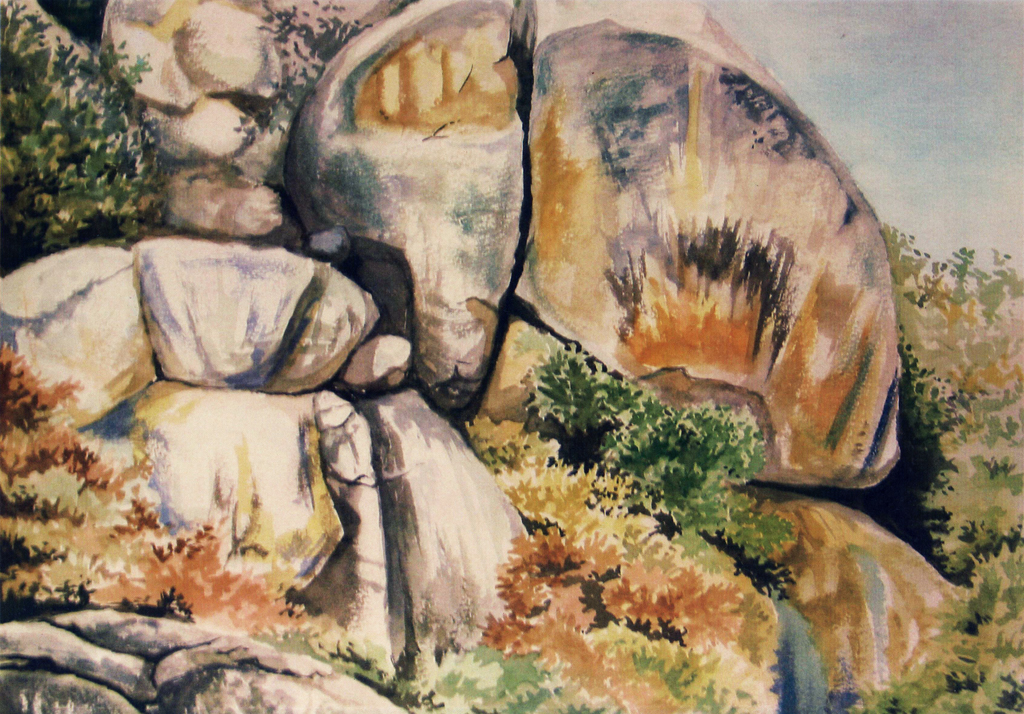
Some watercolour for nostalgia’s sake. An outcrop near Great Zimbabwe:
Missing link.
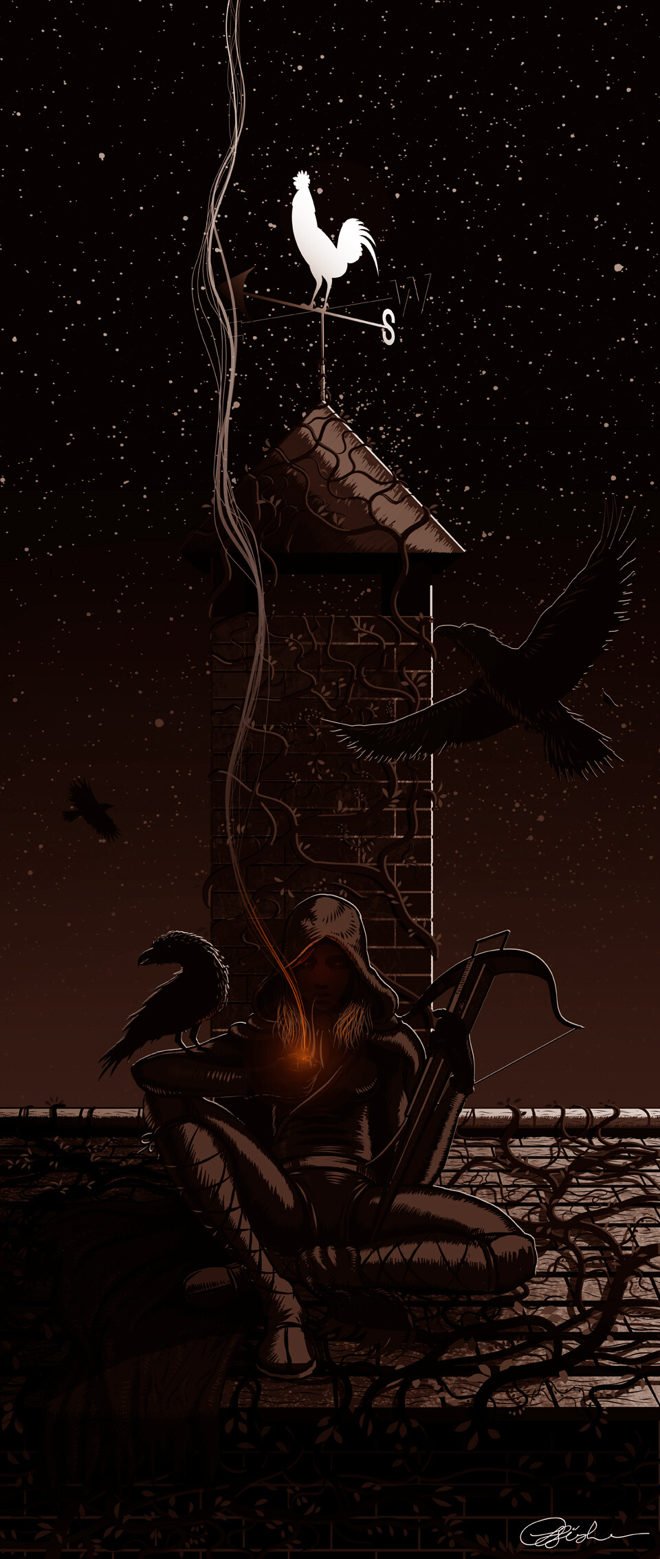
Finished image from previous sketch, hope you like.

Thats pretty coo work
All sorted!
You have pretty good sense of picture space, and sense of weight. Nice works.
There is lot of power behind your black and white work. Translating the power into color is causing you problems. No? Bright color gets away from you. You can’t use color like you do in Black and white work. Color comes alive when placed next to its counter part like black and white. It has its own rules.
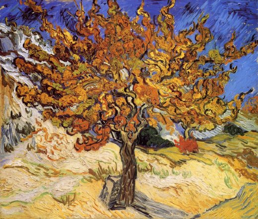
Be sensitive and open to color. You know when your color is not sitting well on the canvas. It doesn’t look good. Right? Study Van Gogh. He is trying all kinds of color all over the place so that it sits well with all the other colors around it. Once he decided to put particular color down on canvas that was that. He is trying like crazy to make it sit well on canvas:
You have pretty good sense of picture space, and sense of weight. Nice works.
There is lot of power behind your black and white work. Translating the power into color is causing you problems. No? Bright color gets away from you. You can’t use color like you do in Black and white work. Color comes alive when placed next to its counter part like black and white. It has its own rules.
Be sensitive and open to color. You know when your color is not sitting well on the canvas. It doesn’t look good. Right? Study Van Gogh. He is trying all kinds of color all over the place so that it sits well with all the other colors around it. Once he decided to put particular color down on canvas that was that. He is trying like crazy to make it sit well on canvas:
Erm, thanks?. If you want an explanation I just don’t really like using bright colours. I prefer the subtlety of analogous colour schemes because I feel they are better suited to convey mood and emotion.
No, your drawing is not dull. Your drawing is not subtle. That’s my point. When you say, “I prefer” you are talking from your conscious thought. What comes out in an artwork is unconscious stuff. And that is not what I am seeing.
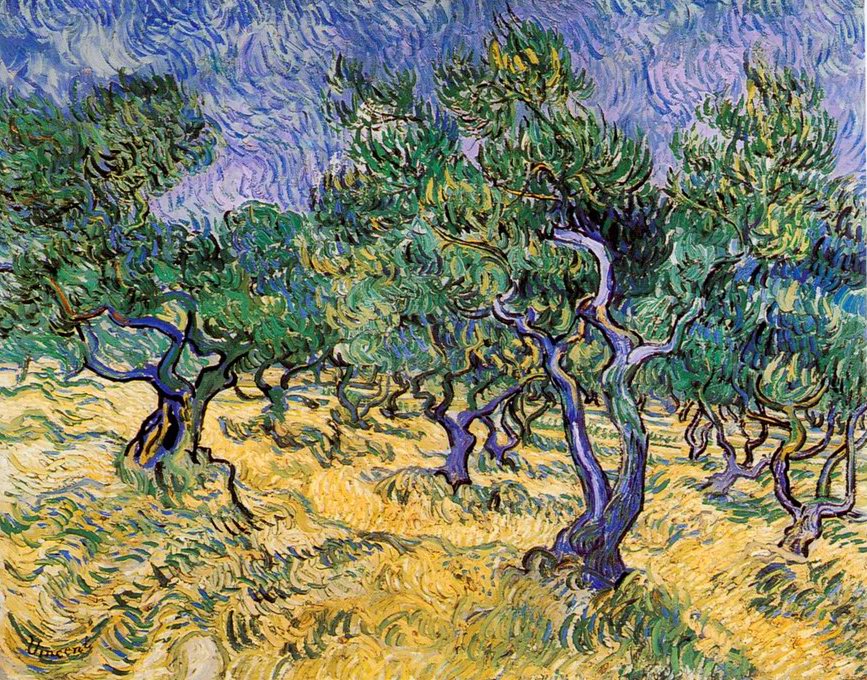
From your watercolor, you are trying to lean towards simultaneous color contrast. Here is example:
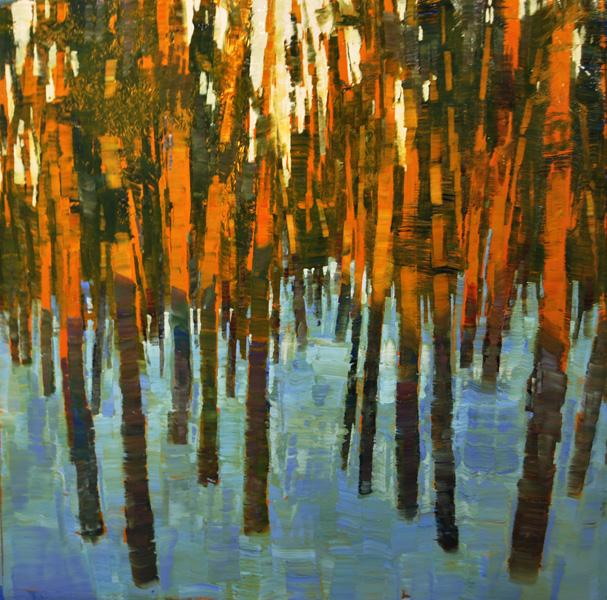
This painting is about color contrast. There is hardly any black or white color in it. Your watercolor has tons of blacks! Subtlety is destroyed. If you are looking for subtle feel, you need to stop using black and white.
Thanks, I’m quite happy with my grasp of colour.
Personally, I find your work quite inspiring. Some really beautiful and creative stuff here. Well done. Just thank people for their critiques and try to learn from them. Don’t worry about their opinions too much.
Personally, I find your work quite inspiring. Some really beautiful and creative stuff here. Well done. Just thank people for their critiques and try to learn from them. Don’t worry about their opinions too much.
Thank you. I imagine many comments get misconstrued due to the limits of this mode of communication.
good advice ![]()
Damn! Such good work!!
Thanks very much 
Sweet stuff You have here.