ooooOOOooooo very interesting
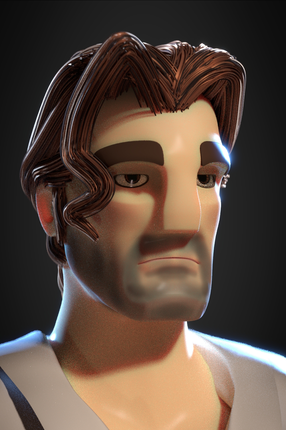
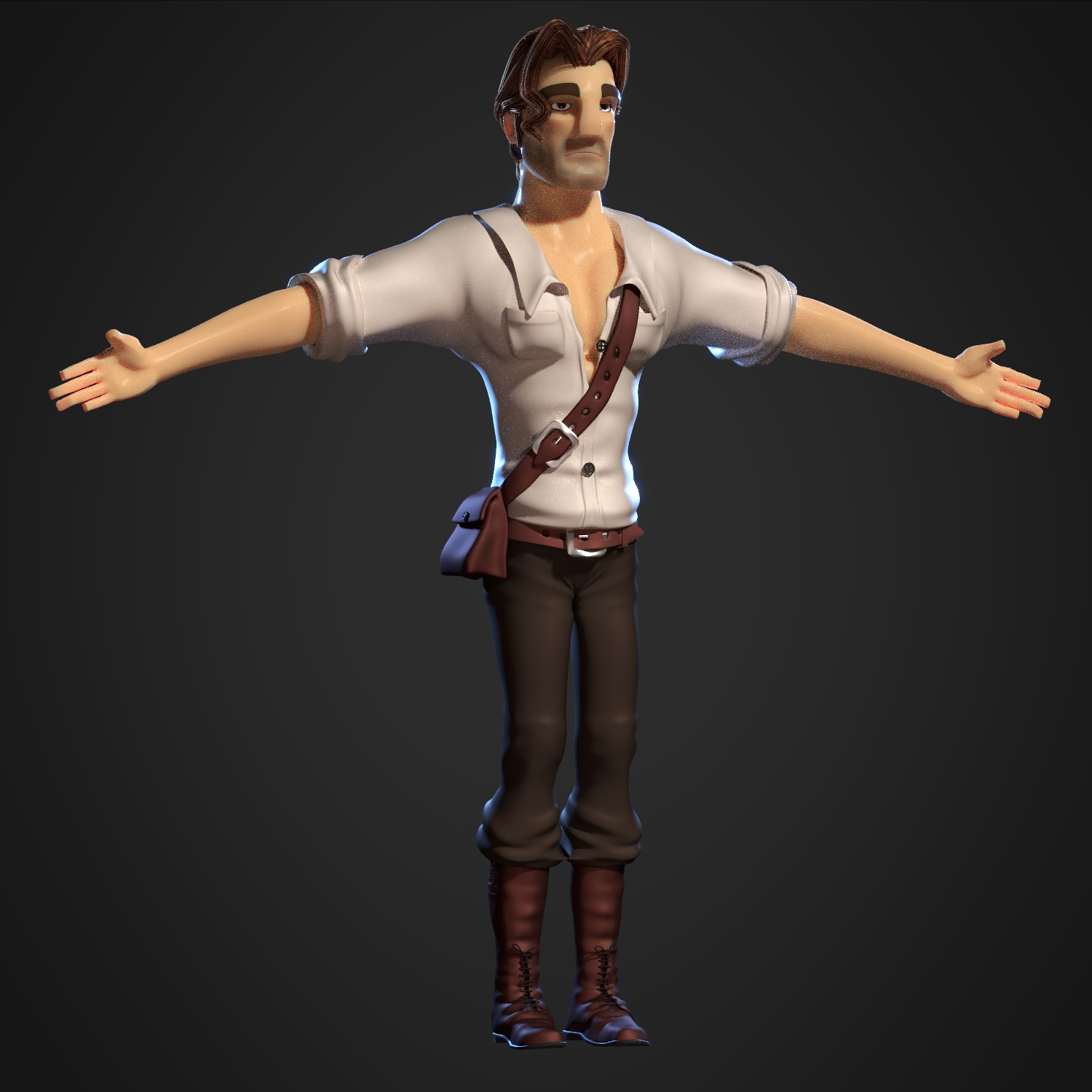
Hello everybody, I have worked on Rainsford today. I would like to improve him quickly because he’s still the main character, and he’s not even rigged today. I still have a lot of works to do on the model, especially on the shirt. But it’s much more better than yesterday. I think I gonna make his arm thicker, i think it will be interesting to have a strong shape like Disney’s hunchback of Notre Dame, to accentuate his “gorilla” side.
I couldn’t wait one more day before making landscape, so I work all the day on ocean shader. What a mess ^^

Attachments

wow it looks great. i’m getting node anxiety from your node tree though.
What a beautiful project and lovely artwork you are presenting here! I’ve read through the pages of your thread and I enjoyed both, the 2d and the 3d posts. I especially love your character design. Keep 'em coming 
And it became much more complex with practical application on a landscape. The reflexion wasn’t very accurate, I had to add more reflexion, and it made the water much more darker. So the reflexion part of the shader is a mix between a glossy and a glass BSDF. Also, I reduced the dispacement modifier to avoid some black artefact on the reflexion. Maybe I can simulate the wave with a voronoi to shade a little bit the global color.
Thank you Minoribus, I also think that the character design (and graphical conception in general) is the most important thing on an artistic project. Many project with good scenarios and even accurate rendering was done with not enough works on design, and it gives a sense of shoddy work, which is never true, because when we’re talking about CG, we’re talking about hundreds of hours of works, and nothing is random, but not researched. That’s the difference between disney and the other, the many project they have abandoned.
But maybe I loose too much time on character design, on what can I improve them or if I can do it better. That’s why the project stagnated for 4 years. Today I want to product something more concrete, that’s why I force me to post an artwork every day. Even if Zaroff will not be published, I learn lots of things every day, and I really enjoy it.

Here’s the facebook page, if you want some updates : https://www.facebook.com/pages/Zaroff/259068260958700 It’s only in French for the moment, but I’m going to translate the texts in English.
Cheers
Rocks, water and sand are great in the last post. Your work on the shaders has paid off 
But it isn’t as well as I expected. So since few days I work on vegetation, I have ridden some books on second and third earth, to fin good information about foliage at this time. I have been to my “bouquiniste” (A sort of bookseller who sells very old books), and I found two wonderful books on the prehistoric times. One of them has many artworks about the giant mammals period. It was hidden very hight on a shelf, ant cost only 5€!!!

So I have worked on vegetation. But I’m not completely satisfied about the result.

Ferns, the texture is all mine, and use no alpha map, (you can use it for closeup), I’ve made a normal map on Blender using, array and baking for the smallest leaves, and after I have painted over the normal map texture the color map with mypaint. I haven’t used a randomized color, but I’m thinking of it.

Sequoia forest, not bad, but leaves use an alpha map and have been multiplying the render time by at least 10. This peaces of render took 1h10 to complete. I have to optimize it. And I have to make a better model for closeup.
That’s why I haven’t post since few days, because I work on the hardest point of the project. Making a visual style for backgrounds which fits well with the character’s Design. After that I will come back to the creek, and the character Design.
Oh I have forgotten : I have seen the 1925 version of the lost world, fantastic!!!


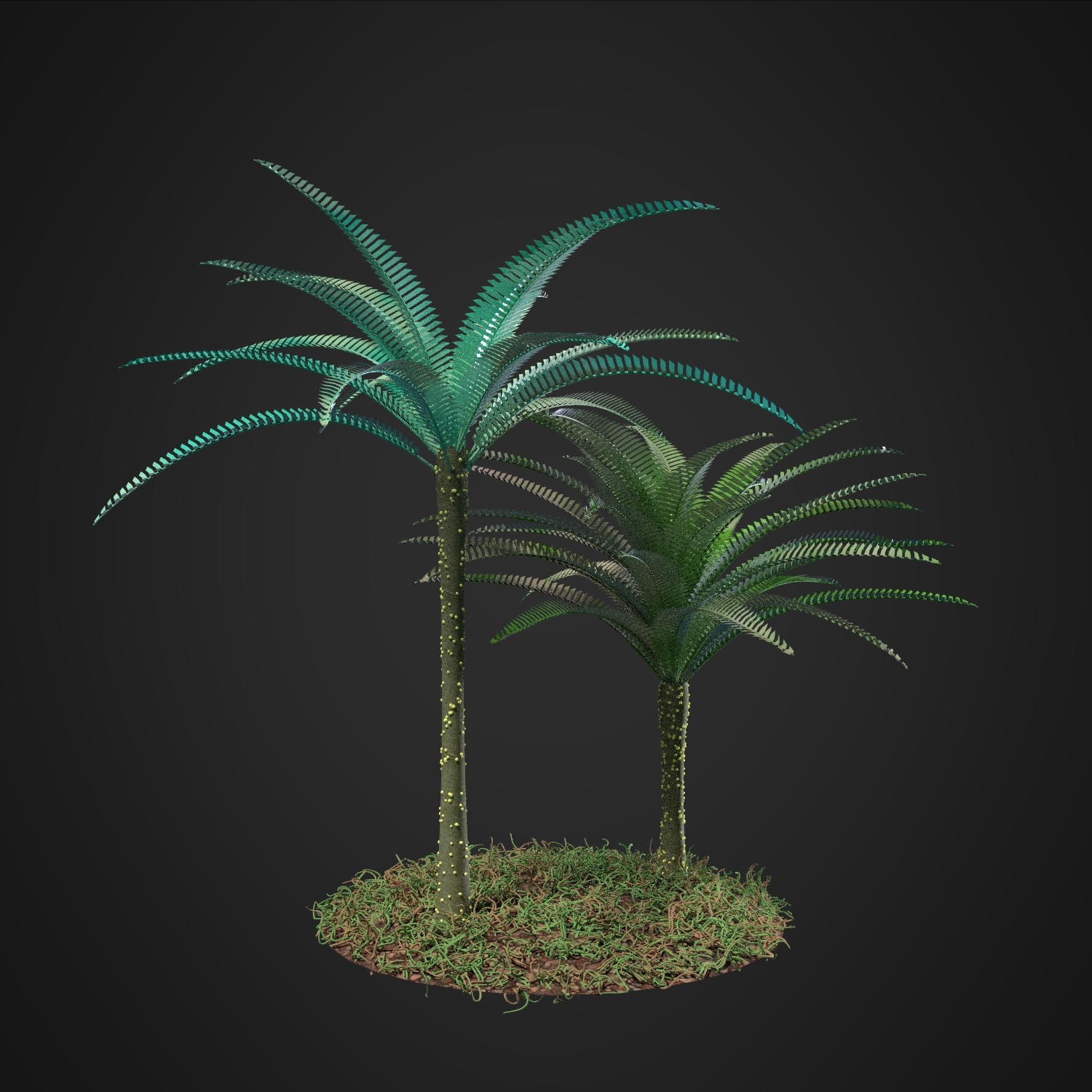
Here’s some plants which need some improvements.

And others works on Zaroff clothes. I’ve been working on it since the beginning of the project. But still things to do.

though I really like the palm trees, their leaves look unnaturally even in structure. perhaps a conservative usage of the displace modifier could give them some subtle noise.
Maybe. Or should I use a more accurate modelling of the palms, also I think it needs a texture.
perhaps if the individual leaf segments had more of a flame shape it would break it up a little more.
Yes you’re right that’s the biggest problem.
decent, well done

Looks great man. I have found you can make some pretty good magic effects by animating some bright objects in combination with the glare node, and setting it to render only the effect, minus the actual objects ( one of the settings in the glare node ). The ghosting effect in particular yields a nice result.
You wanted to say something like this. I already used glare for each render because I love the expressionist lightning. So I have exaggerated it with an ID Mask on the gold material.

For the character design, I just want to have something clear, but in the comics, I will play with glare, highlight and deep shadow much more than today.