They are very easy to spot if you have seen thousands of renders, different render engines and photos shooted with real camera.
I think your render has no antialiasing at all ?
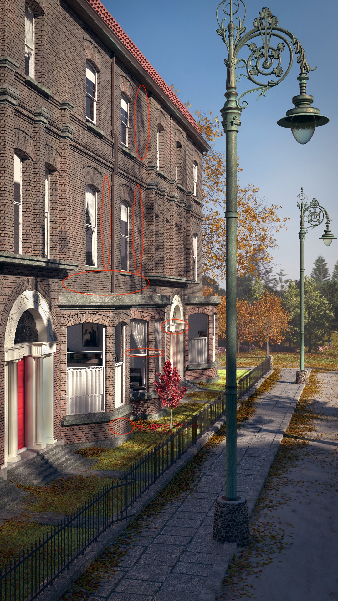
I really like the image. Lighting looks nice…but there is something off with it…im not sure what it is though…may be the repetitiveness of the brick texture? I also really like the trees 
@Tynkatopi I think what you’re seeing is an artifact of bringing the image down to a scale where it can be uploaded. here’s the original. Tell me if you still see it.

My anti-aliasing is set at 8.
edit: just in case, I’ll try maxing the anti-aliasing next time and check for differences.
Just a suggestion: assume the camera is looking north. Move the camera to the east (toward the virtual park) and rotate it back toward the building, so both red spots are in frame. Adjust the distance from the scene so the closest lamppost is completely visible.
That last image is better, but easy still to see those artifacts, antialiasing issues. Look good renders and all good quality interior/exterior photos, you’ll never see those CG-artifacts.
Attachments

The posts aren’t too tall, it all depends where you are from and what your municipality chooses for lamps. I would agree that for that style of lamp, that they usually tend to be shorter (probably because their ornate qualities are meant to be seen by onlookers), however I had lamps very similar to this on the street I grew up on and they were about the same height.
I also don’t completely agree with the comments about the colours causing issues with the composition. Also, cyclical optical paths aren’t always an issue when you are wanting to keep eyes on your layouts.
I think the biggest issue for me is the cropping. There is all of this detail and focal interest throughout, and the crop is very narrow and comes so close to the focal points of the composition. It makes it feel like there is no breathing room, some white space on the right side of the image would probably resolve this issue and make the whole composition more optically pleasing. It would also probably solve any issues with the perspective lines caused by the road, right now you follow them and they almost converge with the edge of the crop (right side).
I wouldn’t take any of this criticism too hard, the comments are only there because it is really good - it’s so close to extraordinary that people are trying to push you over that threshold. Take them as complements.
Either way, awesome stuff man!
Honestly, the more I look at it, the more I actually don’t think those are “Cycle’s antialiasing issues”. I think you are seeing the horizontal mortar lines being bisected by the vertical ones. When the user says the image was also scaled down (and thus antialiased again, separately) in the original image we were seeing, I don’t think that you can blame cycles, as the second processing should mask any of those original issues.
I think it is just because of the subpixel details in the brick pattern that is causing it to look that way as it scales further into perspective, similarly to how herringbone patterns get captured in various forms of photography and video. I think one of the issues might be how the entire image is completely in focus (in the foreground at least), where naturally you would get some falloff and some slight shutter shake if it was a true photo. Like those bricks towards the end of the building most likely would not be as sharp as they are in a real photograph.
@B-Rae Thanks for the good word. I’m not done with this thing yet, obviously. I’ve been busy in the last day fixing some technical errors and also increasing the width of the pic. As I bring the crop away from those lamps, my own eye tends to calm down. DOF is on my mind because of those bricks and their detail…I tend to agree about the aliasing.
@Orinoco thanks for the suggestion. I’ll try it (and some other things), though my concern has always been the distraction of having the building directly behind the posts.
I can see that the trees in the background should be of a better quality, so that’s part of my next bit of business.
Thanks again!
Amazing job!
It’s a great stablishing shot waiting for some tracking. For a while i thought it was a photograph, so congratulations on that side! what it gave it to me was the perfectly clean and aligned tile roof. I guess some dirt or moss there would make it more believable but if you were running to get the entry done i said you have a great sprint!
I like the look and feel of the image; great work! My only criticism is that the point of view (camera position if you will) is too high, creating an unnatural sensation. I suspect you framed it this way to avoid having the camera pointing up and creating converging vertical lines while still including most of the lampost, but I would try lowering the camera and rendering with a smaller focal length, and then cropping out the bottom portion. It would be like using a shift movement on a view camera, this way you can keep the same framing but lower the camera viewpoint.
I like the leaves, particles?
Very nice render awsome!
only i think that the bricks under the lamppost is too high with comparison to the rest of the image.
Still working on ideas that I’ve been getting from you artists! Thanks for all the great input.
@Salokin, you’re not the only one to be bothered by the camera height. I like it, but maybe that’s my inexperience. There’s nothing like as great crane shot in a movie, right? Seriously though I’m bringing it down to eye level and away from the lamps (and I’ll prob. like the difference based on my initial tests)
@dejv yes the leaves are a particle system. I know you can’t see them but there are also little pebbles on the ground here and there.
@lvl this is a gallery pic and supposed to be finished. I don’t think they’ve ever had so much WIP commentary here before this. That being said, I love improving my pics that I thought were already done. I’ll take another look at those brand new tiles!
@Beserker I’m always looking at that walk. It may get some fixes as well. hope to post a new improved pic soon…
Another big thing is those bricks, I’m experimenting with weight painting and displace on the nearer ones to make them look more real.
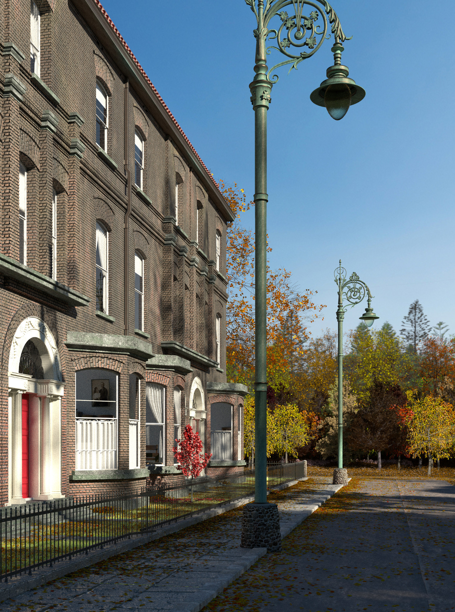
I like this perspective better!
or this:

I’ve quit being a fanboy of those beautiful lamps for the moment…and I’d love to hear comment on this.
edit: I’m done with it for now though. On to other things. I’ll learn to compose my pics better in the future.
Hehe, you fooled my wife! She loved the bricks!
Lowering the camera height to human eye level makes a huge difference, as does having the VP in the picture frame!
I spent a few seconds wondering why this photo is here, before I realized it truly is a 3D render and not taken with a camera. This is uniquely photo-realistic… very awesome work!