Only that it looks F’n Great!!
Hi Zeke,
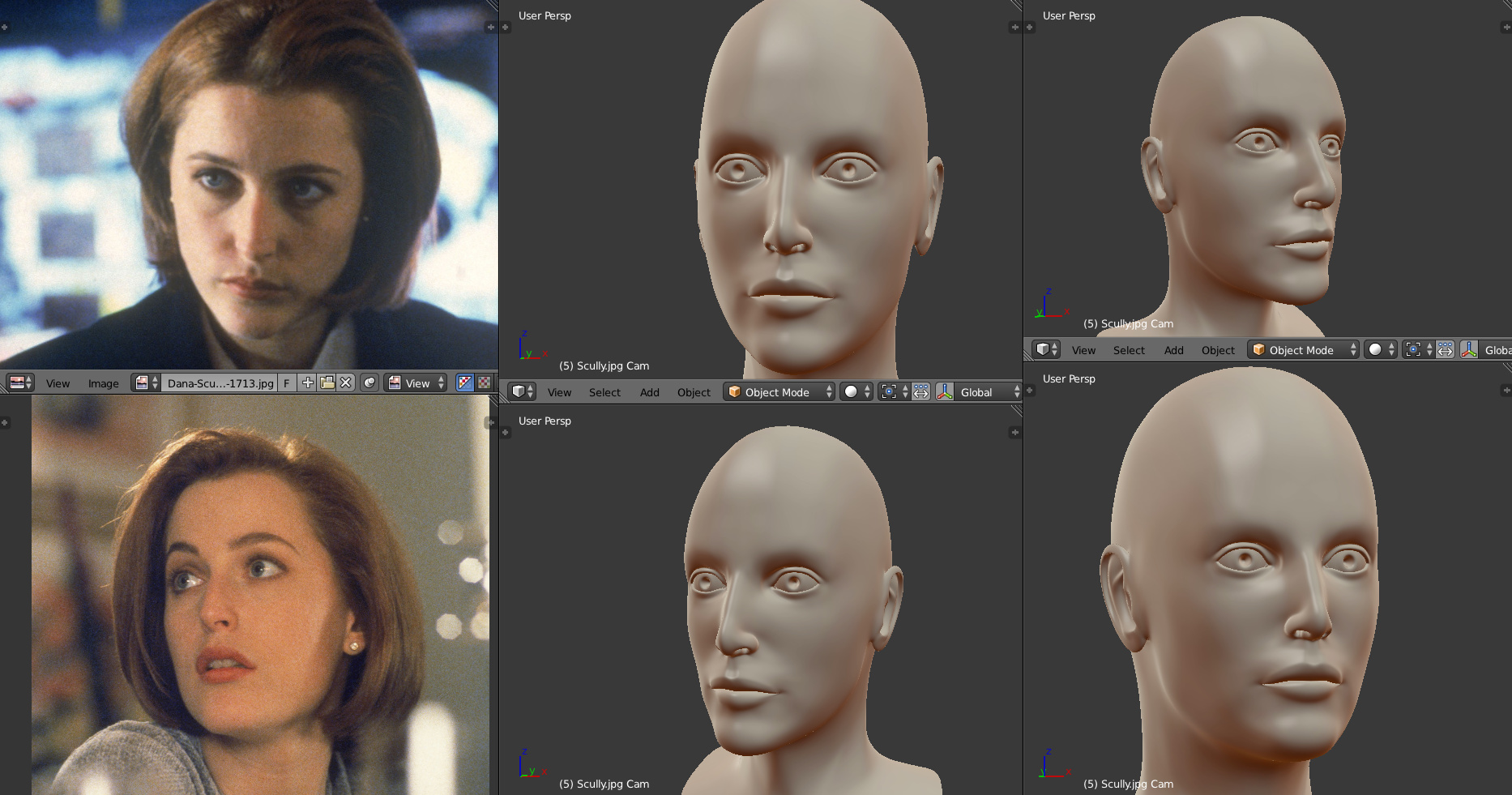
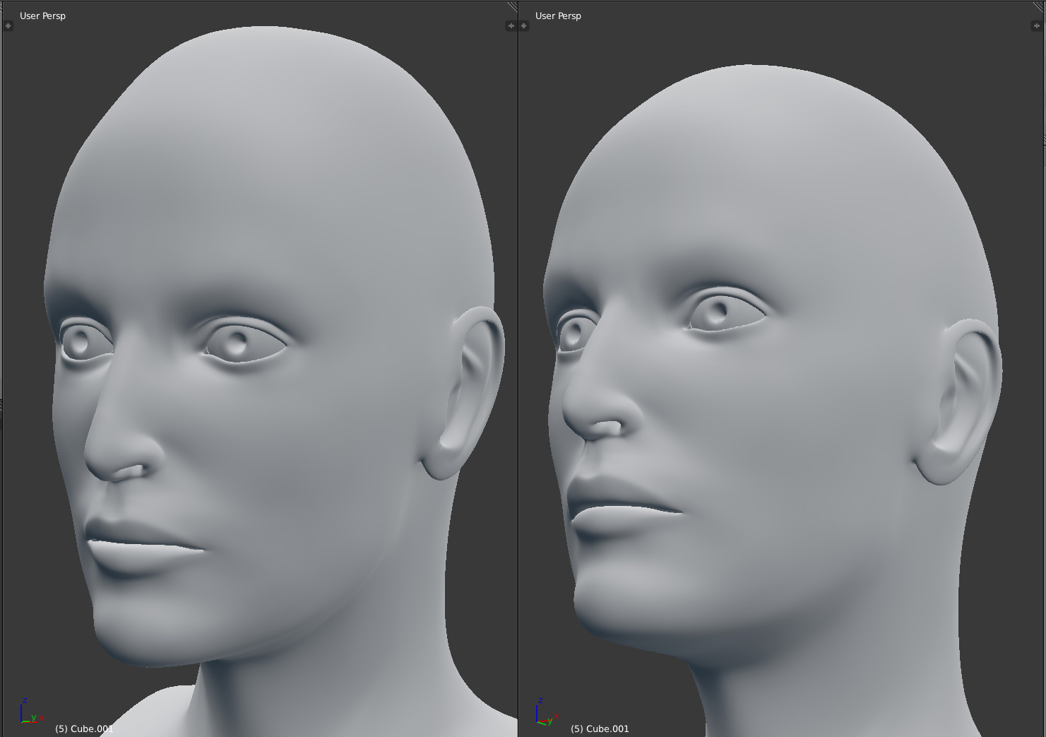
You got a really nice sculpt there.
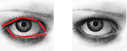
I noticed the eyes have too much of a regular arc, too symmetrical, like a football shape.
Eye lids have angles to them, I’ve drawn red lines on the drawing above,
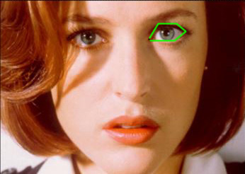
I drew green lines on Scullys’ face.
(Her eyes aren’t symmetrical either, each eye has different shape)
The curves should be made up of straight lines, with rounder corners.
Hope this helps.
Thanks FXR but I don’t think it’s good enough yet. The material is behaving in a way that is not physically accurate. Maybe I’ll ask over on the materials and texturing category, or maybe CGfeedback, though I doubt anyone there uses blender.
I forgot one thing, the eyelids should have more thickness in the skin.
The skin part of the eye between the lashes and eyeball. Sculleys is pretty prominent due to eyeliner.
(I don’t she this in the sculpt as of yet)
It creates like a double edge around the eyeball. Should have a sharpish edge to it.
Thanks Hank. Good point about the eyes. I had originally modeled them that way but it was looking too angular. Maybe I just didn’t do it subtle enough. And I will be addressing the symmetry when I’m done with the model. At this point I have not done any sculpting, just regular polygon modeling. Sculpting will be more for high res details like wrinkles and pores.
The angularity in the eyes shouldn’t be subtle, if anything exaggerating it is usually preferable.
Look at “Michelangelo sculpture of David” look at how the eyelids are exaggerated. (google search the image)
Alright, I’ll try it out when I get my drive reader. That’s crazy, I was just looking at Michelangelo’s David before you posted that!
Secrop was very kind enough to give me some help over on the materials and texturing subforum, and I was able to fix my problem with the eyeball reflections!
It’s looking a bit dry (probably due to a lack of displacement for the normal map) but otherwise pretty good, I think (though looking at it now I wonder if the iris is too big.).
The eye really looks great. But what was the fix that corrected the reflection problems?
Also is the scale of the cornea in relation to the size of the eyeball accurate? If so, I gotta trim down the eyeballs in my project.
Thanks FXR. I believe the problem was with the clamping in the render settings, which I always thought was almost a post effect that clamped the 32 bit image based on pixel values, but I guess it has to do with light intensity?
By the cornea do you mean the transparent outer mesh? I based my models on medical drawings by Frank Netter, they should be pretty accurate (if you guys want I can upload some of the images if you ever need a good reference for the eye). I was initially worried that the iris was too big, but like I said, I think I’ll have to see it in the eye socket before I make that judgment.
Finally got my drive reader, so now I can get back to work!
I tried to tweak the eyelids to add more harsh angles, rotated the jaws back and the ears out just a bit, and reshaped the nose just a bit. I’m now also looking for a more accurate way to model from photos, because just guessing the angle and focal length of a given reference can only get me so close.
Zeke
It’s getting better!!
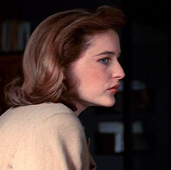
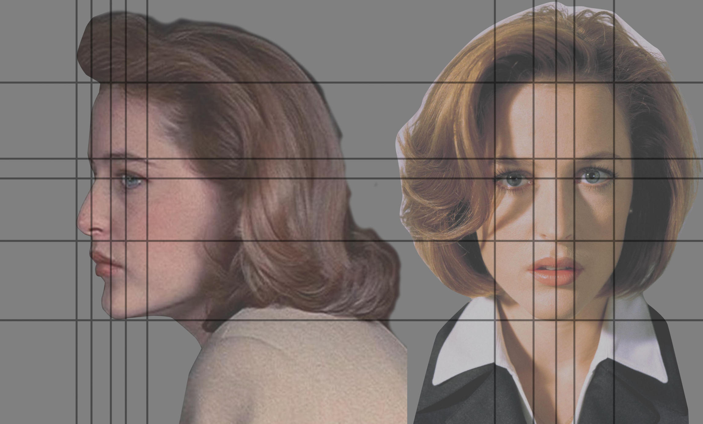
I think you should look at a profile image. Faces in general are much more angular than you think.
Look at this side view of Scully, all the angles, brow, eyes, nose, lips.
Notice how its very zig-zagy. It’s important to know this as it gives you
much better idea what the forms are doing.
(I think use the Ortho view in blender (num 5 shortcut))
The eyes sit under the curve of the brow which goes across the face.
Notice how the brow over the eyes overhangs them.
Look at how the brow overhangs the eye on the outside corners.
Its a very simple quarter circle shape. Outlined by her brow makeup.
Looks like you got it but it just needs to be inflated a little
Her eyes are set in quite a bit (bring her brow line forward)
Maybe make the eyes a little smaller and move them back a little.
Look at the profile the bridge of the nose goes back (zig zag)
Her nose has a small round shape on the tip.
The bridge needs to softened, brought back into the head a little
The bottom of the nose needs to be angled slightly. (zig zag)
Her chin needs to be slightly narrowed. (this will make her lips look larger)
The upper outside corners of her mouth need to be flattened and
turned under. (see profile) It’s a very small flat plane.
The upper lip has sections where the angles change.
Getting this right is hard but might be her most important feature
as far as a likeness goes. She has a very distinctive mouth.
Look at the angles of the shapes. This small plane turns under, this
is what gives her lips that look of being puffy.
In the 3/4 shot where shes looking up (teeth exposed)
Half the upper lip has 2 distinctive shapes 1 very horizontal the other
angled and flat, (in the profile shot this plane almost disappears when her
lips are put together)
Don’t be afraid of making things very angular because you can always
soften (smooth) them later. It’s more important to get the angles
and forms/shapes right.
When creating likenesses it’s important to focus on most important features.
Here I would say the overall face shape, Narrow nose, the full lips, and hairstyle are the important things.
Her hairstyle will help define the face shape. You should get it in. Just basic shapes roughly.
Textures (skin/makeup) will have very dramatic effects on how we perceive the “look” /likeness.
Google “Gillian Anderson” and see how different she can look changed hairstyle, lipstick etc.
Hope this helps, I used to draw allot, but not so much anymore (kind of a refresher task for me).
Good luck
Hank
Thanks for all your advice, Hank! And thanks for the great side reference image. Will definitely address those details.
Sorry about the rather sloppy hairstyle. Just added it for reference.
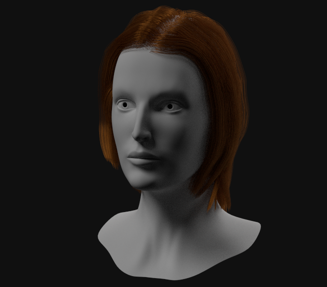
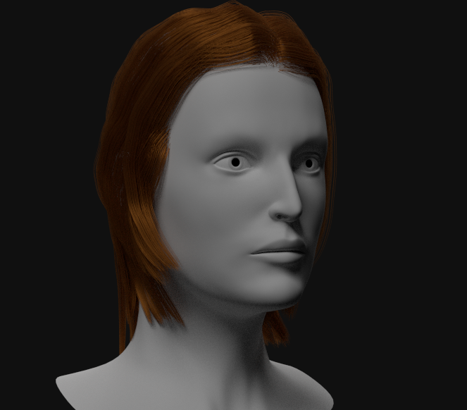
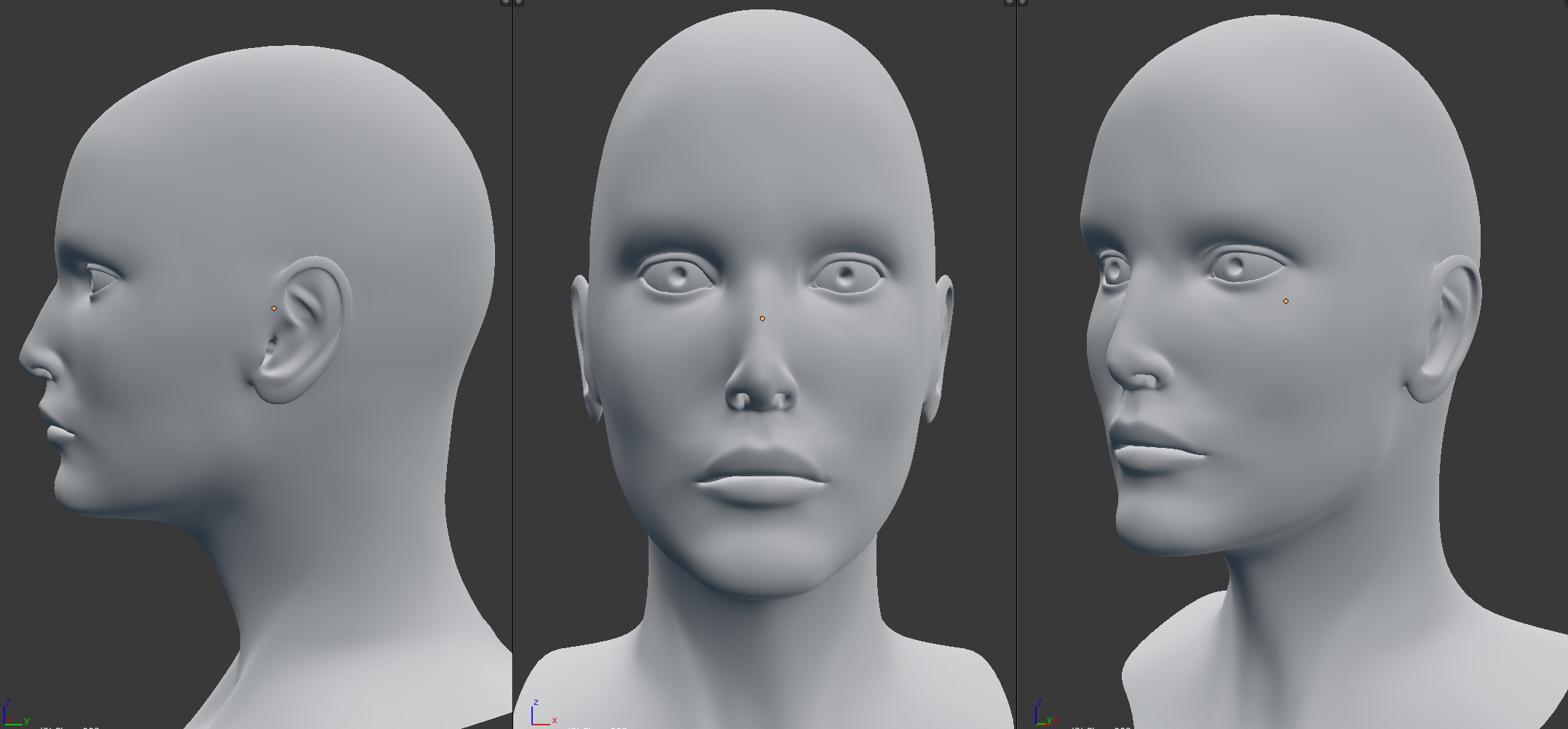
Made many new adjustments to the model, including the eyes, mouth, nose and chin.
Better. But brow and cheekbones need pulled forward more. More definition and sharper edges. Make this over exaggerated at first. Then reduce it to reasonable levels
Also, just a recommendation, post a full profile, a full front, and then if you want a 3/4 front shot.
That helps show geometry.
The reference pic above shows dramatically the rising angle of the upper lip. and the relation of bottom lip as far as protrusion from the face. As well as angle of lip faces.
Thanks FXR, I’ll do that from now on.
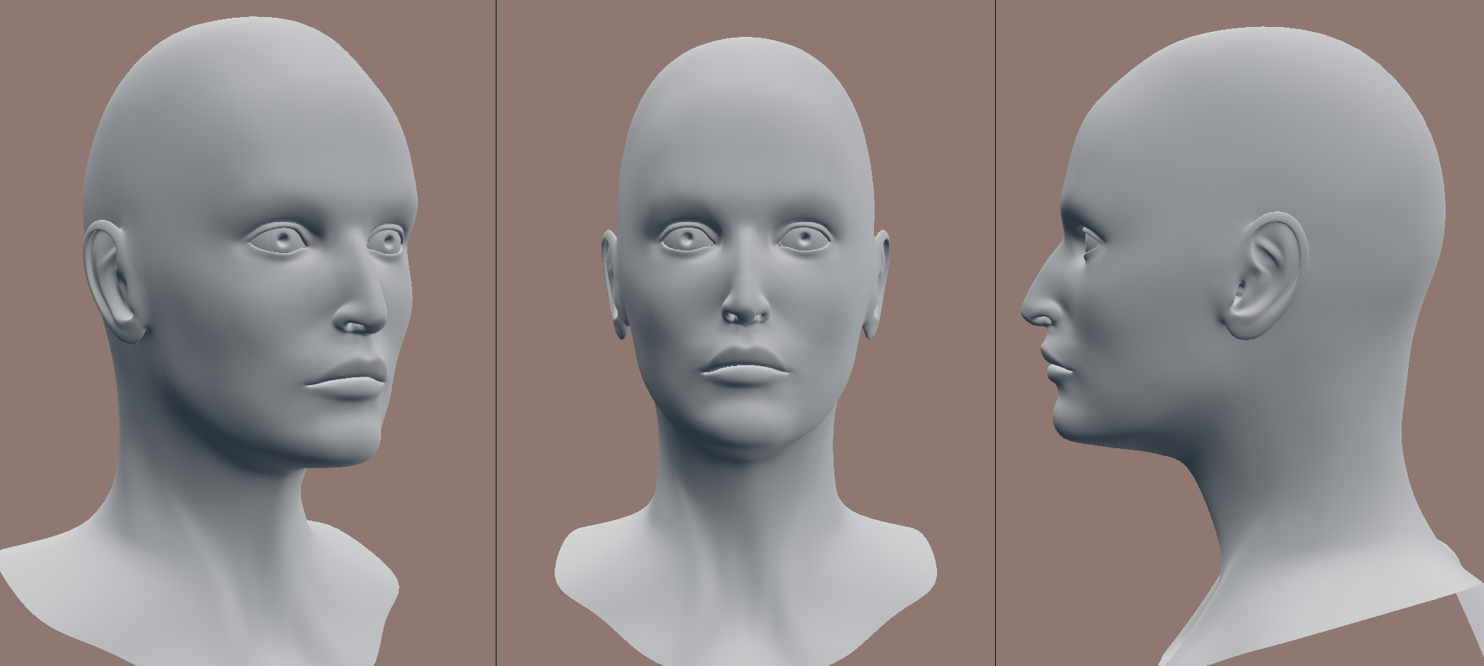
Would it also help to see wireframes (or a solid view with the topology)?
You’ve captured the “overall feel” for her face, well. I can see the similiarity in the eyes and face. Good sign. Also, the relation of the key features seems on track. meaning the golden triangle stuff. Width between eyes, length of nose, etc.
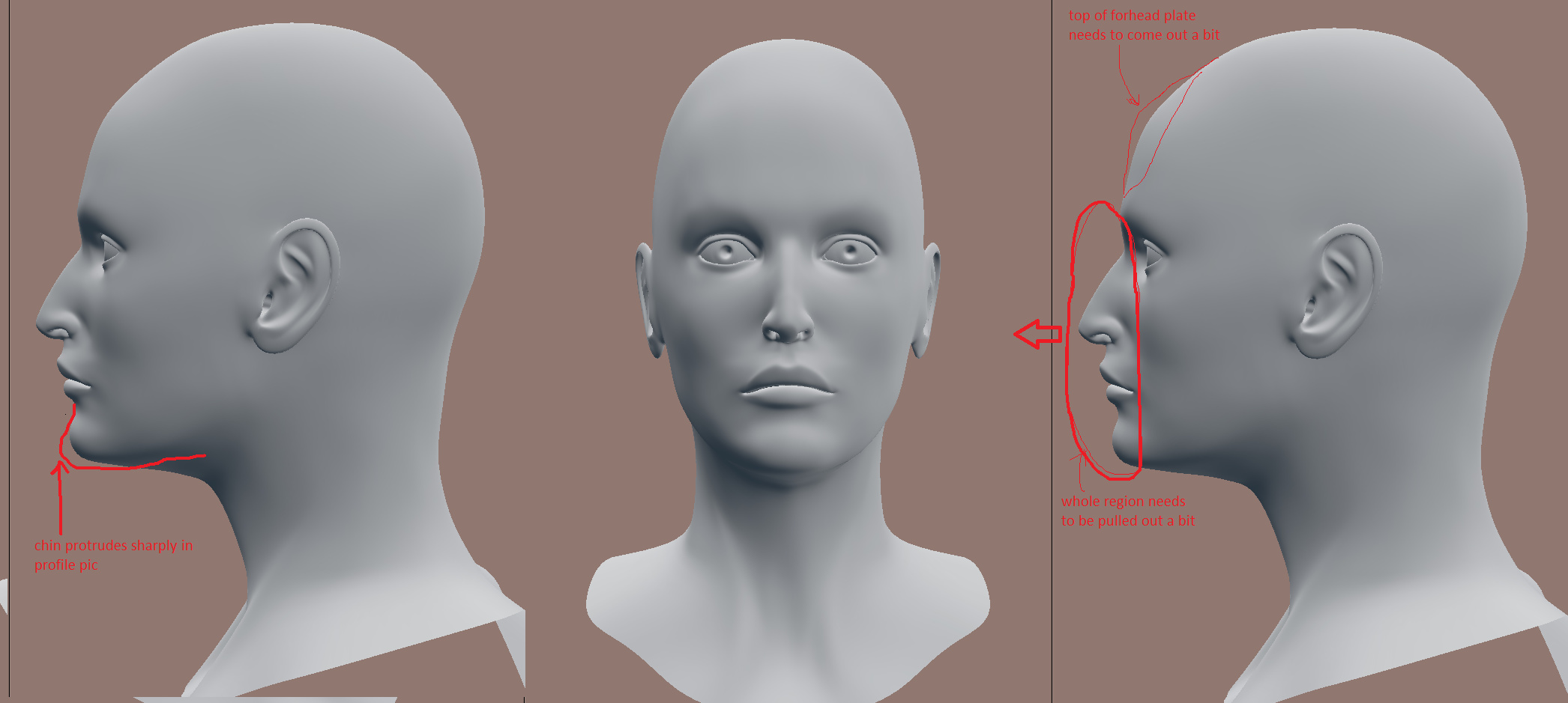
Now a few more points, and remember the following are just suggestions. IMO, the face is a bit too flat.
The entire region, middle brow, nose, upper mandible (middle portion underneath nose), lower lip (middle portion), and chin (not full jaw) could be pulled out a little. Look at the reference profile.
To get a handle, select a strip of verts the width of the nose from chin up to brow, and with influence not set too high, no higher than 2 (if that) pull the verts out about half the width of her eye.
Look that change over and reset any distortions.
After than select a strip of verts (no wider than the width of both eyes) running cross wise on her forehead. Try to get the top of the frontal parietal plate. meaning right where you’d head a soccer ball. Pull those verts forward to create a more vertical forehead line.
Last is the chin. Grab the verts around the chin and pull forward and slightly down. Look closely at the ref pic. The angle from lower lip to chin tip is pretty sharp and finely boned.
Jaw - needs to have a sharper edge defining the jawbone. That’s achieved by tucking the mesh, just inside the jawbone line, up underneath. Check your own jaw bone, there is a defined boney edge.
Very, very last - "Doris"has some head topography videos which are really really good, if you’d like to gain some physiological insights about your head sculpts. Way worth the time.
Good luck
Attachments
Well I think I made some fairly significant changes, primarily in the way I overlayed the references. First I created a template in photoshop from the side view and front view images:
I then added this to some empties around the model to use in the front and side views:
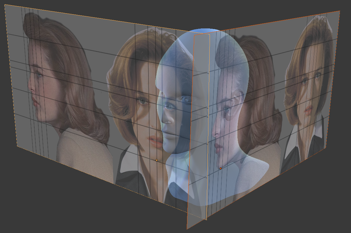
I used this setup to make the changes to my model, but now I feel like it looks worse than before
This might be because I was working in orthographic view while referencing the images, which obviously were not shot that way, so the focal lengths are mismatched. I like the workflow, but it’s throwing me off.
“Luke, use the Force…” Stop trying to overlay references, and just get as close to the feel of this as you can. Save a copy at each stage so you can go back, but jump into sculpt mode and at least try to concentrate on the form from all the references total. Capture the likeness, but try not to make a digital scan of her and lose the life in it.
Excuse me if it comes off too bossy, I just think you are much closer and I want to see you continue to push this.
Of course, you’re right.  But then again, I am aiming for realistic and not a caricature. Some scan data would be nice!
I’ll work on it from an artistic standpoint from here on out.