Finally got around to playing with these, I like the little spinny thing in the middle.
One suggestion though, I think the selected item code needs some work since it’s possible to have the mouse pointer fully in one item while another is active due to the simple ‘degrees from center of item’ algorithm. The closer the items are packed together the worse it gets.
I’d do either a test for the mouse in the actual button space or split it up into rows and do some sort of test based on that – whichever is quicker. Could probably do a simple modulo test (mouse_y % some_magic_number == row) maybe, have to think on that a bit more.
Could you look into prioritising the cardinal directions (N, E, S, W)? For instance, in the mode-switching radial menu, the top position isn’t filled. There’s a lot of really interesting reading on radial menus, if you’re interested. If I’m not mistaken Don Hopkins did quite a few articles on them that are worth checking out.
Ofcourse, even better would be Marking Menus, but those are burdened by Autodesk patents if I’m not mistaken.
I’m also glad to see you’ll be implementing a click-less method, the way I use radial menus is to hold the shortcut key, move my mouse in the appropriate direction and let go.
Thanks to everyone that contributed to this addon, it’s amazing!
I really like the idea of using icons in place of text when possible. If I remember correctly our brains supposedly process images something like 1000x faster than text.
Cool, very cool script! i would like to add the possibility to use submenù: in base of the context if you press space bar it will open the menù with main blenders features(i.e view, material, and why not, the add-ons!) so you dont’ have to remember all q+ key combination, just press space bar in substitution to the default search menu, and the quickly access to the main features.
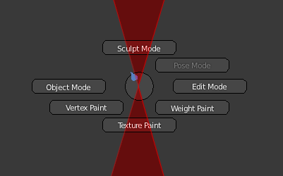
I have done some brief reading on the subject of pie menus, and I do know that my addon breaks with some of the rules - (8 max options per pie/cardinal directions) I’ve actually tried to adhere to these rules, but in practice it gets hard - seems blender always has odd groupings (as in 3, 5, 7) options and then additionally I try to group things in the pie in logical orders - for instance on the mode select (which I moved sculpt to north) I put all the texture paint modes towards the bottom, and the other modes on N/W/E - Pose I just had to fit in.
I do welcome non-coder contributions of menu layout though! If you think a particular pie should have options in certain positions, tell me about it, or better yet, post a mockup picture of where you think the options should go. Nailing down the individual options and where they go takes way more time than I’d like to admit!
I’m going to look into clickless method, but I’m not too terribly convinced at the speedup. Once you learn the places of the menu items it seems I don’t even read the entries - just key->direction->click (you don’t actually have to be on the “button” to select it)
Your welcome! Hopefully it gets better in time.
You made a version that works in blender, or just a generalized pie menu? If it’s a blender version, why don’t you share - we could all learn from it I’m sure!
On the todo list! It is remarkable though after using the addon for awhile, you start to learn where things are and stop even reading. It becomes “muscle memory”
I’d like to get submenus in - Uncle Entity has some support for it, but I have to dig through and add some polish. They also actually seem to slow things way down workflow wise, but add a bit of flexibility to design. I’d like to see any work you happen to get done on it!
@everybody else: Thanks for the praise and encouragement!
@everybody else: if you downloaded the update this morning (10/22/12) there was a registration bug in the code so you could not turn the addon off then on again - it’s fixed now.
Awesome update! Glad you decided to lose the Q+button thing - and those 1,2,3 pies should become very handy for sculpting (though I did notice a significant lagging of the viewport when opening a pie in sculpt mode)
As for the whole Hold down key, hover mouse over button, release key thing - I don’t think I would actually use this addon unless you somehow did that. Pressing Tab and then choosing the mode is actually slower than what it used to be (for switching between edit, weight paint, pose and object modes at least, and the same speed for sculpt and the others)
And back to the whole customisability thing - It’d be nice if we could choose to disable certain pies to free up the hotkeys. Personally I’d never use the Q one (numpad views) since I do have a numpad and would find that quicker, and I also have a little addon of my own that uses Q. I know I could manually go and disable it in the Input tab of user prefs, but something more intuitive and simple would be nice.
Lastly, I tiny UI thing:
I suggest swapping Bounding Box and Rendered. Maybe you wanted to group Material and Rendered since they are cycles-only, but Bounding Box is not important enough for me to be all on it’s own down there Also you don’t want to accidentally click Rendered, so I think it’d be best if it’s not grouped with the others
Are you just seeing this on dense meshes? Does any of the other python UI slow down also?
I’m going to try to add it as an option - though I think a big advantage of it is freeing keybinds up for other things, and less to remember keybind wise. Right now, Q is the only unused character on the whole keyboard! (If I’m wrong please tell me so) That leaves very little option in the binding department.
Also, I still, after using Blender since 2.36 don’t remember things like the different pivot keys or even less used shading styles. Quick! Whats the keybind for pivot on active? (alt+.) Way easier to remember all pivots are just on . I feel like some things are slower for sure, like toggling between solid/wire, but the overall speedup during the course of the project puts you ahead not fiddling with trying to remember terse binds. (Anything using more than 2 keys is a no no in my book)
I already added a way to enable/disable different pies in my working copy - coming next release!
I’d also like to suggest a hotkey change (I know I could just do it for myself, but I think others might prefer it this way too):
Instead of hitting Tab to open the mode-switching pie, make it Ctrl+Tab.
Hitting Tab to go between edit and object mode is very quick and never does anything else. Ctrl+Tab normally goes between whatever mode you’re in and Pose/Weight paint mode.
Personally I think this is confusing sometimes, and find myself randomly hitting combinations Ctrl+Tab and Tab hoping to get back to object mode, so the pie here would be great.
Also though, having the pie on the Tab key is a slow down from the original Edit-Object mode switch, but a speed up for all the other modes (except the confusing Pose/Weight mode).
But maybe it’s just me so unless some other people agree, keep it how it is now.
EDIT:
Just remembered Ctrl+Tab in edit mode is for Vert/Edge/Face stuff… Not sure how to solve that… unless you’ve figured out the whole sub-pie thing - that way you’d have Vert/Edge/Face as a sub-pie of Edit mode (Maya does it similar to this, so there must be some logic in it )
I’m trying it. It’s nice. A problem I find is that sometimes, even the mouse is over a button, it is not highlighted.
And I want to understand if the arrow in the center is really needed or if we can remove it. For me it’s not needed.
I think that’s due to this: It doesn’t look at what button the mouse is over, but rather the angle - so button one will have a certain portion of 360 degrees. If the mouse isn’t in there, it won’t be hi-lighted. Also though, this means that you don’t have to have the mouse over that button, just somewhere around it. This allows for much faster interaction due to the whole muscle memory thing.
It shows in what direction the mouse is, which helps you to quickly know which “button” the mouse will click. Also, it looks cool and is that not one of the biggest reasons for having pie menus?
It’s best to not think of them as buttons really, but directions. Which leads me to think that having the buttons there is’nt a good idea at all, but rather have them pie slices that andrew-101 showed in the other BA thread - I believe he’s actually already coded this, but I don’t know how well the code would fit into LiquidApe’s
[ATTACH=CONFIG]200179[/ATTACH]
^that third one would be impractical and confusing - even if it does look cool
I’m making this addon for me formost, partially to deal with my RSI issues in my wrists. Minimizing any two button presses is sort of a big goal for me, so I’m going to stay away from ctrl+tab. Once again, of course you are welcome to change it in the input section of keymaps - Really I would like to remind everybody how easy this is - just search for “Pie” in the searchbox to find the relevant keybindings.
I would like to get subpie’s in - probably in the form of calling a pie menu from another pie menu.
I think gregzaal explained the functionality fairly well with angle. This is intended for sure. The next release will have an option to disable the “Clock” in the center of the pie menu.
I agree! Looking cool is fun!
I would say the middle pie looks the best, but upon further consideration I think it would break down quickly in a practical sense. As soon at you have 6 or 8 pies it would start falling apart due to room needed for labels. Often, though I try to keep the pies to 8 slices, there are situation where more are going to be required. Even with 8 and some longer names this will start to look really bad with text overlaying multiple slices. Icons would be the solution to this, but sadly there are not icons for all blenders functions - so I would arbitrarily have to choose icons for functionalities and nobody would really know what means what.
Yep, that’s the way I designed it originally – each sub-pie is a PieMenu that’s restricted to a sub-slice of the main menu. Unfortunately text on an angle looks really, really bad and I didn’t have a need for sub-menus so I didn’t work on it too much other than to test to see if I could get it to work.
And icons would be cool, one of these days I’ll get around to an icon bpy-api so it’ll be easy to add and access the existing ones
I think you misunderstand my intention - I saw your work with the angled pie pieces and agree it is not the solution - I was going to put in a set of submenus without the angle, but in the previous comment what I was referring to was actually calling another full pie from a pie. So you could have a main “sculpt pie” that contains all the sub-pies like each of the 3 pie brush pies. For instance, when you click the Grey Brushes Pie option on the main sculpt pie, the sculpt pie will disapear and the grey brushes pie will appear around the cursor. I think this would mostly help at learning hotkeys in the end though, as accessing the grey brushes pie directly will be faster for experienced users.
Nice to know this is on your list - I’ll try to tackle other todo’s before this one then with the assumption that a bpy-api icon access is coming from you! Thanks Uncle Entity!


 Also you don’t want to accidentally click Rendered, so I think it’d be best if it’s not grouped with the others
 so unless some other people agree, keep it how it is now.