Looks nice, I never thought I would like this style of interior.
I’m still adding things. Will add artwork next, or picture frames.
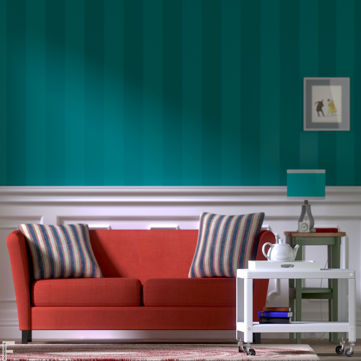
Hm, I would be careful with that. The vertical stripes on the wall are guiding the eye towards the furniture. That nice effect will be broken if you place too much on the wall. At the moment you also have a nice “horizon” where the wall and the white wood meet. I like it as it is. But I’m curious how it would look with some artwork on the wall, though.
This is looking good, I am not sure about what is that thing up the green table, something like a paper above a clock and I think the wallpaper need a textile texture
It’s coming along well!
A couple of little nitpick:
the “trolley” wheels usually points more o less in the same angle becouse of pushing/pulling;
the lamp wire seems like very stiff;
book covers looks very “plastic”, i would tone down the glossiness;
maybe a higher f stop (less defocus)?
thank you all for your comments. I have made some changes, some not reflected in this next render, because I only rendered portions and overlaid them in gimp. Here’s the rug, which is having problems with children being rendered too far apart, created a spotty pattern. The pattern is an ikea swirl pattern for the rug, but it’s hard to tell now. Added a texture to the lamp shade, don’t know if I like it or not. Added a frame and a public domain painting, which is really nice I think. But my dof is screwing it up, so I will take down dof to a minimum I think.
I am thinking of a large landscape painting above the couch, but as minoribus pointed out, it could be a problem. I found a beautiful ikea chandelier I want to add next. Hopefully it fits the decor. This is again a large render, so please have a closer look. Again DOf will be lessened or removed entirely for the next full render. Thoughts?
mik1190: edit to add, I changed the book gloss and updated the wire. Will show them in the next full render. I completely agreed with those things :), thanks
Ok, dof removed. made a clock. removed other clock. other updates. Adding slight vignette. now doing almost all post in Blender. Full size, but only 250 samples. Cancel that, I couldn’t upload full size, too big. so this one is 1000x1000. not happy with the rug, so I might just remove the texture and make the particles randomly rotate.
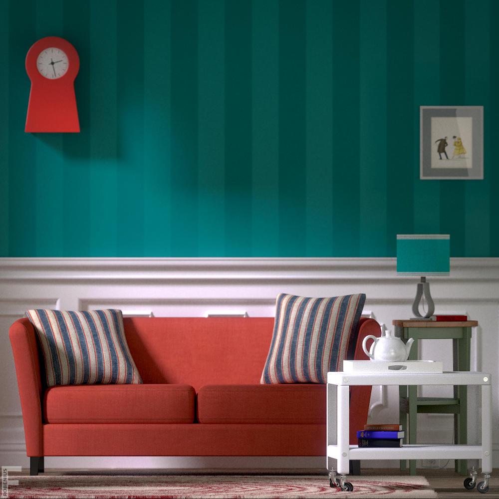
I think you should scap the clock. It’s drawing a like directly away from your subjects. I like the idea of a landscape painting in the center of the wall. Keep going, it’s looking great!
I’d also say that the two objects on the wall distract from the furniture. Especially the red clock. If you want to have something on the wall, how about a painting or piece of abstract art in modest colors which guides the viewers eye to the furniture instead of distracting it. It should be something that points downwards, perhaps.
Thank you both. I will browse around for some more appropriate works.I wonder if a series of smaller paintings, like the one on the right would work, placed alternatively on the wall? Until there’s an update, here’s the man as a placeholder…joseph ducreux. lol
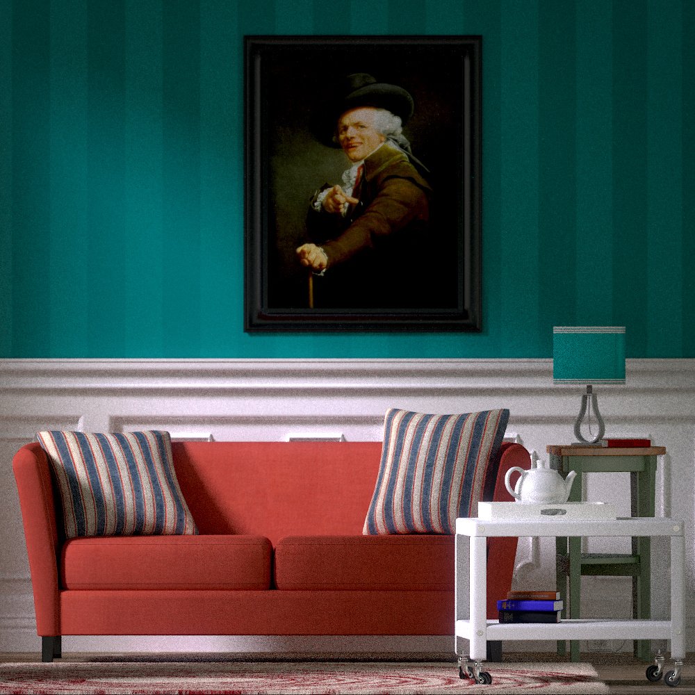
I think the larger painting is better than the clock / small painting combo. But I must be honest with you my eyes are drawn instantly to the painting rather than the furniture.
It’s like that wall needs something but it’s a delicate balance.
I agree with harleynut97. The picture has too much contrast against everything else. If you can find a landscape image that somewhat matches your color scheme, I think it will look much better.
update. thanks for comment. the last image was a joke. It’s a popular internet meme. I should have made that clearer. Was trying for humor, ha. anyway, I love the colors with this new one. I feel that it compliments the image, but does also detract from the other things. But at the same time I think it all works. let me know. Can’t wait to finish this angle to move to the next one with new furniture.

Just wondering… if something like this 2d mockup might be a thought, without drawing attention away from the furniture.
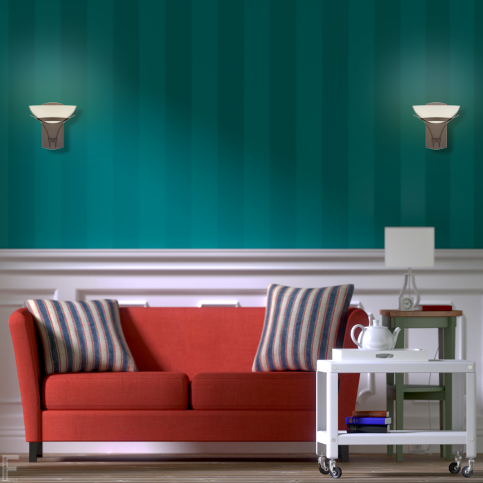
Just in case You hadn´t noticed yet, the wheels of the small car are in the carpet, I like it and the one that posted harleynut97 is cool too.
harley, I like your good sense of space/design. I like that suggestion. It does seem like like a nice minimalist choice. I have an ikea page bookmarked that is a kind of globe lamp and considered putting them on the wall on either side of the couch, but it still leaves something open and too bare in the middle, I think? The lamp you chose to put in there looks right at home! I will look through some reference photos sometime today. Thanks again for taking the time to do that Harley. And Juanrav, thanks for the comment. Perhaps I need to slightly rotate the cart to prevent the wheels from going all the way into the carpet.
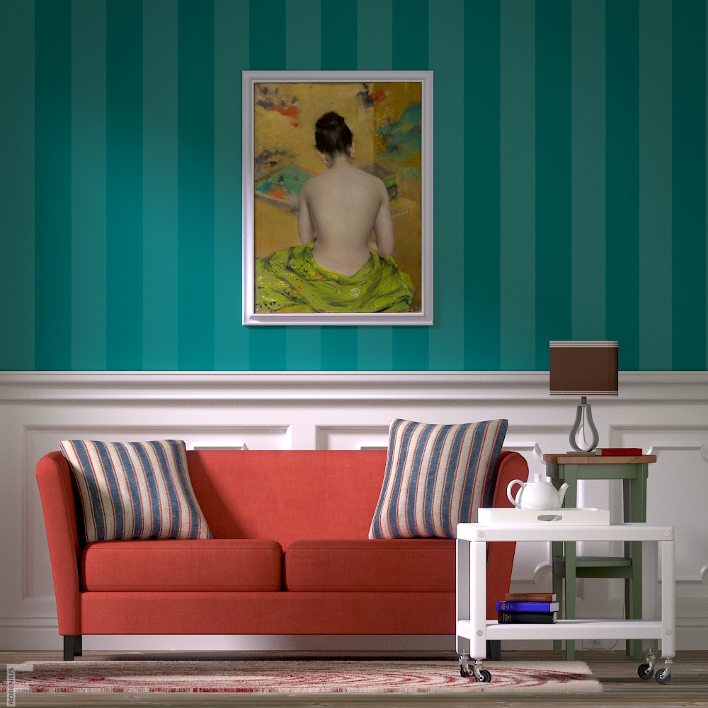
small changes. I think this view is getting closer to being done. I am considering adding wall lamps,but the ones I tried yesterday did not work well. Anyway, here’s a high sample render with colors and lighting pretty much final for this render. I really like the portrait painting and think it works as well as a landscape, and has a better feel. Like I said, I am still trying lamps. I’m also considering adding a throw to the sofa. Hopefully it’s not too empty. I’m not sure how I feel about the rug still.
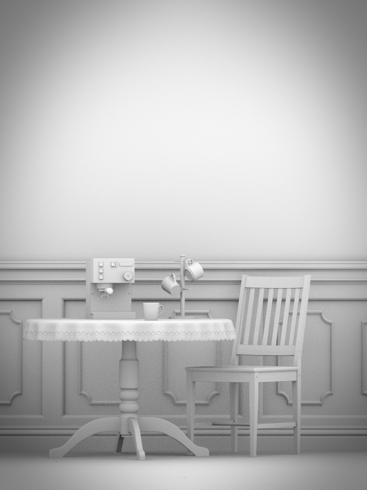
Also included is a AO pass for the dining area that is started. The espresso machine in this one is a model I did months ago, which was posted in finished projects (unfortunately lost the final .blend but had an earlier backup). I’m thinking of placing a window as backdrop with some nice curtains.
I’m not sure how I feel about the rug still
It probably looks better with a different camera angle (pointing more downward from above) but it is difficult to make out the pattern at this angle.
The new scene looks good, I’ll look forward to seeing what you do with the textures.
looks good! I would consider to try set up a very subtle displacement on the wall so the lights will get more life to it, I have never seen a wall completely flat.
Harley, thanks. Trying to make choices of where I want the table.
Thanks Cramer. I’m testing some displacements tonight, as I think you’re right.
I just knocked a hole in the wall to make room for a door to the right of the couch, which leads to another room. Experimenting with lighting for the next render.
another update. I didn’t plan on having such close shots, but I might improve the book modeling and materials and get more close shots. I tweaked the rug, and now it looks 100% better to me. I got these book textures online, so I have no clue what they are, but I presume the top one is appropriate. I finished adding an entryway from one room to another, with the dining table moved to the room behind this living room. So far pleased with this render besides the books. Also, it looks too empty. I am keeping this lighting, as I think it works so far.
This render I noticed has a bit much maybe chromatic abberation, but it’s ok. only a test render.
