Incredible…absolutely incredible.
Really cool, and the partial breakdown is much appreciated !
It just all works together every beautifully. A very dark and forbidding scene 5*.
WOW, AMAZING
Love it.
I can only say one word: Awesome!
Awesome, really realistic and moody image! Great job 8)
top notch!
Very nice! Sets a mood, hints at a story.
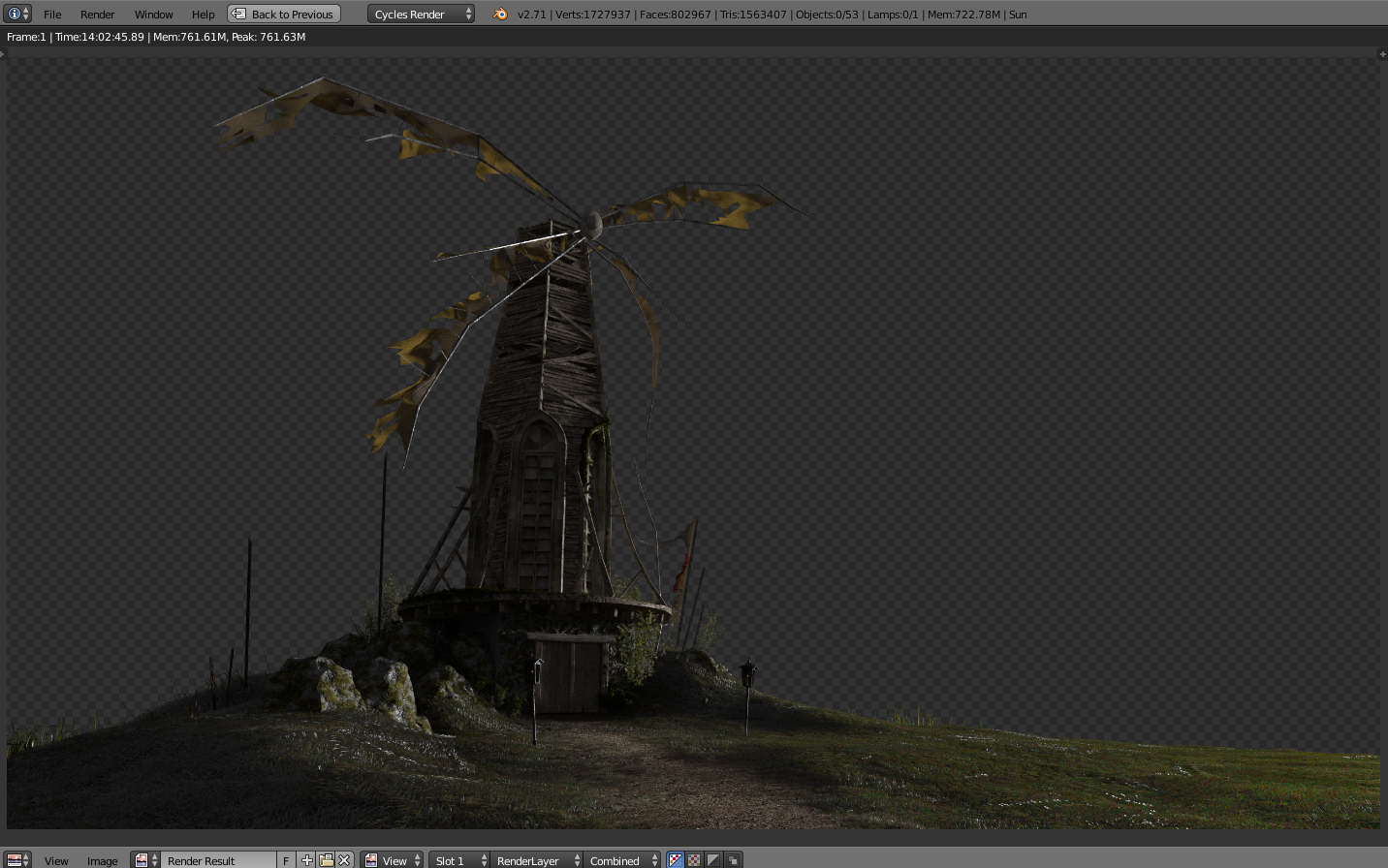
It’s interesting that even though the windmill looks tattered and abandoned the torches are lit. Something is going on there.
Thanks for sharing a bit about the particle technique. It looks like those are all flat texture planes constrained to face the camera, except for some which are flat against the ground? Just my guess.
Nice job seamlessly blending the 2D sky with the 3D set.
Looks awesome! Great work!
great work! how did you do your sky, just an HDRI image?
Excellent work! I really like this scene. Great atmosphere and mood.
well shit…it’s all been said…really like it.
WAUW! love it… epic mood and very nice liek the sketch you showed.
my only 2 cents are that the cotton/sheets on the mills arms could have some more torn edges or handpainted cotton  makes it bit more realistic
Did you do the fog in cycles using volumetrics? Any insight in how you did this would be great!
Wow, thanks for all the support guys!
you have no idea how this motivates me, really!
Since some of you have questions about how i made this, i’ll try to briefly explain the crucial parts, hope helps someone
The grass indeed was made of geometry! 
no billboards at all, before that, i had already made some tests with HUGE amounts of instanced objects and blender handled quite well, so was really cool to use real geometry projecting complex shadow silhuettes etc instead of simply placing planes alpha mapped
Also, this way, i could made “tufts” of grass, merging several grass blades and placing in a form that the scatter itself would not do, so it becomes way more real than just use planes or single grass blades
i took some screenshots to illustrate better this:
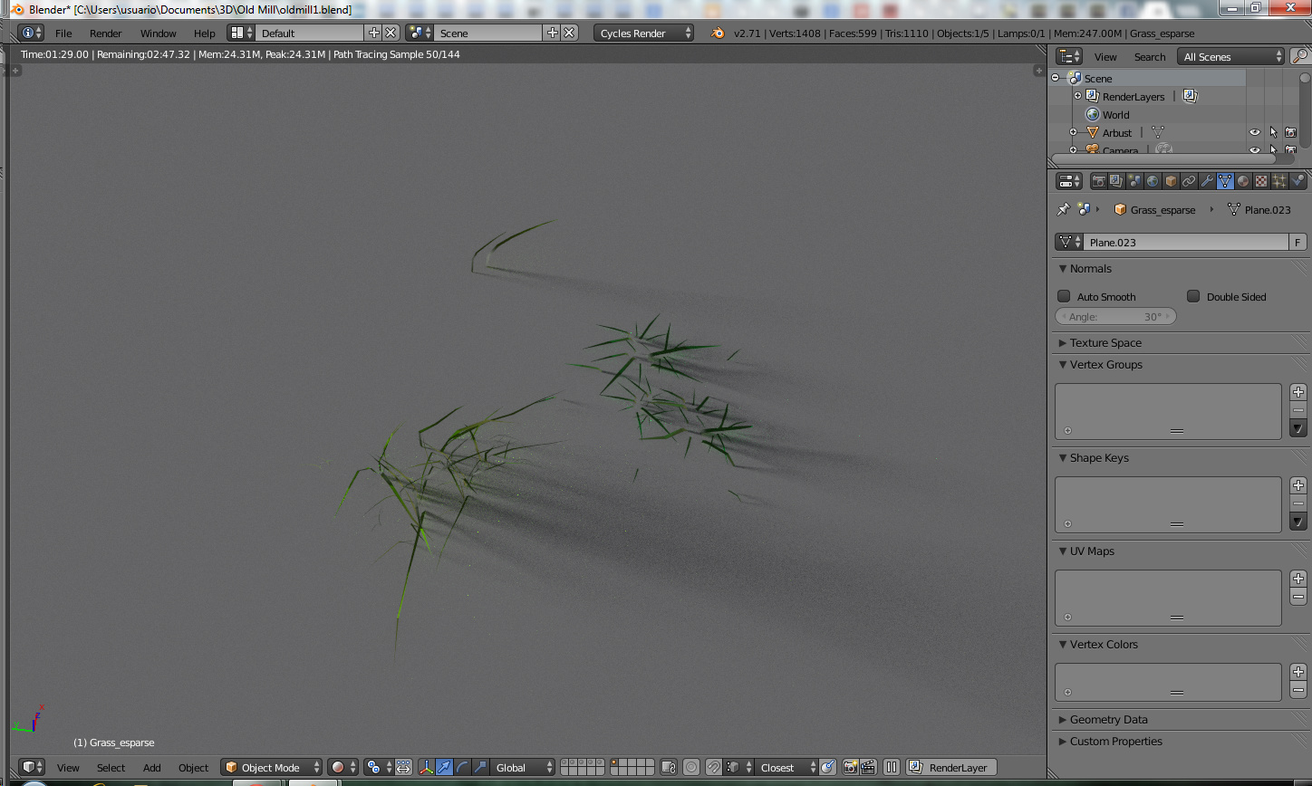
This was the group of scatter objects i’ve used to make the low grass (ie: foreground grass)
as you can see, they’re not made of single blades, thus creating more interesting shapes
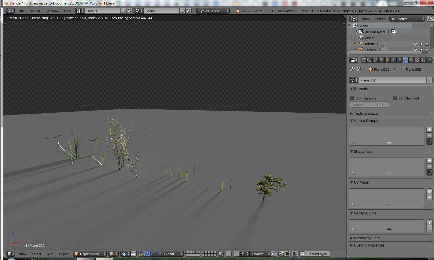
And here the background grass, in this case i’ve used single blades only to create contrast in the general scene
To encorage you to use mesh scatter instead of billboard grass, i’ll share some tests i made earlier in another project (not finished, unfortunately)
pretty insane, uh?
and this was just about 5% of the whole terrain, hahahah
(continue…)
Image limit per post :mad:
Proceed, @swirlypillow:
Hey man, the sky was not HDRI at all, indeed i took some brush sets, a nice ref and painted the whole thing, its not that hard, really!
This way, i could choose way better the colors that would match and blend to the render, and also helps me to improve the composition as well
@spect3r: About the fog, i swear that i really wanted to use some fucking brutal volumetric fog and summons satan to all over the render, but since sun light is not supported yet, and my light setup was already pretty sweet, i took over this 
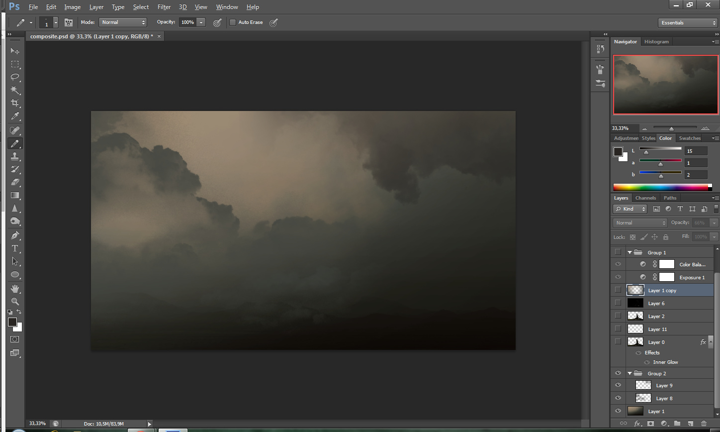
For the fog, was a bunch more cheating on pos than anything else, first i’ve rendered a mist pass in blender, and in compositor used color ramp to match the feel that i wanted, this way u can choose where the fog starts and ends/the intensity also
After that, i really use a small portion of this mist pass in final render, the real trick was to apply a inner glow in the render, inside photoshop with a sample color that matches w/ background, this way, the render will really sit well with the BG, but, after that i made a copy of the render and layered on top of that inner glow layer, this way i could leave the parts that looked cool, and control other parts that dont need that
This glow process is similar to what compositors do with greenscreen to match the plates
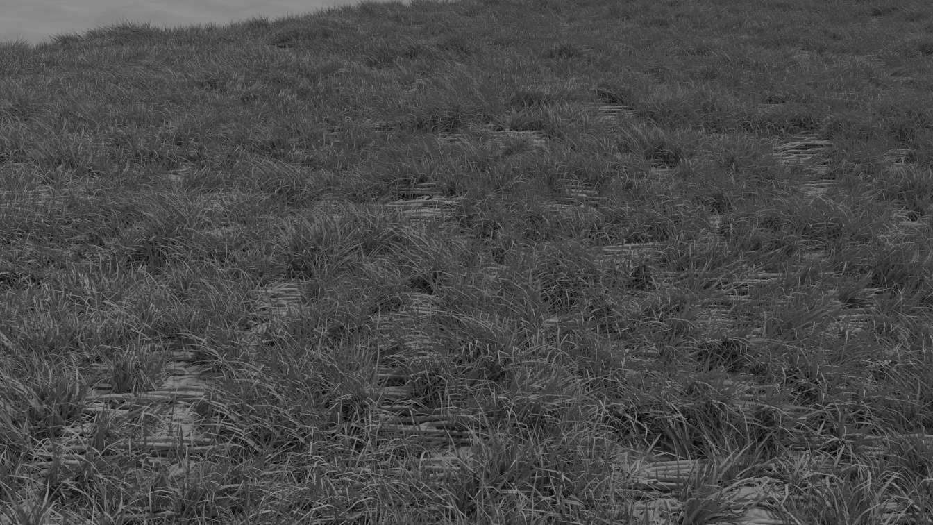
The raw render here:
The big secret to really achieve a epic image its on the pos, so investing in photoshop magic (or blender black magic) is the key to sucess, never subestime that.
And sorry for my redneck english, i’m from Brazil im should not even be speaking english hahahahah
Thanks for all the comments, u are welcome to ask anything
@rombout And yes! i tottally agree with you, i must admit, after some time, all i wanted was to see a render, and this compromised a bit the final render 
But next time, i’ll try to calm down and take some tea and medicine for anxiety hahahah
Thanks for your reply!! That’s a great method… And until cycles supports sky light and sun lamps for volumetrics, probably the best way to do it… ! Good job agai!
Wonderfull painting!
Holy … ! That is amazing! Thanks for sharing. This is what makes me want to get into painting. Really beautifull mate.
I feel like I am ruining the party here, but I really do have some (constructive) criticisms:
-
the composition is off. The original’s composition just works better: your mill is (arguably) positioned too far to the left. For example, add a thirds grid, or create a 1.1618 to 1 ratio frame (golden rectangle), and you will see what I mean. It’s not bad, but can definitely be improved. The aspect ratio of the original is much wider - take these things into consideration.
-
open the image in an image editor, and mirror the image. You will notice immediately that the angle of the windmill is wrong: its angle should be either straight up, or tilted outward toward the edge (depends a bit on the mood you want to go for). (And always mirror your image/work/drawings: it will show you potential compositional issues)
-
the cap (the top part that houses the windshaft) is completely missing, and it is present in the drawing. Your windshaft’s canister is also ridiculous looking. The sails look completely unconvincing, and their supposedly wooden structure looks as if it’s made of metal. Those look bent, not fractured and broken as wood would. There is no splintering. The structure of the sails needs a LOT of work.
-
The corner beams along the side or the tower also look metal like. Too much glint and highlights there, unless you are going for a wet look. The tower’s wood structure looks a bit like a barn - and a fragile one. It is unconvincing.
-
The original sketch shows a six-sided tower, while you opted for four sides. It looks dead wrong in your version. Too simplified, and visual interest and detail is lost because of that decision.
-
from a technical point of view the windmill is completely unconvincing. You took too much artistic freedom, and, consequently, the windmill almost looks like a toy. Especially the top part is quite bad - it detracts quite badly from the overall image. Do not take too many technical liberties when depicting “real” objects and structures. It ruins believability. The top part of this windmill is horrible in its execution (sorry - just stating fact).
-
the perspective is too flat looking: the camera’s viewpoint should be lowered, as if the viewer is looking up to this structure more. That increases the dramatic impact.
-
there is insufficient light contrast between the main subject and the background. Compare to the original concept art work. The entire image looks too flat. There is no conscious lighting guiding the viewer to the important parts (like the doors)
-
in the original artwork more tension is created because of the top sail touching the edge. The point of the original is the focus on the doors - something lacking in your version.
-
the windmill’s overall proportions are quite poor compared to the original’s version. The tower takes up too much height, the doors too small. The hill part is not commanding enough - it should take up more vertical height in the overall composition. You also need more visual details, more chaos in the bottom part.
-
the top windows’ glassdo not reflect any light. It makes for a boring effect. The colour chosen for the sails is ill chosen in my opinion. The torn sails look unrealistic, and too papery. The scale of the torn material is also off, and more detail is expected. More ragged looking fringes that blow in the wind. The torn material and the tearing look unrealistic, and worse: unconvincing.
-
the lamps’ light should really be used to accomplish more visually interesting lighting that is cast on the ground and on the doors. You can tell this is done in the original artwork. Also use more colour to increase visual contrast and meaning. For example, the light cast by the lamps can be set to a very warm colour, bringing that area to the front. This would also help bringing out the stoney structure/walls at the bottom. And guide the viewer’s eyes towards the bottom of the image, giving it a strong focus (which is missing in your version).
-
Think more about the mood you are trying to create: remember, you are trying to tell a story. For example, some background details like lighting in the far background below in the valley and more dark patches and layering in the clouds could create a more foreboding feeling. There is a lot you can do in post.
All in all, it needs more work. It could be ten times better and more dramatic with some (relatively) minor adjustments to push it to the next level. You are getting close, though. I do like the subtle valley in the background - it adds depth. Please read up on how windmills actually function, and their building structure / construction.
A sketch can get away with more liberties taken, because our brain fills in the details based on our expectations. In more realistic (CG) renders this is no longer possible, and even small details that contradict our expectation may ruin the believability of an image. The top part and sails of your windmill are a mess. This is the main issue with your image (aside from the compositional/lighting problems I described).
Btw, the reasons why I am somewhat critical:
- I feel you are about to enter the next level, and comments like “wow, great piece” have no meaning when really looking at a work like this. Your technical abilities are proven, now proceed to getting it exactly right. A bit more work, and you have a brilliant piece, rather than an “almost, but not quite good looking” piece of artwork. The devil is in the details. There is actually a lot that can be improved. I regard this as a first version. It needs more work before it is acceptable (to a professional’s eye).
- I work in the field as a design professional, and I just can’t look at a render that has the potential to be superb, rather than mediocre!
- I am by origin Dutch, and the butchering of a depiction of a windmill just does not sit right with me

Get the (technical) details right, and your piece will be that much more convincing. Oh man, that windmill cap is killing me… As are the sails. At the very least get the windmill right!
Some references:

I hope you will take up the challenge, improve on this first version, and create a second iteration that will blow our minds.