This is an idea i came up with a few days ago, now I’m not sure what can be improved. Any ideas?
Not sure how to look at it. After looking up some references I understand it now.
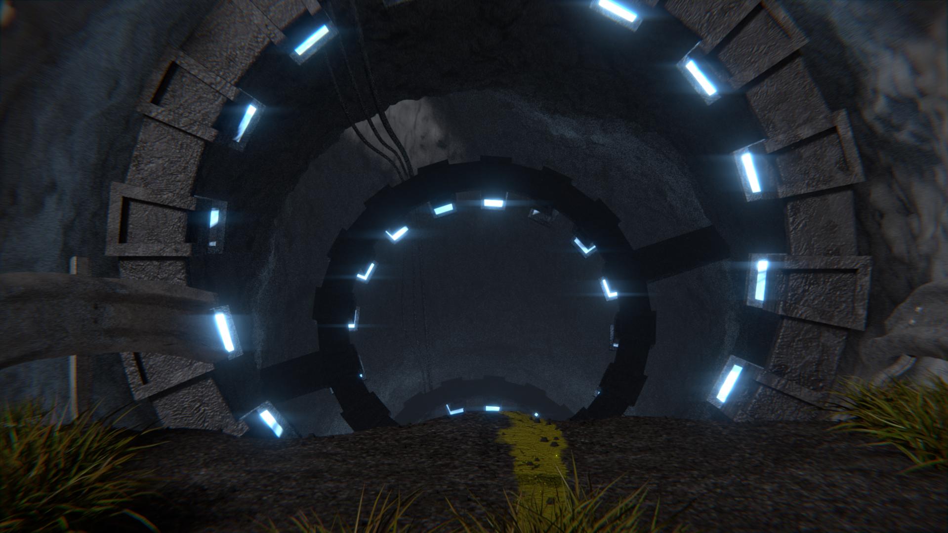
The foreground and the background look composited to me, the materials, aand the lighting seems different to me.
I would change the position of the camera and a seamless transition to the fore-, and background. I like more the lighting of the background than the foreground.
Maybe add something for us to use to determine scale?
- Everything looks too flat like two images pasted together.
- The scale looks off, i think the tunnel needs to be bigger,
- The tunnel goes down too fast, we should be able to see more of it