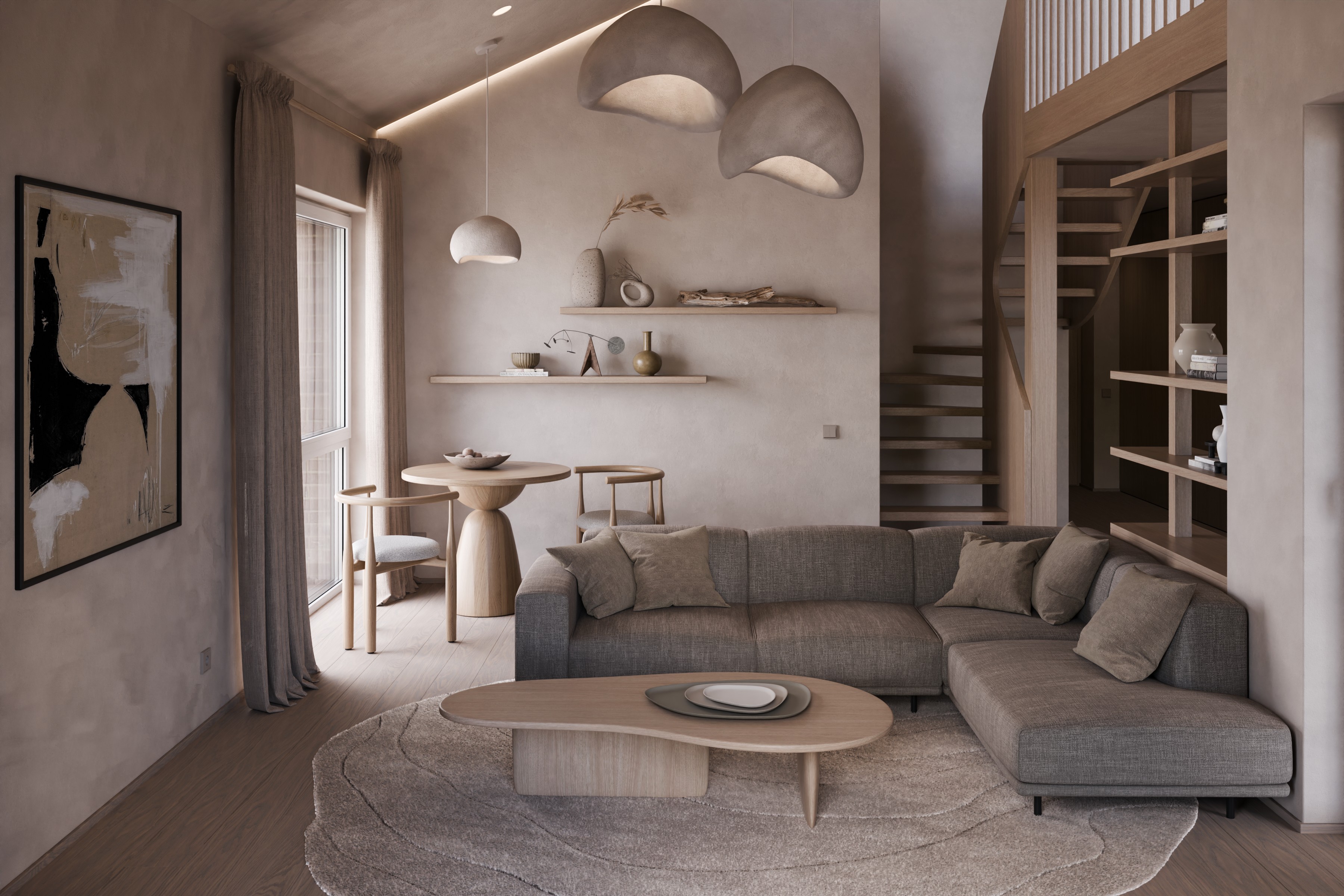
Trying to do interior design in addition to visualizations this time. Struggling with accessories at the moment. Any feedback about design as well as technical visualization aspects would be really appreciated.
I will hopefully post more images later. Things like final image lightness and contrast are not yet fully addressed. Some images are too dark at the moment, please imagine them lighter
What do you think? Do you imagine yourself living or spending time in such an environment and feeling comfortable? Why? Why not?
Thank you. It is in this case what we are going for. Earthly tones. The inspiration styles are Japandi and Wabi Sabi. They both embrace earthly tones and natural materials, Wabi Sabi even values sort of decay and wear.
But “dated and dingy”, might not be what we are after. Might consider adding some cleaner elements. Thanks, that’s useful. Although, thinking about it, maybe just brightening the images might do something to help with this as well. Might add some more color in some accessories, to avoid monochromatic look for the images. I think sort of monochromatic look for the interior design is not such a huge problem though.
The first impression is nice and cozy. You allow dipping in this atmosphere. As for the technical things of interior design:
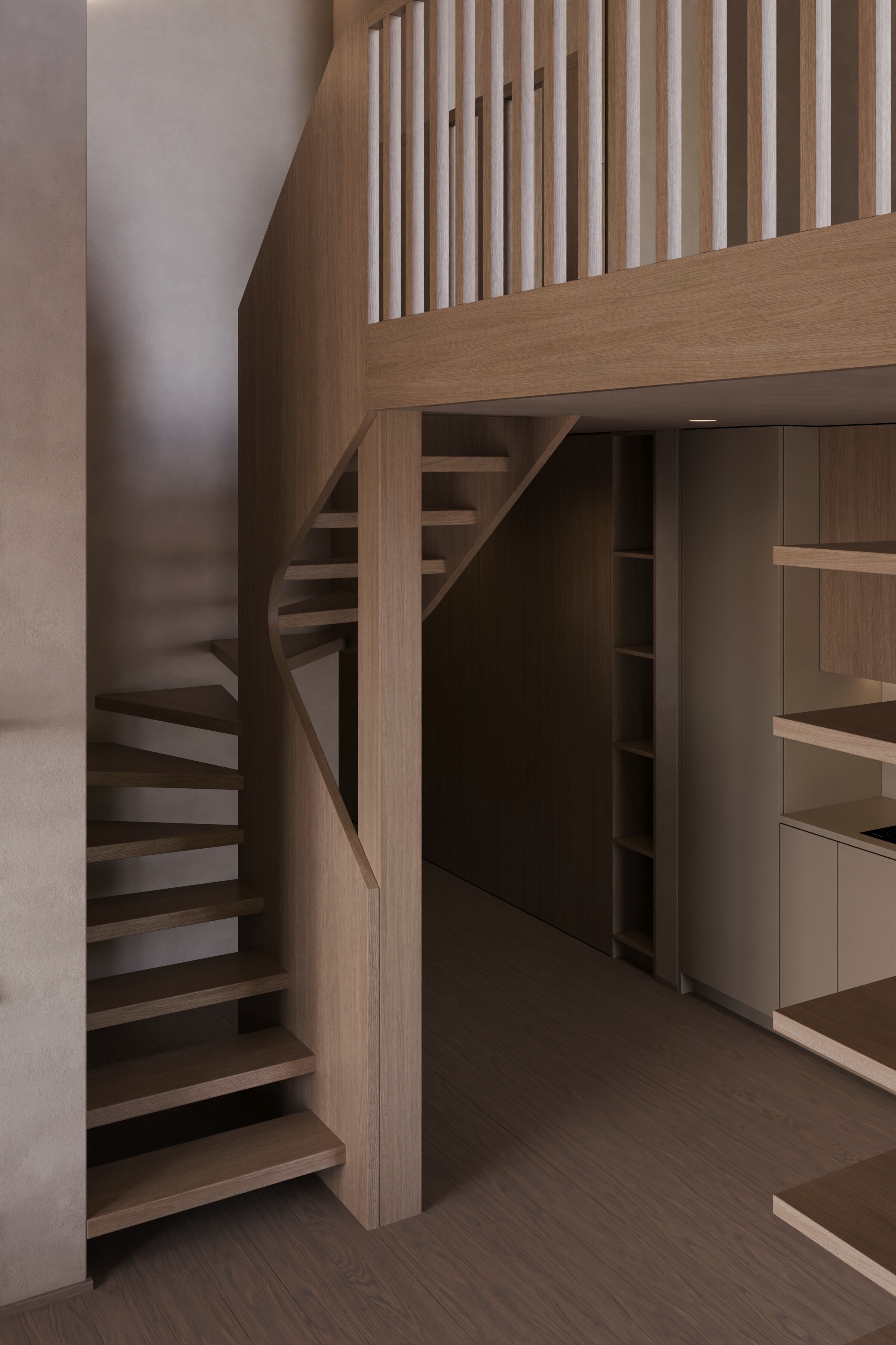
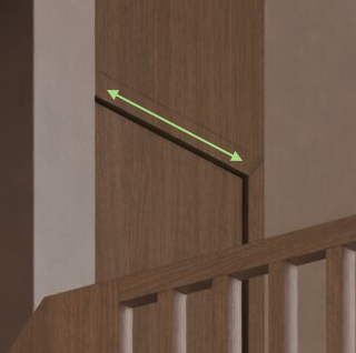
The stairs look ultra uncomfortable without handrails and dangerous because there is a pretty big gap between steps (some feet can easily slip in, especially at high speed)
When speaking about design we should always consider comfortable lighting. The kitchen countertop is not lit enough. Imagine someone is cooking, he’ll see the shadow of himself on the countertop, and that LED light line is not enough. Probably it can be fixed by adding a build-in hood that has build-in spotlights.
Speaking about spotlights you should consider using the IES. They’ll give a much better feeling of space (if we speak about the renderings). By the way, you can vector them into specific objects in your scene, for example, the plant.
And a little bit about the kitchen. You offer the doors with a Tip-on opening system which isn’t quite comfortable due to the accidental openings of the doors. Take into consideration the profile handle.
I like it and i like the color palette too.
My personal taste need just a little more contrast.
Only the 2 big mushrooms pendant material seems a little odd to me (maybe just because i see them similar to the left wall)
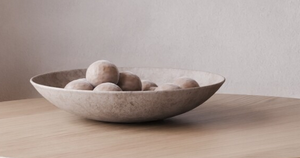
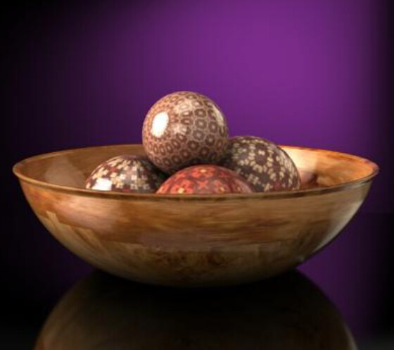
It’s just a “decorative bowl with orbs”. People put all kinds of things in them. Real or fake fruit, ornate wooden orbs, colorful glass orbs, anything to add a little pop of color or visual interest to an otherwise empty table. Generally set aside when dining. Here’s an example of wooden orb idea but you can find all kinds of examples of other things.
Stairs are fairly difficult in this situation unfortunately, the actual space was not built following regulations - there is just not enough space planned for them like it often happens, so it wasn’t easy to come up with a way to make them. A lot of compromises were carefully considered and made. They are not perfect, but they are limited by the specific situation. The open gaps for example allow for deeper steps and add more comfort which is not otherwise possible to be made to even follow guidelines. They are actually too narrow as well. That’s bad in my opinion. I am unhappy about the situation, but it’s a loft. The compromises are there but they are deliberate. The critic here is valid. They do have handrails though:
They will surely not win the most comfortable stairs awards any time soon , but I don’t think that expectation comes with this loft space.
The amount of light in the kitchen is completely fine tough. Countertop can receive around 500 - 800 lux of lighting depending on the actual LED strip product we can chose. Personally I am perfectly comfortable with 100 lux! And I have measured and considered it carefully. Really, 100 is really enough for me and not even dark. But… It’s not about my personal preferences here, so 800 lux is really enough. Since the main source for the countertop is the LED strip the shadow should not be a big issue. It was considered. We might still re-consider the distribution of light and adding extra spotlights is still a consideration for me. At the moment there is a strong gradient in the space that might not be perfect. Not sure about that. But that also comes to preference. I would tend to make it 2-3 times as bright as my own personal preference and I think that should work in most cases.
Kitchen design decisions are also considered. Profile handles are an option, but that would be up to the client. At the moment it’s up to us, so tip-on’s it is. Although I am not a huge fan of them myself, but I do agree that this just looks better. And some people don’t mind them. Either way, not a big deal to change it if the need arises. This would be discussed with the client in time.
Tanks for noticing. This was also kind of deliberate. It can be made like that… should it be though?.. I don’t know. Thinking about it now it’s worth considering not having a gap there at all. I’ll think about it, thanks for noticing.
Oh my… It’s a thing. OK. What a weird thing to have in my personal opinion. :D(not in a bad way) But I would apparently definitely need to have one if I lived in an interior like that(which I actually imagine, I do like the style a lot personally as well). They really seem to be needed there.
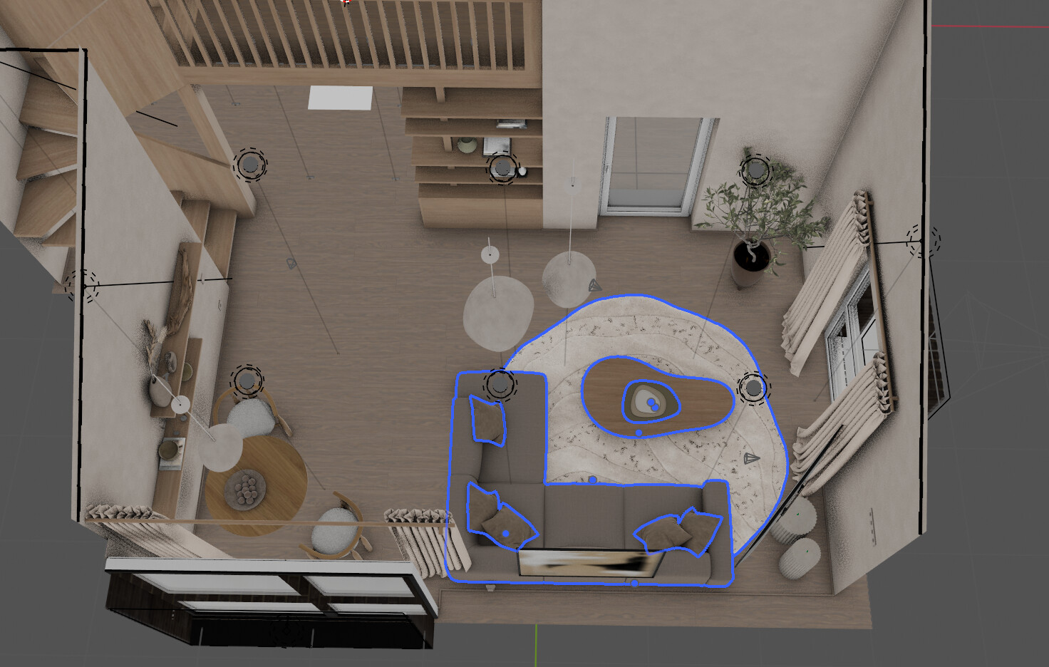
Okay, overall it looks nice and cozy, but the biggest problem is the couch. It blocks the way to the stairs, and maybe its to big for a small room. Just rotate it 90 deg counter clockwise and move it to the wall, underneath the picture. Maybe even closer to the other window, depending on the light.
Next lower the ceiling lights. The one above the desk should that high that you look against it, when you are standing. The other two big ceiling lights should be a bit lower too, depending on how they distribute the light.
It could work, but at this point too much would need to be rethinked and redone. We did not see this as too big of a problem, it still doesn’t seem to be(in this case). Now it separates the spaces, I kind of like it. Although, yes, it seems to be a valid argument.
Especially between the sofa and the table. This could definitely be seen as a problem.
I just don’t see it as a problem that needs to be solved in this particular case. For some people it may really be a way bigger problem, I suppose.
Thanks a lot for the feedback! It i still very valuable to hear even if I chose to not act on it. I do really appreciate it a lot. I mean, really a lot.
Hmm, i would usually like to keep such small rooms as open as possible, specially when the room is that high. A 3-seater couch under the picture, so you have a view from the lower part of the ceiling to the higher part, which “opens” the view. And two light seats on the opposite side of the couch table. That way you even have room for a bigger eating table, big enough for four people, although the small table looks more cozy. Maybe you should ask a feng-shui expert
I actually recalculated lighting and rethought it in the kitchen, added a few more spotlights so that the countertop LED light does not seem disproportionately strong to the surroundings. Came to a conclusion, that we should base the final decisions on wishes of the clients, because to my best understanding of lighting, there is a whole lot of space for preference here and luckily also options, because there is a wide range for light bulbs and LED strips to chose from to make it as light or as dim as one’s heart wishes. So your feedback was very useful, thank you.
I think it’s very nice, since we can pretty easily make the lighting 200lux, or 2000lux, at the moment I am staying with around 400-450 for kitchen area and around 650 for the countertop. Which is really really bright in my personal opinion. But some people might consider it just OK, and some even want more.
Another thing that came out of this is the realization that we should definitely look into dimming options as well as more discussion and trying things out, because I am really really OK, with only 75 lux on my desk right now:
I guess it may be that there is more than one way to make an interior design. It might depend on the circumstances. I think ours led us to this. Hopefully, that’s still OK.
I do not like the wood on the tables or the stairwell and balusters, but that’s me. I tend to overload my scenes with a lot of similar, but not exact woods, as that has been what I see most IRL — though in older buildings, to be fair.
Real woodwork also is never that straight. I tend to add extra geometry just to give things a little bit of a bend and misalignment. Even in a brand new place that is something that stands out to me.
Can’t stand the artwork either, but it fits well with the piece.
This is a very good point. I am quite used to wood being made to look very consistent and straight in real life, however stairs are usually different, because they are usually solid wood and veneer is never used. I have not put much thought into this to be honest and different wood and imperfections would probably make sense in this style.
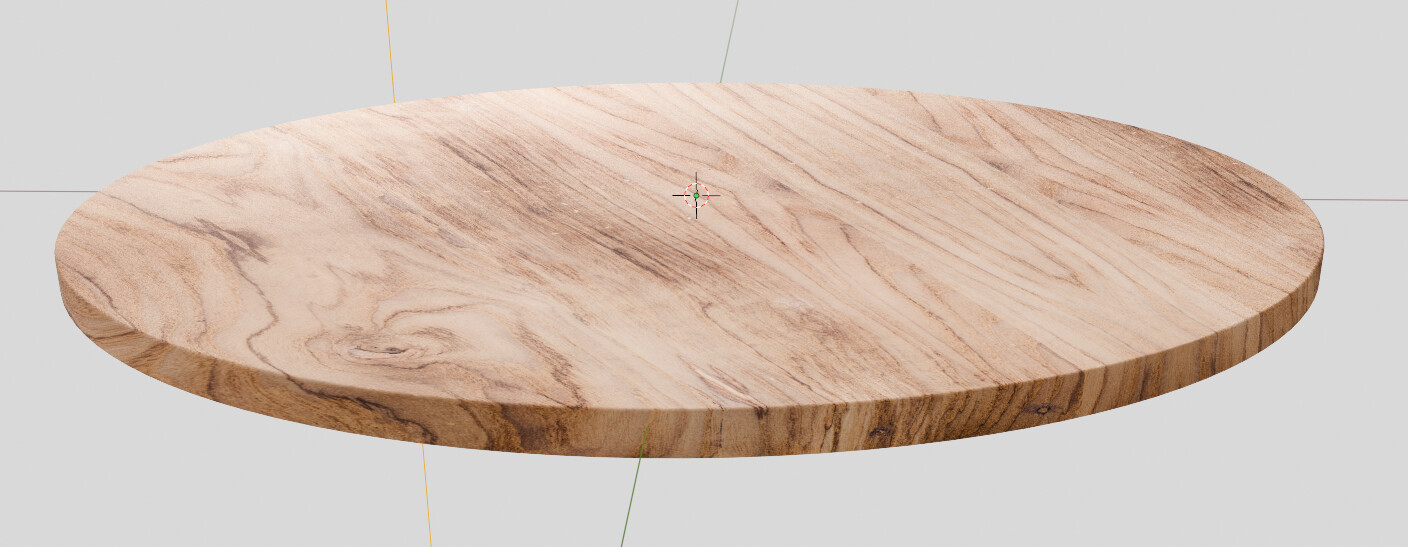
The wood on the tables is bothering me as well. I usually struggle to find good wood textures when it comes to some specific kind designers want to use. Apparently even if I am one of the designers(who could have known?..). And the dining(or should I call it breakfast) table is solid wood so in order to make it really realistic I would need to go procedural, which is extremely time consuming for me and very difficult to reach good results. I am definitively trying to think of something to improve this.
Well, dimming is not the only option. You can also group lights. Lets say you have four spotlights for the countertop, you can switch them all on, or just two of them.
If you have a suitable square wood map (square seemed to work super easy), you can try doing Project From View (Bounds). I’d isolate the tabletop first, position the view around 30-40 degrees angled down, and apply it. The effect starts to fall apart at certain angles (you will need to rotate the table after applying), but you can see below there are no problems selling this as a solid tabletop.