+10000… There are so many things that could be improved. That’s why I’m really looking forward to the workflow rework. Which begs a question, why doesn’t select loop and ring have shortcuts in edit mode? At least they are not listed on the menu if they do have one. I use these far more than the other select options.
Depends on what and how you need icons for. It also depends on the app and how it was designed. Programs like Paint Shop Pro allows you to add a custom toolbar, populate it with your most needed icons. You can then place that toolbar anywhere you want it. You can even float it.
In Autocad, you’ll be thankful icons were invented. Here’s why. You can store macros or scripts to an icon. (Macros are a group of routine commands that could otherwise take time if you type everything in it manually.) You regularly insert pre-drawn symbols in Autocad, hundreds of them. The macro goes something like this if you type it manually: Insert, enter, name of symbol, location point, rotation, etc.
The program allows you to store these symbols to an icon. You can even draw your own icon, not easy, but you can temporarily draw anything and refine it later. Icons, unlike textual buttons, don’t use too much space.
not that hard alt+rmb and strg+alt+rmb…
In the constraints, it helps to clarify that you are adding a constraint and not, say, a modifier.
jeah… adding a modifier through the constraints panel - makes sense william!
Maybe its an idea, to make a HTML based interface, ea a markup language, so people could create themes with icons / or text buttons.
One step more would be to have blender as a complete web app. ( maybe with help from blend4web ), and their node code as a replacement for game logic…maybe a bit Wild idea, but coding and web stuff goes hand in hand these days.
Indeed, but still weird they are not shown in the menu.
Grimm, a tip/workaround how to find out shortcuts: go to user preferences, input. Type in the function or action into the name field. The list then gets filtered and you can check the shortcut, if there is any. Works for “loop” and “ring” in your case.
I wouldn’t mind icons as an option, much like how for different paint brushes in Blender how you can select a custom icon. We could maybe have something like that in user preference, then if you don’t like the normal fonts you could make your own, use someone else’s icon pack you like that someone might make or maybe have your “icons” be the text in a font you find most readable.
interesting program, I searched for screen shots of it on Google and while it’s look a little bit childesh and non professional, but still it shows how much the icons helps you to pick the tool you want with out turning into proof reading mode, reading every command until you find what you want[/QUOTE]
I had the first few versions of trueSpace back in the '90s. Version 1.0 didn’t have many features so there weren’t too many icons to bother with. But by the time they got to v3 there were so many icons it was ridiculous. They had icons buried under icons because there wasn’t enough room for them. You’d click on an icon and five or six more would pop up. Trying to remember which “top” icon a particular icon was buried under was a pain in the neck.
I stopped using trueSpace because the price kept going up with each new version, but the interface also had a lot to do with it. They eventually released trueSpace for free (v.7?) a few years back so I downloaded it to see how the program had changed. It was worse than before.
I’ll stick with Blender.
Steve S
Cool thanks Sanne, I didn’t know that. ![]() I was being facetious about the shortcuts just to make a point. It’s just one of many issues with Blender that make it difficult for new users to learn. I suspect that the reason they aren’t in the menu is because there wasn’t enough space or some other issue.
I was being facetious about the shortcuts just to make a point. It’s just one of many issues with Blender that make it difficult for new users to learn. I suspect that the reason they aren’t in the menu is because there wasn’t enough space or some other issue.
As a developer myself (web apps) I know what might seem an easy problem can have dependencies that turn it into a not so easy problem.
Yeah, I guess it’s something along those lines, or maybe just lack of time and so many other things have preference. I’d still think that existing shortcuts should be exposed in the UI next to the textual command, so maybe it’s worth a bug report or at least a mention in the devs channel #blendercoders at freenode, if you like to follow up on this.
It seems we were both wrong, according to Bastien those menu entries are different from the shortcuts. Even more confusing, to be honest, but ok, at least we know now.
Thanks for the bug report nonetheless!
In my opinion on icons vs. text in Blender, the only thing I can see that could really be replaced with icons (right now) is the text in the tabs in the toolbar panel (with tooltips attached saying what they are). That is simply because text is just not real readable when it’s sideways.
![]() No problem. In any case the issue still remains and those menu items have no shortcuts and users are still to be confused.
No problem. In any case the issue still remains and those menu items have no shortcuts and users are still to be confused. ![]()
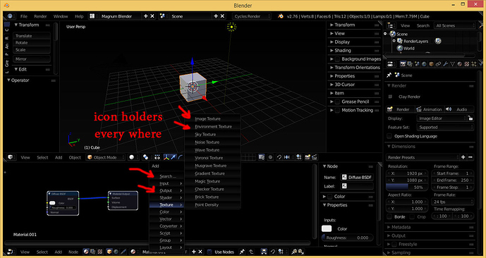
HI Guys, so today i opened blender to take a second look, and i was surprised that icons holders is already established in the UI, all the commands, or maybe most of them have a blank space sitting beside them, ready for an icon to sit there, so people who said that icons will eat the space, well its already eaten, look at the image below
I assume the OP is offering his time to do the icons.
Ahhhhhhgh!
i extremely love to do it, the problem is that i’m committed to the full time job that i have, i wouldn’t find the time to complete this project, as now i’m on a small vacation, i’m able to contribute. other wise i wouldn’t find the time, but i don’t find it impossible for some one else to take over,
As mentioned previously, there are about 2600 operations which would need an icon. All of those would need to be intuitively understandable and consistent among each other. All those operations would need to be grouped, such that similar operations are visualized using the same ideas to be understandable and consistent. With this amount of icons, it is extremely time consuming to finish them at all. When it comes to consistency, it would be a lot of back and forth with a huge amount of those icons. It would also be handy to make them as intuitively understandable as possible. That’s extremely tedious work!
There would need to be guidelines that explain all the ideas behind those icons to ensure that icons that are added later on will follow the spirit of the original ones.
You have this awesome idea which is more or less a mammoth project and you are saying that someone else should do it? You are just the idea guy?
Besides that: The title is wrong. Icons are not the next big thing for Blender. Not at all. Long before that, there will be a new key map, 2.8 and many other things.
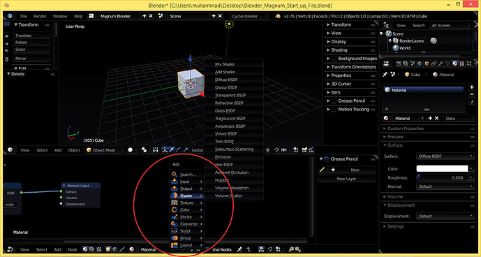
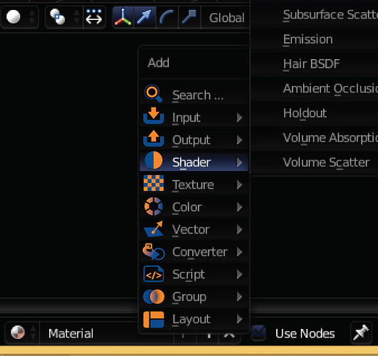
Hi, so i tried to actually test something really fast, the following icons took me about an hour to finish, they are eleven icons in total, i didn’t try to make them too fancy, just acceptable, the colors i used Is derived from the blender logo

which are orange and blue
and here is the result
compare the menu on the left with the bold icons, with the menu on the right with out any icons, i think its alot better to work with the one that have them
While not a huge fan of the color scheme you made (the icons are actually pretty nice imo), I have to agree that the icons make the menu far more readable.


