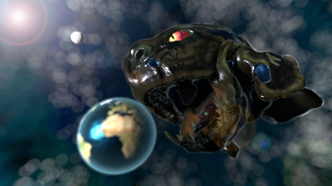
Here’s another dragon I’m working on. The idea was to make a dragon about the size of a mouse, and have it running around in holes in walls, and stealing cheese from mouse traps.


Wow, a whole month without a single comment! I shouldn’t complain, it’s probably been a lot longer for others.
LOL! I love your dragons, but man, the other stuff is a bit sloppy… Your dragons are A+ though 
I know they’re sloppy, that’s why I’d like critiques.
Thanks about the dragons though. BTW, I liked your old avatar better.
The dragon going for the cheese is great. Keep going!
Thanks PhoenixSmith. I’ve actually made a 480 frame animation with it, I just need to add sound.


Lol!.. I guess you’re after a little more specific critique than “sloppy”? It does seem that more effort was put into the Gecko Dragon than the rest, but as far as to put a finger on it… I really couldn’t without knowing how you did what you did. Overall it looks like you know what you’re doing though.
LOL! Bro, not meant to be an insult… Your dragons look like something I could only dream of doing… The latest creature was good tho… But the other stuff is completely mis-proportioned and all. Just something that needs worked on  And no, the last one didn’t appear sloppy. And when I said sloppy, I didn’t mean to say that you work carelessly, or whatever.
PS: What’s wrong with my ugly mug? 
Thanks again for the comments. Here’s some more work on Sloppybeast:

The next step is to add people. Then I plan to fix the scaling on the noise texture, and paint in a displacement map. The grass looks dark like that because of far too much displacement.
PS: I guess I was critiquing your avatar more on color scheme and composition. It’s not what you look like. I solid background might improve it.


Nice works… The shoulders are a bit big on the shirt, and the shoes are a bit low poly… Beast perfect. I wouldn’t change a thing
The profile pic could definitely use work, but whatever
Thanks for the critiques and complements. The shoes do look low-poly, partly because of lack of textures, (all rendered with diffuse only,) and partly because they are low-poly. The shirt does have extra large shoulders. Here’s another WIP:
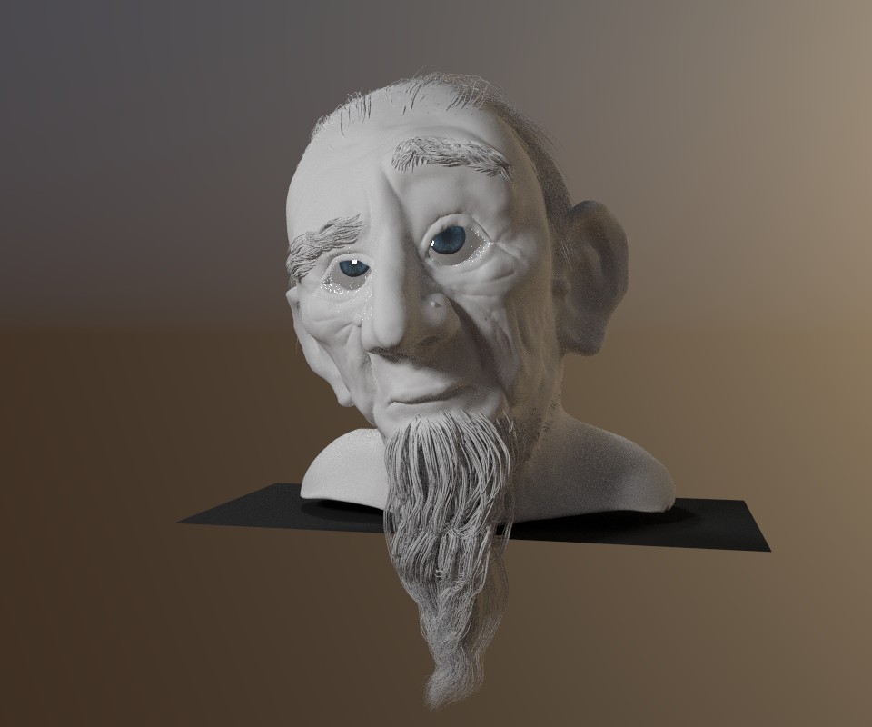
Ok, and wacky eyes, but cool face.
