Dave_K
July 26, 2014, 10:35pm
41
looking much better.
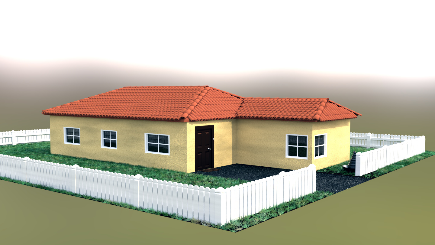
though i agree with Words that the grunge map you applied to the walls is a bit strong. tone down the dark spots a bit, what you want is natural variation in the surface tones, not rotten down crack house! haha. take your time at this stage. the textures make or break the whole project.
dont forget roof, it could use some streaks in the low spots to indicate water draining. but not too strong. if this is for a real estate company they are going to want it “clean, but believable”
Words:
Heloo! Aaah you’ve left it late to get a realistic image!!
Vast improvements, by the way, on the original image.
Lighting is what will make the biggest difference in the shortest amount of time. A quite harsh (sharp shadow a.k.a low soft size), bright sun lamp is a good idea. Not too bright mind. The color of your walls makes it look a bit dirty, is this set in stone or can they be whiter? If they can’t be then a brighter light source will help anyway.
I think your grass is too long and the color is off, use reference images and try to match the color of the grass to yours.
Your angle in the latest image hides too much of the villa, just angle it down a little more.
There are a fair few extra assets to be modeled but it looks like a lot have been pointed out already, these little things really count with photo-realism.
Play with either uv mapping or texture space to solve your procedural textures on the walls looking stretched/squished (uv mapping is obviously better, but texture space can be a faster solution, you’ll be fine with uv mapping because this is a simple cube based shape). Also the dark patches make it look a little dirty (again), not necessarily too bad (could be a realism thing) but I doubt a real estate company would want it
Don’t be afraid to cheat. From a learning standpoint it would obviously be better to do everything yourself. But if you can find models for drainpipes etc. under licenses that allow it (a lot of models are under these licenses, especially for blender) you can manipulate these instead of starting from scratch and this will save a lot of time. The common creative commons licenses can be found here https://creativecommons.org/licenses/
I hope I’m of some help, the best of luck. I’ll be following this thread!
A lot of help! I love all of your suggestions! They’re right on! Um, I’d like to do everything from scratch myself, so I can take on full credit…
Dave_K:
looking much better.
though i agree with Words that the grunge map you applied to the walls is a bit strong. tone down the dark spots a bit, what you want is natural variation in the surface tones, not rotten down crack house! haha. take your time at this stage. the textures make or break the whole project.
dont forget roof, it could use some streaks in the low spots to indicate water draining. but not too strong. if this is for a real estate company they are going to want it “clean, but believable”
Yeah, I toned down the ‘grunge’ but my lighting is too strong… I’ll turn down my light next, and re-render
Okay, this is update #10 … The lighting is WAY to bright, and the grass is a little too tall… but I think I’m making good progress
Here’s the light turned down a bit
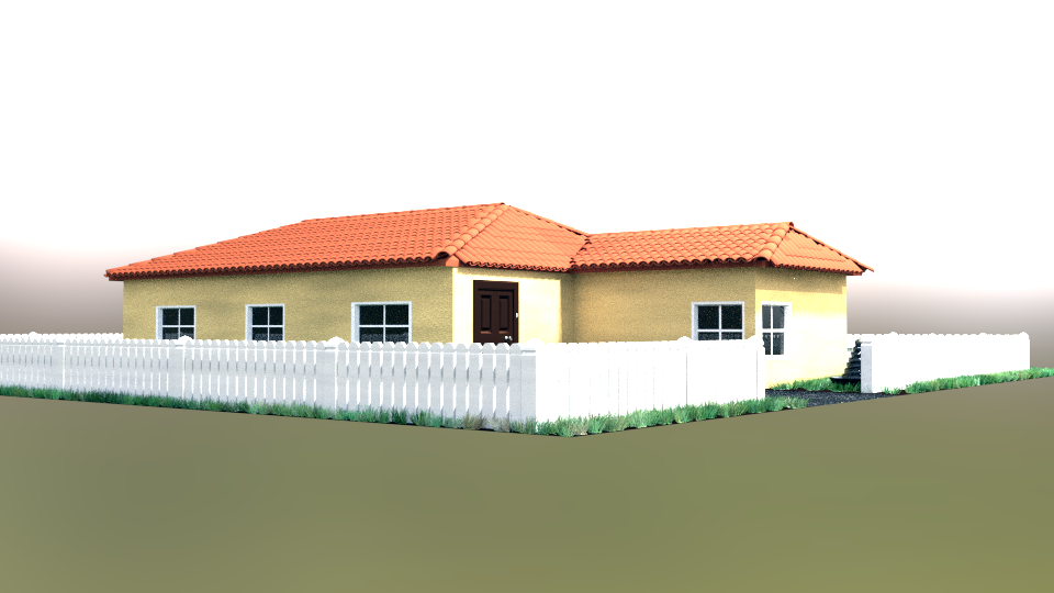
 The next update will look better, but this should do for now
  Thanks!