A visual symphony of colors. Well done!
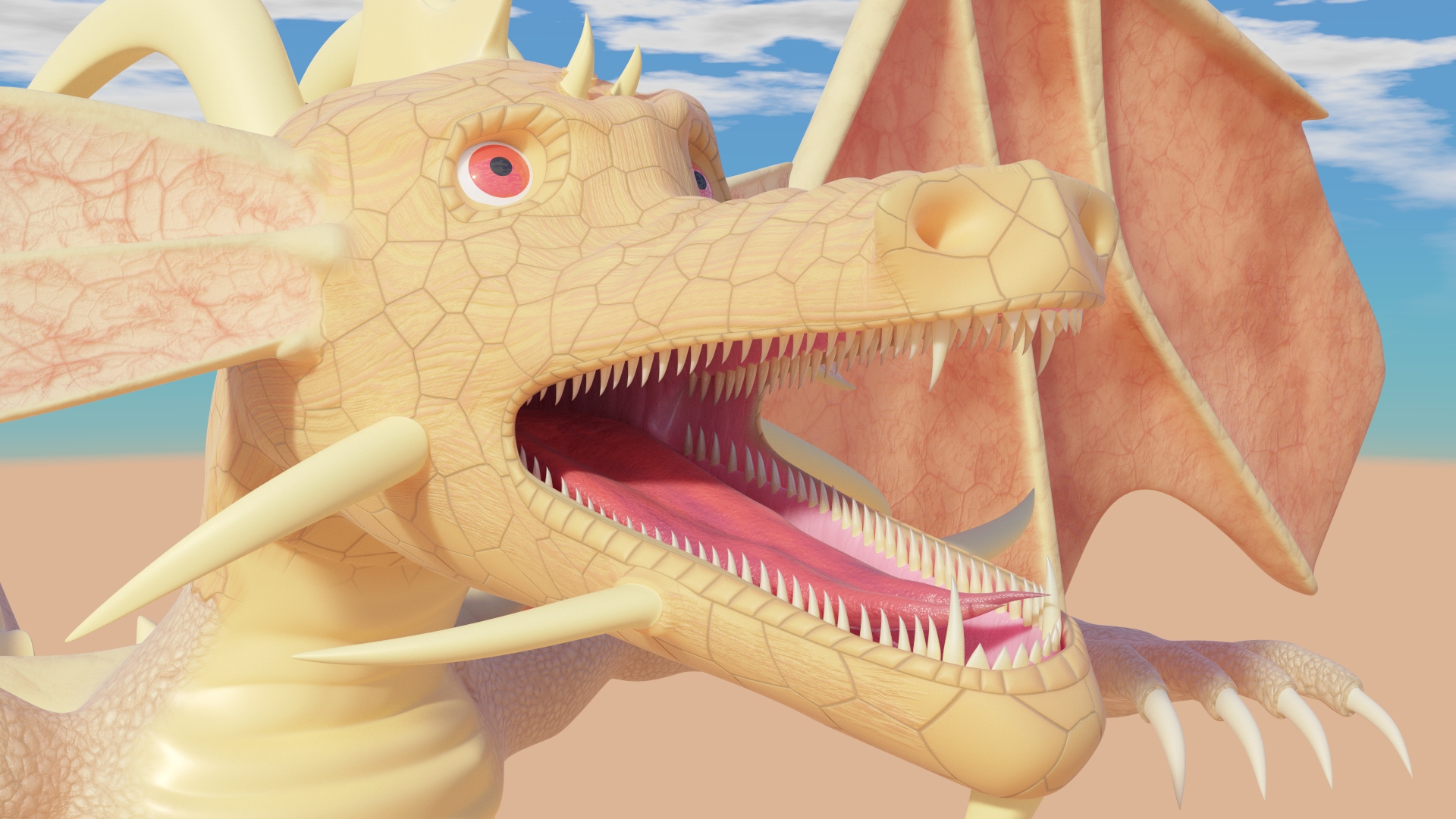
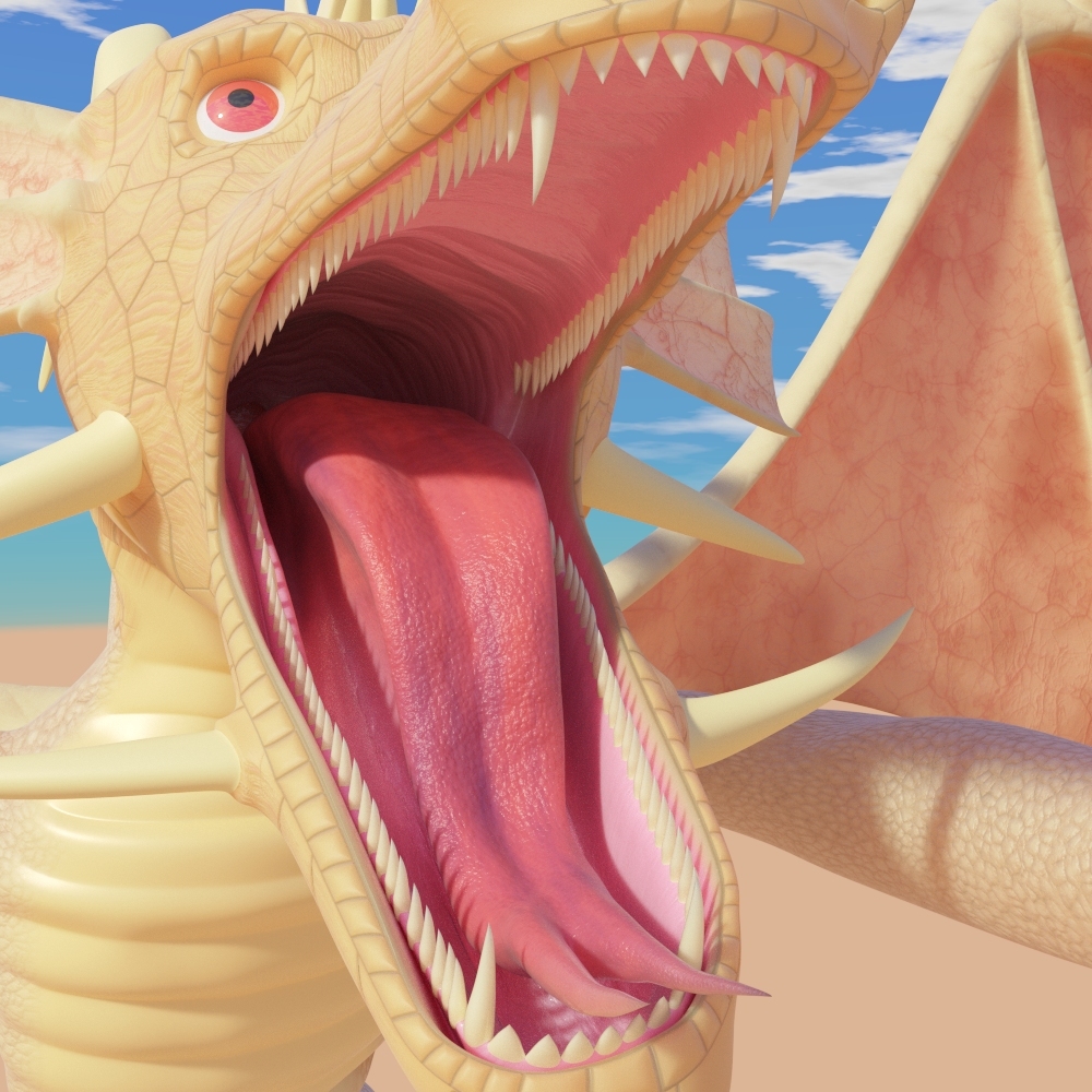
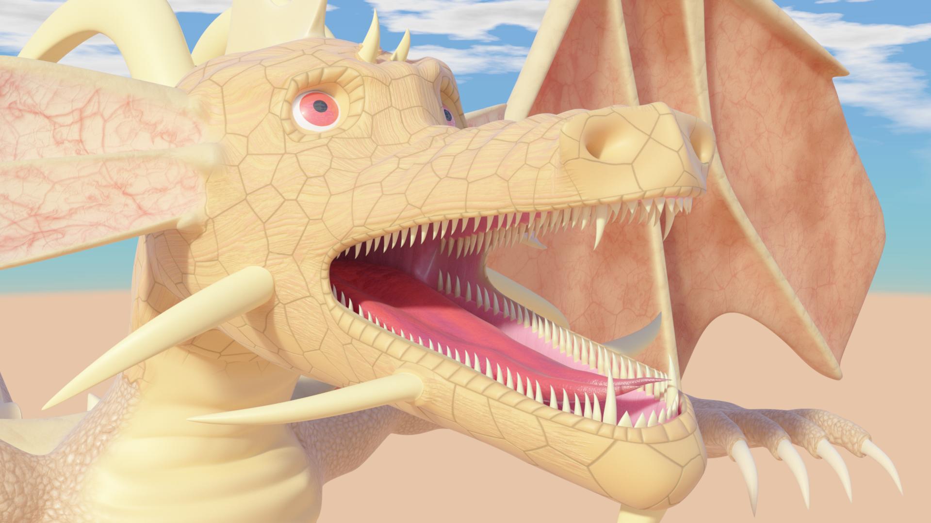
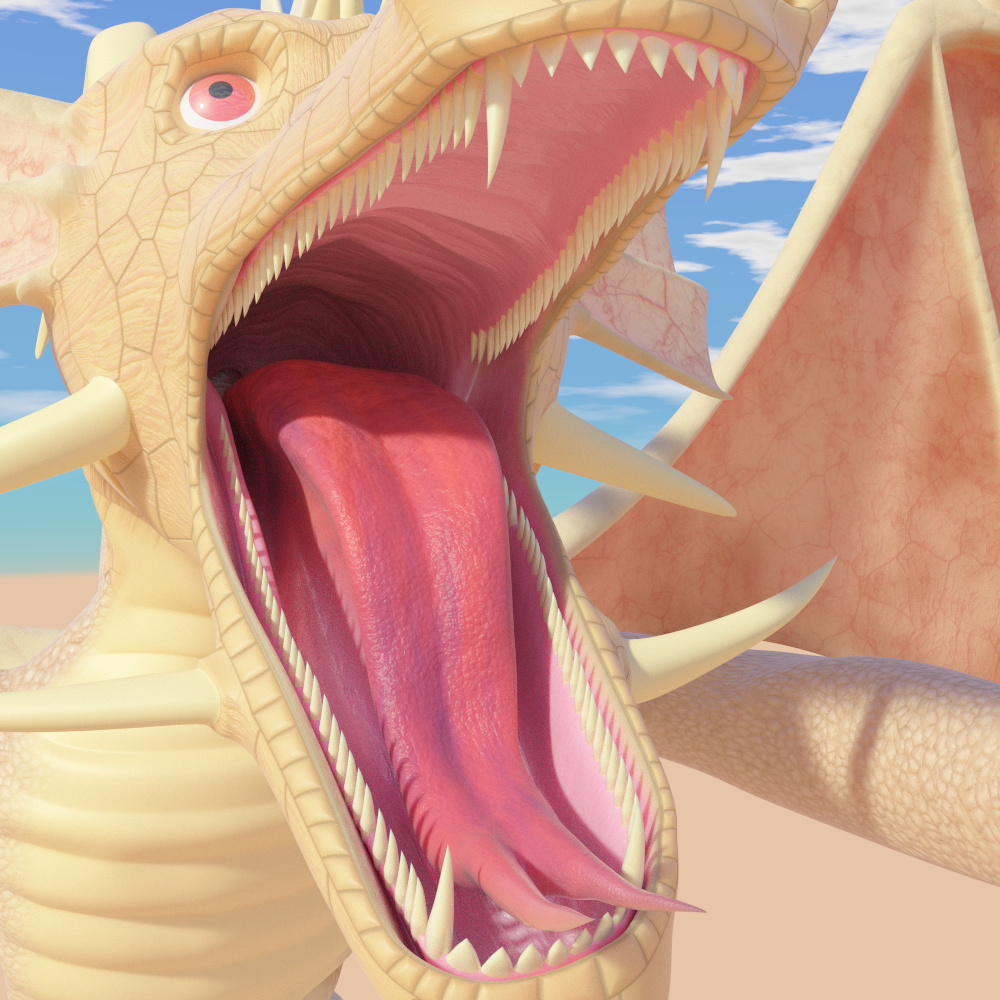
Okay, call it an obsession, but I told myself that I would not dare to try any other organic creatures until the node group that I use to make them is about perfect, that’s the reason I’ve been tweaking away for over a month to make my model look as good as possible (even though I’ve never really gotten to where I can paint texture maps like ILM or those other big VFX houses).
Quite a step up from his more humble beginnings (below) as far as quality goes (before the time when I decided to finally give him proper texturing, proper rigging, and better topology). Of course it’s also in BI and I’m not sure if Blender even had SSS yet. Long time users may have seen this image before, and yes, the Dragon models used here is really how he originated.
1 Like
Glad to see that you’re still posting. It seems the trolls are well too.
Good job AceDragon, I like your abstracts, I find them relaxing to watch somehow.
Still iterating on the Dragon (the latest ones). It can take a while considering Cycles CPU rendering and all of the variables you need to take into account for organic materials. The newest iterations come with significant tweaks to the material and some tweaks to the tonemap.
Also, Merry Christmas 2012.
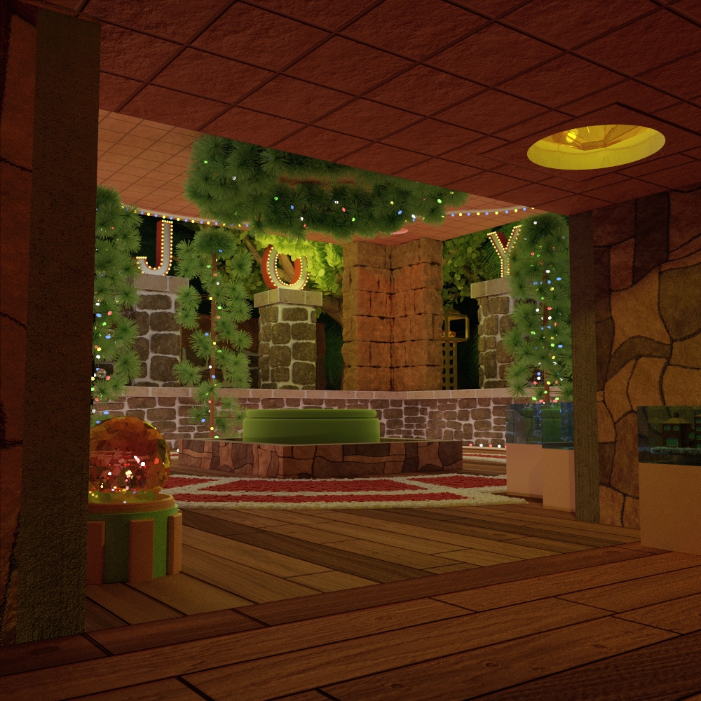
The image above was also one of the early examples of how my new machine at the time was able to render far more complex scenes than the old one (which could only use 2 gigs of RAM at max). It also was recently improved upon in post by way of brightening so that the corner didn’t give an impression of an unfinished scene (it was there, it was just almost black). This was my first new Christmas picture in almost 10 years (the first one in comparison was one of my earliest images and would have a crude quality compared to this one.
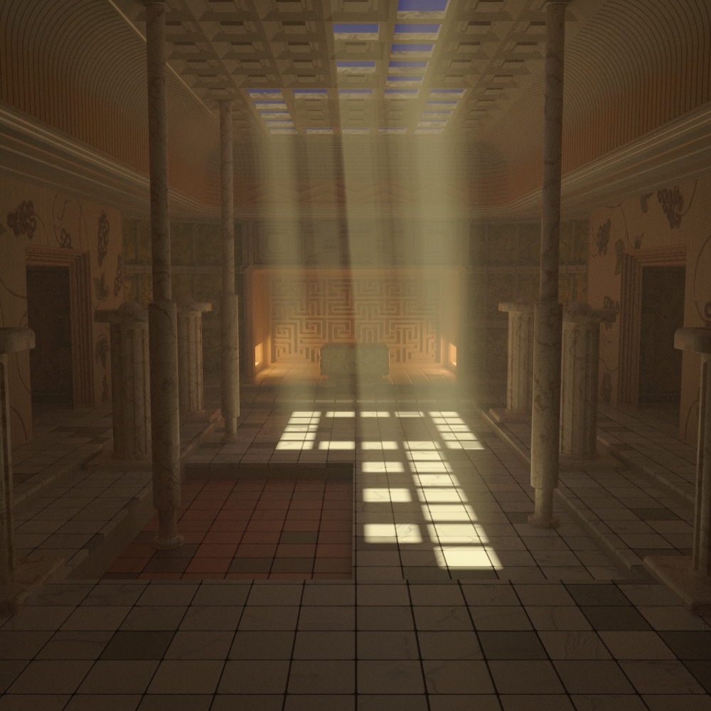
Hinted Keys: - Basically an image that lets light and shadow portray the subject of the image. The key doesn’t exist in a physical form, or maybe it does exist and this is a clue. By now, I’ve pretty much perfected my better tonemap solution for Cycles images as well as the universal glossy material that saw its earliest iteration used in An Intriguing Room I’d say that the combination of both made this turn out pretty good considering that the tonemap is designed to avoid easy burnout.
And two images from the bitbucket, I never officially recognized them as completed pieces because they both had something that fell short. The first one was my first and last full-sized render to be made in the now defunct render25 branch used in Sintel and one of the few pre-cycles images that used a GI solution for the old Internal Renderer.
This one got a bit further I think, but it was dependent on the initial work done by Farsthary on volumetric materials in the Internal Renderer. To say the least it had a few implementation issues that prevented full usability for full quality imagery (though I guess it doesn’t look that bad).
Also, the first image is by no means the only new work I have for 2015, only that the rest were contract pieces for a local bank.
Also, I swapped out the Dragon images in the post above with even newer iterations, filling in some missing pieces in the shader and further work on the tonemap (like a way to simulate an Oren-Nayer type roughness with the SSS shader).
Really cool, varied and artistic material Ace! You really seem to know this software inside out 
Thanks.
Moving on.
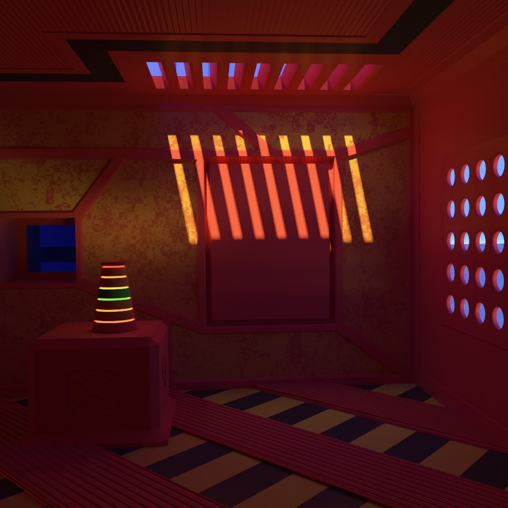
Inside the Red Locker; - Hot off the render machine (as of last week at least). Was trying to think of some nifty idea to make into an image and one that gave the impression of being in a sort of ‘locker’ came to mind. Okay, it’s not completely red, but it’s a nice example of how Cycles just allows you to play with light and even making it easy to position the shadows so as to work more nicely with other elements in the scene. It basically started very simple, with just plain materials to capture the beauty of realistic shading, but ultimately saw a certain level of detail attrition which can really start to make it pop so long as you know when to stop.
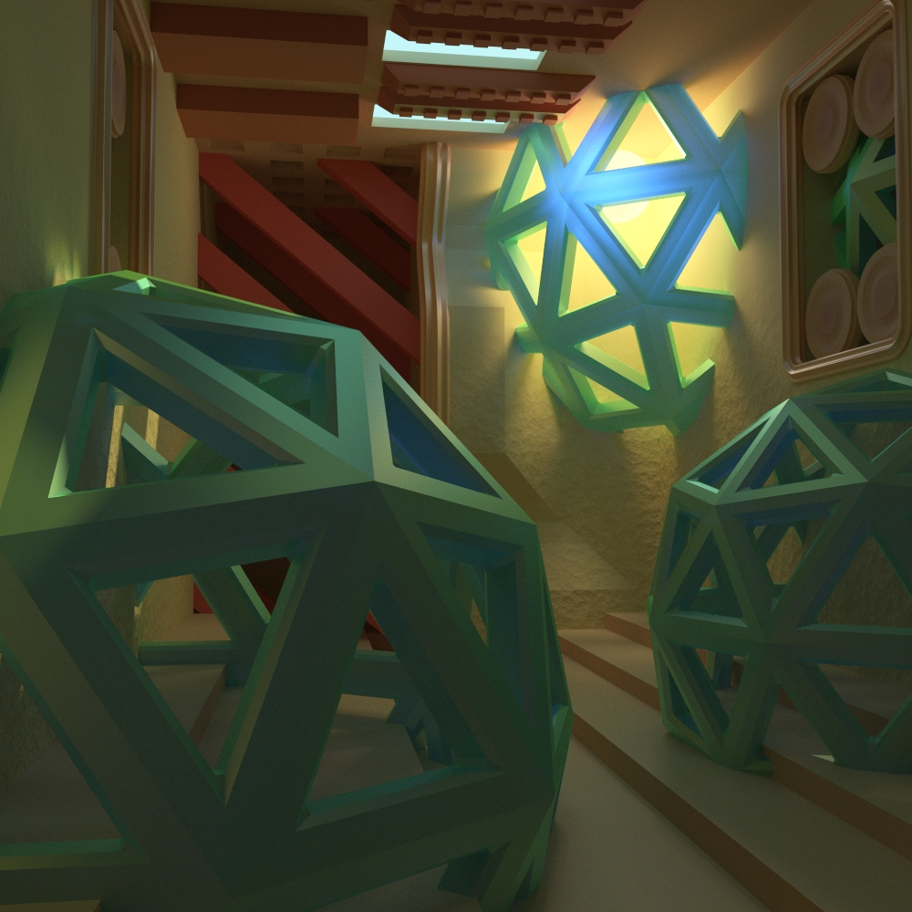
The Geometric Spheroid Room; - My first ever image with the Cycles render engine and re-rendered with a better tonemap and better materials sometime last year, it was originally built to explore the new-found possibilities of what I could now do in Blender itself thanks to the Cycles engine. It was kind of nice timing as well because I was becoming unsure of what exactly I would do since I was introduced to what pathtracing could do with Luxrender and didn’t think I wanted to use BI so much anymore. The image that got me hooked on Cycles and the basics of using it (like not using the glossy material by itself).
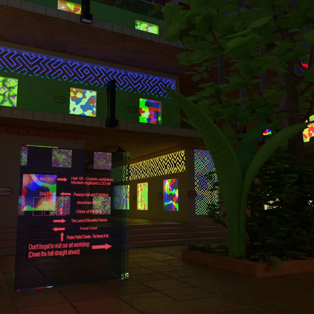
21st Century Art; The Future is OLED’s - Every now and then, I make an image that showcases hypothetical technology that could someday become reality, this imagines a museum that’s not an ordinary art museum, but one packed with OLED displays that complete replace generic canvases and perhaps can even be changed out to give reasons to come back.
Updated the Dragon images again, trying to find ways to push the shading further and in a more realistic fashion, I look at my earlier iterations these days and I think “really?”.
Also, three more images…
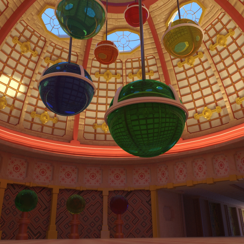
Dome of Oracles:: - Was a little tricky to make due to the complex dome nature of the building mesh, my original thought was to have this domed interior with spheres hanging throughout that gives the impression of planets and whatnot. I say that in terms of the subject, I got pretty close to what I was looking for.
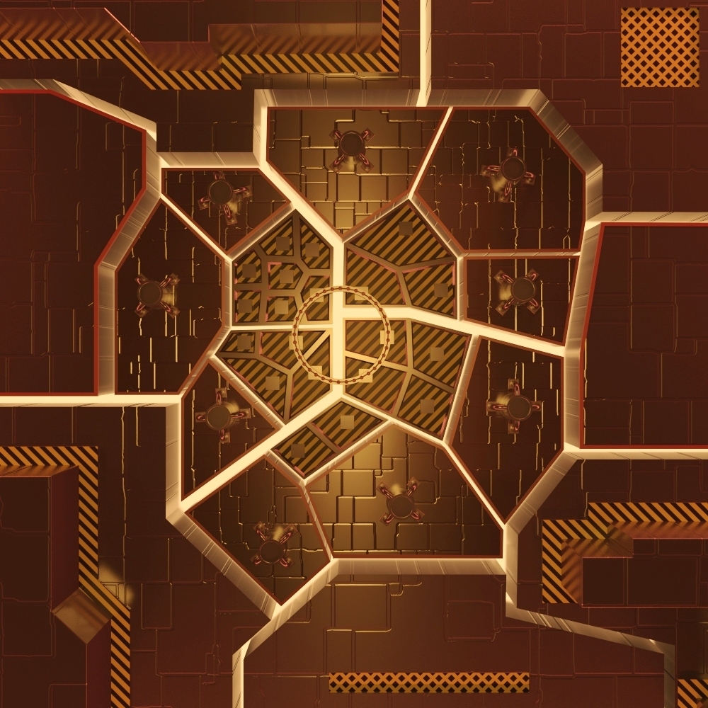
Metallics; Raw:: - My newest image (done after the one above). Basically the plan was to create a metallic piece that would go from simpler around the edges to more complex in the center, and I think the way it evolved got it close enough to what I was looking for. In a way, I might tend to make images through an organic thought process where I iterate > add detail > tweak > and repeat those steps until I figure there’s nothing more to add without creating a visual representation of rambling. If it seems somewhat spartan compared to previous images, that’s because it was part of the point.
Simplistic Reflectance:: - An image that is among the Cycles works done on my old machine, and one of those images which I did with the intent of trying out a new feature. In this case it was the introduction of the AO pass so I thought I would make use of it in a series of images that is simple, but has everything work together in a harmonic fashion. The series I had the idea of never came to fruition, but I would ultimately end up using that pass (in the same fashion) in one or two other images later on.
Updated the Dragon images once again with what I think is an upgrade to material realism and an upgrade to a more realistic tonemap.
I also a week or so ago updated the tonemaps for the two newer images in the post before.
Also…
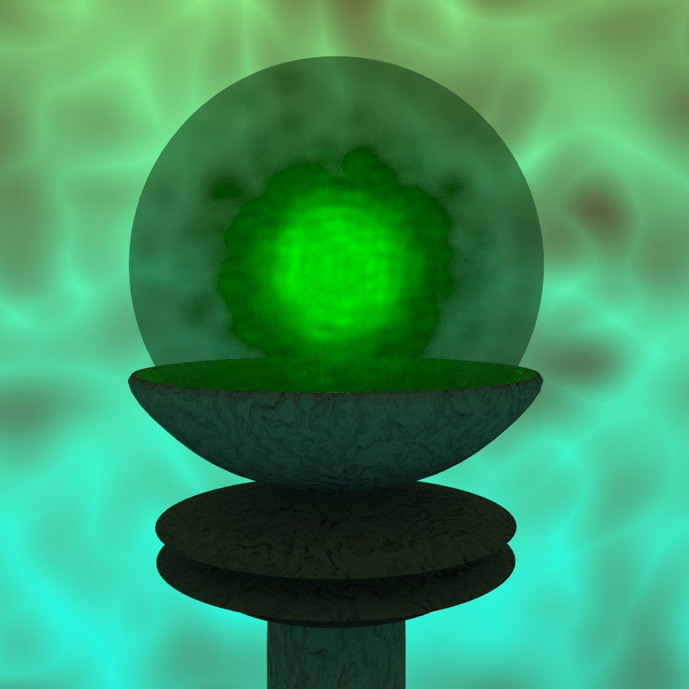
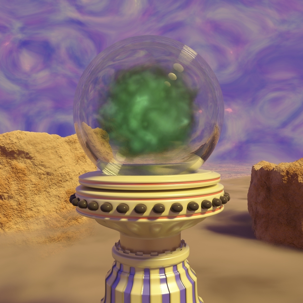
Smokier Spheroid; - Another remix of an old image of mine done in Cycles, this time however, it has real volumetrics inside a real refractive surface and it has what I think is a far better background. This also tested my ability to denoise an image by way of local editing (to prevent quality loss) due to the fact that fully converging the highlights otherwise would take more than 40 or 45 thousand samples (took over an hour, but that meant far less time than just waiting for Cycles to do it).

Smokey Spheroid; - The original version done in my first year or so with Blender, couldn’t use any raytracing for the sphere here due to the limitations that the old internal engine was known for.
EDIT: And here’s an alternate version of the first image with more glow added in post (I don’t often do this type of work and just do a re-render, but I need to work on my brush skills and it’s faster).
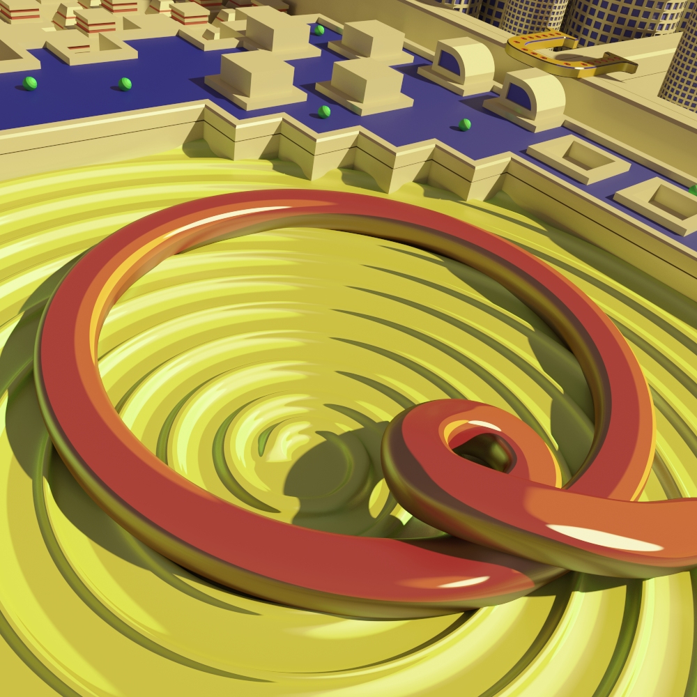
Q; - A quick diversion from my usual fare (which skews more towards realism). Wanted to act on some quirky idea I had that would make people think “what is it?” Hence the name being only 1 letter.
You can get some interesting stylization if you use at least 3 or 4 Cycles toon shaders in a single material.
I know I may seem like a broken record with this Dragon, but I think I’ve officially pushed Cycles close to the maximum extent for realistic organic shaders (outside of textures that is). I’m at the point where I would be adding several new nodes for subtle upgrades, and some of these materials are close to simply erroring out and becoming black if I add them (not to mention overcomplicating things as I’m reluctant to add new group node inputs that wouldn’t give much effect).
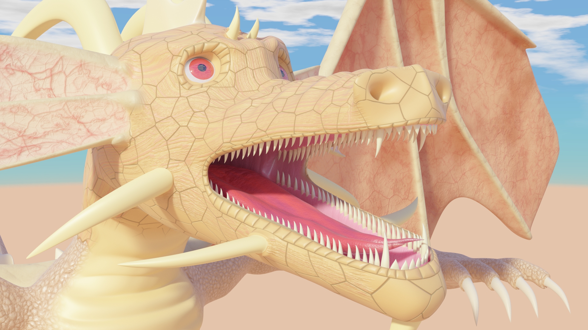

I think that part of the problem really isn’t in the shading. It seems that you’ve got that part nailed down in terms of technicality. I really think that this would be much better if you concentrated on those pesky textures and of all things… lighting. One more thing, it’s difficult for me to gauge what kind of look you’re going for in the first place. This dragon seems to have a very different look to its “skin” than I’m used to, I guess.
I’m aware that my texture painting skills aren’t the best, but the purpose of him being around is to perfect an all-purpose shading setup to use in Cycles. If I use him in a more serious image, I’ll be sure to improve the texturing.
Also, I’m not really sure what’s wrong with the lighting, it’s lit by environmental MIS sampling using a complex procedural atmosphere texture with a built-in solar disk, I honestly don’t see much of a difference myself compared to real world daytime lighting.
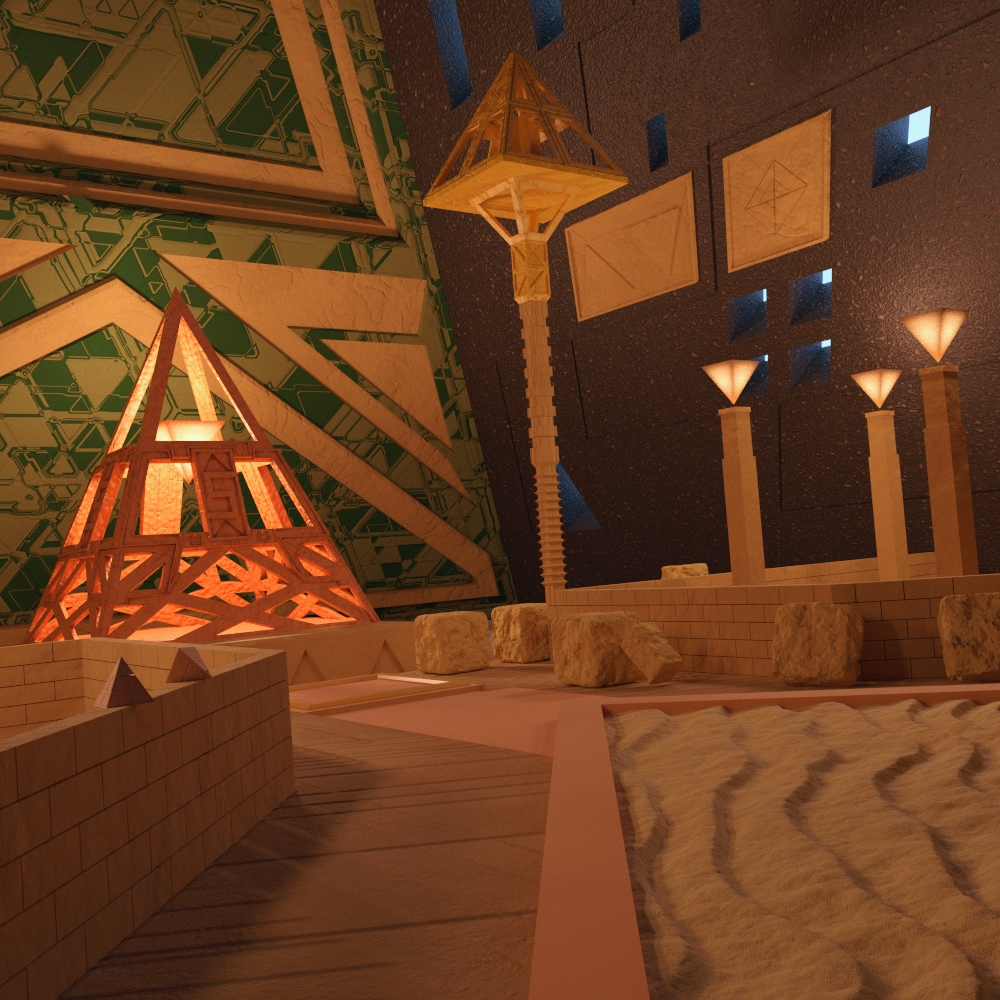
Pyrameridian; - Hot out of the Cycles render engine, and showing that I’m still making work despite current interest going more in the direction of some game development. I’m not sure what to say about this, other than that I used a trick where I used a combination of invisible mesh lights and omni lights with a 2 bounce limit to create the lamp effect without bringing too much noise (those who say the bounce limit is useless should look again). The reason being, there’s little chance in heck you could light a scene like this if the only lamps are behind SSS materials.
This also again incorporates my new tonemap that compresses highlights and the latest upgrades to my physical gloss node group material. The material in general is mainly going through minor changes now, it’s about as good as it can get for its purpose by now (in my perspective at least).
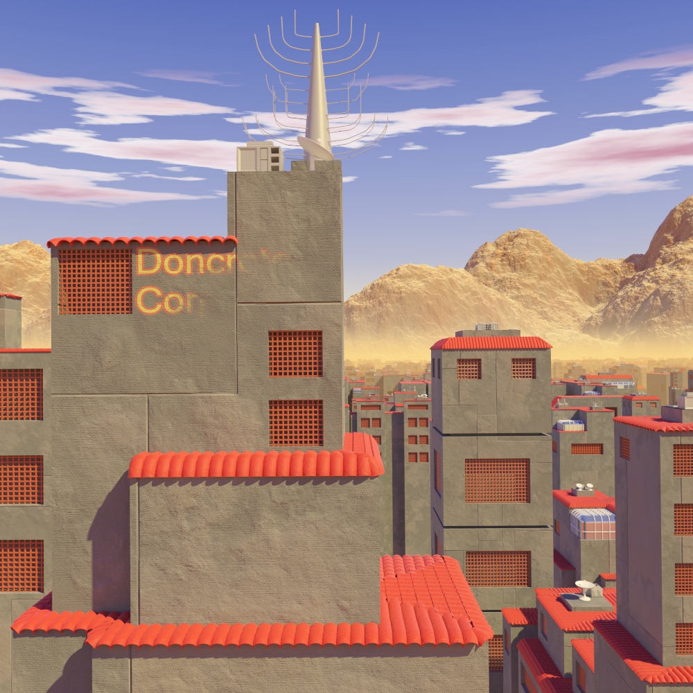
It’s the Grey Building right?; - Nothing like getting lost in a large city where all of the buildings look similar to one another, which is one component that drove the idea for this piece. Another bit of the inspiration if derived from the images of the Vogon planet seen in the semi-recent Hitchhiker’s Guide to the Galaxy movie where all of the buildings are grey (though admittedly the buildings here are slightly more colorful).
The buildings in the back are copies of 18 unique instances arranged in a quasi-grid pattern using a particle system. The number being just enough to avoid a lot of obvious repeats when noting the visual space for them. The polygons for the emission plane are also detached from each other and staggered at random heights to add diversity. Another thing that helped is the more recent commit for Cycles allowing for the cubic interpolation of textures, as it allowed for larger scales with similar quality and less pattern repetition.
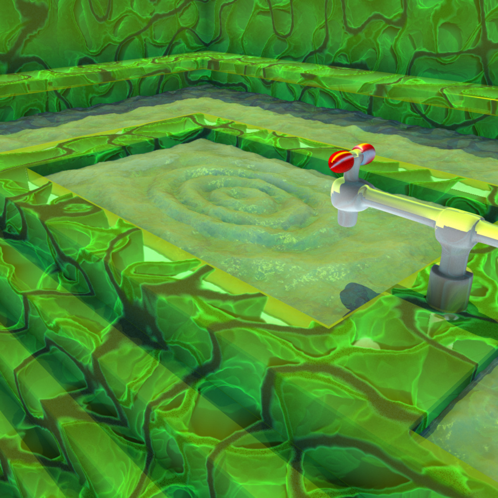
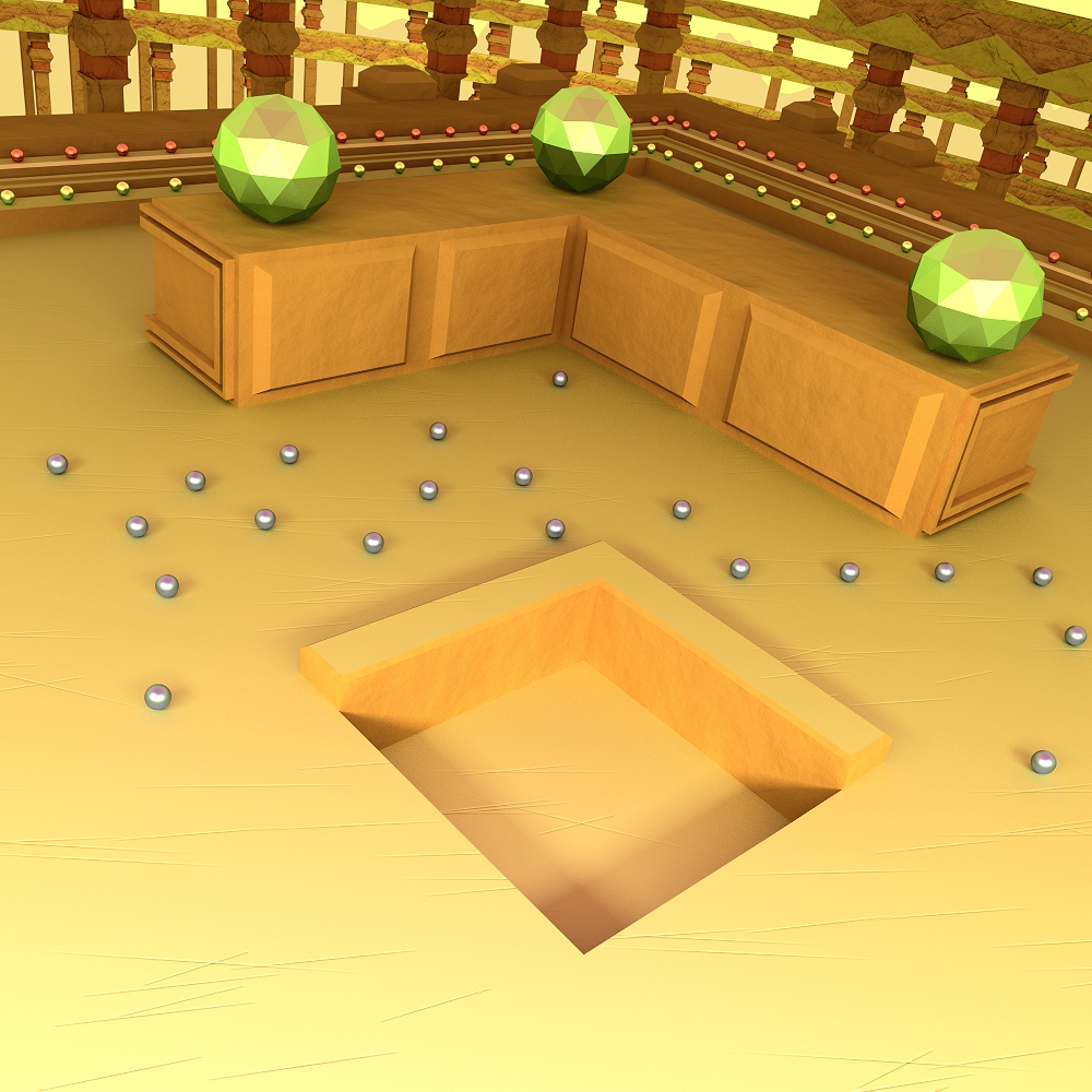
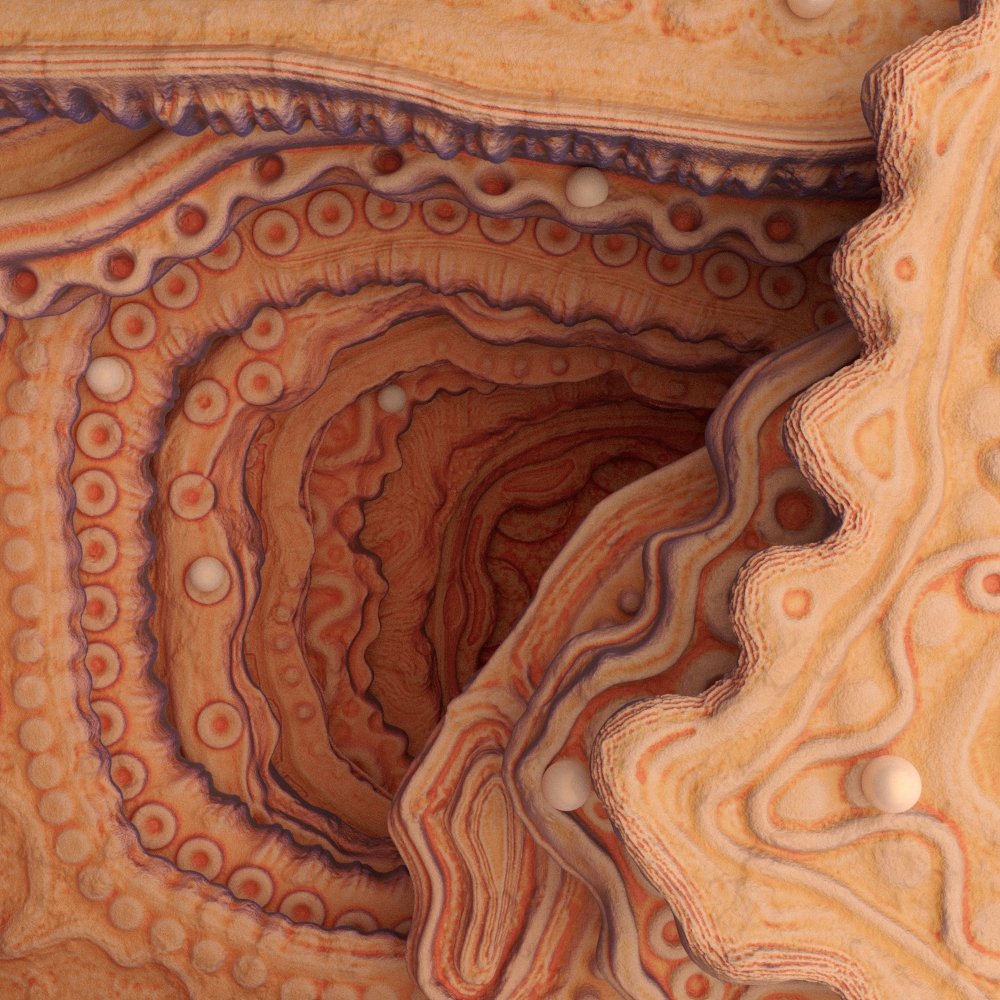
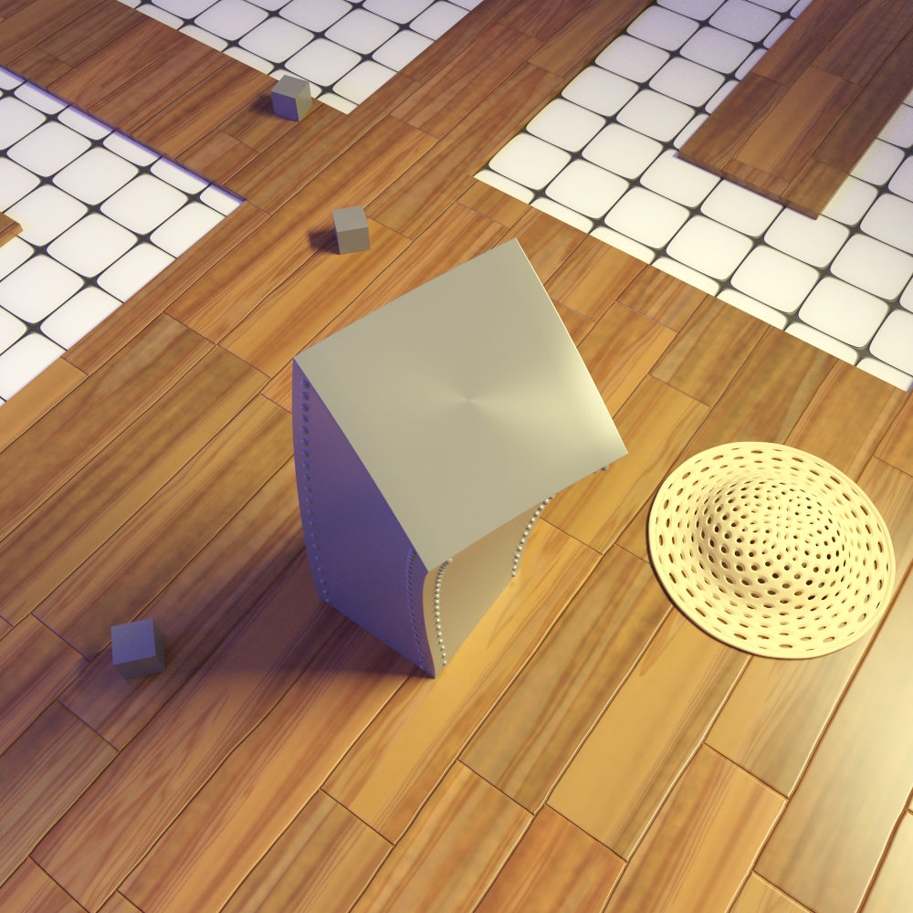
Coraled Well; - My latest image, and one that is of a decidedly smaller scale than a number of previous ones (in fact, the whole scene doesn’t extend far beyond what’s in the camera). This is another one of those renders where I simply point the camera straight down and create a miniature landscape of details, patterns, and other objects. This also can be seen as a good example of just the type of work you can make with Dyntopo sculpting, Dyntopo was used in everything save for the surrounding environment and the pearls and is one of the best things to ever happen on the modeling front in my opinion (as all of the layers here individually took less than an hour to fully detail).
Also noting, this makes use Cycle’s new object coordinate data type (an empty in this case), used to propagate a gradient across the different objects from top to bottom.
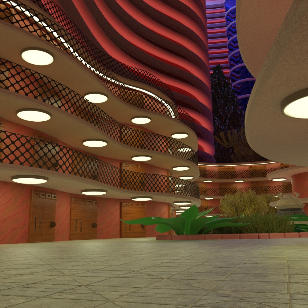
Hotelier Abstracted; - My latest bid to create a nice looking indoor scene in Cycles, Cycles may only be a unidirectional path tracer at heart, but it does surprisingly good at difficult scenes given enough samples.
Basically one of those times where I have a general overview and I mix in what I had in mind from the start with the more organic process of letting ideas come and trying others here and there (like a waterfall for the background which I quickly scrapped). Basically it wound up being a sort of abstracted interior with some hotel-like attributes to it (with no rooms seen in the higher parts). Lightpath tricks were also used to not only dramatically improve the sampling from the lamos, but also give them a softly shaded look as opposed to some mono-colored shape that emission shading does out of the box. I think it overall turned out well as a result.
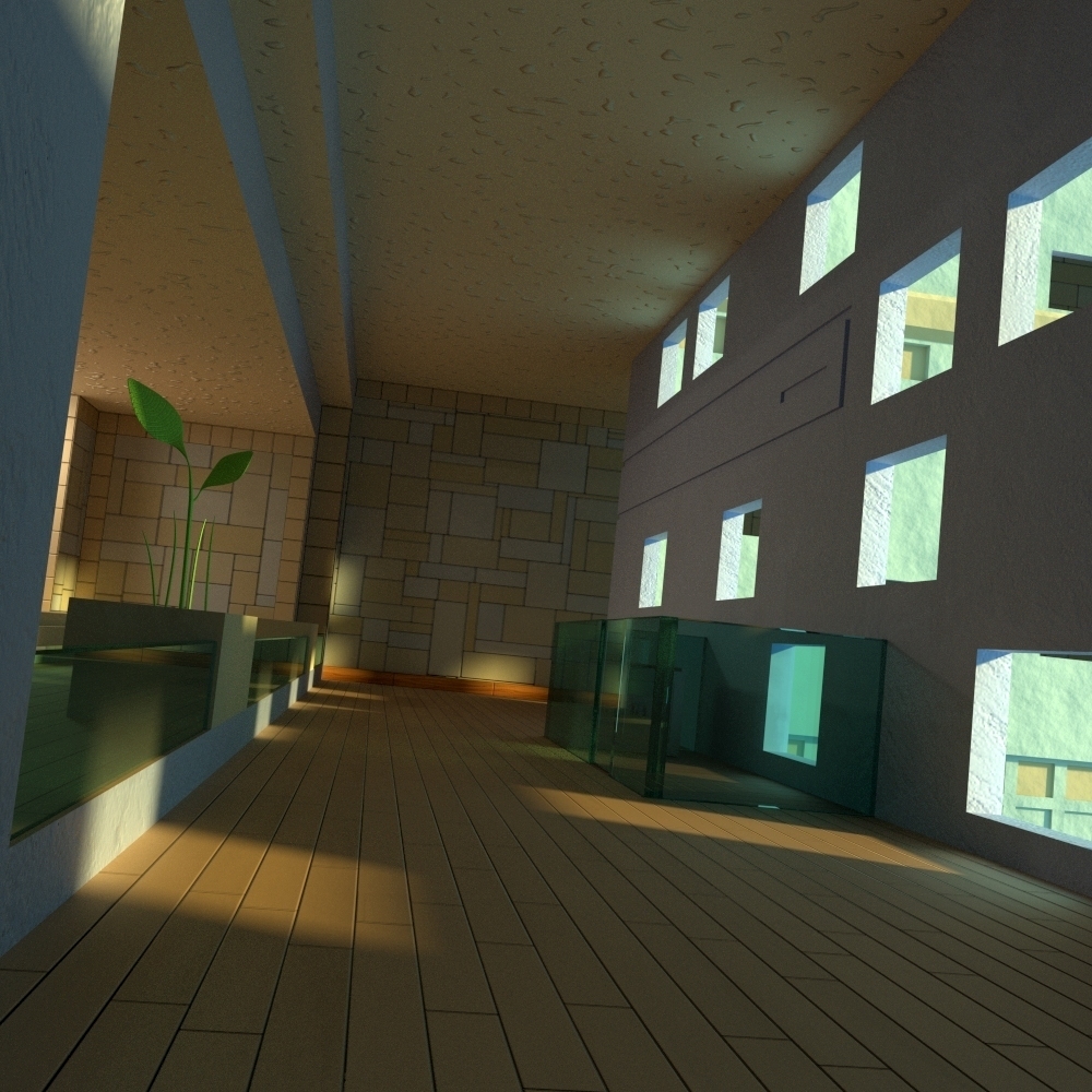
The Blue Interior; - One of my earliest attempts at creating an indoor scene in Cycles in comparison to the image above (over two years ago). Cycles did not have the same level of performance and efficient sampling that it has now so this would’ve needed more samples than an equivalent scene today.
Pretty much the way I do interiors, I try to make them not look ‘typical’ as in resembling the many thousands of images that are out there, I don’t want much in the way of plain and boring arch-vis, which is especially important if you also want to a build a brand to your art (which I’m obligated to do for my stuff since I sell prints of them).
1 Like
A Brick of Lead; - Deviating from my usual stuff which generally strives for realism, I had an idea for a quick, but expressive and quirky piece which I think turned out real well. In a sense, I used a slight alteration of the tonemap to make everything bolder and more stylistic than previous images, also using a node trick to make the main light more directional to accent the subject.
Nothing that’s a real technical marvel here, but that’s not something that every image has to achieve.
Nice work ace,
good to see your skills evolving.
Really cool vibrant textures you’ve got going on ace dragon. Keep up the good work.
Updated the Dragon images in post 49, with further tweaks and enhancements to the shading aspect of the materials and a realism bump in the tonemap. I think in the shading at least, things are final.
And thanks to BPR and Iamthwee, I’m glad you like what you see.