I remodeled the panels. The topology is much cleaner this time.

I changed the lighting up a bit. I think it’s going to keep it like that.
Now I’m going to go and work on the time rotor and fix all of the other problems with the scene.
That’s looking better. Have you considered making one panel first, asking about it, then duplicating it? They seems too wide to me, though I may be imagining it. Was it always so tall?
No I haven’t thought of that, but I might do that if I redo the walls.
Here’s some of the reference I’ve been working with in attempt to get the lighting right.

I’ll let you judge for your self, and tell me. If it’s too tall it’s a problem with my pillars. I’ve been using them as reference for the walls.
Have you tried using reference images from the program itself? The set is all well and good, but the lighting in the program was very different. A lot of the light was coming fromt the central collumn if I remember correctly.
That might be true for the older ones but I think that image is basically how it was around the end of time (just watched that this morning so that’s what I can relate to). Here something that I know was in the show.

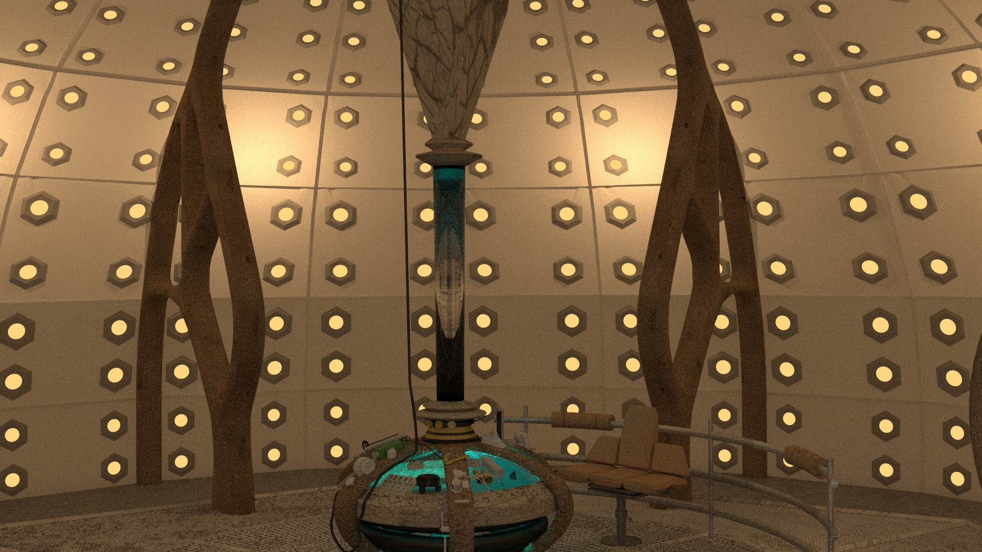
So it looks like I want to make the time rotor have a slight emission shader to it, Add the lights by the grate, fix up the UV map of the part that connects the time rotor to the ceiling, and add a cloth sim for the ceiling. Anything to add?
Another way you can reduce the overall height is just raise the level of the floor grille and the central assembly. Even in the images, you can see that the floor at the centre has the maximum height.
Are you using cycles for this or BI?
Cheers!
I’m using cycles, I don’t like BI because all of the results I see look really flat compared to cycles.
Did you see my bigger on the inside tests on page 2? I lowered the grates because the looked way to high at that angle. I intend to take full advantage of my ability to have it be bigger on the inside.
Here my latest render, I took away all refraction from the time rotor because I can never get it to look right. I also add a bit of emmision to it. I think I might want to control it with a noise texture.
Maybe a noise texture on the console to control the translucency?
Thanks for all your feedback.
THis latest one looks really good. However, your reference image highlights a solid difference. The width of the individual panels making up your walls is noticeably wider. At this point it’s up to you on how accurate you want it to be. Everything else is looking very good though.
Thanks. I’m definately going to have to work on the walls. Again.
I want almost total acuracy, so I’ve still got a ton of work to do.
My list of things to do.
- Fix time rotor size [complete]
- Make material for parts inside time rotor
- Unwrap bottom grate [complete]
- Remake walls
- Make material for chair
- Add doors and police public call box sign
- Cloth sim for ceiling (that’s why you never see it in any of my renders)
- Add materials to all of the things on the console
If I think of anything else I’ll edit my post and add it. If I complete something I’ll edit my post and add something like [complete] after it.
Ok. I fixed the time rotor size (does that look better?), reunwrapped the grate, added the lights under the grate and corrected the color.

What do you guys think?
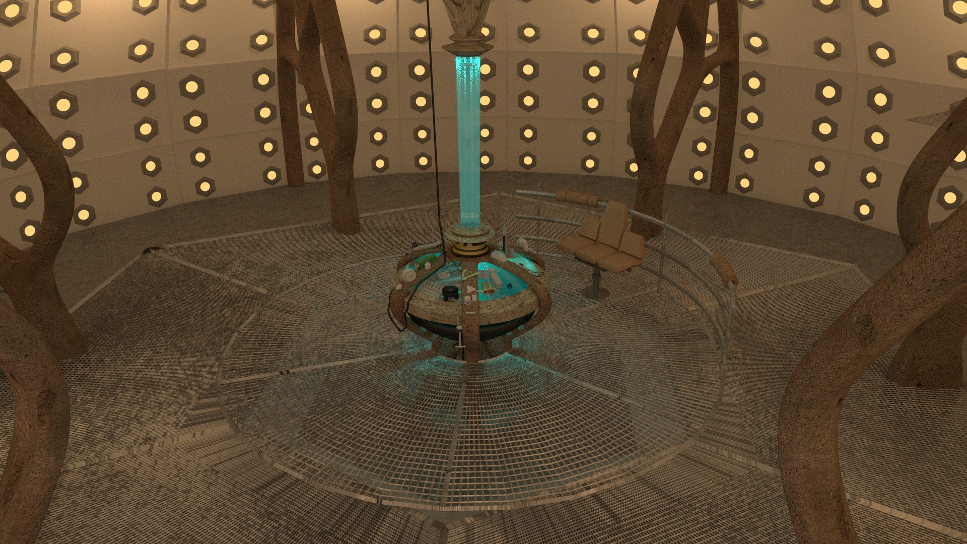
there is no picture. Also I noticed your attempt at a bigger on the inside effect…Will you be resizing it as its really squashed. Also the room/walls looks abit oversized for the console, maybe scale it down a smidge.
Thanks for pointing that out, tomjayy94.
What about my bigger on the inside effect looks squashed, all I can see is that the hight and width of the image could be changed up a bit, and I don’t plan on fixing any of that stuff. I’m going to be completely redoing it later, with an animation and hopefully a tenth doctor sculpt that I just started this morning using a base mesh that I got off of blendswap.
I have to agree with you on the walls and stuff looking a bit oversized.
I changed the scale of the pillars using what looked like a good size for the floor as a reference. I’m going to wait for some feedback before I continue because I don’t want to model the wall just to have to redo them again (for the fourth time).


Please give me your feedback on the new sizes,
Thanks in advance.
That still seems too wide to me. Try scaling them in on X and Y a bit. It’s still too big, I’m sure of it.
Do you mean the floor and the pillars? Would it help for me to get rid of a bit of the top portion of the pillars?

Nice, I’m guessing your going for the look of the actual studio? How did you make your walls? And I guess I need to add some wires all over the place, It really adds something.
woops! it uploaded 3x I can send you a copy if you want soo you can have a look or whatever :).
Copy of the model? That would be great. I’m very curious how you did everything. When did you start working on this?