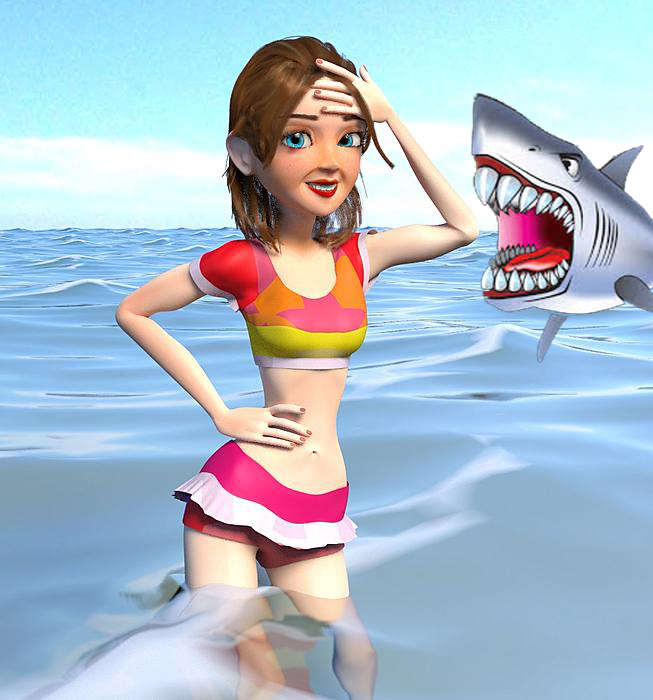
Hi guys  . Here a work I did inspired on a vacation. How can I improve? Please feel free to criticize. (Maybe the model’s cheeks for example.)
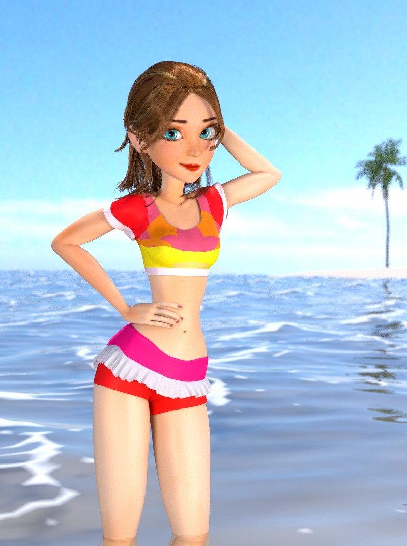
Blender Cycles. 50 samples
Edit: New image
Hi guys . Here a work I did inspired on a vacation. How can I improve? Please feel free to criticize. (Maybe the model’s cheeks for example.)
Blender Cycles. 50 samples
Edit: New image
hey mano
like this 
no seriously, she is really cute.
the colour of her ears, face and body are three different tones, maybe a little more even.
the two lines on the sides of her mouth seem to make her grimace instead of smile, maybe soften them quite a bit.
keep it up, looks like it can be a fun scene.
shaun
Hahahaha XD . The shark was well thought out. Thanks @Speed7. I will follow your recommendations and update the image. I’ll post even today
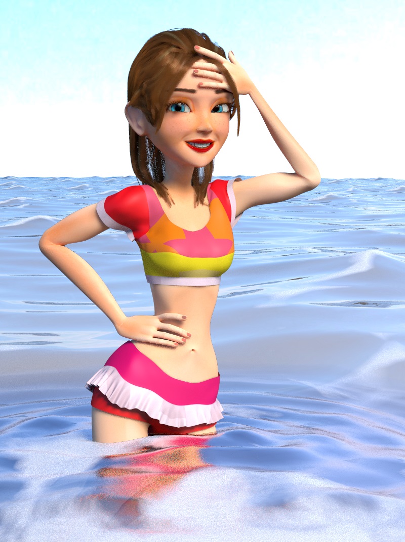
Here the image with the edits. I think the two lines on the sides of her mouth must be even more smoothed.
The pink on her bakini top is futia? lone single. Toon water looks like she’s in my glass. What did I say?
Thanks for the tips @@Smokey :eyebrowlift:.
Really the water looks like glass. I’ll edit.
Sorry but, what does mean “futia”? I did not understand. 
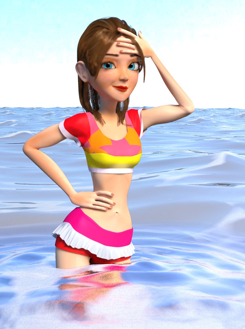
Ahhh. The futia color in bikini top is lonely. I edited a little texture. Put a foam in water and edited the hair. Here is:
Sorry no spell check ‘fushia’. Like a down ward arrow, were not getting any younger you know. A to be young.
The comment on the water was ment in a positive way, water I wouldn’t mind swimming. Yet the newer reflection could be blured some I think. I like her.
Nice work. Put a bit more time and tweaking into this and you have gallery stuff!
c&c: The composition could be a bit better. There’s nothing else in the picture that should be in focus except her, so put her in the centre, not to the left. Otherwise you could put something there like a little palm beach. And please, don’t make it another shark as a bad guy, been done to death, literally. We kill more sharks in half a day than they kill or even injure in a year, and I dived with plenty of them.
The colors look a bit washed out, not a whole lot of contrast. The background sky seams a bit sharp for the eyes. If you have troubles with the lighting, you can use composite nodes to try and brighten it up a bit. Suggestions: make the sky more a real sky with soft blue colors (a (different) HDR(jpg) environment texture perhaps?), less saturation, a bit more contrast. Right now it’s a bit difficult to see volume in her figure, there’s one edge of shadow and the rest is fairly the same light color.
Maybe less energy for your lamps, I don’t know… You could tone down the highlights by using one or several composite nodes under the “color” category. (color balance is a good one for this, try it  )
)
I assume you’re using cycles, have you tried mixing a simple diffuse and glossy shader and use a fresnel/layer weight as the mix factor input? that way the edge closest to the light will have more gloss and maybe helps bring out the volume a bit more.
As for the model itself: there is some pinching in the elbows happening. Not really a big deal, especially troublesome if you have an animation rig and don’t want to be stuck on getting every single possible pose to look good, but for this single pose you could tweak the elbow and arms to maintain their volume a bit more.
Her ear looks fake. CGcookie has a simple 5 minutes video tutorial (sculptcookie) on how to sculpt ears that will massively improve your ear models.
Please don’t take all this the wrong way, I’m very tired, so maybe my crits&comments seem a bit chaotic. It’s obvious you put effort in this and you have skill, make it shine!
Regarding composition, someone studied classic portraits, and found something in common: one of the subjects eyes was always on the centerline. There was no particular preference for which eye it was.
Good composition should lead the viewer around the image. The eyes of the subject is where the viewer should begin that journey. In such a simple scene, you don’t have too many elements to direct the viewers eye: the horizon line, the arms, the water.
Try moving the horizon line up or down to see whether you think there is an improvement. Right now the horizon line directs attention at her neck and shoulders, which is kind of ‘meh’.
The arms are directing attention to her head and her hips, always a good thing, but the fingers on her right hand might be a problem: her left hand fingers are slightly bent, directing the viewer around her waist and hips, but the right hand fingers are straight and pointing at the sky, and nothing up in that corner to direct the viewer back into the image. You might want to re-pose the hand so those fingers are pulling that lock of hair away from her face, thus having her fingers bent and pointed at her head, instead of the sky.
Water color gets less saturated in the distance, more saturated in the foreground. You can use this to saturate and darken the water about her legs, giving a bit more contrast there, and you may want to try a little wave shape in the bottom right hand corner of the image, to catch the viewer’s eye and push it back toward the center, should it stray down there. You already have something similar with the wave shapes on the center right side of the image, and putting a bit more on the right means you could move the model to center her left eye, which is the eye with the most contrast, so should probably be the one in the middle.
The elbow pinching does need fixing. I really like what you’ve done with her smile. It seemed forced in the earlier versions, but now is quite natural and warm.
Thank you @thelowlander. I just saw your recommendations and I will try to apply all  .
.
A doubt @Orinoco, the “centerline”, where one eye should be, it would be a vertical line on the center of image?
Hahaha, @thelowlander. The shark was not my idea XD.
Yes, exactly right. ![]()
The hair texture is more interesting in the last image but we now clearly see the strands since the sky color show betwine them. Its easy to fix in postwork using an hair brush, picking the color from the hair to paint where the sky come through.
The face expression is very cool.
The hand/ finger proportion feel a little wrong. I feel like the finger must look slightly longer compare to the palm part.
It is nice, though the character looks more like a cartoon as opposed to a model (or maybe you meant model as in 3D model as opposed to a more common fashion model).
Anatomically, the knees are a bit large in proportion with the elbows, but the water distorts that so I’m not sure if that is visually accurate.
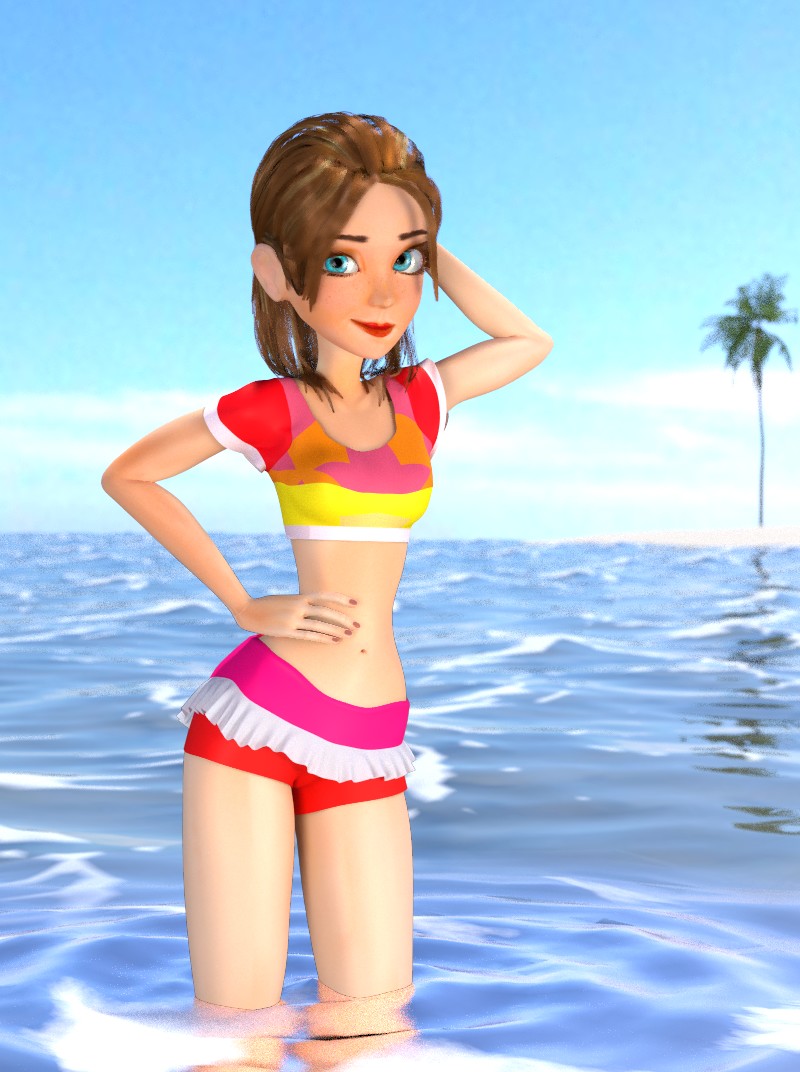
Thank you very much @@Androol :). Here the new image:
Starting to look really good, the face especially.
Shaun
SWEET! I like it a lot.
