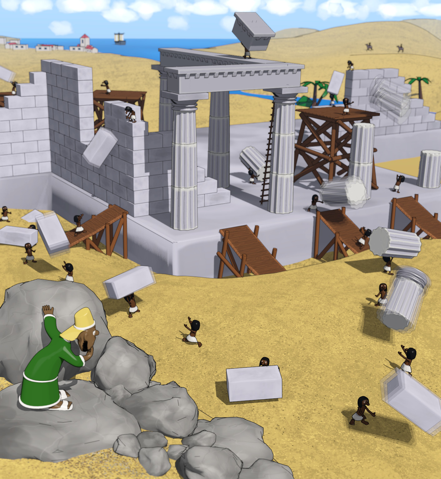
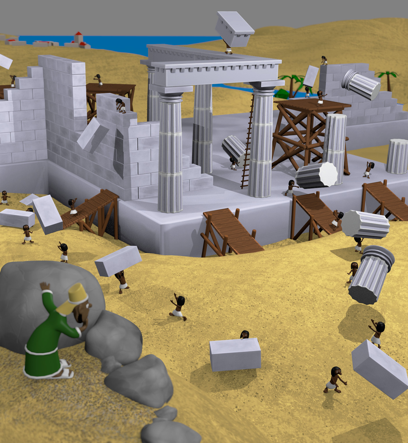
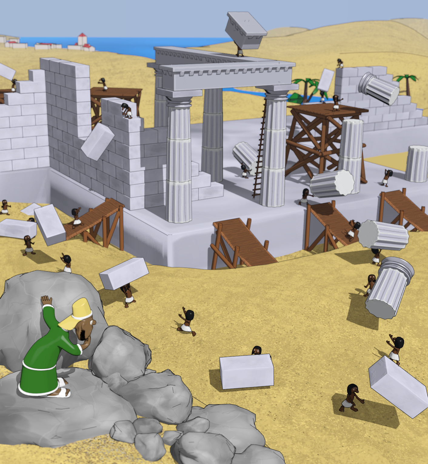
Here’s my WIP for Blender Guru latest Competition, taken from Asterix and Cleopatre comic book, so I don’t know if it’s gonna match the rules, but it’s great fun anyway. My first big scene, not just single model. Final result will most likely be rendered in cycles, but I’m still far from it, so any suggestions are welcome, not only about rendering but also modeling, or workflow in general.
Still haven’t finished all modeling, have to model the dark character and the hill in down-left corner, scaries me cause I haven’t been modeling any character besides the workers yet so I’m painting textures for now and runing away from it for now.
Thanks for comments
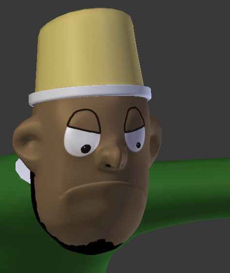
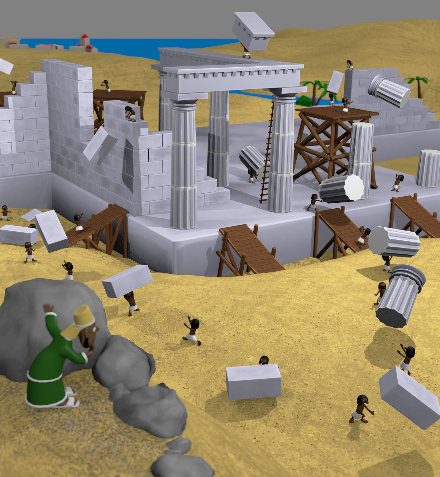
Modeled and painted the face of a bad guy.
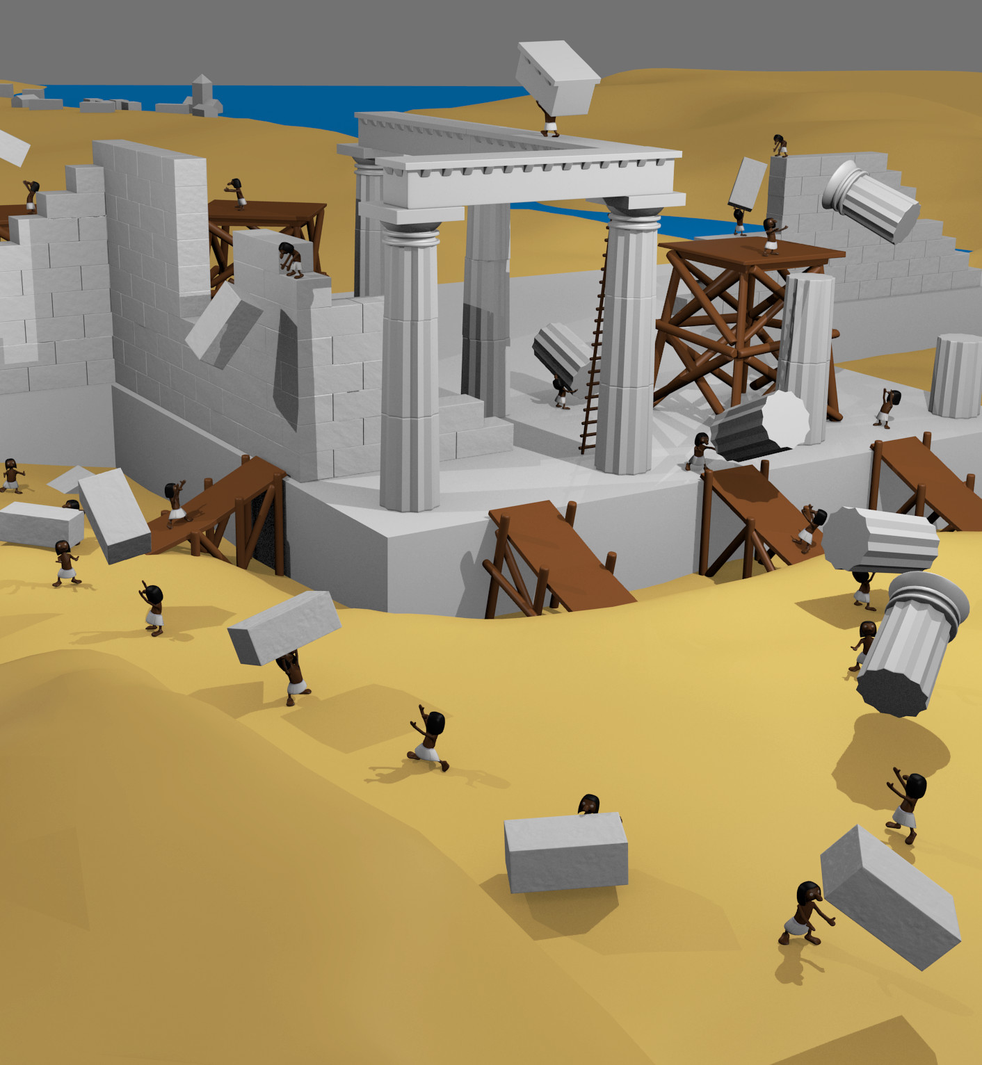
Almost all models ready, all that has to be re-done is re-done I think.
I’m near to polishing the scene.
I really love this scene. One of those ideas I wish I had thought of myself. Great work!
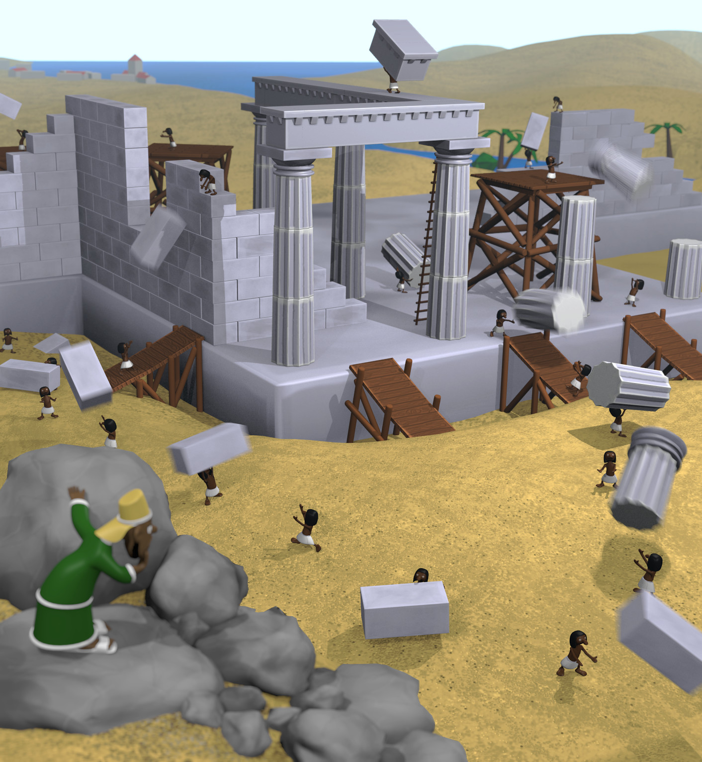
only crit: the block in the bottom right corner does not seem right, it doesn’t look like it is being thrown to the next guy but off the screen. Have you thought about adding motion blur to the blocks to help the viewer get a sense of movement?
Yep, I’ll add motion blur to moving blocks, but it’s the thing still to be done, I’ll check the bottom right block next time I open the scene, but it’s finished for today
Any idea how to make stones surrounding the bad guy look better? I’ll add more of the small ones, cause now it looks extremely unnatural, but what else? Any suggestions appreciated
Maybe add two new displacements to each of them, one larger and one small than the original. I would get rid of the bump map as well. It does not flow with the rest of the scene IMO. Also take care where you have rocks intersecting each other.
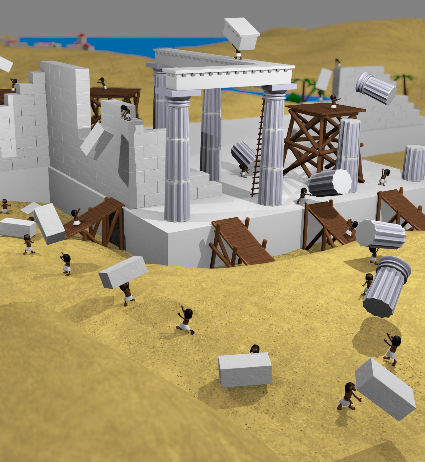
Can I first say that I love this idea, looks really great so far! If you want suggestions on something else to do, perhaps try adding some motion blurring to the masonry being thrown around? Might make the image look a bit more dynamic
Added long-awaited motion blur, really pumps up render times, cause vector blur from compositor sucks here
Also some mist, but I’m not sure if that’s gonna stay this way.
Motion blur and mist make scene more realistic, and I don’t know if it’s not doing bad to the cartoony look. Gimme your opinions.
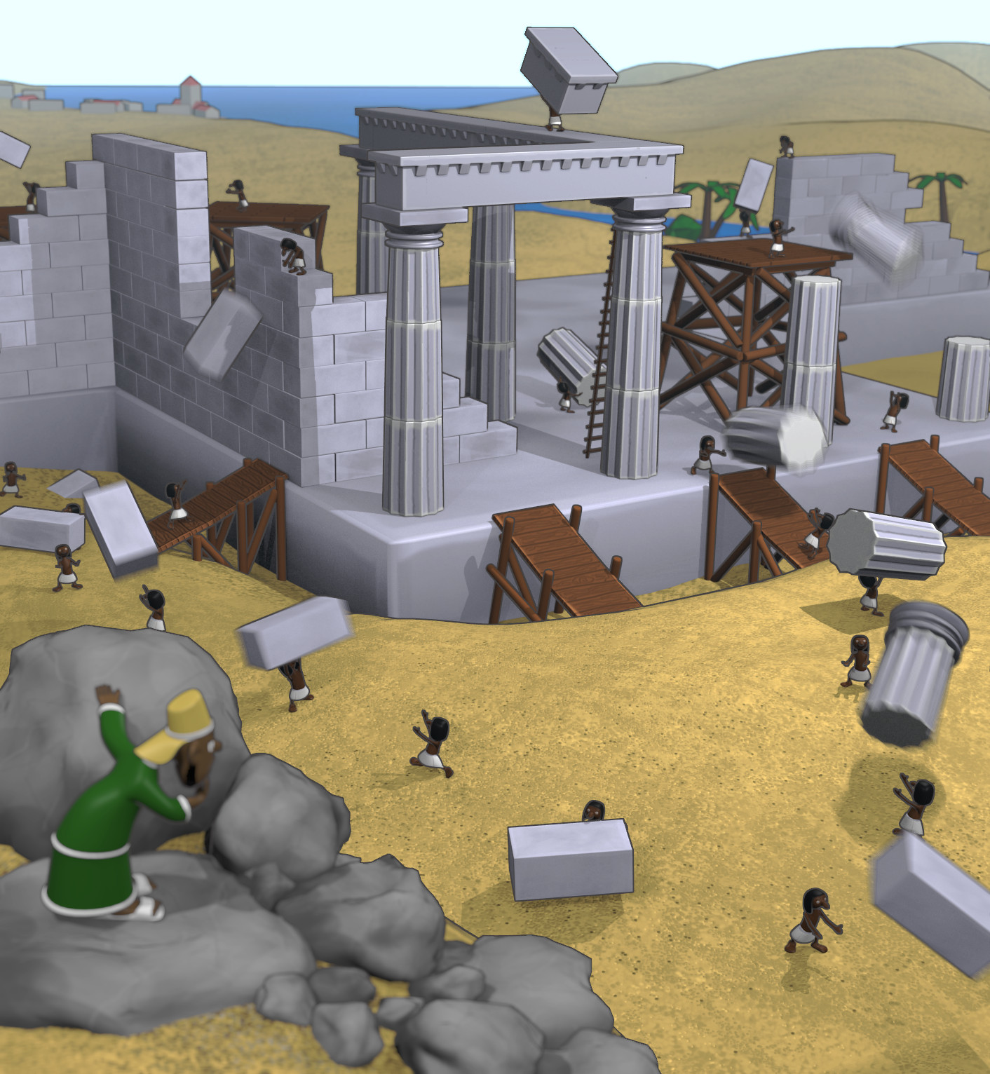
Another option to make it more cartoony would be freestyle, but I haven’t used it once so it could be quite adventure to try it. Here’s test render with edge option from BI that i think already looks quite OK, if I tweaked it in freestyle it could be awesome
Haven’t been doing anything for a while, but latest humble bundle was just too good
Added freestyle, changed lighting, fixed some things, I’m nearing completion big steps