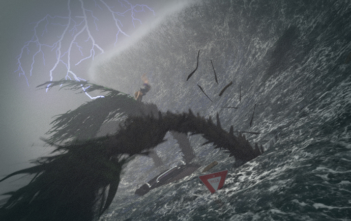
#12 is the best.
yeah… i think post #12 is still better,
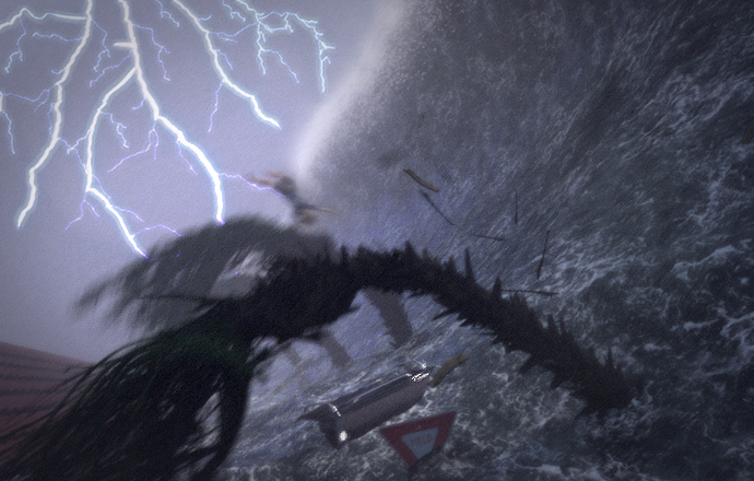
although the latest one also looks good… if you show it to like some random bunch of people on the street they’d say that it must be taken from a mobile camera in 2008. they won’t even doubt that its fake.
but the post #12 one looks more dramatic and kind of movie like. that to the 3d community is a priority.
I’m going to have to agree with everyone about #12 being the best. I would revert back to that (assuming you still have it) and just change the color and brightness of the lighting. I’d say don’t have it illuminate the actual scene, but illuminate the clouds around it like in the reference.
One of the things that bothers me when I look at any of your images is the composition. You have a lot of beautiful lines that could lead to a focal point but don’t. The biggest examples are the wave, the trees, and the lightning. What are they doing? The wave draws a line to the center of the image. The tree’s do the same thing. The lightning draws a line down from the top of the image to the bottom. All of these could be moved (carefully) to focus on something, maybe a house being destroyed. Basically to help focus on something. If you haven’t already, you should watch Andrew Price’s composition video.
Hope this is helpful.
There seems to be a consensus on #12 being the best one…but I really like the glow coming from the water in #19.
@harley. Thanks, what you said is really important. I was focusing way too much on the lightening when this an image about a big wave.
@cergina, thanks for the opinion.
@prana, appreciate the vote of confidence, and the explanation as to why.
@tardismaker. I do have the old versions. I’ve screwed up enough scenes to know it’s important to save version (and renders) under different names. I went back to version 132, which is post #12. I’ve taken your notes to heart and I am experimenting with having a person flying through the air as a focal point. I just worry that I’m jumping the shark. I have watched the Price composition video, it’s helpful and I have recommended to few other artists with saturation issues.
Great Job Photox
Thanks spanishrose. I added a tiled roof on the left. I feel like there is so much chaos in the scene that a little bit of symmetry might contrast it better. Heavy saturation vignette
.
How did you get the motion blur on the trees?
There are 4 major forms of blur used.
-
Motion blur in blender. I am rendering frame 5. Frame 1 and 10 have location/rotation keyframed for the trees as a whole, and for individual fronds. I think shutter is about .7 in this one.
-
The gaussian filter is changed from 1.5 to 2.7 this blurs/aliases everything more.
-
In the compositing nodes I am using slight glare/blur
-
There is a photoshop layer with 10% opacity that had the motion blur filter run on it for about 8 pixels. That gives more of a shaky cam look.
I tried to take the best elements of #12 and work in some new ideas. I modeled a half of a fiat, and put that in. The tiles are more prominent. How about the crows, are they too cliche?
Click for higher resolution
I feel like you have too much going on at once in this now and its kind of taking away from the scene. I would remove the birds, the roof and make it so that the kid is moving in some way instead of standing there staring at it.
Same opinion as Star Wars, even if i don’t know what you can put in place of the roof. I think the house could be better if you let see more of it: windows, terrace, part of garden, maybe a couple other house behind it, all this widening the image; however it’s a lot more work… you can try adding some clouds behind the lightning, don’t forget to modify the step size or may have extreme render times.
[double post… I would love if this forum allowed me to delete post  ]
]
yeap I agree by far the best render so far for me too.
Like others have mentioned, I don’t think the crows work… I would lose them. I think the changes you made to be able to see the car better works real well.
I’m completely thinking out loud here, but I wonder if you placed the character crouched down on top of the roof, like they moved to the highest area they could find before the tsunami if that would work? You could then further move the house up higher showing more of the sides… but you would probably need to … brace yourself Photox… lose the lightning all together 
The character works fine right where you have him now, but just an idea I guess.


