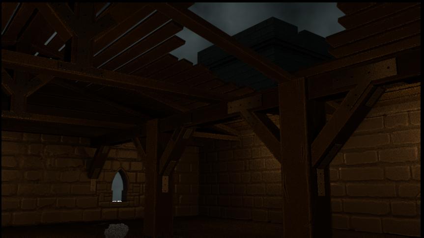
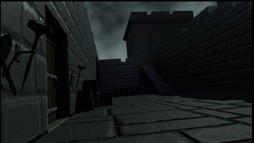
-Everything is very dark. Can’t almost see anything. Well, the lighting might not be realy final so you could ignore this.
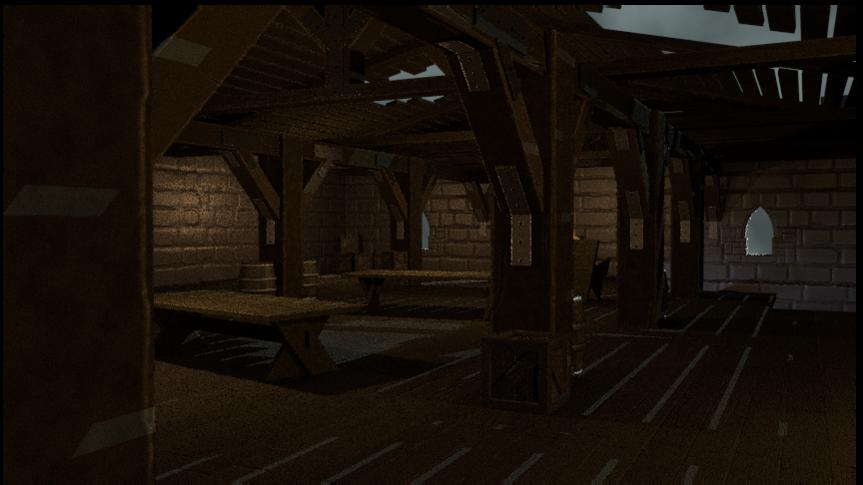
-Repeating texture. This is very obvious in the pillars, they are all identical
-Texture scale is wrong. The blocks is way too big. In my estimate, one of those smaller blocks is about two feet high. The wooden beams also suffer the same thing.
-The pillars in the front really need to have more details. They are very close so they are subject to more scrutiny. You might want to sulpt them too.
-Wasted effort. You scultp lot of details to your characters. The clothing, the weapos and all… and did you do? Put it at the back. It is barely dozens pixel tall in my monitor. If this is what the final composition looks like, then all those sculpting and awesomeness is wasted.
Oh! By the way I assume that you are making a still image. Is it?
I guess again I have problems with the exposure and gamma. Gonna make few test renders and post them tomorrow. Lighting is far from final.
Main focus of this project was to explore modular low-poly asset creation(among other things low-poly). Most textures repeat for that reason.
3.Scale is pretty accurate, with the note that I intentionally made some of the assets slightly bigger to avoid any realistic feel to them. Perhaps the camera angle and the focal length leave such impression.
Edit:Ah, I think I know why you assume that the scale is wrong. If you are referring to the image with the yellow proxy mesh, there is a tangent forming with the pillar. I got the same impression as well. Will work on that also further down the road.
4.You are right. Actually everything you see was sculpted but I intend to add some more ‘damage’ to 1 or 2 pillars. They vary along the X and Y axis so rotating a few should help.
All those renders are made with low samples just to preview the characters, which are also quite low-poly.
All those assets are for an animated short.
Thank you for the feedback. I will double-check few things anyways.
Uhm. It is not just gamma and exposure. It is the lack of light. This is rectified in your latter images.
Okay. You didn’t tell us that.
Nope not the pillar. I base it on the ledge he it was standing on, assuming that he is 6 feet tall.
I would like to see when it is done.
This is on assumption that you are making a still image.
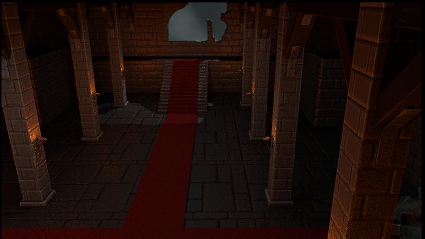
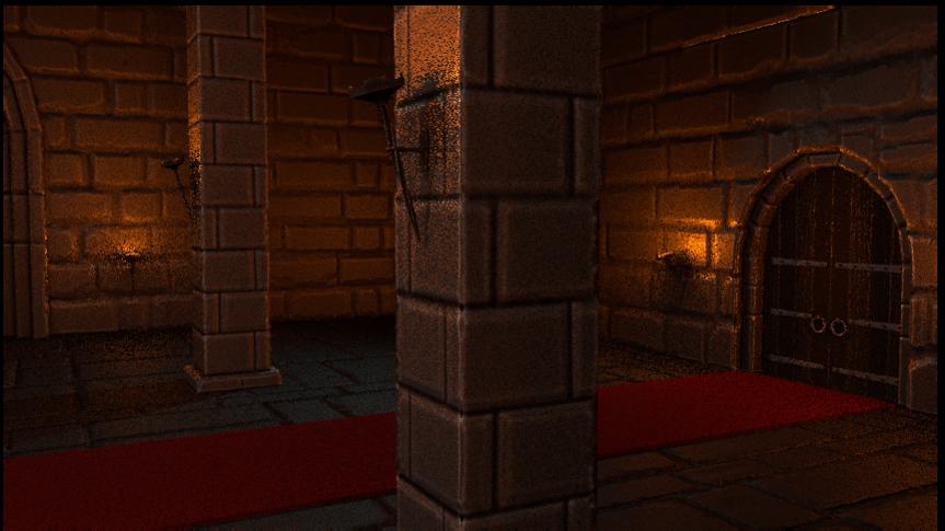
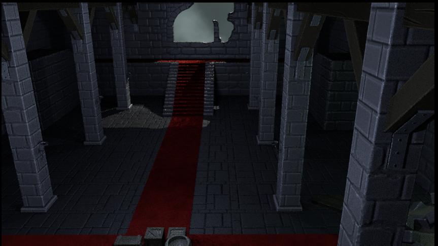
Crit on new images.
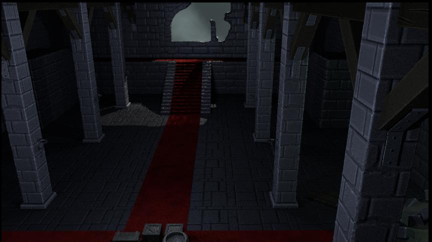
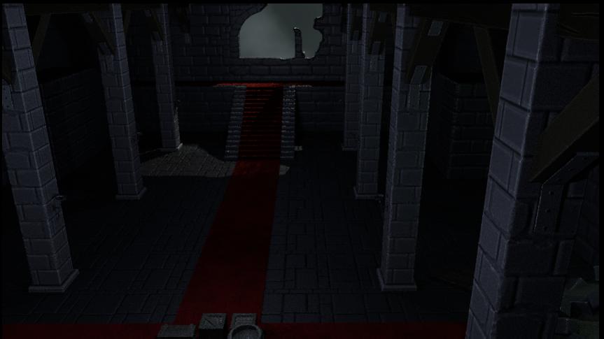
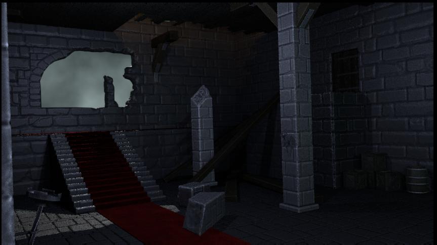
I think the carpet is unusual. Such places (and time) should not have those kind of things placed there.
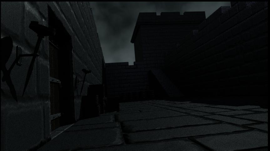
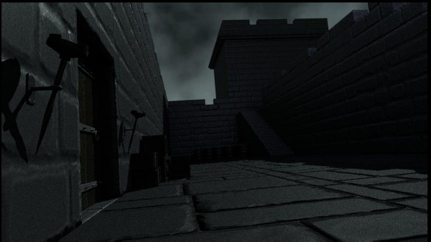
Again it is not the gamma or exposure, it is lighting that is the problem here. I say the scenes look to evenly lighted and contain too obvious light sources that logically should not be there (except for the torches even if there is no fire as I see them as tests). The third set especially has that white light with no obvious reason as to how it come to be (don’t say moon).
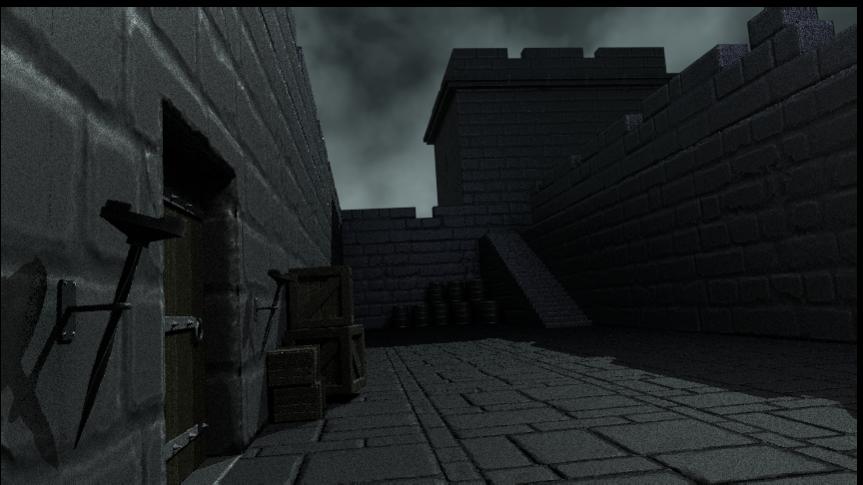
The stones are too shiny. They look varnished.
The first and second set of images appear to have no roof. Is this intentional?
Did some tweaking. Changed the mapping on the stone floor. I think they look better(not so large now).
About the carpet, it is placeholder. For some odd reason I enjoy the red and blue colors or the combination of both.
About the lighting, I agree and actually it is something I thought about a lot.
-If you want to talk about realistic light sources you wont be able to see anything because this is supposed to be some fantasy medieval time where flashlights did not exist. So if I don’t place some temporary lights the interior will be pitch black.
-I started with the fact that except fire and natural light there wont be any other sources of light. That is the reason why I created the damage on the roof and on that stone window, so there is more light coming inside the interior.
-About the stones, will check the glossy.
-About the roof, I am currently working on it. I want to look ‘damaged’ so more light can light up the interior and perhaps create some interesting shadows.
-About the human scale, it is the camera angle and the ‘tangent’ forming between the human and the pillar.
Maybe the overall lack of light is because of the image texture I use as a background. Will look into it. In general I will want to either create a cloudy sky using ‘volume’ or somehow I will need to fake it. Or perhaps the way the site compresses some images. Will continue testing.
Thanks for the feedback. Keep it coming. Tell me if they still look very dark.
I should have made myself more clear about the lighting. What I mean is that those extra lighting have become too distracting. The second set for example, the pillars cast horizontal shadows from seemingly no where. There is also strong up lighting (light pointing up)… or so it seems. And the pillars being to most well lit in the place just looks weird and out of place.
It is also not becuase of the lack of light, at least this time. Its the way you light things. I will try to elaborate later.
On new images.
But first, please don’t be afraid of the dark and the pitch black, especially here. Don’t always try to eliminate them. You don’t have to light up everything.
Also are you using Blender internal for rendering?
Again your lighting is a problem here. This is most extreme in the second image. Here the wall is reflecting light from seemingly nowhere creating this distracting specular highlights on the wall. The table and pillars is also casting strong weird shadows from a lightsource that isn’t there. Those shadows look ugly. Those issue also appear on the third image albeit more subtle.
If you really decided on using these lights (point lights is it not?) or eliminating dark areas then maybe you can try some of these:
-turn of specular highlights from your extra lights. This would remove those ugly specular highlights on the wall.
-use soft shadows on those lights by increasing sample and softsize. That would make the shadows soft and more subtle. You may even just turn off shadows so these lights cast no shadows.
-decrease their intensity so they don’t become too overbearing.
-use ambient occlusion if you haven’t use it yet. Try decreasing attenuation distance so it would illuminate everything more uniformly.
Though I should say the first image looks good. You just have to use softer shadows for your light. With such cloudy skies, it would have diffused the sunlight of moonlight, unless it isn’t sunlight or moonlight.
Thanks for the tips. Will definitely try to implement some of them.
I don’t want to get rid of the pitch black darkness, it is something I am looking to incorporate in the animation. I am trying to light the interior so it can be seen what has been done so far but most importantly resolve the issue I have with the exposure and gamma.
Agree about the light. Where I live, currently the sky looks almost exactly the same as the background image. Shadows are extremely soft. Right now, I am using light fall-off node to smooth it out.
Anyways, I am moving my focus to rigging and animation. If I spend more time on lighting it will be time wasted.