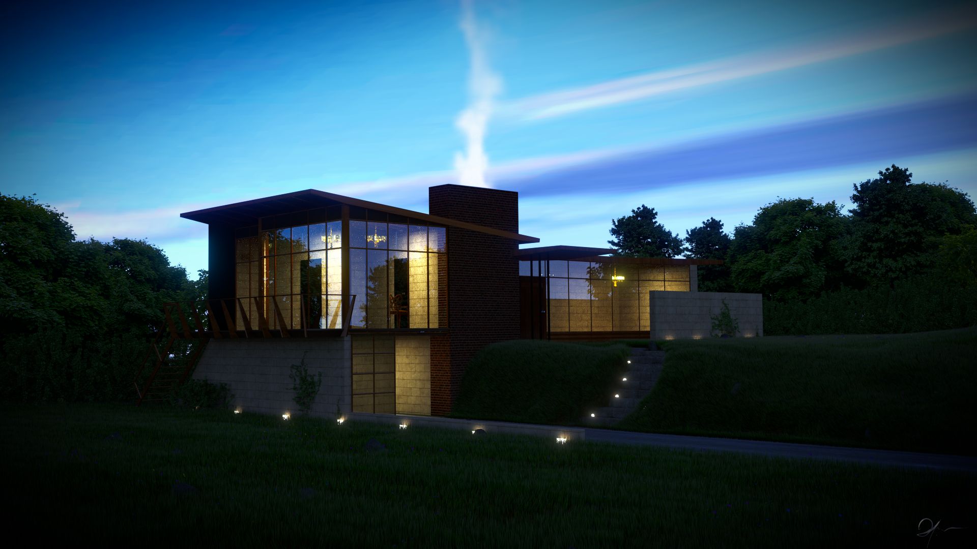
I think that the shadows are to dark
i did that be consistence with the other shadows, no?
should be a bit more reflection especially from the driveway
i wanted to add some but then it’s an old asphalt.
The bricks around the chimney look a bit to dark to my eye
if you mean the stairs, then it is not just your eye but mine too.
The shadows look to even without sky fill etc.
the lights does have a sky light, except for the tree as it is composite-d, i’ll add a hint of blue on it -iAw-
Looks great, but the thing that really stands out to me is the grass on the hilly spot not pointing straight upwards. in the particle tab, just change the normal emission to 0 and the z emission to whatever the normal was. You probably already knew that, just pointing it out.
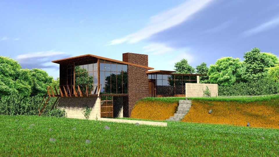
the new trees look a lot better now!
Also I think it would look a lot better with something in the background (hill, mountain, etc)-just an image would be fine.
just pointing it out.
i tried before to make the grass normals all head up (using the normal entry) but it didn’t work, i even searched of a way to tweak the hilly spot normals but couldn’t, so i improvised:evilgrin::
-ranked up the grass number to cover enough
-used a weighted vertex group and gave the hilly a setting of 1.0
-gave 0.1 to the other areas
so thanks, i’ll try it. -iAw-
Also I think it would look a lot better with something in the background (hill, mountain, etc)-just an image would be fine.
true, but i don’t want to block the horizon, as too many thing may spoil the composition, i try it too -iAw-
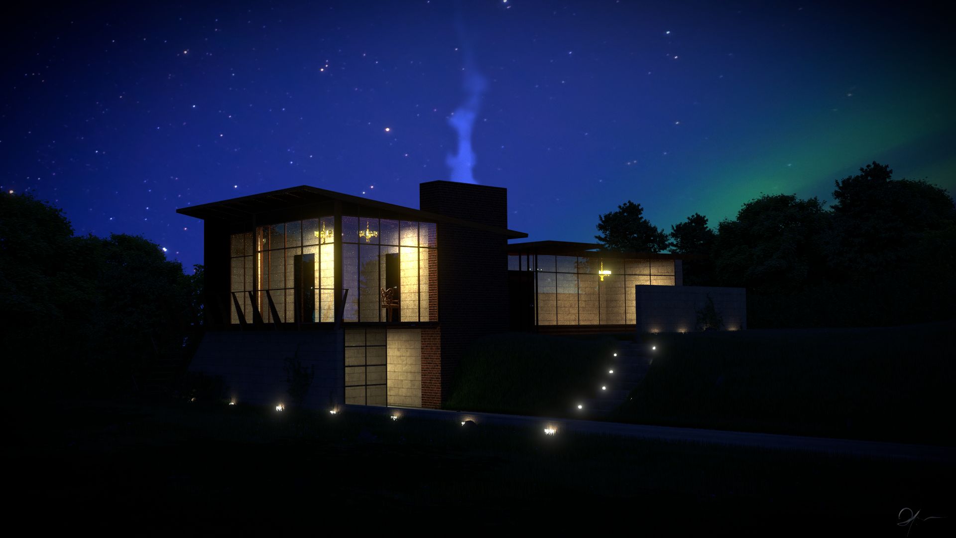
I love this shot, the grass in particular is gorgeous… I think your chimney stack bump might be inverted… and the grass is a little too long IMO… Nice composition overall
the only thing that bothers me is that the reflections on the windows in the night scenes seem to be too much!
lower than this would eliminate it, it is already very subtle.