Very cool! I can’t wait to see it colored up, don’t forget about a smooth Fresnel falloff for the car’s paint ![]() Also the details are a bit blown out due to too much light.
Also the details are a bit blown out due to too much light.
It looks good so far, keep up the good work!
Very cool! I can’t wait to see it colored up, don’t forget about a smooth Fresnel falloff for the car’s paint ![]() Also the details are a bit blown out due to too much light.
Also the details are a bit blown out due to too much light.
It looks good so far, keep up the good work!
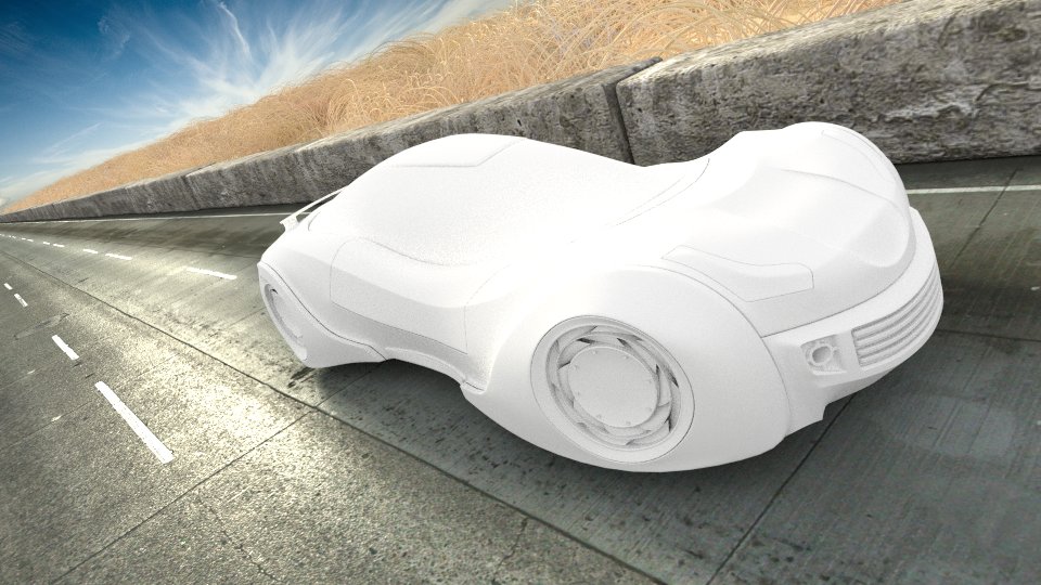
Added a cool sky and some desert vegetation…
Thanks for the tip ferrettank… I’ll definitely add fresnel to my reflections after doing some researches on google…
Almost finished…
Cheers!
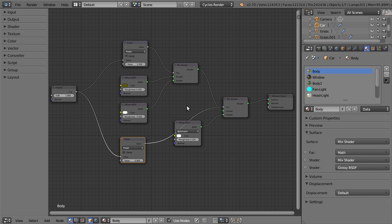
Ok, so I spent some time learning about the fresnel shader and I decided to adjust it to my needs. I figured mixing two diffuse shaders (one white and other with the material color) with fresnel results in very good looking objects, as opposed to mixing just diffuse and glossy with fresnel, here’s my shader for the car’s skin:
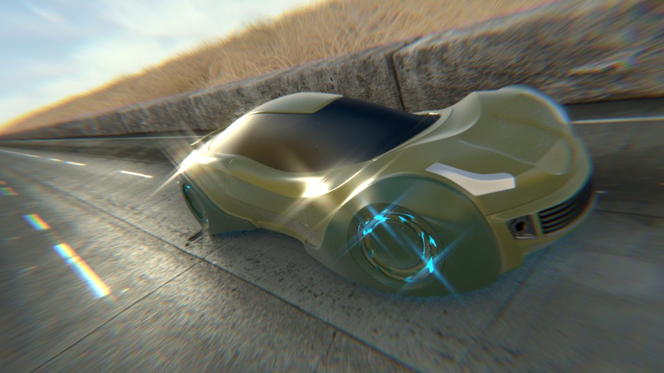
And voilà…
It’s amazing how Blender Cycles allows you to add reallistic lighting to your scenes without even breaking a swet. It’s just out of this world!
I’m playing a bit with photo-realism in this pic, I think it looks good… now, if I can find a way to add reallistic sun flares, I’m done… :yes:
Good day!
Looking very good so far… I like the blue lights behind the wheels, they fit the car nicely.
Have you tried using object or material passes on your render? this gives you greater control over the composoting nodes by allowing you to add filters etc to individual objects/materials, rather than them influencing the entire image.
This explains it better than i can lol. -
http://wiki.blender.org/index.php/Doc:2.6/Manual/Render/Cycles/Passes
You might have overdone it a bit with the postpro effects here. The basic render looked really cool though
Looks good! although next time, compositionally wise, I would make the focal point, more saturated and brighter then the background. Right now my eyes want to look at the clouds. Remember not to over saturate everything either, it makes it look to CG 
Keep up the good work!
Thanks for the critic… first time trying barrel distortion and lens flare, I’ll get it right the next time…
I’ve done this in the final pic I think… I’ve darkened the corners and left the center bright… I’ve also removed much of the saturation to try to make the image look a little more pale… in other words, I’ve tried to make shadows darker and bright areas brighter, for a better composition. But I’ve still got a long ways to go regarding color correction.
Thanks mate, it’s cool that you find my work good, I’ll definitely try to keep it up! : )