How does this look?
Hmm, there are issues with virtually every aspect of the piece. I think you should go back a few steps on this one.
You’re a writer, so do an exercise and write a short paragraph describing this scene as you want it to be, not as is it per se. After you’ve written that, go look at reference art in the style you’re after. Pick out 3 - 6 images that capture the style you want. I think you mentioned one, find a few of those that really strike you. Post your paragraph and the ref images you choose, and we’ll talk about some concept art and rewiring some of what you’ve got. We’ll probably scrap most of the materials and go for clay renders, with test lighting. It’s a lot of work, but that’s how solid art get made.
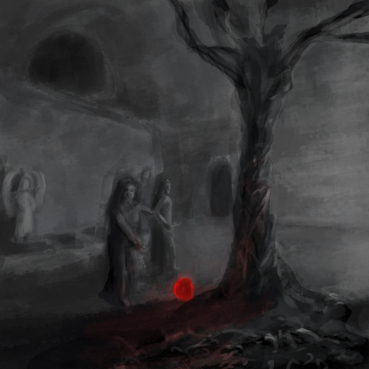
Another idea is to just use what you have as a base for painting over in photoshop. I forget what it’s called (A marquette?) basically you run some filters on it and then start painting using the image as a guide for shading and color. Here is your current image with a bunch of ps filters run on it. It changes the feel alot. Auto levels, brightness contrast, accented edges, smart blur, saturation boosted.
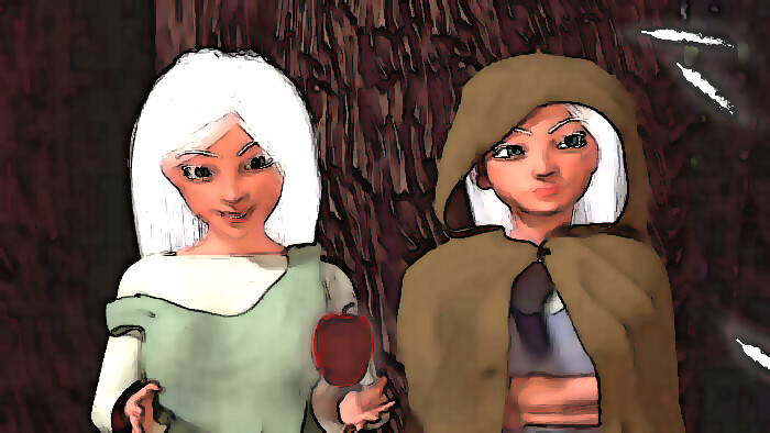
That’s actually really cool what you did there. I really like that. The problem I’m having is to me the scene says a lot, but it’s apparently not translating well to the viewer. It’s actually something I’ve learned in writing, sometimes you just have to delete a scene all together and start over. Trying to rework a failed scene will sometimes just make things worse. Maybe highlighting them by themselves isn’t the right direction, maybe you’re right, and I just need to reestablish a new scene all together. I thought about maybe just cleaning up my original scene. The following photo was actually my first ever blender project. I did try to clean up some of the lighting from the original though.
Thanks
Attachments
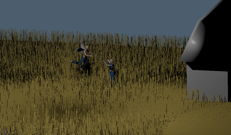
I did a real quick test scene. I thought of maybe a scene using the actual two protagonist. The story actually takes place on a medieval wheat farm. And in its essence it is a love story. So I thought of maybe the two in a sunset in the middle of golden rods ready to embrace each other.
Attachments
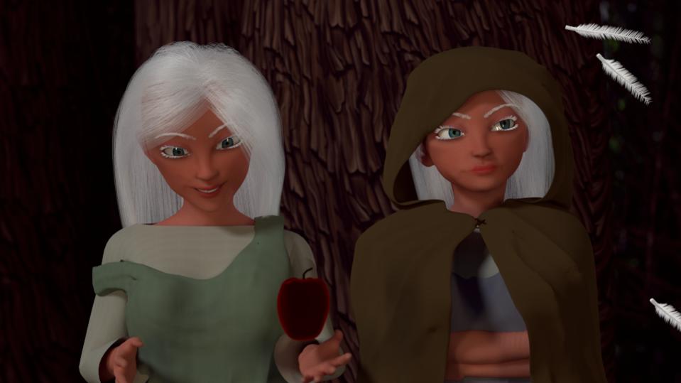
- Lighting is necessary. So necessary.
- The faces, look like, well, Barbies.
- The apple doesn’t look right. It looks way too two-dimensional. Unless that’s your purpose, but it doesn’t look great.
Good luck with your improvements!
is there still a problem with the lighting in that one too? Everyone keeps getting on me about that, but I’m apparently not understanding something about it. Or my screen just shows things brighter.
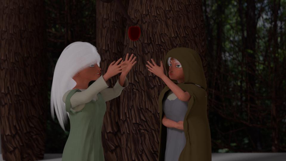
So yes the tree is important, but so is the apple. I was originally trying to use the lighting to silhouette the girls. I was trying to show the girls attitudes in the piece, one hyper interested, one distant and disinterested. So, for growth I’ve lightened the lighting a bit, and I’ve changed the scene a bit to show them both interested in the apple. It needs to be cleaned up a bit, but I wanted to see what you thought about a brighter changed scene.
Attachments
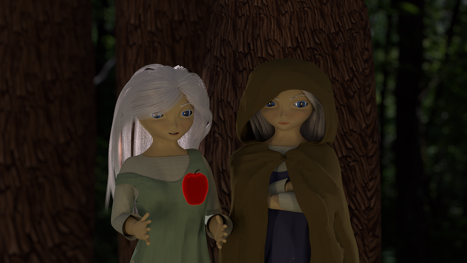
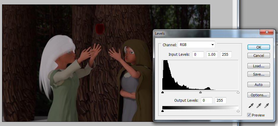
Something is still extremely wrong with the levels. It’s insanely underlit with levels skewed wildly, what’s worse there is no clear lighting source.
Post a screenshot of your nodes for the skin (and the apple) in the above image.
Look how far to the left (black) your levels are. 80% of your pixels are in the darkest 10% of brightness.
The new poses are stiff, unnatural and don’t make sense. Why would the angry one be reaching for the apple? As for the photograph of trees in the background, you should blur it strongly, you can’t just plop a real photograph into a scene like this. But I would like to see the skin and apple nodes.
Here’s one thumbnail sketch
This captures few ideas:
There are one or two angel statues in the background and two empty pedestals the two angels just became mortals. There’s a tree/vine grown through the floor and a glowing apple appears on its dark side when the two are about to leave. One who sees that grabs the other and points at it.
It should show the girls are former higher beings (could add feathers near the pedestals). It captures action, there’s the glowing apple which is on the dark side of the tree/wine symbolizing evil, and the top of the tree gives an opportunity to tie the book title inside the branches/leaves if the image is extended to it or done as a graphic element.
In the world settings, maybe try adding some volume scatter, Look at this tut This way you can give that feather a little something to work with when it shows off its glow.
And many (not all but many) shin shader networks use a diffuse, glossy and a sss. and many of them make use of the layer weight nodes as well.
It saddens me at times to see the amazing things you guys can do, and how much further I have to go.
JA12 - I love what you did there, and the thought direction I could take with it for the title. The scene itself is a little darker than the story would allow. The story itself is young adult and very lighthearted with some intense scenes. My original intent was to just create a simple scene which highlighted the girls. The tree and the apple is a very important part of the story, but I wasn’t really trying to highlight it as much on the cover as I was the girls. They aren’t even the main characters of the story, but everyone who has read it says they’re their favorite. Again I really like what you did there.
Joseph - I’ve actually watched that video before, along with a million more of them. And I was having the same Idea as you for the title. The more I work with you guys it becomes apparent that even though I’ve referenced the manual before. I think I really need to just sit down and read it cover to cover. Youtube videos are nice to watch, but I’m thinking they just don’t cover enough of what I would learn reading the manual.
Don’t worry about that, at all, because there will always be others who do amazing things that one wishes to be able to do, no matter if you’re a beginner or a working professional. If you want to go there and compare your abilities, then maybe compare what you can do now to what you were able to do before. Don’t criticize too hard though, some things take a lot of time to learn and understand.
Thanks but it’s actually quite misleading. The image was supposed to give an example of what I meant in an earlier post about putting ideas down and working in a small scale to do that quickly without going into too much detail. The one I posted is way too big.
What I actually meant was working in this scale, or smaller, and no zooming.
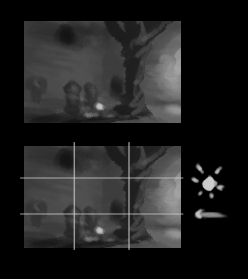
You could make many of these kind of thumbnails to then have multiple options to choose from. The reason to work in this scale is to
- make fast visual notes about the ideas you have
- force to not care about the detail. You can try making the brush size smaller for detailing but it will fail
- force not to care about your drawing ability if you (mistakenly) think that you can’t draw. Wouldn’t do much good in this scale anyway so can forget about that
- keep the focus on the ideas and think about how to place the elements in the scene and if they fit in composition guides, where the light might come from, see where the focus is, camera placement, etc
When you’re thinking about what to show in front of the camera you might see the image like I posted earlier in your minds eye, which still doesn’t have much detail that would be in the final (materials, hair styles, clothes, …). Taking notes of what you see could be done like this.
Once you have multiple thumbnails you could then look at them and see which you like the most. It could work like a preview for the book cover, just that you’re looking at it far away.
Those thumbnails might not make much sense to other people which was what I was thinking when making the “thumbnail” bigger and posted that. It should make some sense to other people if you work on all the ideas at once, but if you just try to figure out where to put the characters and should it be light against dark or the other way around, it might be just some splotches and lines in a different configuration.
To me, there doesn’t seem to be enough feathers if that’s supposed to be a focus of the image.
Perhaps the character on the right can grab hold of the one on the left while they’re looking at the different things to give them a better connection.
I get what you are saying. I find my self going all in and spend many hours tweaking things afterwards. I would be way more efficient if I would step back and start with the thumbnails first. Things I would probably have learned with traditional training. I’ve only started doing serious visual art less than a year ago. Trying to self teach myself everything. So all of your guys feedback is very helpful. So many things to learn. Thanks
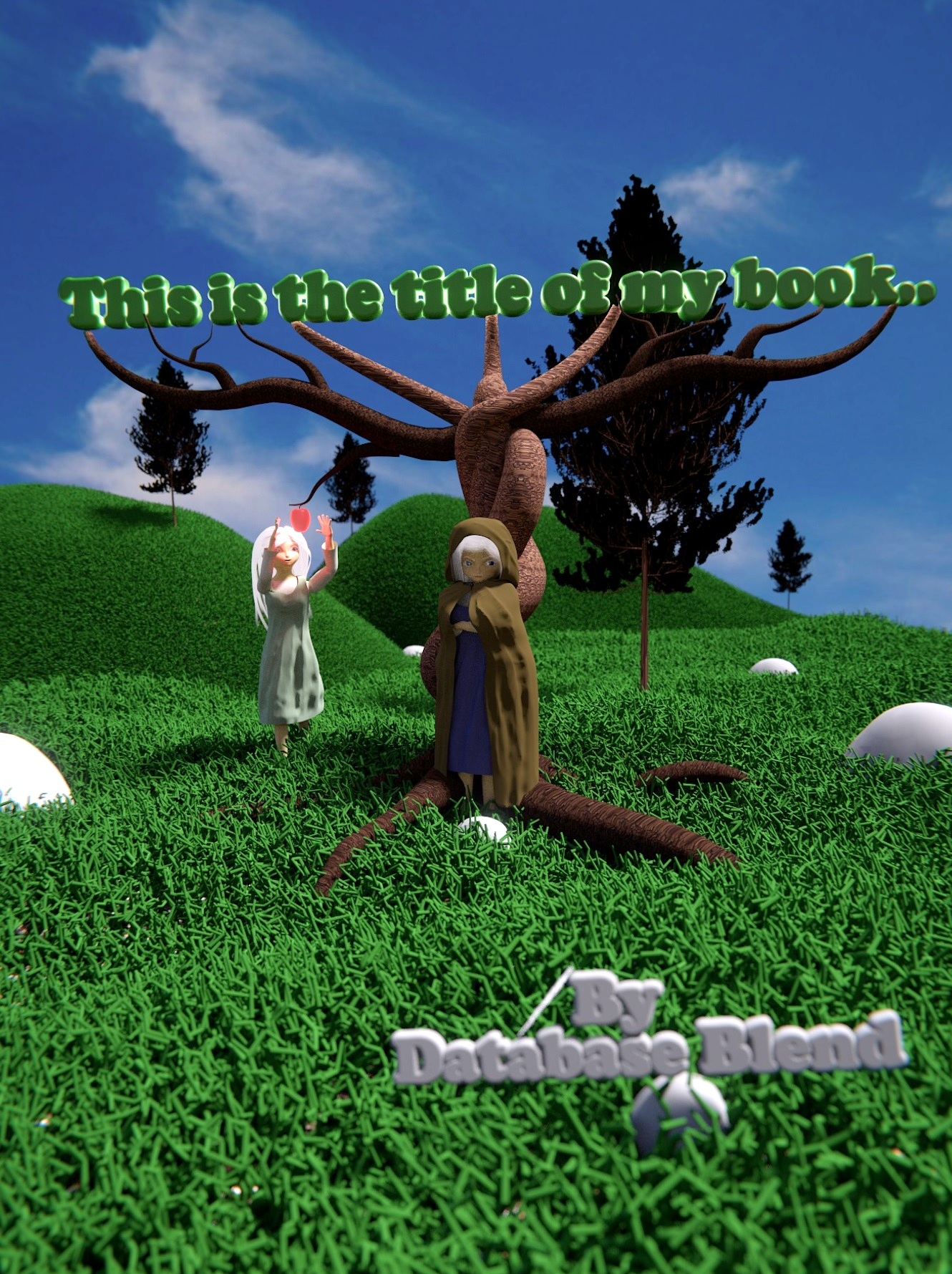
So I went back to the drawing board, and I thought about and drew up several variations of the cover, and this is what i came up with.
A lot of friends and family feel the original models fit the book better, so I wanted to use them instead of my newer models. Using them I felt like making a realistic scene wouldn’t feel right. So, I felt that a stylized stop motion feel would do better for the scene and the book. I really liked some of JA12’s suggestions, so I went with something toward his mock-up, but with a light and airy feel. I feel like I’ve also improved on the lighting as well. There are still some things I want to tweak, but let me know what you think.
Again thanks for everyone’s help.
Attachments
Good job. Don’t know what others think but to me it starts to look like a book cover.
I’ll list few technical and style things that come to mind, see if any are useful to what you’re looking for or working towards
- Uniform grass (color, size, coverage), rounded forms and text font/style make quite a cartoony look. Those and others listed would need some work for semi-realistic look
- Foreground tree and tree silhouettes behind aren’t separated in value, black mixes with black
- foreground, middleground and background separation is not that clear either. Aerial perspective would push background elements more back (less contrast, less saturation, sky color tint for long distances). Reflective light could separate foreground elements from each other
- A photographer would use focal length and position to frame the background and to increase distance or flatten everything in depth. Could test if you like longer or shorter lens better, with a different framing. Having everything sharp could be a thing too
- Tree/vine surface is very smooth, so are the forms. If you want it to look evil, could use sharp/pointy/angled shapes and rough surface texture. Cold color or lack of it could add to that. Or alternatively a very unique color relative to the environment could do it.
- Fabric folds are usually quite smooth unless it’s very wrinkled
If you’re interested,
Aerial perspective https://en.wikipedia.org/wiki/Aerial_perspective
Focal length https://www.youtube.com/watch?v=HG-vPzrEONM
Depth of field https://www.youtube.com/watch?v=8uU9O8c7Hss
Nice improvement! One thing they teach you in art school, is about ‘lines’ of a composition, which determine how your eye flows over the picture. You might look into this for when you are sketching your scenes.
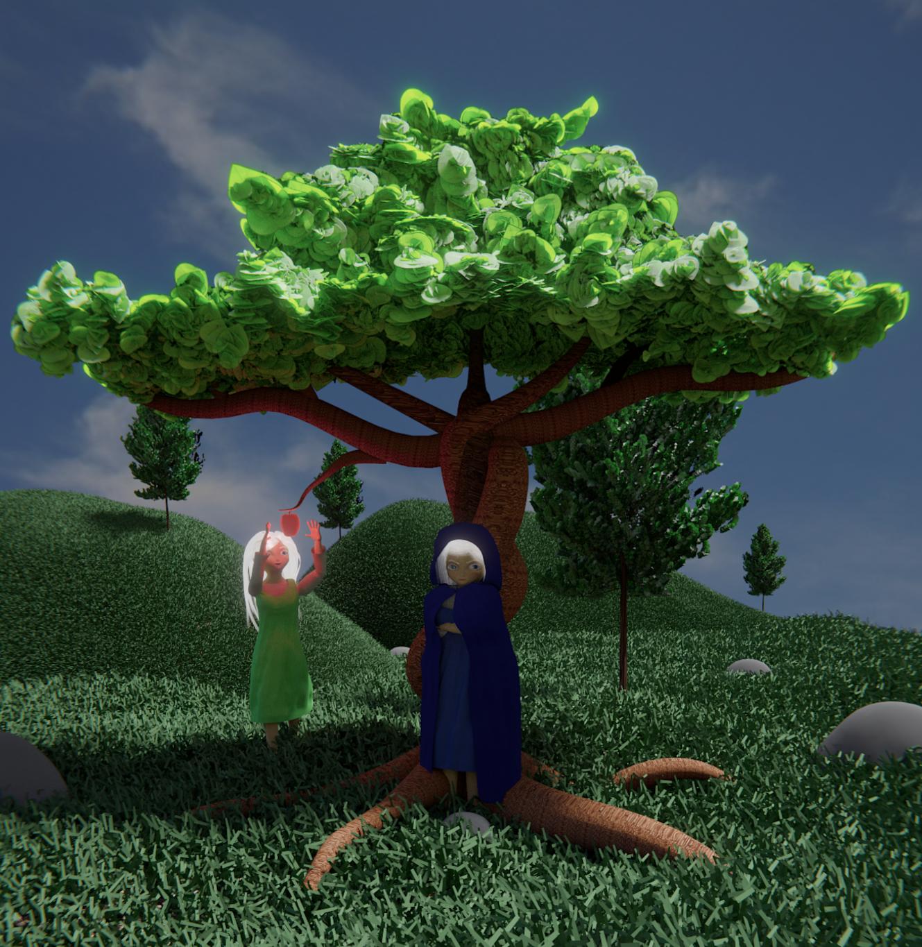
Thanks. So, I really wanted to go the direction of a stylized cartoony feel. The book itself is lighter, and it’s a young adult so I feel the cartoony look will go with it. Think animeish. You have the light an airy feel, but there are also a lot of intense moments. The trees behind I wanted to give a bit more of a realistic feel, because the tree in the foreground is supposed to be very unnatural. I also wanted to dim the colors of everything but the girls, the apple and the tree.
I will work with the camera focus more to give a better depth. So, yes composition, I’ve been trying to really study some of that. I’ve tried to make it so nothing important flows off scene, and I’ve also tried to use the thirds rule with the positioning of the camera. Let me know if you see something that could be improved towards that end though. I even tried to keep in mind balance.
Here is some of where I am now with it. I’ve removed the title and name off of the picture to keep some Anonymity. The Title is now above the tree, using some old English font, and the name plate hasn’t changed.
Attachments
Great work experimenting, it’s definitely coming out of it’s shell now. I’m going to toss out a whole bunch of ideas, and I think by experimenting with them all you can achieve a stronger composition.
- Try a mist pass, this scene goes some distance back and you would get some atmospheric scattering. The objects farthest back will take on a grey purple haze. This is a short tutorial that covers the basics. Mist pass tutorialdd
Here it is embedded:
Because the hills in the distance will be blurred, you can add a simple texture (as opposed to particles) to them and add some more ones farther into the distance. As it is, it kind of looks like the world drops off a cliff. Maybe they are going up, hinting at an enormous mountain.
- This next is one of most overused and is sometime consider a cheap trick: DOF, or depth of field. In a nutshell this puts one point in your scene in focus and objects further away become blurred. Here the foreground red car is in focus:
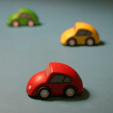
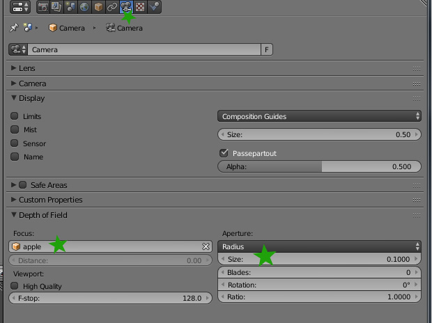
It’s quite simple to setup you use can an empty to control the location, ( or any other object). In your case I think the most sensible spot would be the apple. So just select your camera, go to the data tab (top green star in image) go to depth of field, select the apple object from the dropdown, and then adjust the size. The larger the size value the more blurred distant objects become.
Keep playing with the materials and modeling, in general I think you want more detail, limbs, bark on the tree.
I really like the effect the new leaves have, but experiment with shape, texture, location, they are coming off a bit like lettuce.
The female reaching for the apple still has a wooden pose, quite unnatural. Look at reference images of people reaching for something. I would raise the apple up, and make her standing on tippy toes, in a natural pose that you match from a photographic reference.
Grass seems less saturated than the other greens.
Experiment with camera angle. There’s no law that says things must be shot level.
Great progress!
Try and suck it up and work through the mist pass tutorial, Try it, gain the skill, and then decide if you want it. If it doesn’t feel right, you’ll have that club in the bag for another scene. Same thing with DOF.