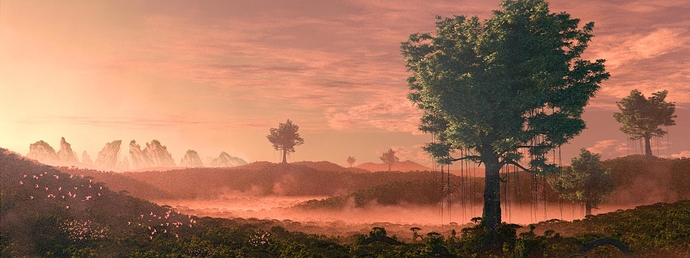
I have actually thought about having some normal sized trees in the foreground, I guess I just thought it would fit. Maybe I can replace the branch in the foreground with trees on the hill and have the character hanging on the top of the tree. We’ll see.
Very cool idea and a lot of improvement so far.
There are still a few issues with scale I think. It’s interesting that if we saw this exact scene in real life we would obviously just readjust our expectations of scale, but when we know that it is a piece of art instead, then we have issues suspending disbelief when we see things that are incongruous with our expectations. In this case, the fact that the tree just looks like a directly scaled up version of a smaller tree, makes it hard for me to internally reconcile the relative sizes of all the objects. Is that person tiny or are those leaves and trees huge? I obviously know the answer to those questions, but the fact that those are the first things that come to mind means that there is still a bit of a scale issue in my opinion.
JA12’s suggestion of a revised presentation has one very useful visual mechanic for resolving the scale, and that is the huge roots that wind down the mountain side, whilst dotted by what we recongnise more clearly as normal sized trees. There will be other ways to address the issue, but that’s an example of one that might work. An alternative might be to consider that huge leaves actually make the tree look scaled up, rather than make the tree look huge, if it were possible to reduce the size of the foliage then that may help (but this is hard to visualise since work would likely need to be done to prevent the tree just looking bare, or lacking in branches). Another thought that came to mind was to try and introduce a vertical aerial perspective by adding a subtle vertical gradient volumetric component (denser at top) which might make the tall trees appear to fade out just a little as the reach skywards into the haze. Perhaps post-pro test instead?
As for the general composition, my first thought was to have the misty valley weave its way towards the viewer in a reverse S-shape (rather than disappear off to the left). It’s a good opportunity to create some sort of visual movement original from the viewer (the character) into the distance, and also to introduce some more scale-appropriate detail, and vegetation density variation in the middle-ground (similar to JA12’s last compositional sketch). I like interesting canvas shapes, but I wonder whether you are making it hard to capture the scale by removing so much vertical height from your image - the mid-distance becomes very short. The advice given earlier to crop tight might not be the best solution in this case, make sure that you can adequately represent the important components of the image to resolve the scale issue first.
So I took some steps back because I felt like I was going in the wrong direction with this. Most notably I flipped the image and added some cliffs in the distance. I also completely scrapped the idea of planets and a person. What do you think about it?
The cliffs are only a matte I drew and probably still need some work.
Wonderful work Bjarke, the one thing that’s distracting in the image is noise, i can’t make out some details in the foreground. The rest is great, the fog gradation, the sky, the overall tones, all are very good. Keep it up.
Thank you! The noise is only there because the image is currently only rendered at 100 samples. For the final image it will be higher. The image compression isn’t helping much either ![]()
Awesome! Great job. 
100 samples at this level of noise is incredible, considering the complexity of the scene and how much particles you got there. Great job with the setup!
Thank you! The final image will be around 1000 samples (maybe more). Currently it takes way too long to render every change at 1000 samples. Even after 2 optimization passes, where I halved the render time, it still takes about 10-15 minutes at 100 samples. Mostly the volumetric effects and geometry is to blame ![]()
I like the changes. The cliffs address a couple of the things I had problems with:
- the large size of the mountains/cliffs seems logical without any thought so the scale is now much easier to reconcile, and
- the addition of the background gives use the more traditional landscape composition with foreground, mid-ground and background. In this case it does not matter so much if the middle distance is short due to the addition of the distant background.
I’m not a fan of cropping the main subject (the large tree), but some people do it (Annie Leibovitz does it in so many of her photos, and I’ve seen it a few masterpiece paintings too). It often looks a little awkward to me, however, it is really personal preference and a matter of whether it is contributes to your composition.
I would consider carefully how much attention you draw to the cliffs, it has the potential to become a bit of a competitor for center of interest if they are very prominent. I would perhaps try to make them a little more faded out due to lateral aerial perspective. However, you can have two centers of interest if you wish, as long as it works with your vision.
Here we go 
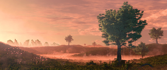
So I did as Matt suggested and un-cropped the image a bit. Now it is also the current widescreen cinema standard which is cool. I also tried making the cliffs a bit more faded but it just made it hard to tell what they are, so I chose to keep the old stuff.
If there are no objections, I will start the final render tomorrow 
Looks good to me! If I were working on it I would consider a couple of other things. Firstly I would look to see if I could incorporate the clouds a little more into the design of the image (I suspect you may have already done this to some extent with the edge of the cloud cover mirroring the curve in the foreground forested area). Your choice of thin flat clouds compliments the round trees well IMO, so I would presereve that. Also, I think I would probably also have more of the distant mountains leaning to the right, at the moment it feels a little like it pulls me away from the centre of interest.
I’m not quite sure what you mean by incorporating the clouds more into the design of the image, but I totally agree with the need of more mountains leaning to the right, so I did that. I also faded them a bit more.
What I meant by using clouds as part of the design, is just to consider any aspects of the composition that you might achieve with other methods. E.g. framing of a main subject (think dark clouds hinting at a frame around the tree), or to help provide contrast in areas of interest (e.g. sunlit clouds to provide contrast with a silhouetted main subject), and to leading the eye (think striations and/or patterns in the clouds leading the viewer to where you want them to go). The example that I mentioned was that I saw a mirrored curve in your image; tools like these can provide a coherency and interest beyond more arbitariliy placing things until it just kinda looks nice.
Please excuse the crappy drawing; I’m at a different computer with an ergonomic mouse! The edge of the clouds looked to follow the curve in the foreground, albeit quite subtly (actually subtle is often better than making the design choices blatantly obvious).

An example of someone who used clouds as a design tool a lot would be Claude Vernet. I’ll try to think of some others, I know I saw a lot of it in gallery visits last year!
Ah, I see! I’d love to experiment with that but sadly my final render is almost ready (it takes a long time believe me) and I don’t feel like re-rendering it now. But I’ll definitely keep it mind mind for the future ![]()
No worries, I look forward to seeing the final render of this one!
Feels a bit soft to me, like old images for a debate about life on mars or so.
I wonder, in a red sky would plants be green and have leaves like earth leaves etc…
If you want to go SciFi its fine to use a bit more fantasy, be a bit wilder, huge corals, or clustered blobs etc, plants with mouths or eyes, maybe creatures in between plant / animal life forms or … well its your imagination.
Maybe you wanted to create a 2nd early earth… then maybe ok; as in a sense it got a “lilte bit” the feeling of that discovery fictional series about alien life… but it could then use some more… of …
Maybe ad a crashed space ship or so, or something else to tune the SF levels up.
To give you some ideas find covers of old SF books
Final image: http://www.blenderartists.org/forum/showthread.php?359813-The-Forest-of-Giants
As always you guys have been you huge help, so you deserve a big thank you! Keep it up 


