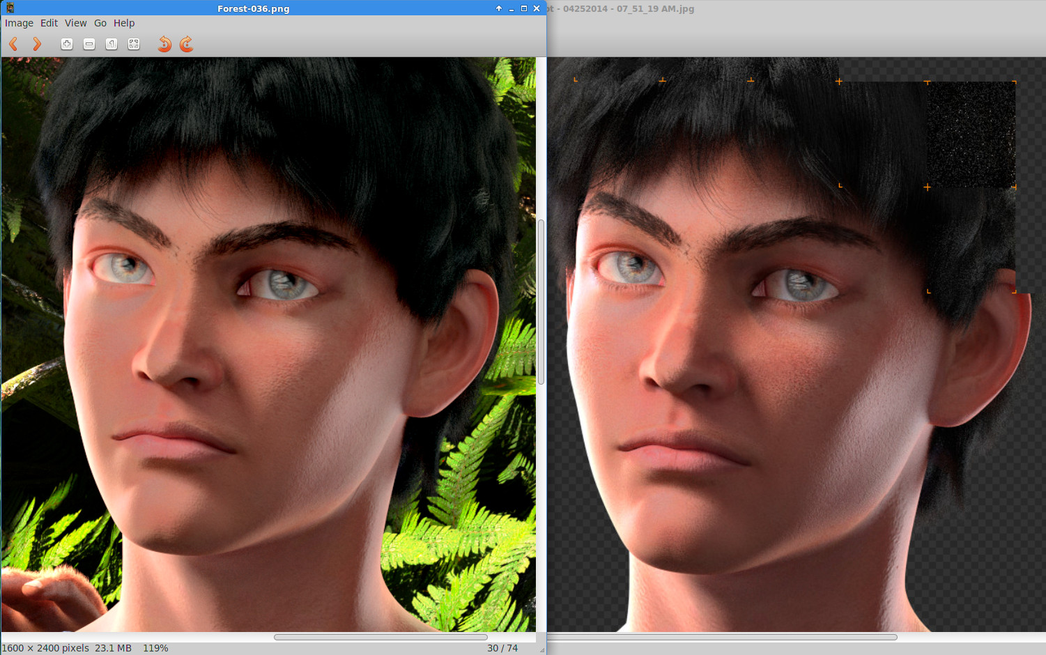
I had recently made modifications to Asherah’s render settings that worked so well I decided to re-render Steven. I’ll post a complete scene tonight, perhaps. But I did create a “Before-n-After” screenshot - Before is on the left, and After is on the right, still rendering.
The difference minor tweaks makes. I think the most profound tweak in this case was altering the clamping settings. Clamping the light rays - direct and indirect - is to the best of my understanding a method of controlling runaway conditions in certain reflections that causes over-bright spots on the image, or fireflies. It works well. But the result is a slight loss of detail and a slight lowering of contrast. Which is easy enough to tweak in compositing. Even so, it can be hard to find that right level of clamping. In this case, I changed clamping from 5 to 10 - which halved the clamping effect… I think. The results are remarkable. Because more light was getting through, I cut the main light from 200 to 150 and the fill from 10 to 8 to compensate. Even then, the highlights on the After that have yet to go through compositing are still comparable to the composited Before version that used a clamping level of 5. His right iris (our left on his bright side) stands out just a little more, there is more color to the skin, more gradation in the tones and the highlights pop a little better. Very minor corrective tweaking will be required in compositing, methinks. I’m also rendering in Blender 2.70a stable rather than GIT and it’s actually rendering faster. Will need to update my build environment and see if that makes a difference. Asherah rendered at 25 hours rather than 48 hours, for instance. However, I did make significant changes to her textures that I hope made a difference too. I removed SSS from every skin texture that is covered by fur, for instance.
Yet another render of the book cover scene. I relaxed the clamping on the renderer, which allowed a lot more highlights in Asherah’s fur to come out. The result is a little more contrasty than the previous render, but then the set is contrasty too so this fits better, methinks. Steven’s eyes look better in this render too, and Asherah’s eyes are not quite so dark.
My single GTX560 ti with 1 Gb of video memory can render up to few million verts if it’s diffuse, and ~1 million if it’s complex materials with relfections plus normals. 4 gb of VRAM should render much, much more. 48 hours is ridiculously too much.
I got her down to 25 hours with some optimizations with the materials beneath the fur. 2.70a rendered a bit faster than GIT too, interestingly. Will try updating my deps and see if that makes a difference. He rendered much faster - about 12 hours.
SSS and fur are the major bottlenecks in this render. Because of SSS, I am limited to CPU. There’s a point where the number of verts doesn’t have as much influence on time to render as the materials being used. I don’t want plastic figures with texture fur, so I use particle fur and SSS instead and that is the price to pay - longer renders. Plus, it’s a 1600x2400 image too.
I love all the hard work and thought you put into your work. Very cool.
I did want to share a few things.
I think she draws too much of my eye…he is the main character but he isn’t showing up against her. Right now my eye wants to look at her only. She has far more interesting details than he does.
You have a very busy background…giving no chance for the eye to rest. I myself do that all the time and I have to always check what I do against the 30% details vs 70% rest and direct the eye of the viewer rule. You can keep busy details but the lighting for them needs to drop way down so they fade into the background. Right now your background is brighter than your main characters.
I know you’ve work very hard on this and it shows. I suppose I want to like this better but I am finding it hard to get into the image. I think its too many details popping out at me…I don’t know where to look.
I hate to sound so picky but I like your work and so I wanted to share with what I see with my fresh eyes.
I’ve been going through some of these videos for help with my compositions and paintings. They might give you some more ammo for your art gun. I find them very inspiring.
I look forward to learning more about your story too.
Thanks a million for your input. The background is a simple solution. Set an f-stop, for instance.
Making Asherah less interesting will be vastly harder. Steven’s visually a regular guy, at least in this book. She’s… Asherah. Definitely a challenge making her less noticeable when standing next to something we’re accustomed to seeing daily.
She is a core character in the story - co-protagonist in the series if you will - and by the end of the 6 book series turns out to be the fulcrum of the overall plot. But it is still from Steven’s perspective - though in third person.
I have been experimenting with different poses. I’ll keep your suggestions in mind as I experiment. Not sure I could set her back on the branch in the distance, however. I could try. But her expression and appearance warrants a closer composition. But the experimentation continues…
Decided to explore a few different directions. And ended up taking a radically different direction for the book cover. A more interpretive and intimate direction. Everything composited in Blender. I created the text in Inkscape and imported into Blender, as well as the white-out too, and just brought it all together via nodes, along with a ridiculous amount of tweaking… It took an obscene amount of time to render both renderlayers. I may look into water-cooling for my CPU and see if that puts an end to the periodic throttling I’ve noticed in the system logs. That could be the source of the issue. Or I could try rendering on just four threads rather than all eight… In any case, my wife/editor loves this version of the cover. I like it too, personally.
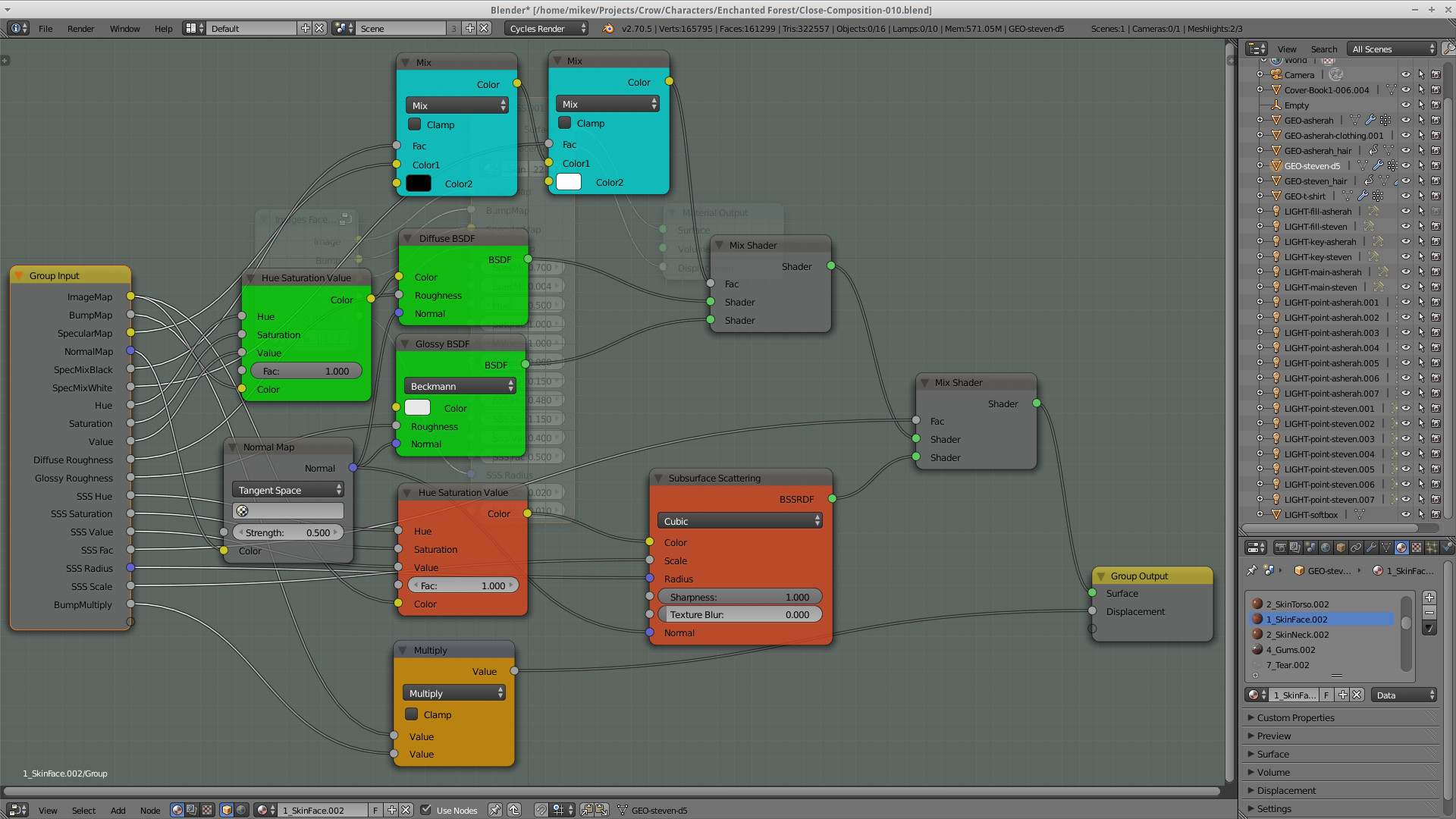
Sure. I tried to keep my nodes as simple as possible while still producing the effect I was seeking. Here is the raw skin shader I used for Steven and for Asherah too, with tweaks to the settings appropriate to both and the scene.
Of course, these are strictly for the actual materials. After integration into the scene via render-layers and perfecting the lighting for the overall scene, the real appearance is finalized via nodes in post. The materials nodes and scene nodes both work together in harmony to produce the final look - from the semi-realistic look of my earlier posts to the blown-out saturated final draft of my book-cover.