Brilliant, what are you using for the sky is it vue, or blender’s preetham/hoklse-wilks sky presets?
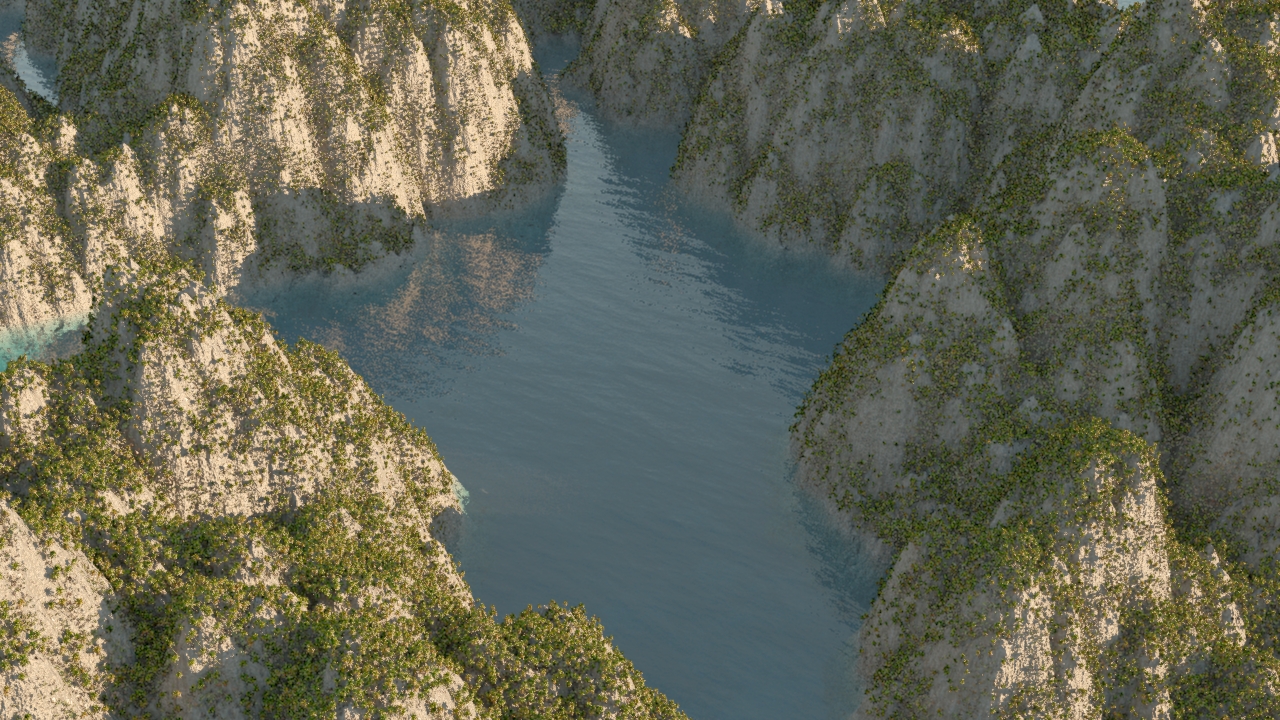
I’m using Vue’s relatively new Photometric lighting model here. I pulled the sun down below the horizon, and made the ambient light dark blue. The only other thing I did was adjust the balance between sun and ambient light to get the effect I wanted, and for this last image bump up the total exposure for a lighter shot.
I’m using Blender to clean up the Photoscan models, although in this case I haven’t done too much work on them. Just trying out a scene idea.
Proof of concept here. I’m looking at a tutorial done using Photoscan, Maya and Mari. Seeing how far I can get using Blender instead of Maya and Mari.
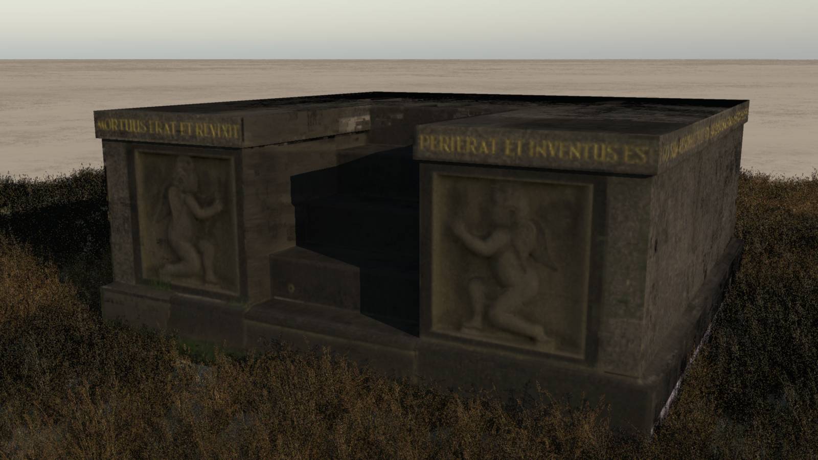
Scanned the memorial structure (of which this is the base) for Photoscan (32 images)
Exported the model and cameras to Blender as fbx
Built a clean mesh over the top (I might finish it sometime, but very busy at work ATM)
Projected a couple of the original photos (front, right) onto the mesh using the corresponding cameras and 2 UV Project modifiers. Some scaling needed.
Used Texture paint to clone from those projected images/UVs onto the final texture/UV.
The cloning was very slow. Maybe my images were a bit big (approx 100MB each). Final resolution not that great, but that’s probably because my actual final texture image was only 1k (duh). Not sure if projecting the image onto the model is better than using Project from View to project the geometry onto the image. Must play around with it some more.
Attachments
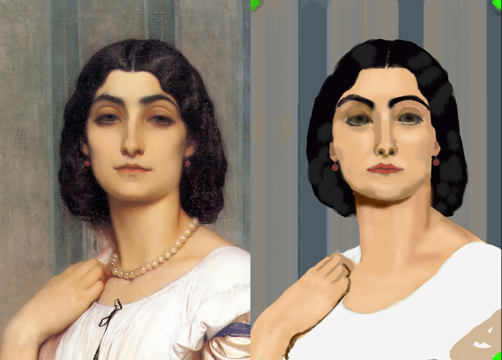
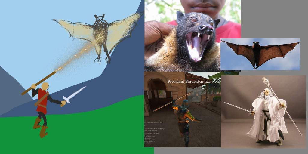
Taking a ‘little’ detour at the moment. Whenever I do any art I get to the issue of concept. What’s worth doing? So I’m looking at the whole concept art area, and doing a workshop on painting to support that. I think concepting is easier in 2D. So here’s a basic value study - not very detailed and lot’s of errors but hey it’s only week 2.
Attachments

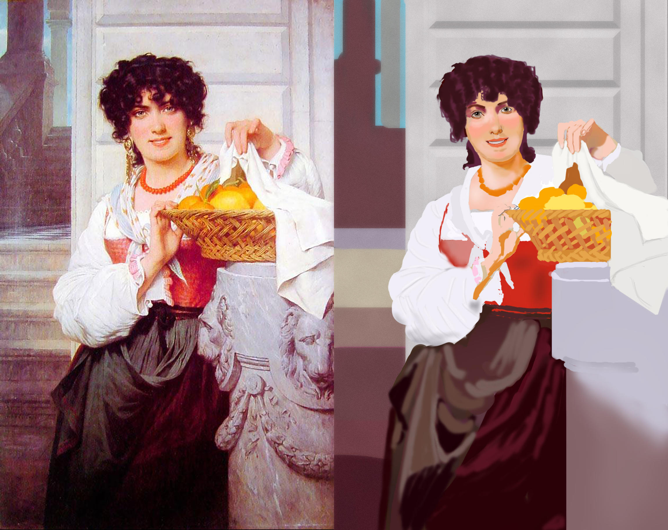
Here’s a more complex piece. We’re moving on to designing our own images next. As Concept Art is my main interest here that’s good. I do want to be able to paint with confidence though.
Attachments
1 Like
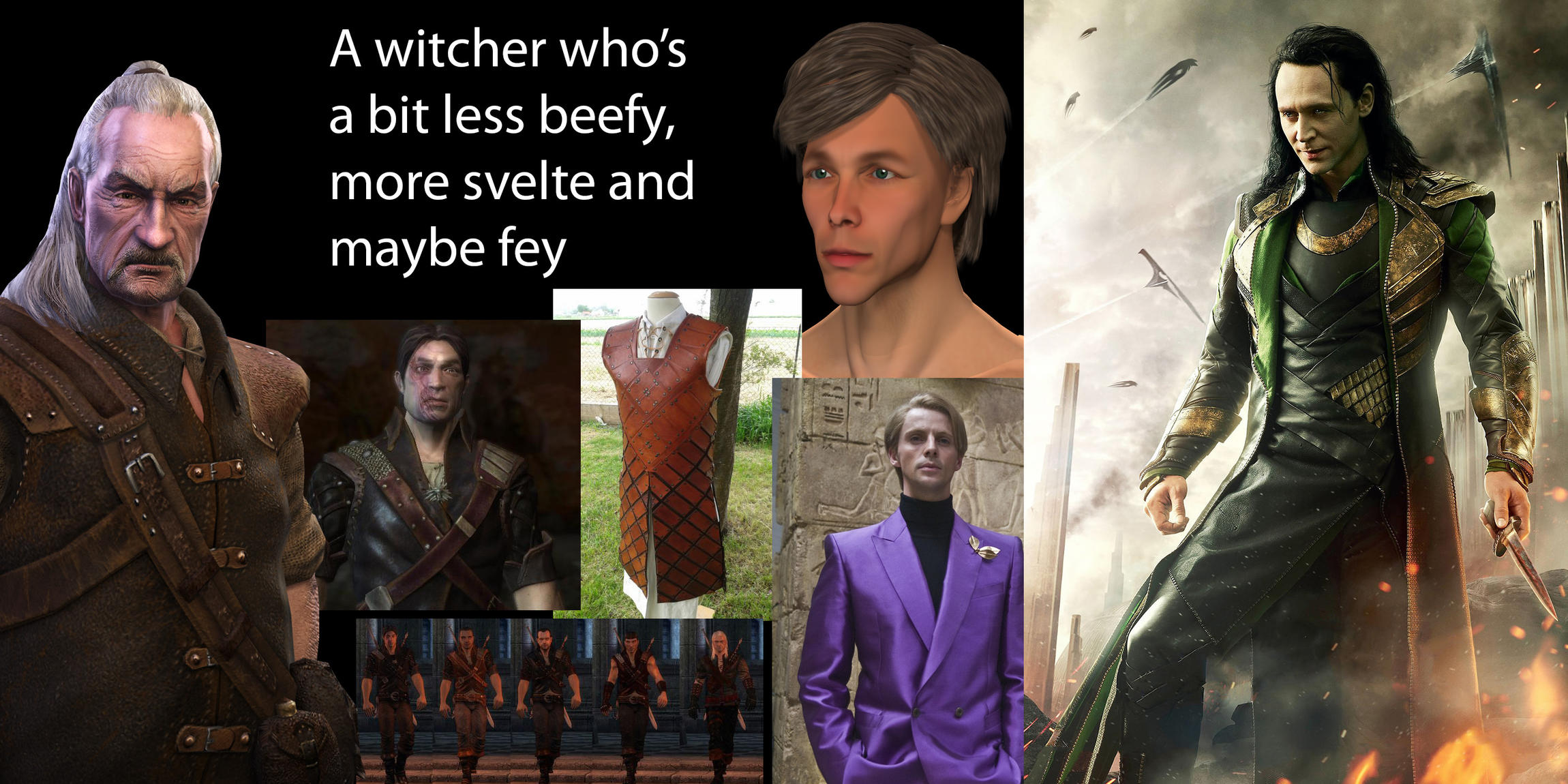
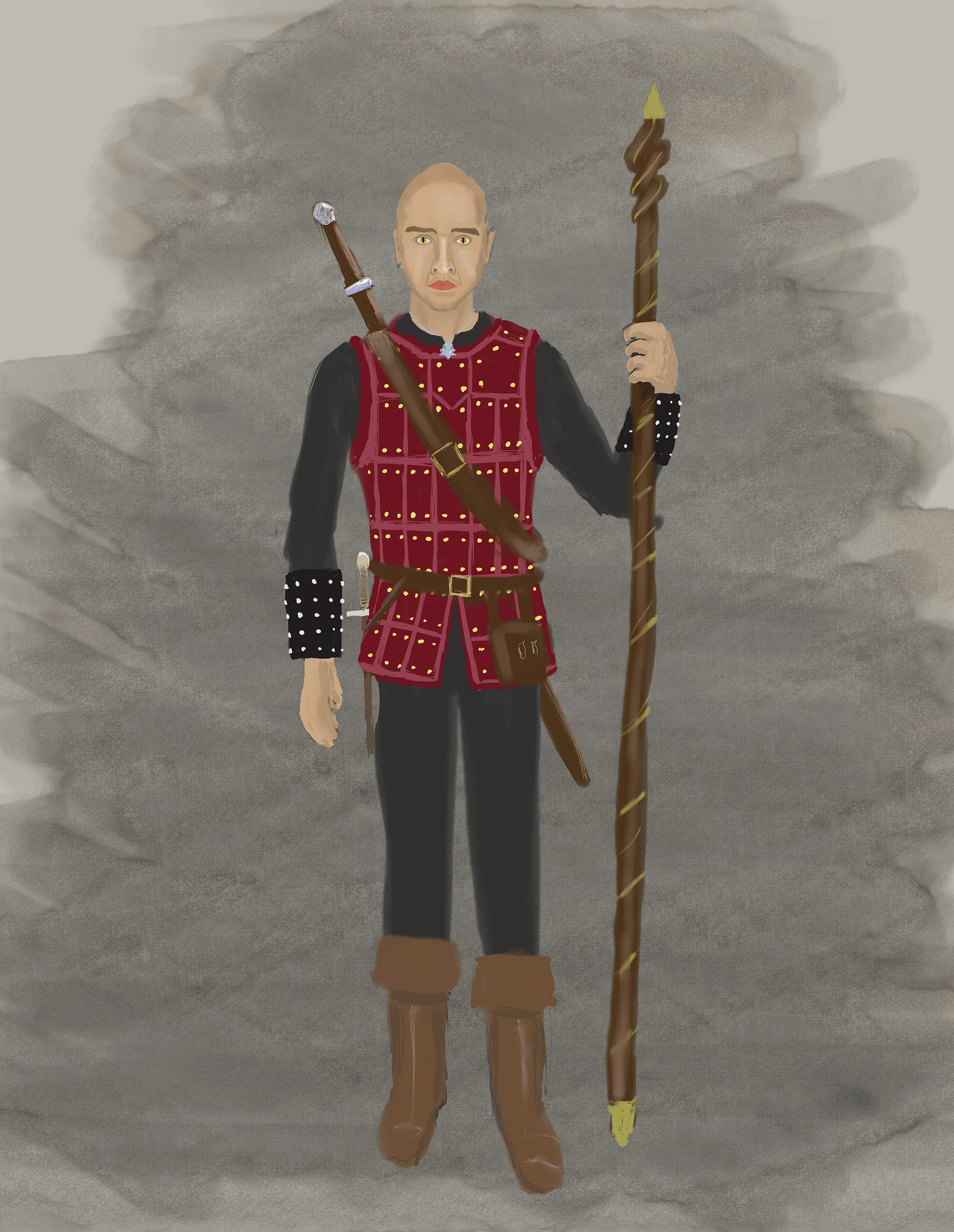
So, working on a moodboard. Pulling together some ideas for a more svelte witcher, more a Loki than a Thor.
Attachments
So I’ve started on the actual character. The model (person) here is from 3d.sk and I did actually model and rig a character based on those photos a few years back. Shouldn’t be too hard to outfit him in the new gear. Lots of work to do still of course.
Attachments

Some more work in this character design. I’ve previously modelled and rigged the guy, so I might work on the outfit and create a 3D model from this.
Attachments
Loved the cave in the ground


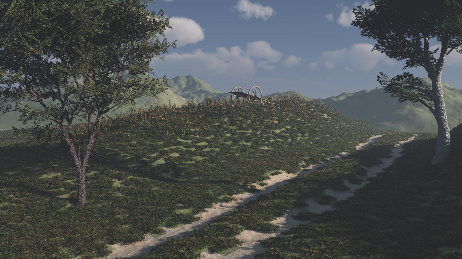

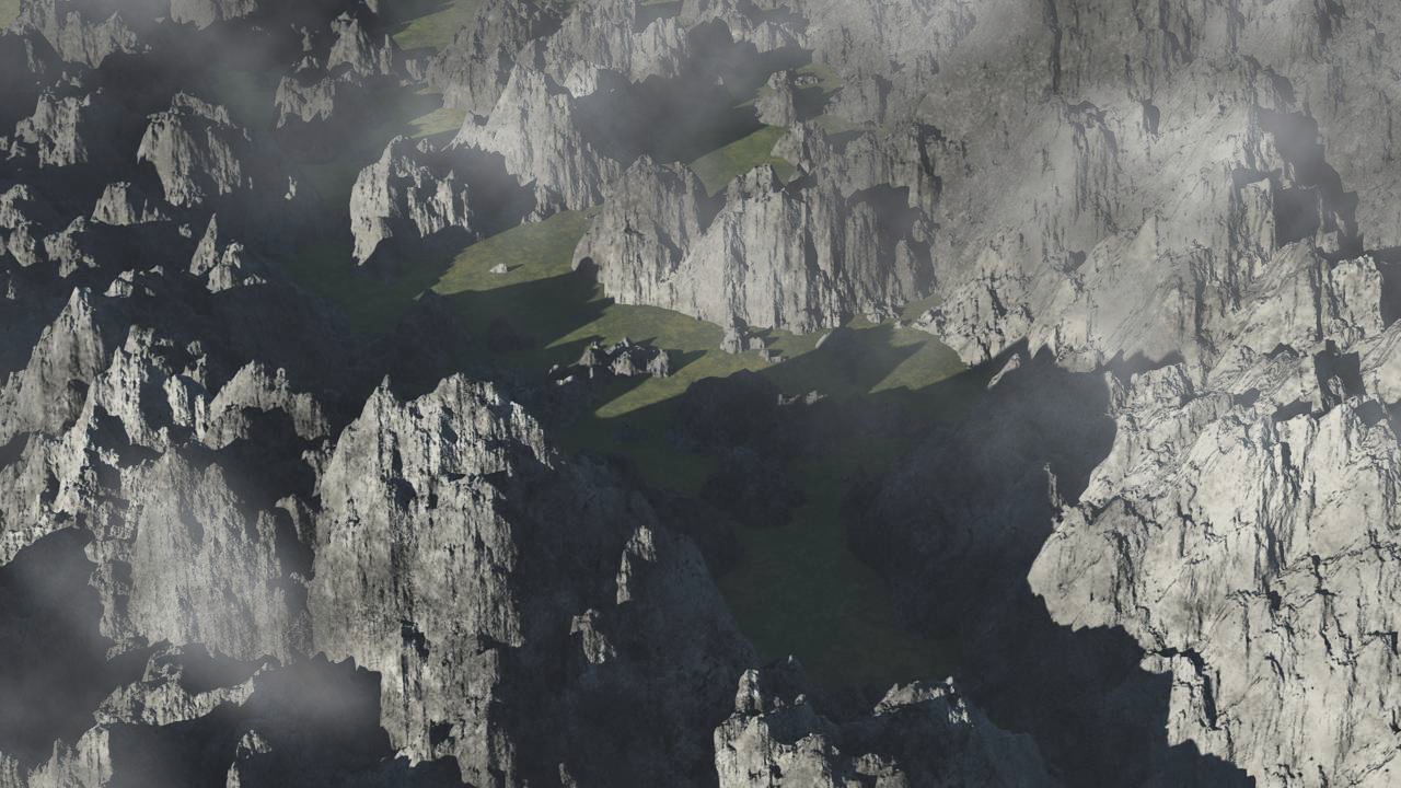
Your landscapes look very good!


wow these look great. I like the one with the houses.
Thanks. I’m hoping that by churning out lots of stuff it will get easier to come up with (good) ideas.
You’ve been banging out of a lot of stuff recently (with some not looking bad at all), here’s my latest advice.
I would see about playing with the tonemapping settings in Cycles in order to do things like reducing the burnout and giving a more photographic look (that would include the curve settings, the looks, and the gamma control).
It would also be nice if the resolutions were more consistent (some of them are quite small compared to others).
Ace thanks for your advice, both points very relevant. However there’s method in my madness. At a recent workshop I did someone mentioned the concept (from the book Art and Fear I think) that students who prioritize quantity over quality generally produce the best work. I’m deliberately concentrating on concept/composition and ignoring everything else. It is just a sketchbook.
As for the image sizes - I used to do some stock photography and it was often said that if an image didn’t look good in a thumbnail then it wouldn’t look good at larger size. I’ve decided to downsize my images and intend to be consistent from here out. If I find something I really like I’ll work it up both in quality and size.