Keep on drawing dude, you are getting better and better. On the last post the thing that is bothering me is the length of the upper arm and the size of the feet both seem a little small.
Thanks Tyrant Monkey 
His right upper arm is supposed to be foreshortened although I think I’ve messed up the angle a bit and his feet do seem to be a bit small - thanks for the feedback - you’ve caught me at a point where I can still fix these without too much bother :).

awesome - digitally painted or inked? how is your comic going?
Thanks Jester! Sorry I should’ve said - digitally painted in Gimp with a Wacom tablet. The comic is going very slowly since I have to earn a living as a software tester by day but it is a labour of love so I don’t mind taking my time - thanks for asking though :).

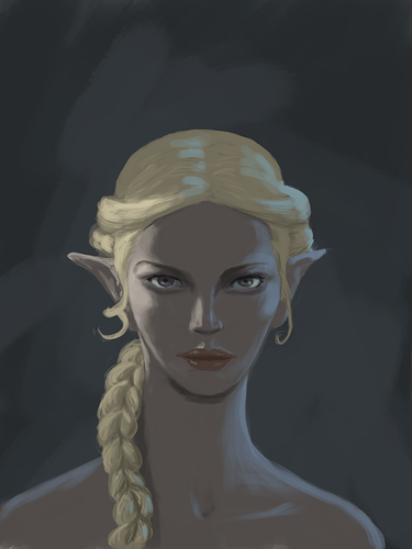
Looks like there is pretty solid underddrawing/structure to this face on the last one. Nice job!
As a critique I’d say there are a few light/shadow issues, I would highly recommend premium courses on idrawgirls.com.
Thanks Aole :). I use the Loomis technique to construct my faces - I find it serves me well. Yes my lighting skills need a bit of work still - thanks for the link - Xia Taptara at idrawgirls.com is awesome isn’t he?
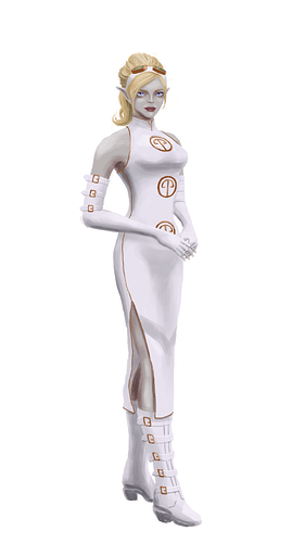
Well here’s a piece I’m working on at the moment - Umia - one of my comic book characters. Any critiques would be much appreciated - thanks.
Attachments

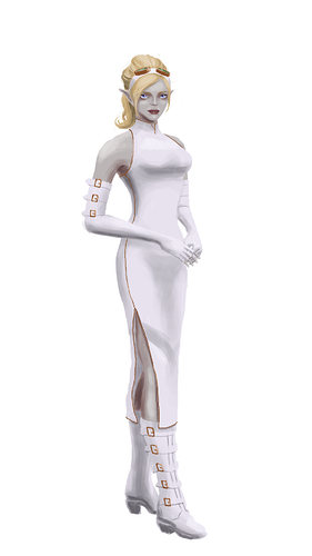
Well here she is: Lady Umia Yulon, professional winged-panther rider from Suborea. Any critiques would be most appreciated - thanks.
Attachments

Hmmm. I really like the hair and the boots.
Sorry for saying this but a lot of anatomical details is wrong. The breast is too high. The shoulder have to be skinnier. The back more developed. The neck more prominent.
The skin is zombie-like.
And I would like the boots to be shiny. Paint in reflections and specular highlights. Shiny boots are awesome.
The white background also doesn’t display your character well. White on white just doesn’t give the bang you need.
Thanks for the feedback Ralmon, really appreciated it :). I can see my anatomical mistakes now that you have pointed them out and don’t be sorry - this is precisely the purpose of me asking for critique :). The zombie-like skin is a conscious design decision so I am happy with that - thanks though.
I’ve been doing a few master studies - here’s a piece where I’ve tried to apply what I’ve learned to multiple light sources:
Attachments

cool stuff. nice values. btw the LOTR character was played by Liv Tyler, daughter of rocker Stephen Tyler of Aerosmith.
Thanks Modron - yep I know Liv Tyler (not personally) :).
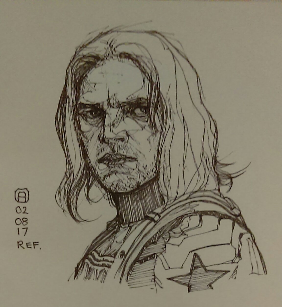
Here’s a character concept from my comic project - he’s a Warrior Acolyte Of Mymosule - an evil henchman type guy:

Another character from my long term comic book project. Critiques most welcome - thanks.
“On the broken world of Dustryon, Princess Tronica Vin is heir to the throne of Vangaia and is a technological genius but she is easily bored. To get her kicks she takes to the streets of her crime ridden kingdom and indulges in a bit of vigilantism. Armed with a chainsword of her own design she has taken down some heavy duty baddies already. What will she do next?”

I see really nice progression in your works. The last full body designs stand out. I would maybe work a little more on details. Also the part in the picture seem a bit anatomically off. Keep it up!