Thanks, RhinoFlip! This vintage iphone design is going to be scaled with our video footage to appear approximately 2 feet tall, so it’s a big one.
I agree with you, harleynut, I think it’s generally better to push a completion date back for the sake of quality when it’s possible. However, our next video will be based on the GTA video game series, and I would like it to be completed in time for the release of the GTA V game (since a lot of people will be doing searches on it and that will create a much larger potential audience for us). Since that game releases on September 17th, there isn’t much time left to get started. Fortunately, I feel I can still devote enough time to this Apple video to accomplish all the visual gags I want to put in it, so Tuesday isn’t such a bad deadline.
Here’s another update! I worked on a bunch of shots today, getting them further along to completion. Also, the iphone 7 model is done. I used a bunch of pieces from Chris Kuhn’s “gadgets” pack: http://www.blendswap.com/blends/view/39159
So half the credit really ought to go to him, the model would simply look dull without those details. I think it honestly still does look a little dull, especially around the back, but since nobody’s really going to see the back in the video, I’m not putting anything back there besides the old Apple logo.
The next step for this model will be setting up materials, which I don’t have a lot of experience with, but I’m hoping goes smoothly enough. I’ll also be uploading some more renders to show tomorrow (technically today).
I’ve been working on the extreme close up shot of the iphone 6/mini (the only ECU in the video, thankfully). This will likely also be the image used for the thumbnail of the video, so it’s a very important shot to me.
Initially I was going to make the phone white, but lately I’ve been thinking black is a better choice. Black will make the highlights show up better, as well as make the phone stand out much more from the background. This is especially important for a thumbnail image.
In addition to the HDR probe, the model is also lit with a single plane, used really only to gain the reflection on the screen. This plane uses a gradient material, brighter at the top and losing intensity downward. Blazraidr uses a similar technique in this tutorial he created on lighting his Jaguar model:
What do you think? Does the black look okay? Do you think white would have any advantages over the black, for this particular shot?
I like the black better…I think you will get better contrast against the actors hands as well. (not sure what is going to be in your background though)
You did a nice job on the texturing of the mini and yes Blazraider has some great tutoorials… I think he has one of the best Rigid body tutorials out there right now.
I don’t believe I’ve seen his rigid bodies tutorial yet, I’ll have to check it out!
I’m actually just keeping the background white. I tried creating a simple background set for the video, but ultimately I decided it just looked God awful, and made the space look a bit compressed as well. I think the white allows the environment to breathe, and fits in line with the “Appley” look as well.
Thanks, Acer! If you mean the actual shoot, that only took about 4 hours for the main footage, plus another hour for b-roll with another actor (and most of what we shot I actually cut from the edit, due to time). If you’re referring to the post-work, I’m hoping to get it done by Tuesday. If necessary, I’ll extend that to Thursday, though. So about 4 to 6 more days.
We shot this on the 14th of August, and I’ve probably worked on it about 1/2 to 1/3 of the days since then, between other work.
Tonight (and honestly most of today) has been a bit of a crap day, unfortunately. Progress was very slow going, and anything that didn’t turn out mediocre just turned out crappy. But everybody has days like this. Tomorrow will be better.
Here is the iphone 7 model as it stands with it’s materials. I still have to add some details, such as the symbols on the keypad, and some other text here and there to add a little more believability. And also the monitor texture of course.
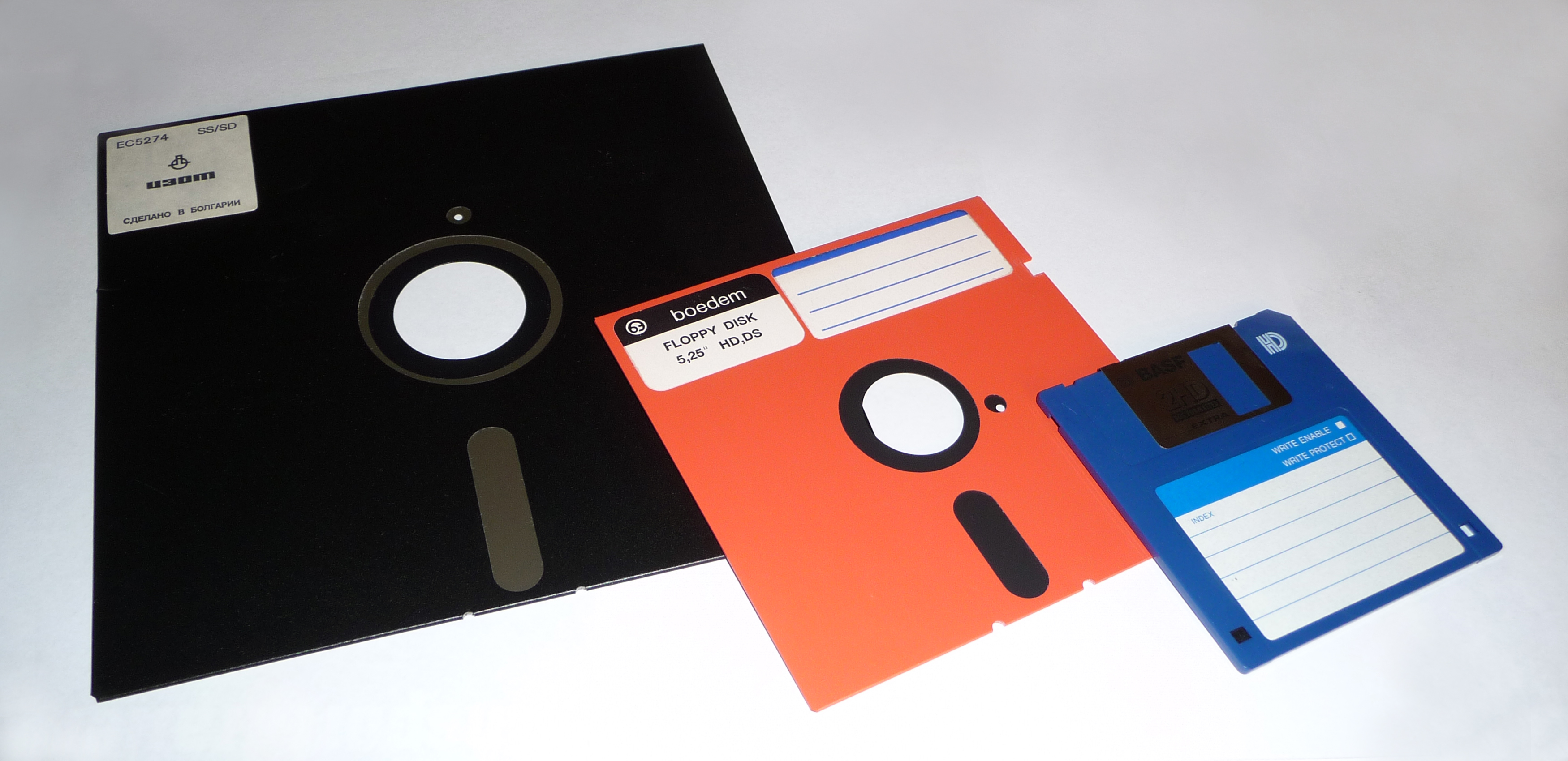
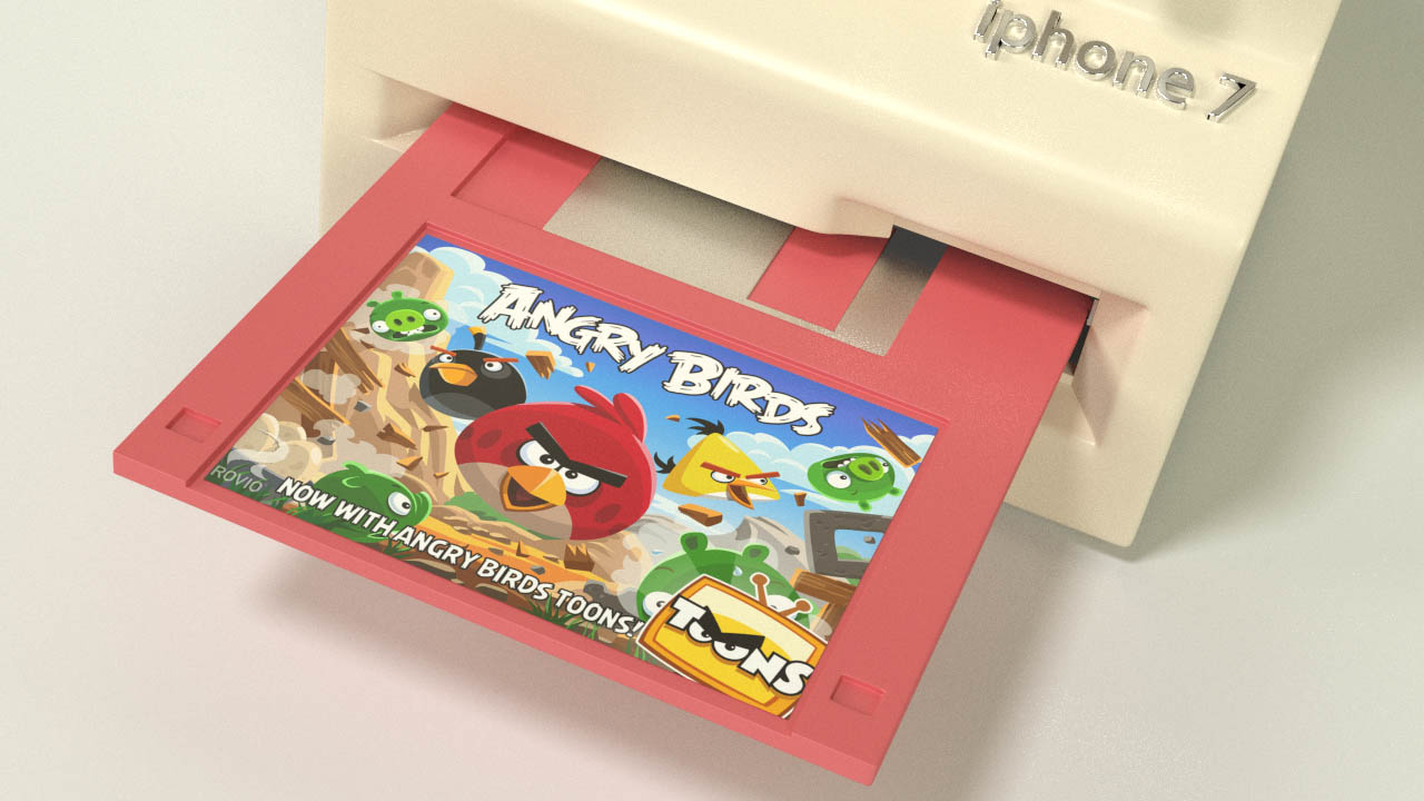
I wanted to get an opinion from people; should I use the 5.25" floppy disk, or the 3.5" floppies to be shown as the app disks? I myself would feel more nostalgia from the bigger ones, but I’m not sure how many viewers will actually know what those are. Also it might be harder to make them look believable, being so thin. The 3.5" disks have a little more volume, plus the moving metal part adds a nice touch.
I think the 3 1/2" would make the most sense for exactly the reasons you mentioned… I don’t know if I even remember what 5 1/2" discs look like, and I’m over 50
Everything is looking good… I recommend using the small discs… it is bulky enough without making it too big for the hand by requiring the larger disc.
I have big hands, but if I try to hold that phone taking the larger discs I will neet a handle on the back of it, otherwise I am holding by finger tips…
I know this is satire, but you mentioned believability in another post… taking this into consideration assists with that.
When I asked for the scale, i should had mentioned that i wanted to know which size of floppy has this phone. XD now I’m out of the debate… I was expecting an answer containing the bigger one which brings huge nostalgia to me. We had 8-bit computer based on ZX-Spectrum which used 5.5" and i really liked that one. I was just careful 'cause they were very soft and easy to bend. Talking about floppys… i also recall Sharp MZ-800 which had small sized floppy (i thing smaller then 3.5") and was different from later days disks by having data written not in circle sequnces (likewise HDD’s) but in spiral so it was kindda vinyl-style.
James, I’m still tracking, wondering what’s next!
That’s really interesting, Rhino. I have never seen the spiral disks! Then again, my only experience with the larger disks was around 1999-2000, when our 8th grade ILA teacher brought an old Mac into the classroom.
The larger disks do bring more nostalgia to me as well, in part because I actually still have the smaller, 3.5" disks in my room. It’s been quite a while since I’ve seen the older ones!
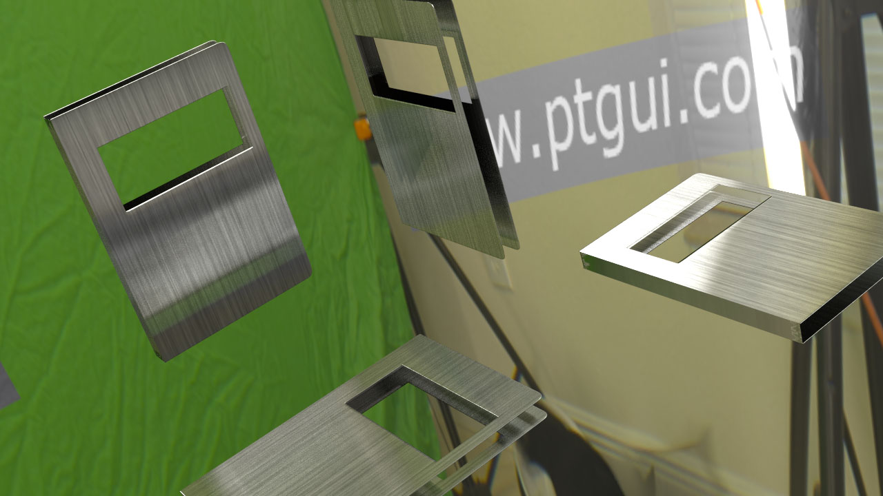
I’ve tried to create a brushed metal material for the metallic guard on the disks. I’ve never used the anisotropic shader before, but Andrew Price’s tutorial made it quite easy to get used to. I’m using a texture I created in Photoshop (using generated noise and motion blur) to give it some texture. I will be using a different lighting setup when I render out the actual production renders (to get better highlights mostly) but here are my tests below.
I may adjust the colors of the disks a bit, as well as add some text to the metal guards to make them look a little more believable. I just don’t want to spend much more time on them, because after all, they’ll only be seen on screen for a few seconds.
Here’s one last update before I go to bed. I’ve been setting up files for the last remaining insert shots (and a few animations), and this is one of them; a comparison of the “ipad mini 2/3 scale” to the normal mini and the normal ipad. I’ll adjust the framing slightly, and probably add some kind of measurement into the shot, but this is approximately how it should look:
The lighting setup is fairly simple, and I’ll probably use it for most of the other full CG shots in the video. I’ll include it with the iphone 7 model when I upload it to Blendswap.com.
Good old (maybe rather young) Andrew… I’m doing brushed metal same way, it’s lot faster and you have more controll over it :D. And i didn’t even did the tutorial, i just picked this. Is the noise connected (blended) to the color or bump?
Good for you! I’m far too lazy (or perhaps afraid?) to try something new without a tutorial first!
The noise (I’m assuming you mean the image I made in Photoshop) is connected to the color input of the anisotropic node; but you can also connect it to the bump of the last node to give the material a little extra bump. I think it uses a very small value typically, such as .001. Andrew does this at the very end of his tutorial, so if you get stuck just look that up.
This will probably be the last update before the video is released on Tuesday. There is still a fair amount of work to be done, and I’ll likely be deep in it between now and Tuesday. Here is a final teaser for you, showing the completed iphone 7 from one of the master shots:
Harley- I think they’ve dropped the two-year contracts in favor of your first-born!
The video is now up everyone! I’m a bit exhausted from working all through the night and into today, so I’m just going to post the link.
Let me know what you think! For those of you that have read the script, how did the finished work compare?
The most difficult part of filmmaking is maintaining your vision from your brain all the way through to the final film. That is what I’m always trying to become better at!
First off I want to say this was a big project and you pulled it all together nicely. I can really appreciate the amount of work that went into this, far behond just Blender 3d work. I thought the camera tracking came out nice, as did the final model on the mini and that big daddy.
You have a great sense of humor James that shows thru on your projects, I hope you will continue on.
As far as critiques… there were a couple small editing glitches, but what really needs continued improvement is the audio. My computer speakers went out, so I’m listening thru a decent set of headphones… I think your levels are turned up too high and clipping at certain times.(either on your microphones or in the editor. Are you using headphones when your are doing the editing? If not you should consider doing it. While I swear like a sailor all the time… I probably would not have dropped the F bomb at the end ( in the actual commercial, I’m not refering to the outtakes., that’s just my opinion.)
Outtakes are always fun to watch ( as long as their not staged) and yours were great. I was really impressed with both of the actors. There were are ton of lines in this video and you guys nailed them quite well. The storyline was fun (I didn’t read the script in advance)
A really great job on this James, it’s always nice to finish a big project like this.


 which brings huge nostalgia to me. We had 8-bit computer based on ZX-Spectrum which used 5.5" and i really liked that one. I was just careful 'cause they were very soft and easy to bend. Talking about floppys… i also recall Sharp MZ-800 which had small sized floppy (i thing smaller then 3.5") and was different from later days disks by having data written not in circle sequnces (likewise HDD’s) but in spiral