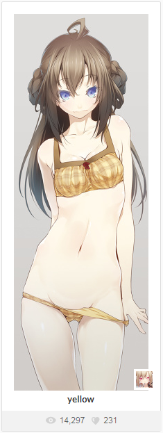
My last hack. Took the image of the character with artist’s illustrations Nilitsu http://otakumode.com/Nilitsu ZBrush (sculpt, autoretop, polypaint). Blender (hair, clothes, render Cycles, a little UV). 3D coat
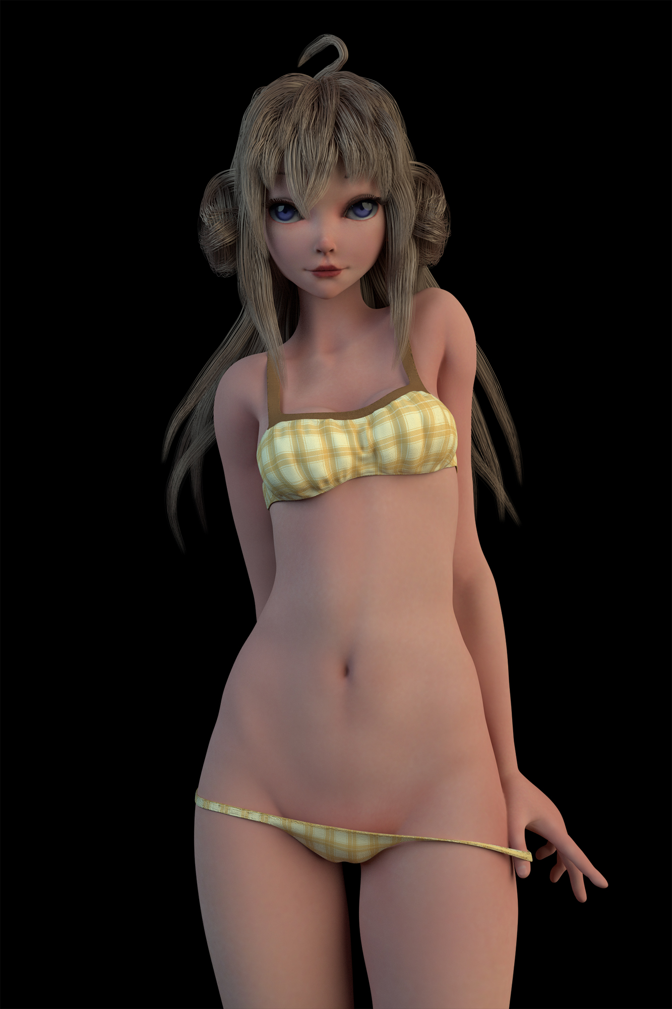
I would set eyes a little bit closer to each other hair looks like too thick too but hey! It’s generally very good work.
We’re not in the critiques section but I think this character deserves improvement. So I’ll give my opinion :
The problem with the eyes is not that they’re too far from each other.
Look at these Chris Sanders drawings for example :
the eyes are almost on the edges of the head. I can give you that it’s a bit too much on the second one but still @CineMay’s 3D model is far from it.
This is what’s wrong with the eyes in my mind :
1: the lower eyelids are absent, which apart from other things makes the lower edge more curved than the upper eyelid, and I think it would look better the other way around.
Example :

I’m not saying it’s necessary and I’m showing the extremes on purpose, but you can do it midway at least.
Yours feels a bit uncanny, it almost looks like someone cut her lower eyelids.
It’s not about adding a wrinkle (there’s no wrinkle on the above image), but the overall shape and the curve on the lower part. I think…
2 : the eyelashes are too straight, not dense enough and too short (look above again).
3 : the eyebrows could be lower (like above again). I didn’t even see them at first glance and thought they were what’s actually the upper eyelids wrinkles (which would be weird, I don’t know I have a strange vision sometimes)
4 : her eyeballs are too dark (look above again). I think most artists cheat on the lighting with the eyes, because that’s litterally what’s looking at us and calling us to look at it. It’s the main focus point, so it should be clear and contrasted. Also compare the size of the iris between your image and the ones I showed you (and how much white/sclera is visible).
For the rest :
- Like @ZarasTM said, the hair is too thick. Anyway the hair could sure use some work on its shape to have nicer curves
- The lips going inside on the left and right makes an exaggerated kind of duck face.
- The pose is cool, but her face has no expression. Make it a least a bit asymmetric.
- No SSS on an almost naked character ? Please.
The rest is good. Just keep in mind that the face is always the n°1 thing you can’t fail on a human character. I know no exception to that.
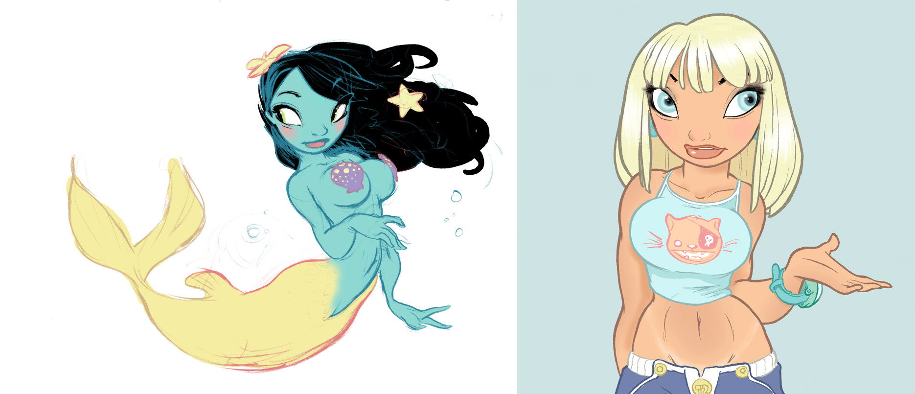
These are great tips! I like the blue picture very much.
But maybe CineMay had something like this in mind:
Nice work btw!
@ZarasTM Settings hair is not yet entirely understood, and it seemed to me that this is not a bad option. Thank you!
Really good tips, I will try to consider these in future work. Thank you!
Thank you!
Wow, I would change a little bit the hair but other than that it’s amazing!
The face is really nice, you can feel the personality of the character.
5 stars from me!