So here it is, Now what I want to learn is the composting.
I have think about rule of thirds and that kind of stuff but i didnt see improvement.
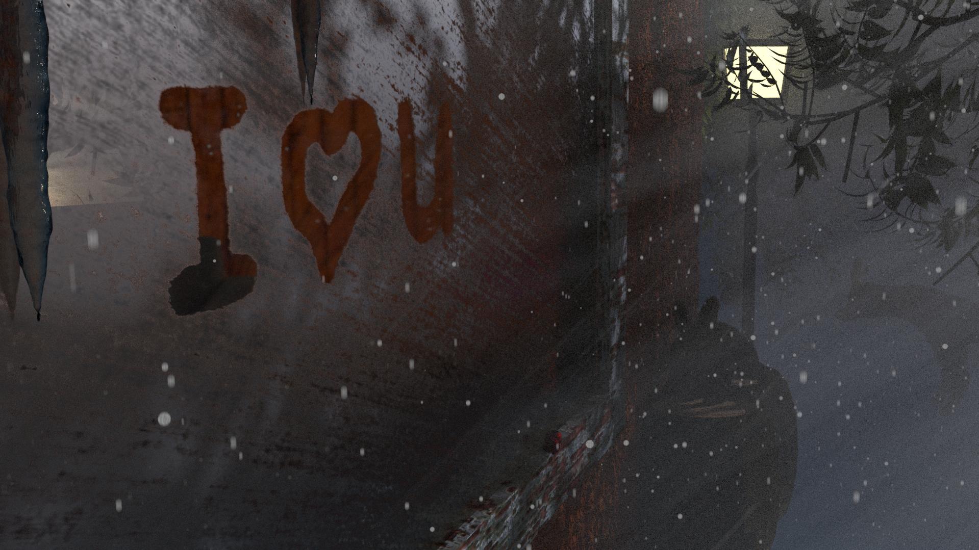
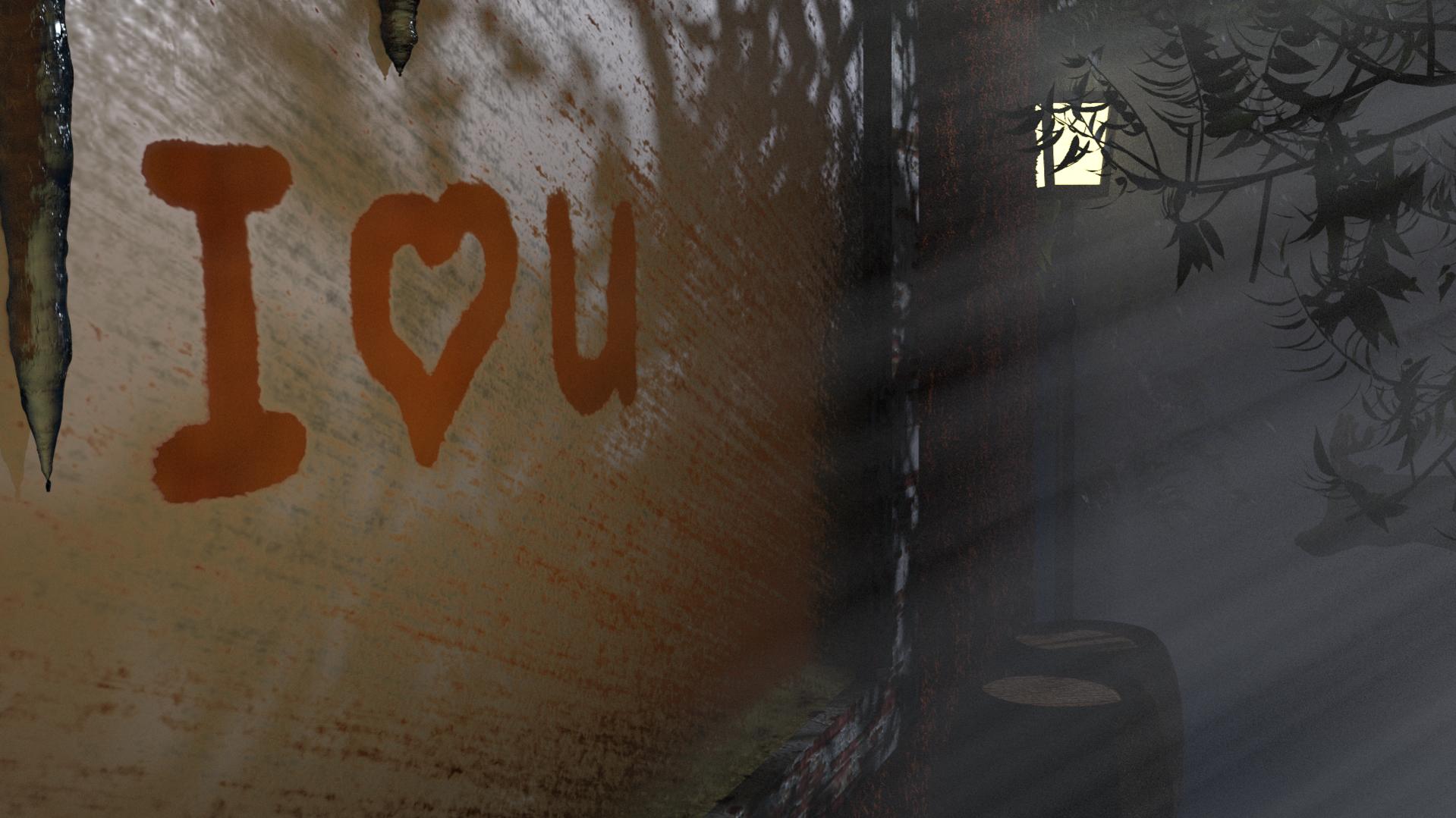
( one corner the heart/text, and the other corner a rabbit).
Maybe the rabbit is way to dark and not eye catching:confused:.
dont really know how to fix tht without changing the lighting of the scene to much.(I’m afraid the beams will go away. ao wil light everthing the much)
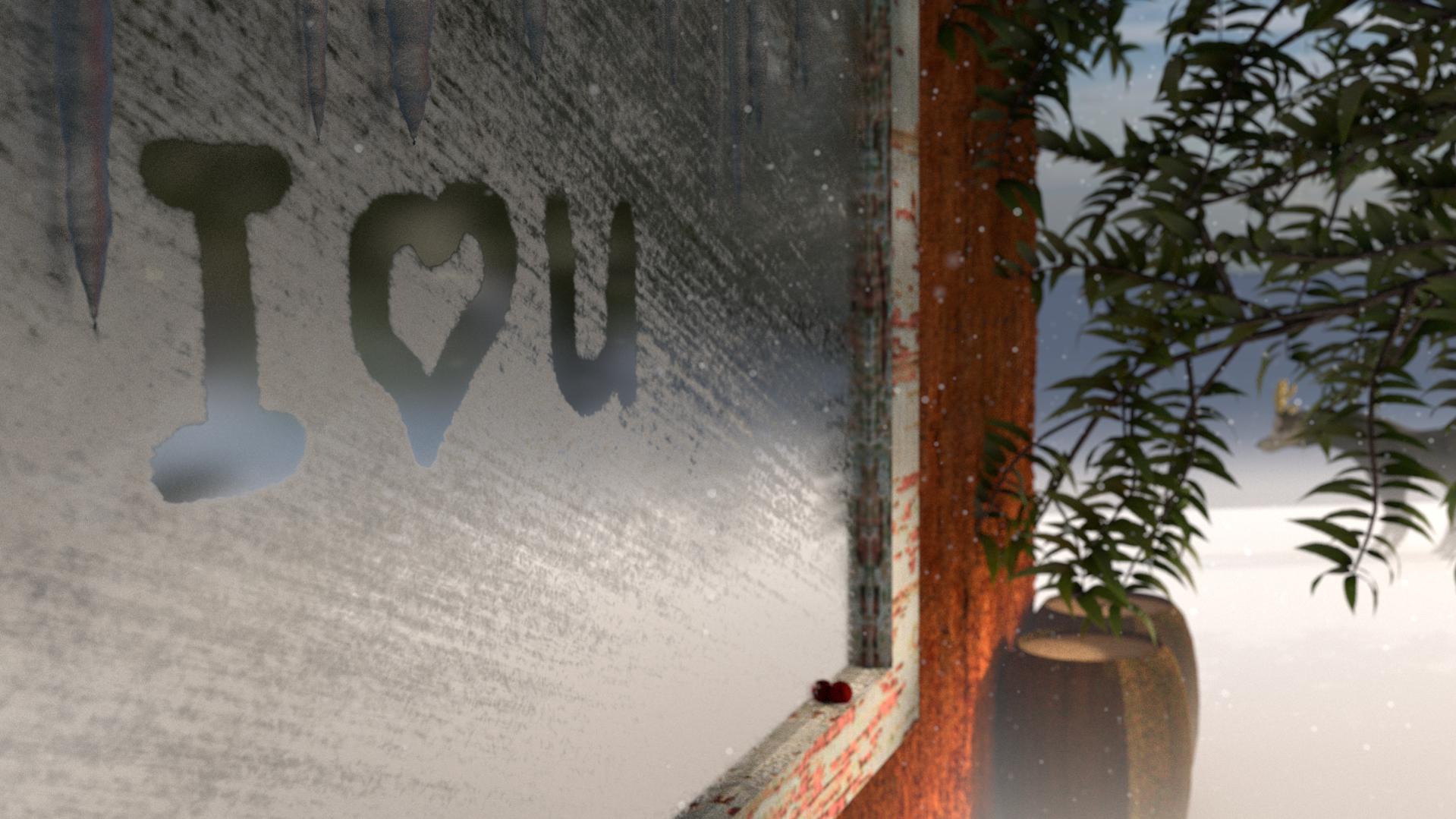
Here are some test renders.
First i did not intent to make it a night scene.
The animal is too dark, I can’t see it in the first and third image. The texture behind ‘I love you’ is very grungy, so much so that I don’t know what it is? Is it a window? Also the rays of light are pointing a different direction than the visible light source. Also that light would be glowing a bit or creating a lense flare.
Composition is pretty hard starting out.
You’ve got the right idea by trying to divide the screen into thirds. “I love you” is positioned very well and the red color helps it to stick out. But if the animal is important to your scene, don’t cut it in half. Place it in one of the intersection on your rule of thirds and keep it from touching any lines in your image and away from the sides.
Also try to think about the value of your colors. Things that aren’t important to the story of your image like the barrels or leaves or light should not be the darkest or lightest things in your image because the eye will find them first.
You can also consider using rule of fifths. If you have a complex image, that scheme is just as pleasing and gives you more ideas for placing elements in the scene.