Basically I’m attempting to see how her website might display this in a SVG format. Right now I’m wondering if a gradient will display here. She likes what I have so that end is a done deal. Now comes the tech business. Well that didn’t take long BA doesn’t accept SVGs. So less try a PNG. Hell it might be her site will not accept a SVG for that matter.
I like it very much and especially the representation of the lens by such reduced means.
What caught my eye after a while is the difference of the letter “o” in shots and photo. I could imagine a bigger lens - overlapping the S of shots - and thus allowing a not compressed second line. But maybe that would be boring.
You can use this if you want, here’s the eps file.
First: the O replaced by a lens works better in the word Shots, because it would be clearer what the business is about even if the word photography isn’t there. Also, the lens icon you used could be problematic if printed at very small sizes, it should be simpler.
In any logo you should have different “weights”, for each element that it contains, right now the word photography grabs the attention that “Bobbi” should have, since that’s the word people will probably use to refer to your daughter’s business.
The word photography should be used just as a safe measure, just a reminder that this company is about taking pictures, but it doesn’t have to be as big as the business name.
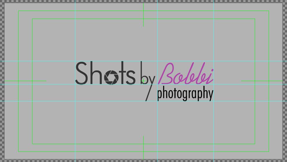
Try to keep things organized by using guides, see how things are nicely aligned on the mockup? That will make the design more pleasant to the eyes.
Don’t use the typography as it comes by default, change it a little bit to make it unique. Maybe connecting characters, or rounding the corners, or even scanning her signature.
Use colors a bit toned down on saturation, it will be better when you’re dealing with printed stuff like business cards or promotional material.
As for the original question, go with png always, it will save you headaches later on.
Whoa guys I have no intention of becoming a logo artist. : ) Although I did several hours of homework before even starting.
Several observations here. First the daughter loves the logo. It’s a mom-and-pop business minus pop and will probably remain so. The clients are almost all young females and will probably remain so.
But, thank you guys for the helpful observations. A little bit of my thinking here. First off my daughter has a rapport with the youngsters because of a good sense of humor and the ability to make it fun. Hence the staggered line and Pink color. Research has found females like ‘compressed’ fonts hence the second line. Look at beauty products and perfumes.
The visual weight here is deceptive. I should have posted a picture of my little effort overlaid on her site. I will do that here. I copy the comment about reduction. At one time I had the lens overlaying three letters. And, for a business card I could do that if it doesn’t read. I think rules are made to be broken for what we perceive as a specific purpose. Actually at site size I think the effort has movement. Part of why I moved ‘photography’ to the right.
Now it could very well be you disagree with all of the above. Hell there should be jokes about three artist walk into a bar. But, the client here is the daughter. However, thanks for the informative comments and time. Minoribus a vector picture of a actual lens definitely did not work by the way.
I’m unsure about the shape of the little glare on the lens. I like that there is a glare there, but it doesn’t quite agree with the outside of the lens’ shape. You could also consider giving the second line wider letter-spacing, which would allow you to keep the smaller size without distorting the letterforms (sorry to bring that up again, but they really got on to us about that in college).
Just out of curiosity, are you building this in Blender, or another program such as Inkscape or GIMP?
silent 1 now that you mentioned that it dawned on me I have several old design books stashed somewhere. And, I faintly remember a rule about leading. I’m using Gimp in order to give her a SVG file even if she uploads a PNG to that site. Ah the shape of the flare. For some reason everything goes better for me in Blender including curves. By the way minoribus I did misunderstand what you said.
Since I have been away from Blender long enough to forget half my keyboard commands I’ve decided to give the lady several entirely different versions. I’ve been in Gimp and Inkscape for over a month now editing photographs and now this logo effort. One has the lens in the O of SHOTS as per julperados observation.
Now I’m playing around with a ink stroked curved line with text to line and a butterfly. I personally wouldn’t take the feminine theme that far but then she might want to. Also on a personal note Inkscape seems to have more quarks then Blender and Gimp combined. Or, that could be me since it’s not mentioned here. Regardless who has six hundred dollars for a vector program.
Along with retouching some photographs for the daughter I’m still playing around with this logo concept. Julperado I still favor the lens icon for lack of a better word. And, when I took your advice and moved it to the O in SHOTS a thought occurred to me. https://dl.dropboxusercontent.com/u/81075043/Butterfly%203.svg
I recommend you to remove that “photography” word from the logo. It makes it look little unprofessional. Everybody understands that it is about photography when they visit a photographers web site. And also I would make it a lot smaller. Most of companies makes their logos a very small in their pages, because it looks like shouting “WE ARE THE GREAT PHOTOGRAPHY COMPANY, LOOK OUR LOGO” if the logo is so big.
When people are coming to the site, they are not coming to watch the logo, they wanna see the photos.
You can write a few CTA:s to make it clear of which kind of photography you do.
Great work. But i prefer @julperado work.
Is more “compact” and the lens is more the lens is most suitable for a logo.
The font is very nice, elegant, and it makes more “photo studio”.
When i see it’ i think immediately to photo studio.


