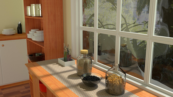
Hi guys, my first post here and would like the opinion of you for this render.
This is just to put into practice what I have been learning Blender in recent months.
Please… critics are welcome.
***I’m sorry for my english, i am learning.***

What I would do first :
- higher resolution and nicer looking background (we should see the sky to make the direct lighting on the inside more plausible).
- The sky is blue so, add an area blue light or environment lighting.
- gloss on wood
- more gloss, refraction and thickness on glass pots
- bigger and lighter pastas
Thanks for your comment. I appreciate and I will put into practice.
This is looking great! There are a few things I ca point out but on the whole, this is a nice image with decent composition and nice lighting. ![]()
I agree with most of what is said here with one acceptation: The sky is blue yes, but the sun is pale yellow. So, you don’t actually want to use a blue light for the sky. Instead, use a blueish color in your environment slot (or in the world tab). Then, use a pale yellow sun lamp for the sun. At any rate, I think the image in the background is less important to fuss over than the things you should actually be looking at i the image.
-
Increase the IOR of the glass should help is seem thicker.
-
There are a lot of un-beveled hard angled edges in your scene.
-
I can’t quite tell but it looks like you tried to add a bit of discontinuity to the fabric table runner. Maybe you used the sculpting brush on it a little. That’s a great idea! However, it’s not really visible in the final image. Might I suggest that you make it a bit more pushed out and along the width instead.
-
taking this to the next level requires you to add little imperfections to the glass and chrome elements in the scene. Use a light subtle scratches map on the pans on the shelf. A light noise as a bump in the glass; things like that.
-
The dishes that are stacked up are just to perfectly stacked and to close together. In fact, they are so close that they are causing moire patterns.
 I would make them thicker and use less of them in the first place. Offset each of them a little to give more variation.
 -
All of the pasta in the jar is looks like you took a bunch of flat layers of pasta arranged in a circle and then duplicated that a bunch of times vertically. The effect is that it looks like separate repeated layers of pasta stuck together. Kind of like ramen.
 I would just take a bunch of pasta and drop it into the jar using dynamics. or at least add more variation. You’ll notice that none of the pasta is oriented vertically. they are all laying horizontally.
Suggestion: The wood texture on the table is to similar to the one on the shelves. It’s causing my eyes to get confused as to what I’m seeing under the table. I would consider using a different texture on the shelves.
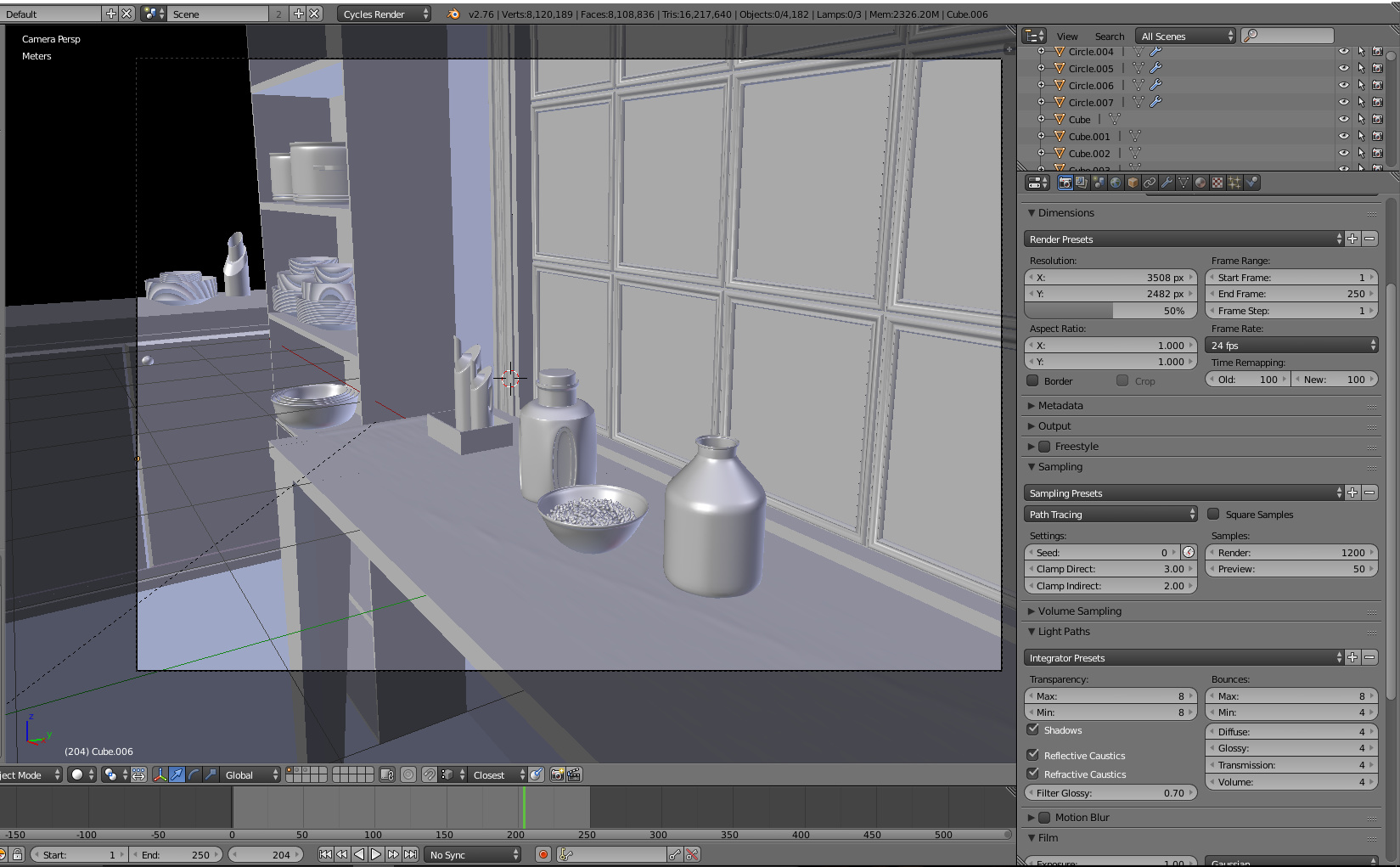
Well … after a long, long, long time …
I had the time to study a little blender.
Studied a little more lighting and texture. It was better, but I will study a little more in other future models.
