Challenge #649 Voting CLOSED

This week’s theme: Eye-Catcher

Challenge #647

Pure Entries

Gordi
I Hope She Says Yes
/uploads/default/original/4X/6/2/4/624e8ce6a5fea29d9a0455bae7d43ff9390e91f6.pngd=1448653264&thumb=1

KubeRoot
ICatch V1.0
/uploads/default/original/4X/0/4/7/0472b61f89c13e1d6bf0961a0320229e76840616.jpgd=1448716589&thumb=1

Enos Shenk
Eye Catcher
/uploads/default/original/4X/9/9/1/991ad159dab6d53dd891e16603adc1bc781932aa.jpgd=1448730473&thumb=1

fcharr
The I-Catch
/uploads/default/original/4X/b/c/a/bca9280ac7de47c5d87e5e3a13ed61a8a5640314.pngd=1448764241&thumb=1

YAFU
Eye-pnotic
/uploads/default/original/4X/5/2/7/52764cb1dfd3ba1c2aa23d1b66772c093d660654.jpgd=1448820343&thumb=1

3dnotguru
a match
/uploads/default/original/4X/1/4/d/14d42d3a3764db772d00255a0294dfbb7ab15bdd.jpgd=1448833191&thumb=1

greengiant83
Spotted
/uploads/default/original/4X/c/3/3/c331b018975def35aba73b1cf3bedd301752d019.jpgd=1448894457&thumb=1

Photox
Clip Show
/uploads/default/original/4X/0/1/7/017fb89d00418ee313a5a3fb7b5c7e428e72b927.jpgd=1448904756&thumb=1

Imaginer
VisionCatcher
/uploads/default/original/4X/6/6/6/66674d9024d23edb07151f790a4abf8a522180cf.jpgd=1448922397&thumb=1

Non-competing Entries

RobertT
Captives of Their Captivations (The Screen-Starers)
http://www.artofinterpretation.com/images3/wc649-CaptivesOfTheirCaptivationsTheScreenStarers-byrjt2015.jpg

Photox, I just noticed your image of the fruit, the bottom middle image. I had ran across that when I was looking through past challenges. It is very nice. I loved the addition of the hairy fuzz.

Thanks greengiant, that was a fun one, undiscovered fruit or something.

‘Spotted’ is a great entry and looks to dominate this week.

3dnotguru: Nice use of DOF to constrain the focus in this piece!

Enos Shenk: This was a fun and creative interpretation of the topic!

fcharr: iReally like how you approached the concept and details like the logo.

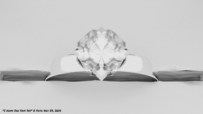
Gordi: Very nice! I like the composition of this piece. One thing I had to do, in order to see the image on my main computer, was adjust the levels so the image was not completely washed out (image attached below):


Once I could see it, the ring design looks very nice!

greengiant83: An excellent idea very well developed and rendered!

Imaginer: Nicely created! I think some focal blur on the background (or even no background at all) could further highlight the main design, which is well done.

KubeRoot: A literal approach can often make for creative and even humorous interpretations, and your image certainly proves that true!

Photox: It’s great to see your many fine renders together in this way. It’s also a good reminder, especially to new participants, how many wonderful entries you’ve created for this challenge. I also like the colors and reflections!

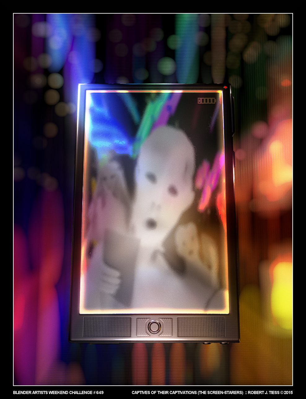
RobertT: This image seems self-referential in ways, I would think. Maybe it’s the border around the image and the border around the screen? Anyway, I noticed at the last minute you managed to give them hands and handheld devices (smartphones? tablets? eReaders?). Some irony too, right, in that, to make this, you had to stare at a screen for a while? The people look ghostly, almost like zombies. I also noticed they’re in focus, somewhat, but the world around them is just a blur. Was all of that intentional? The battery indicator thing makes me wonder too. Are you implying they’re becoming powerless or time is of the essence and people need to re-energize themselves? Get back to life? And the red light? Re-invigoration? Stop? Hmmm… You sure like colors, don’t you? I like the frontal speakers. Buttons sort of remind me of a TIE fighter. I can just hear the Imperial march theme playing…

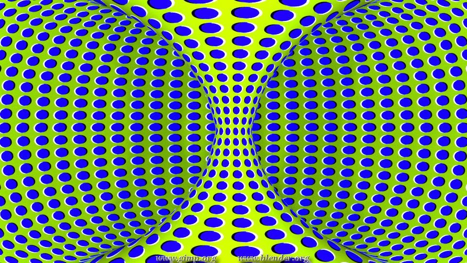
YAFU: Very cool use of black and white, and the hypnotic quality comes through loud and clear! This reminds me of some interesting visual illusions online of static images looking like they move. They often use blue, white, and yellow, and the way it seems to work is that the yellow and blue parts are of varying widths so as to trick the eye into sensing motion.

RobertT

Attachments


RobertT: Thanks for the feedback!

RobertT

Thanks RobertT.
I had done this before:

I do not know why I insist with these things. I always end up dizzy and with severe headaches when I work on it :slight_smile:

Again, excellent entries here. I really enjoy seeing the ideas that people have in each challenge.

thanks Robert :slight_smile: this week I felt like a graphic designer. advertising seems to be all about the eye-catchiness.

Thanks for the feedback RobertT. Again I got my adjustments off. I guess making too bright trying to get the “pop” I wanted. I guess that is what I get for working from a laptop. I may have to find a way to calibrate my screen. Even if I put a color pattern up and hit it with a photometer. This is seems to be the third time I have made this mistake. Oh well, live and learn

Thanks for the feedback RobertT. I’m glad you like it and I’ll keep your advice in mind.

cool illusion, yafu, it looks like the background is moving

@3dnotguru: Your entry remind me when I learn about design graphic of Emphasis (Point of Interest):yes:

@Yafu: Yes Modron’s right, first time I saw it, I guess it Gif, cool;)

I’m a big fan of Vasarely, but I downloaded it to check.

And… The winner of Weekend Challenge 649 with a third of the votes… is… greengiant83!

Here’s to all the great participators…

Gordi : 0 : 0%
KubeRoot : 4 : 14.81%
Enos Shenk : 4 : 14.81%
fcharr : 1 : 3.70%
YAFU : 3 : 11.11%
3dnotguru : 4 : 14.81%
<b>greengiant83 : 9 : 33.33%</b>
Photox : 2 : 7.41%
Imaginer : 0 : 0%

/uploads/default/original/4X/c/3/3/c331b018975def35aba73b1cf3bedd301752d019.jpgd=1448894457&thumb=1

Spotted