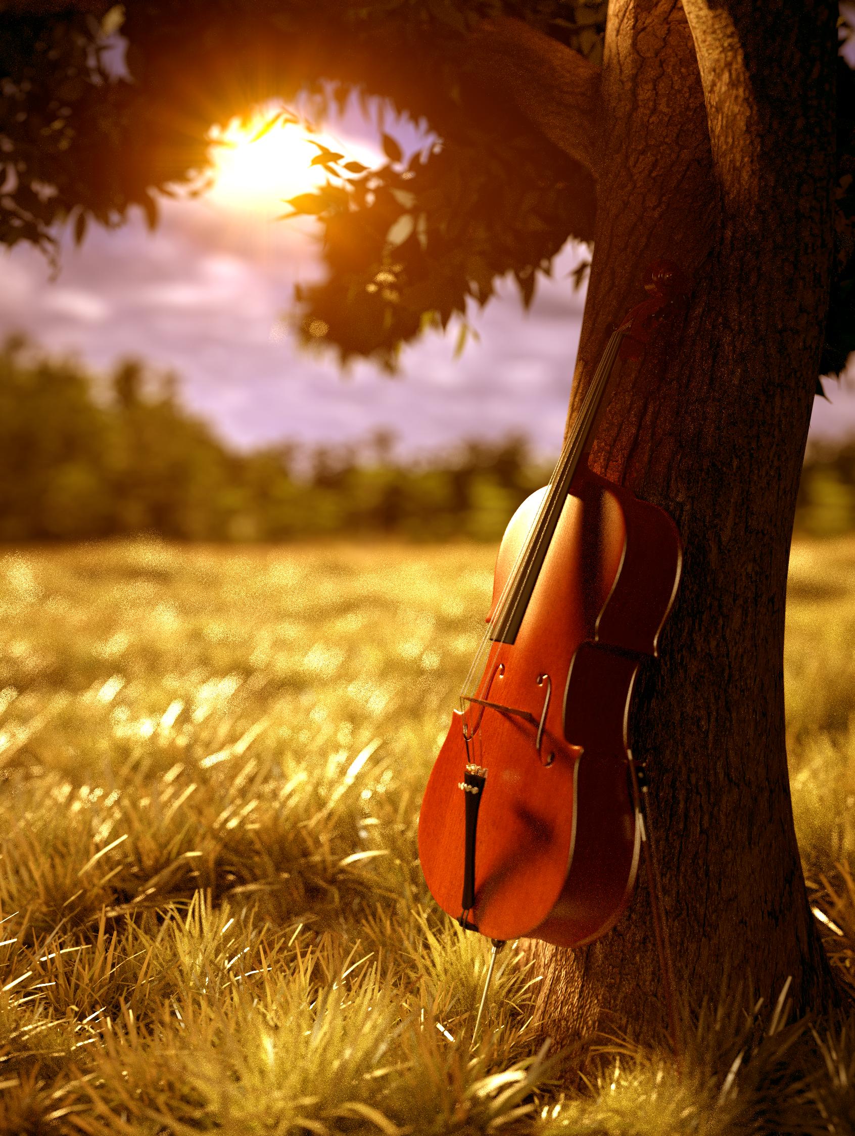
I have almost reached a point in this picture where I am happy to call it finished, but there are a couple of things that I’m not sure about (eg. grass, tree branches). The noisy DoF will be fixed when I perform the final render at a higher sample rate.
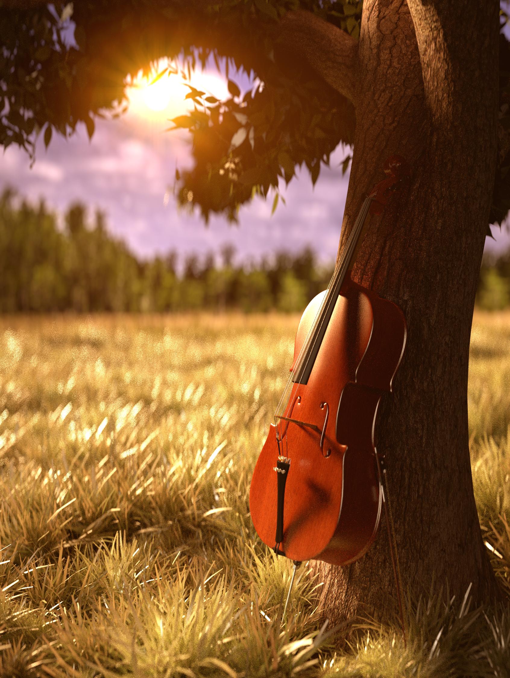
I think at the moment lighting might be a place to work on. You have a sun (flare) in the background, but cello, tree and grass seem to be lit from front side. This looks strange in my eyes.
I like the cello and tree trunk, the grass clumps seem to be a bit large.
I have made quite a few adjustments to the image over the last couple of days, and have worked on the lighting which was surprisingly challenging since the sun looked so aesthetically pleasing, but the Cello needed to be lit from the front, but (I think) I have come to a solution for it. The grass has also been downsized a tiny bit - I want it to be quite overgrown but the clumps definitely were too large.
The lighting is definitely improved in the second image but the colors are too saturated and green’ish…a little hard on eyes. This of course might be due to your current monitor calibration…different monitors have different color temperature/saturation/contrast levels, so it would be a good idea to preview your image on different monitors and try to get an acceptable middle-ground.
I took the liberty to do some quick Photoshop color correction for a ‘cooler’ temperature and less strainful/saturated colors (at least on my side of things :)):
Hey, thanks for taking the time to edit the image in PhotoShop, comparing your edited version with mine easily shows up how hard my pic is on the eyes.
One thing that made it easier is my computer can’t handle rendering at high sample rates so I use my brother’s one to render, making it easier to view my picture on different monitors while working on the picture, and can try for the best colouring possible.