Hi, I like to make a little contribution and share my theme with you. (please log in to see the pictures)
theme features: functional color design and readability
micromanagement and workspeed
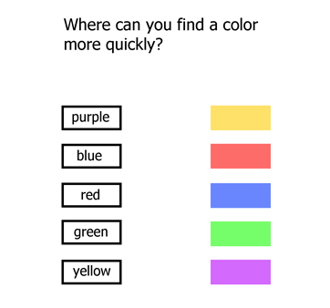
We can see colors much earlier than we can read words without having to look at them directly and without having to focus on the letters.
For example if you’re looking for the color “orange” you can see in an instant that it’s missing on the right side but you would have to read all words on the left first. Just like traffic lights. And btw our eyes are built so that color is collected over the whole view but detailed focus with higher resolution only in the center of our view which is required to read.
Imagine that you could find and click every viewport window header or icon, label, button, tab, tool, node, scrollbar etc. just about 1 second quicker.
With hundreds of mouseclicks per hour these little timesavers sum up significantly. At 10 mouseclicks per minute this can save already about 10 minutes every hour! Or 1 hour every 6 hours.
It’s also less exhausting to have a good overview and organized workspace.
When I was new to blender I had difficulties to identify the different viewports and I started immediately to work on this theme. After 2 days I could at least visually tell the difference between some viewports.
I think it can be also very useful for new blender users.
Headercolors:
red -> properties
blue -> outliner
green -> 3d view
dark yellow -> animation
dark orange -> node editor
purple -> uv/image editor
etc.
Another benefit I’ve noticed is to have instant orientation when I load other files with different screen setups or switch between working screens like Default, Game Logic, Animation, etc.
And here are 2 more optional improvements to this theme:
User Preferences -> Interface -> Uncheck “Python Tooltips” (not needed if you don’t use python script)
User Preferences -> System -> Uncheck “Text Anti-aliasing” (for better readability)
theme install for windows, just unzip and drop the theme here:
C:\Users\YourName\AppData\Roaming\Blender Foundation\Blender\2.76\scripts\presets\interface_theme
Although it is not so much about beauty but functionality, I enjoy the bright and colorful workspace.
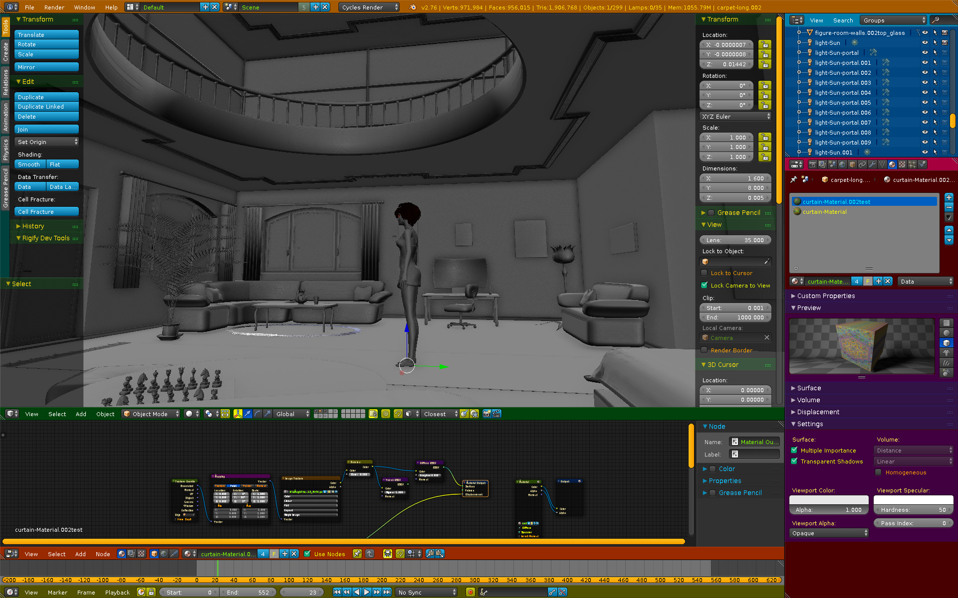
When looking at the figure in the center i can’t read or see any details in the other windows but I can see exactly where they are, what color and size they have and what kind of window they are. Especially where the borders between the views are.
Another little feature are the yellow scrollbars so they can be seen very early.
Almost all 3d viewport editing-, object-, bone colors etc. are the default ones.
I hope you like it and feel free to improve this theme to your likes and use your favourite colors.
edit: the latest update is in post #6
Attachments
8dfa-2015-11-11.zip (5.51 KB)