*HELP* Interior Scene

I have finished my scene, composited it and checked and rechecked. I’m still not happy with my scene but i have spent so long making this scene that i’ve lost an objective view, or the ability to know what isn’t right about the renders. I need fresh eyes to tell me what is wrong with the pictures and if possible to advise me how i might be able to fix the problems (if possible).

Also, there is one problem that i have completely identified but don’t know the answer to. Which is, when the white wall is in certain lights it turns an unnatural dark grey or even black on the outside shots, all the walls are the same colour white and i have hdr lighting which should at least have all the outside walls well lit and white.

Thanks to anyone that can help, or even if you look but cant help.


That’s Blender Internal with heavy ambient occlusion, yes?

AO is a cheap trick to simulate what Blender Internal is not capable of: True global illumination.
Whenever geometry is closely together (as in your room corners, e. g.), some AO modes will darken that areas to a point where your white walls turn dark grey.

If I may say so, the excessive use of AO is also what makes the lighting in your scene look off: It’s mostly unclear where the light is coming from. Everything looks slightly blown out and you lose all the subtle nuances and definition of light vs. shadow.

Blender Internal is also hardly able to make use of the benefits of HDR lighting.

Hi IkariShinji, thanks so much for your feedback.

The actual scenes were rendered with cycles, I made another file to composite them together because the file was running really slow. The light bounces are all set to 8 bounces on all of the options, I’m going to try a full global later today and see if that works better.

Ill also try dialling back the AO and see if that makes for a nicer render.

the types of lights i have are HDR environmental lighting, emission planes where the windows are and I also have portal lighting.

thanks again for your help, much appreciated.

If this is cycles, the problem is clearly that none of the light bounces colors off any of the objects.

The light is entirely white, which is unrealistic, especially considering you have a blue sky, green grass, etc that would reflect light color onto objects. In reality shadows aren’t entirely black, they have a tinge depending on what is illuminating them and lights are rarely entirely white (unless its studio photography). The sun is warm in color, it doesn’t give off white light, you only get that with a heavily overcast sky and that’s why your scene looks rainy and dull.

None of the materials seem to be reflecting one another either (except the glass table and the chrome stove) which is also unrealistic. Objects take a loot of light/color from other objects around them which gives them the realistic look.

Look at this render here: https://s3.amazonaws.com/blenderguru.com/uploads/2014/04/4.jpg

The scene is similar to yours in that its mostly white walls and objects, however look how the red chair reflects its light onto the wall and how it tints it slightly red. The color of the sun is also yellow and gives the scene a warmer look.

To me everything looks rather flat. Realism is usually a mix of bump and grunge, so adding some bump maps, scratches, dirt (if necessary).

By the way, the oven and the tap look perfect!

Sure you’re right AdamTM, that example looks terrific! I’ve been following the blender cookie interior design series to make this pretty much letter for letter with slight adaptations because my content is different, their finished product looks much better than mine.

I have 3 different scenes (foreground, background which has grass fence and sky and glass). The Foreground doesn’t have the environment check in the render layers but I’ve assumed (quite possibly foolishly) that it would still be effecting the foreground colour wise.


Also here are my render settings


Hi Vicvega77, if you wish to obtain a believable interaction between lights and materials you should evaluate carefully that your material shaders are “correct” from a physically based point of view, that they have proper Fresnel effect applied, as well as bump or normal maps.
I would “try” to avoid AO in the render, eventually adding it in post-production. Remember to turn on one light source at a time to better evaluate its influence in the scene. Think carefully about the motivation of each light source to avoid unrealistic, no sorry, “not believable” results (nothing is “real” in CG). You should also activate “Use Environment” if you plan to use an HDR image based lighting or the Sky background in general as well as the Light Portals.
Last but not least, consider to switch to Branched Path Tracing for better control on your samples (remember to turn on Direct/Indirect passes and check the Fresnel effect with the Glossy Color pass); in this way you can evaluate where to put more samples without wasting them where they aren’t needed.

My two cents! Regards.

For the future, and maybe this is my personal preference and workflow, but you might want to block in your scene first with really simple cube shapes with which to tweak the materials and lighting as well as environment.

Btw if you post the .blend we can give you more hands-on tips once we see the node and scene setups.

https://drive.google.com/file/d/0B_kSKRsSZl5eRVRRcGpTbnYtdjQ/view?usp=sharing

To anyone with the patience to download this almost 300mb blender file and then also take the time out to critique said blender file, you are a god among men and i love you.

Looks like all “lightings” are done with shadeless materials/textures and then AO. And like always image textures from the net, they are heavily over saturated for render so you need to balance them.

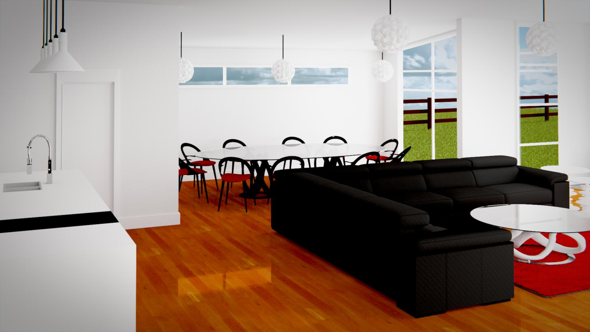
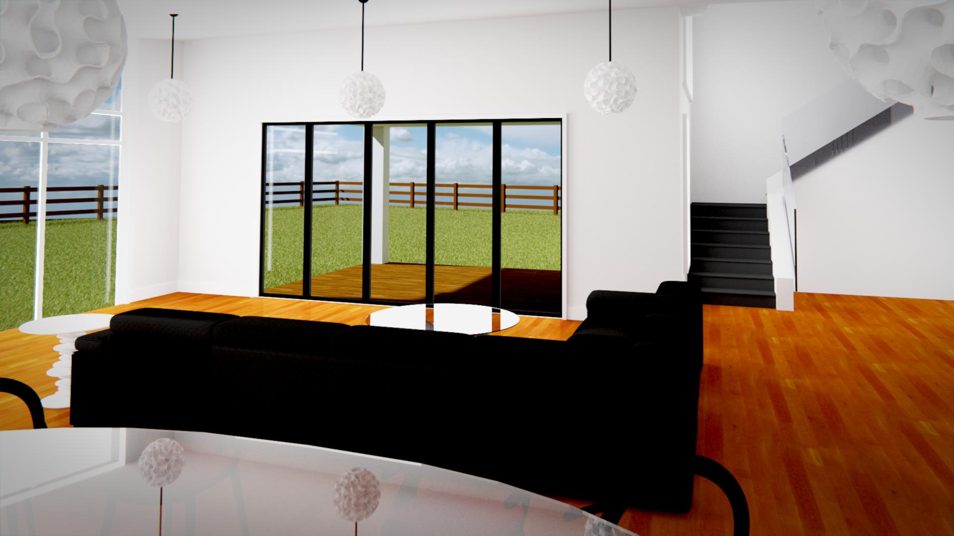
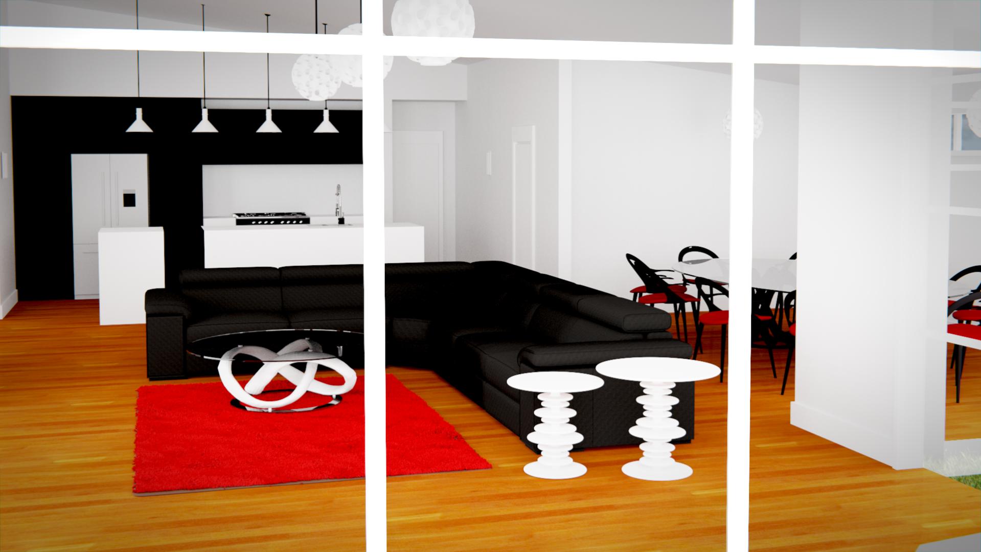
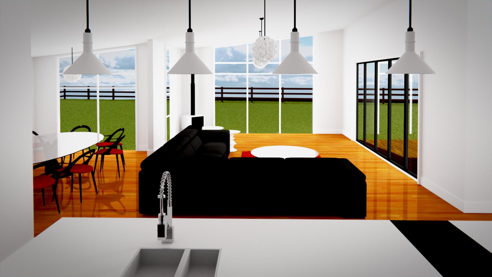
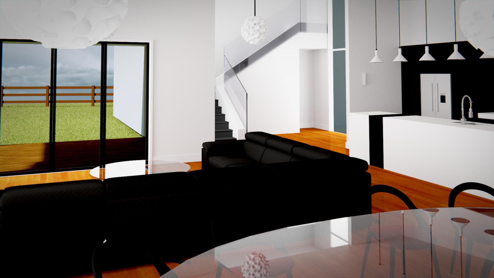
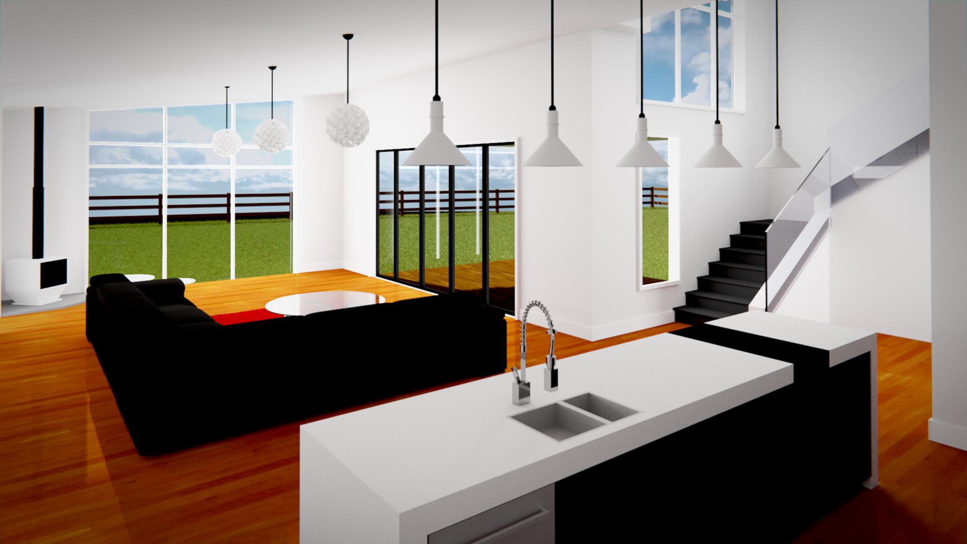
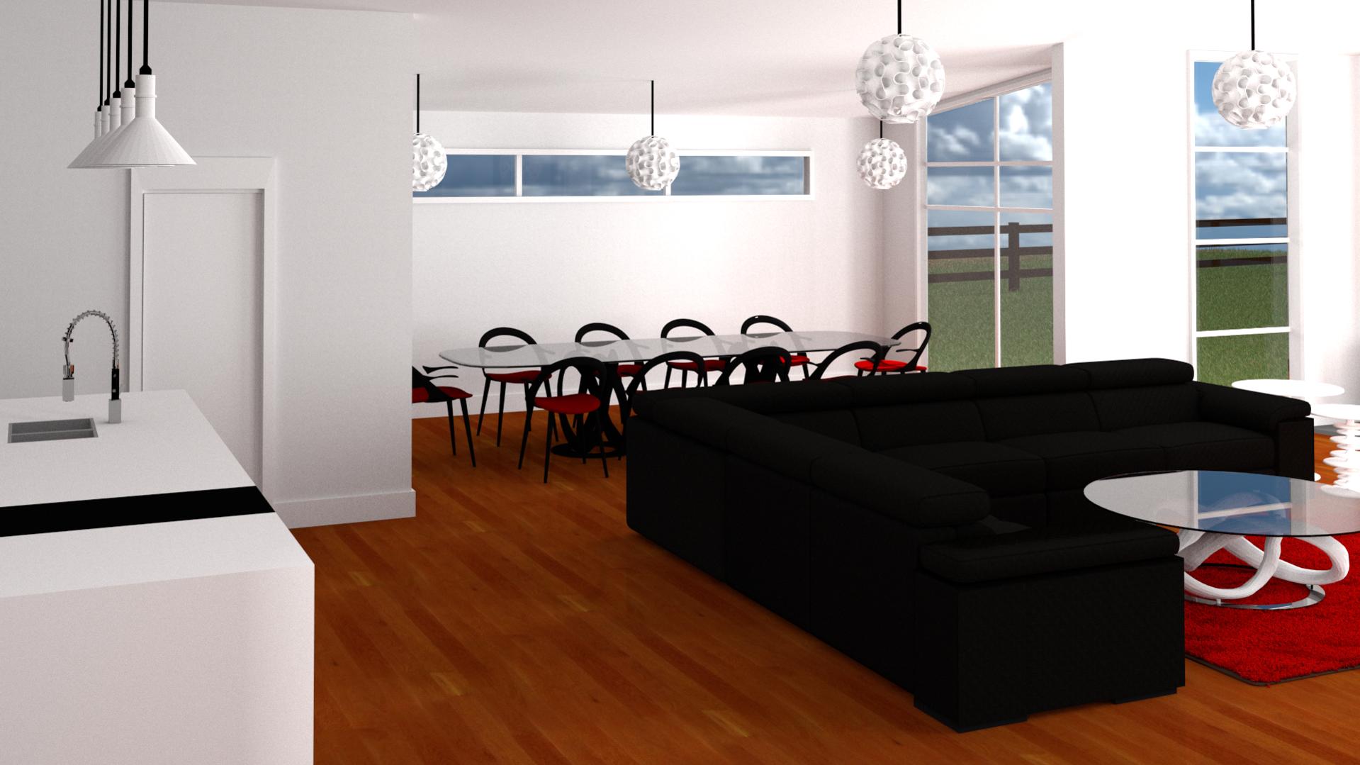
Another issue might be with the layout of the scene: everything(!) is locked to a floor grid. I’ll bet that the sofa is precisely parallel to both walls, and that the furnishings are similarly “on a line.” Likewise, your camera positions often cause the lines of different things to precisely coincide. (For instance, notice how the sofa precisely lines up with the ascending staircase. And, P.S., in that same shot, notice how the deck outside the door appears to slope up towards the railings. Compare the interior floor-line to the outside floor-line.) When two lines line-up in this way, in a two-dimensional rendering the illusion of depth disappears. It’s kinda like a tree growing out of someone’s head.

My suggestion, then, is to rough-up the place a little bit. Make it look “lived-in,” or at least “livable.” Colors! Textures! Spot lights! Instead of a study in black-and-white, how about making (say …) the sofa slightly brown? A decorator might choose glasses or plates or some-such that are, say, “a bold splash of red, or blue, or yellow.” Anything to add visual interest.

And, a little “messy arrangement” of things so that it doesn’t look like the interior decorator placed things on the floor using a chalk-line and a measuring tape. A lot of the illusion of depth comes from slight variations in how things are positioned and how they are lit, and how the various lines within the scene don’t precisely match up to one another. Even a very slight rotation of various objects will add a great deal of interest.

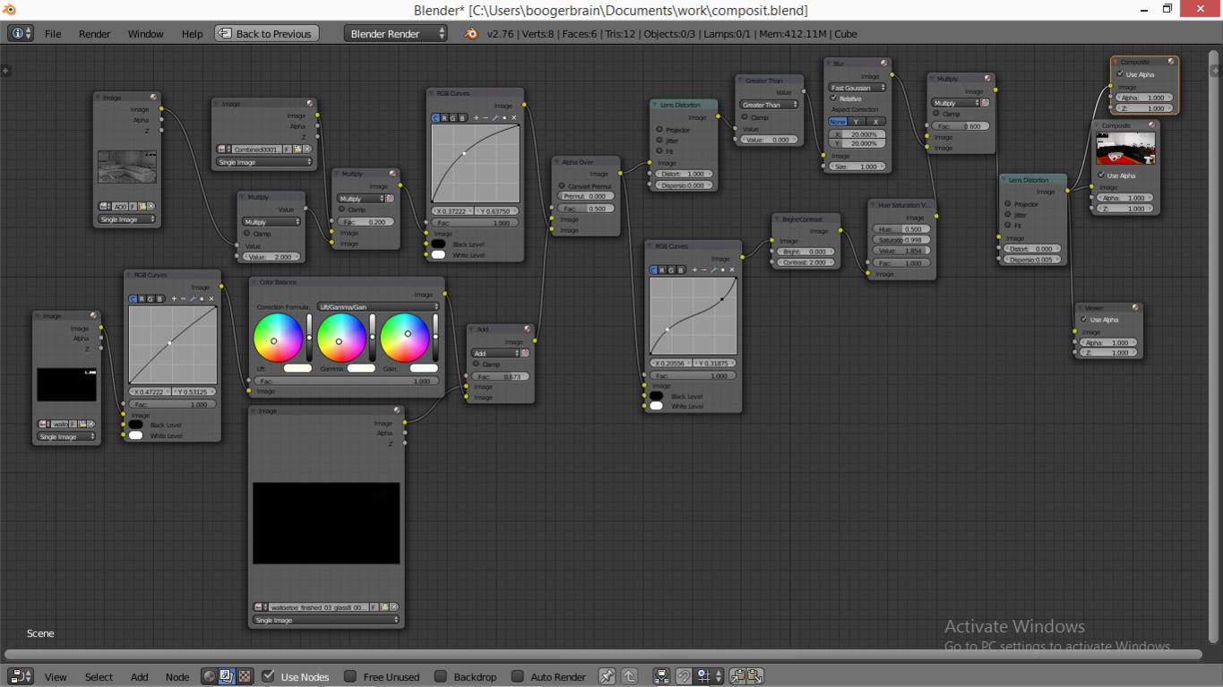
Remember the CG lighting man’s favorite power-tool: the shadow-only spotlight. (Impossible to exist “in the real world,” but, happily, “this is not the real world!”) Use this to “cast shadows” without lightening the surface. You can even do this in a separate (Blender Internal …) render that contains (or, from which you are interested in …) “only the shadows, ma’am.” Then, with the compositor, use these shadows to darken selected areas of the scene, and/or to cast a slightly different (bluish?) hue into the shadows. Shadows are probably the most important factor in creating the illusion of depth, but they are expensive to calculate “correctly.” So, render shadelessly and inject shadows judiciously.

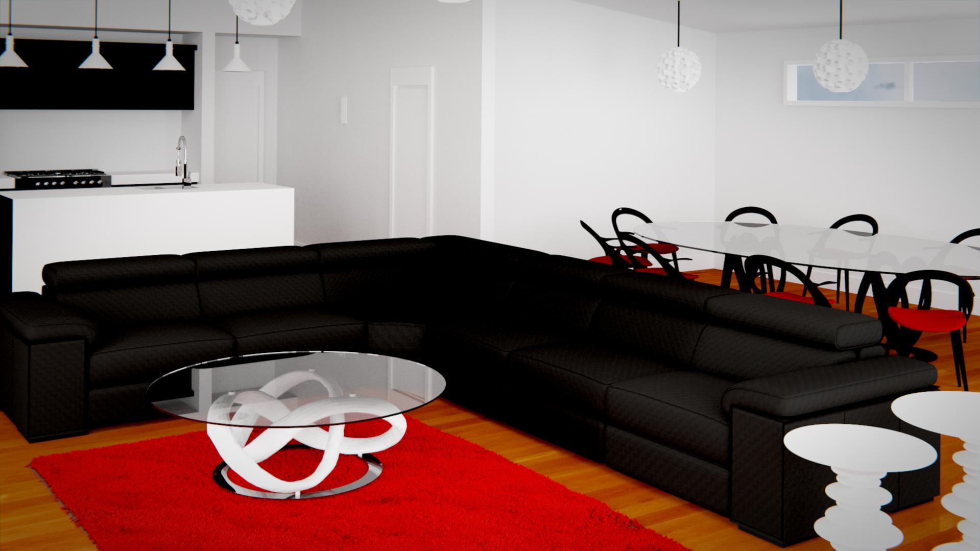
A standard tool that I’ve had since my photo days is “cropping boards,” made by slicing an ordinary picture-mat in half (diagonally) to make two L-shaped pieces. Within most shots (including yours) you will find a “tighter” shot … and a much better one … by cropping what is there. If you allow things “of equal visual interest” to be placed all over the frame, the viewer doesn’t know where their attention ought to be centered … doesn’t know what this picture is “about.” Don’t try to make the shot be “about” everything in the room at one time.

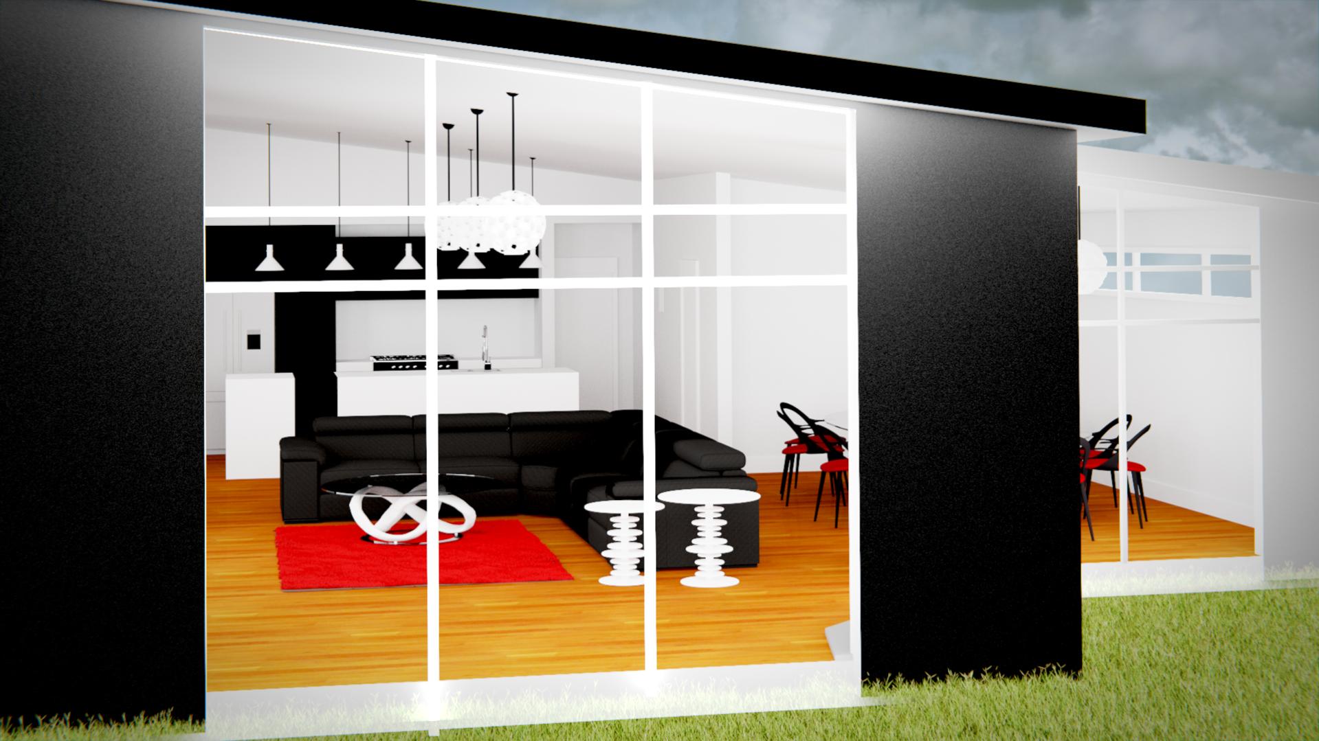
“Fly around” your scene in the workspace and/or in OpenGL Preview renders, looking for the most interesting places to put the camera, and watching carefully for “head trees.” Don’t shoot everything from the same distance, and don’t feel like you have to include everything in the shot. Also, don’t shoot everything with the same f-stop: vary “wide angle” vs. “telephoto” vs. “normal” shots. Let the cameraman sometimes stand on a ladder and sometimes crouch down. When shooting through a window, allow the window-frame to act as a framing device. A very, very slight z-rotation of the camera can add interest without making things look like they’re going to pour-out of the side of the frame.

Thanks both of you for your help. I’ll try to fix/adjust your suggestions and put an updated photo up shortly. You two rule!

I changed the lighting, i haven’t changed the textures or the positions of the furniture yet but its a start.

Before:


After:


High Quality render with better lighting.


Does this look better to you?

  • Every material needs to have some gloss , preferable with some kind of fresnel or layer weight. Best is PBR but not most important.
  • There need to be much more detail in your geometrie. For example in a way that there are no sharp edges. Look in your real room, there is nothing sharp.
  • As much as possible… try to get shades or I should say gradients everywhere. Not in your diffuse color, but by lighting.
    Look at some pictures about interior design… you will see that the gradients on the wall, and the gloss on the materials make it look good.
    You can maybe put a bevel on some edges.

After that , to make it really realistic:

  • Bounces: I would say at least 4 diffuse and 8 for gloss
  • Caustics on
  • And because of these two a lot of samples. ( 4000 ? )

What I personally like more:

  • More drama by reducing some lamps, so not everything is that light. But it depends what you want…

A good guide would be this http://www.chocofur.com/tutorials.html

Take a look at their tutorials, they’re pretty good; and as a plus you can download a bunch of materials and models from the site too.