Hello everybody,
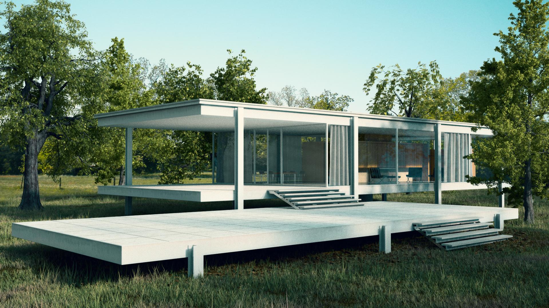
I’ve been working on a project for a week. It’s a visualisation of a well known Mies work, Farnsworth House.
I would like to hear your thoughts on it. My main concern is composition, I was trying different angles and positions of the camera, but in the end it comes out kind of boring for me. In other words I can’t decide where to put focus. I’m pretty satisfied with modelling, materials and lightning.
wow, the grass looks so realistic.
What if you make sections , like a collage of 3 pictures in one, so it easier to make some close ups and more interesting angles.
I have read some articles this week telling me that usually we want to catch the whole house, but that seems to be boring.
Thanks, part of the grass models are from Andrew Price (free sample pack) and few of my own.
yeah the problem is that I don’t want to hide anything I made even though I should to get a better shot.
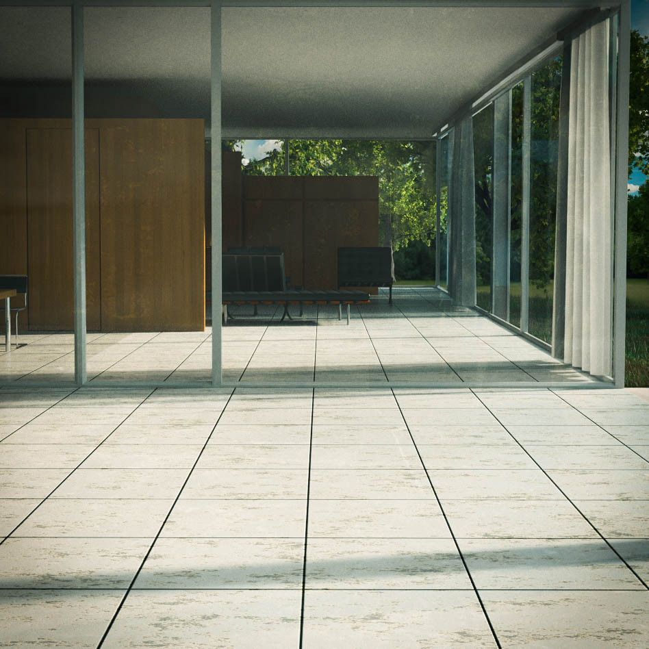
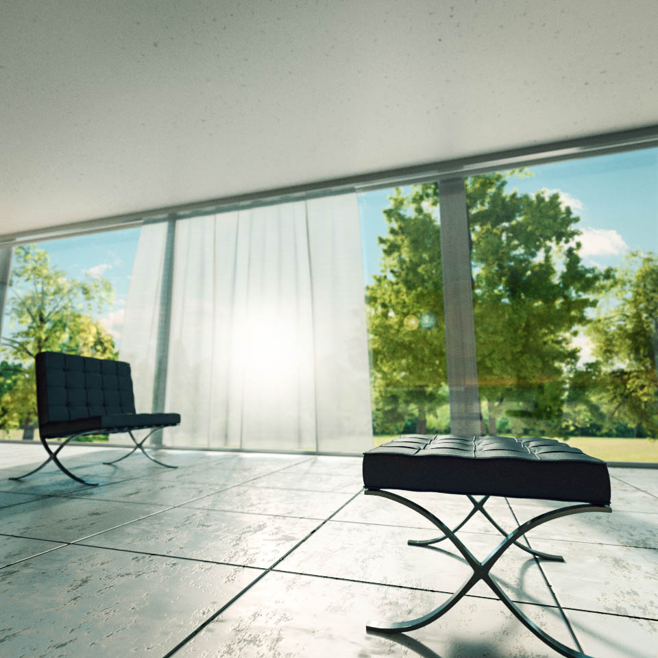
As you said maybe 2 close ups combined with this image would give better result.
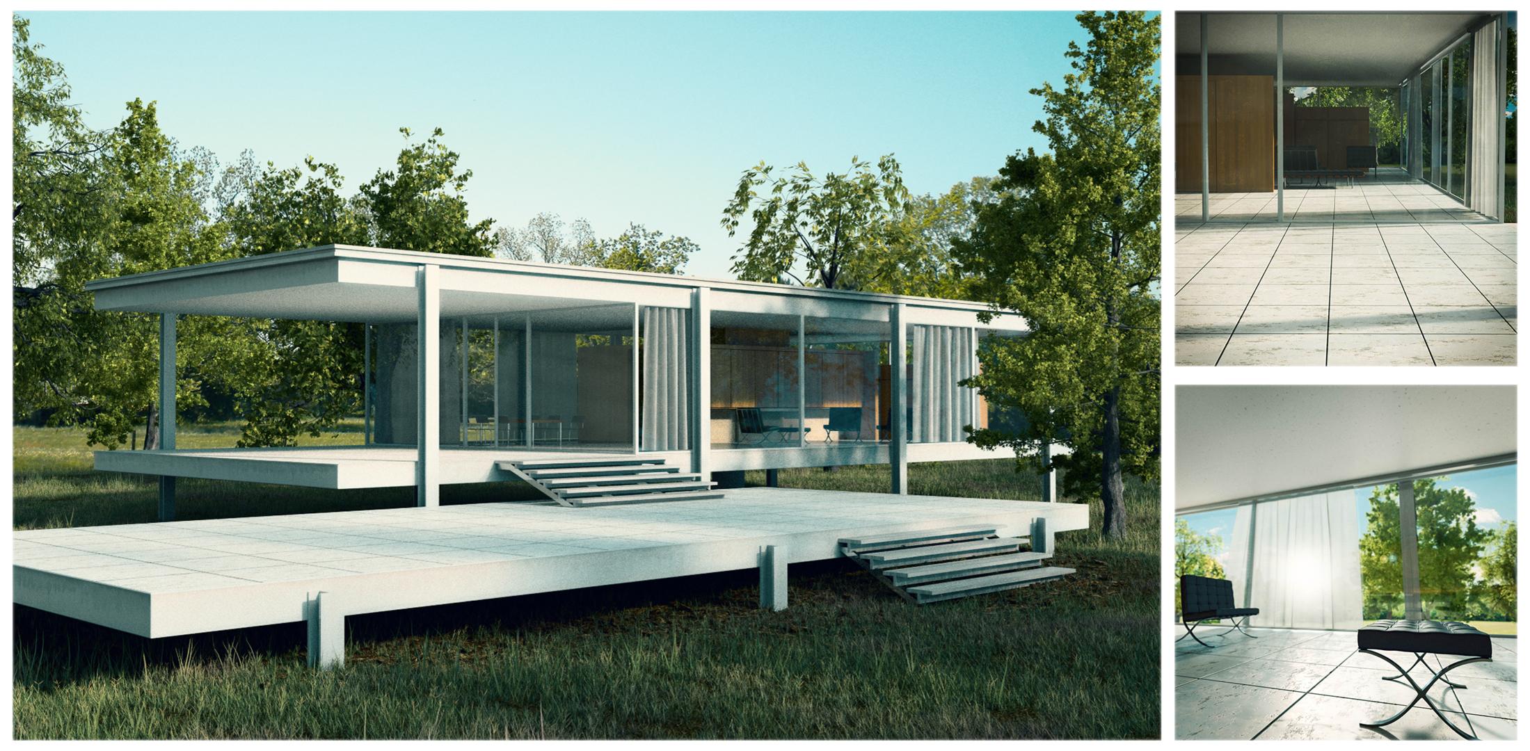
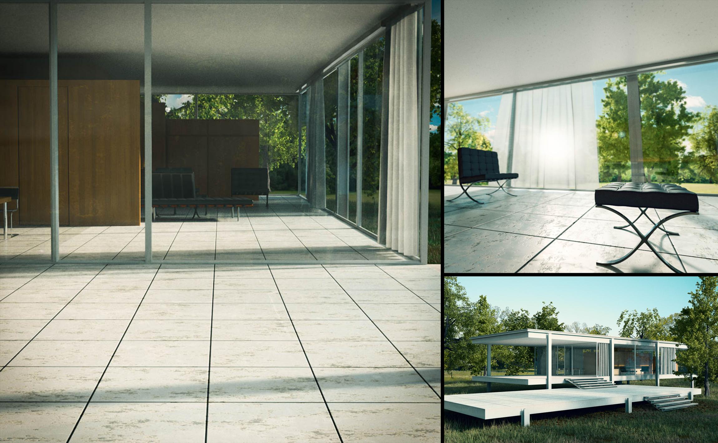
I made two more renders from different angles and combined it with the original, still not sure about it. Maybe angles aren’t good or the way collage is put together, but it’s somehow not working for me.
Looks a bit better to me… but I am thinking with you…
What if the collage is in the proportions of the golden spiral ( 3 pictures in one ) as described here:
And I think the white borders are to thick, I think I would use thin black lines ?
The first picture could have slightly another angle and a bit more close up ?
Had some free time again and made another collage that might look better. I used golden ratio spiral to position and scale those images + paid more attention to close ups than the whole house.