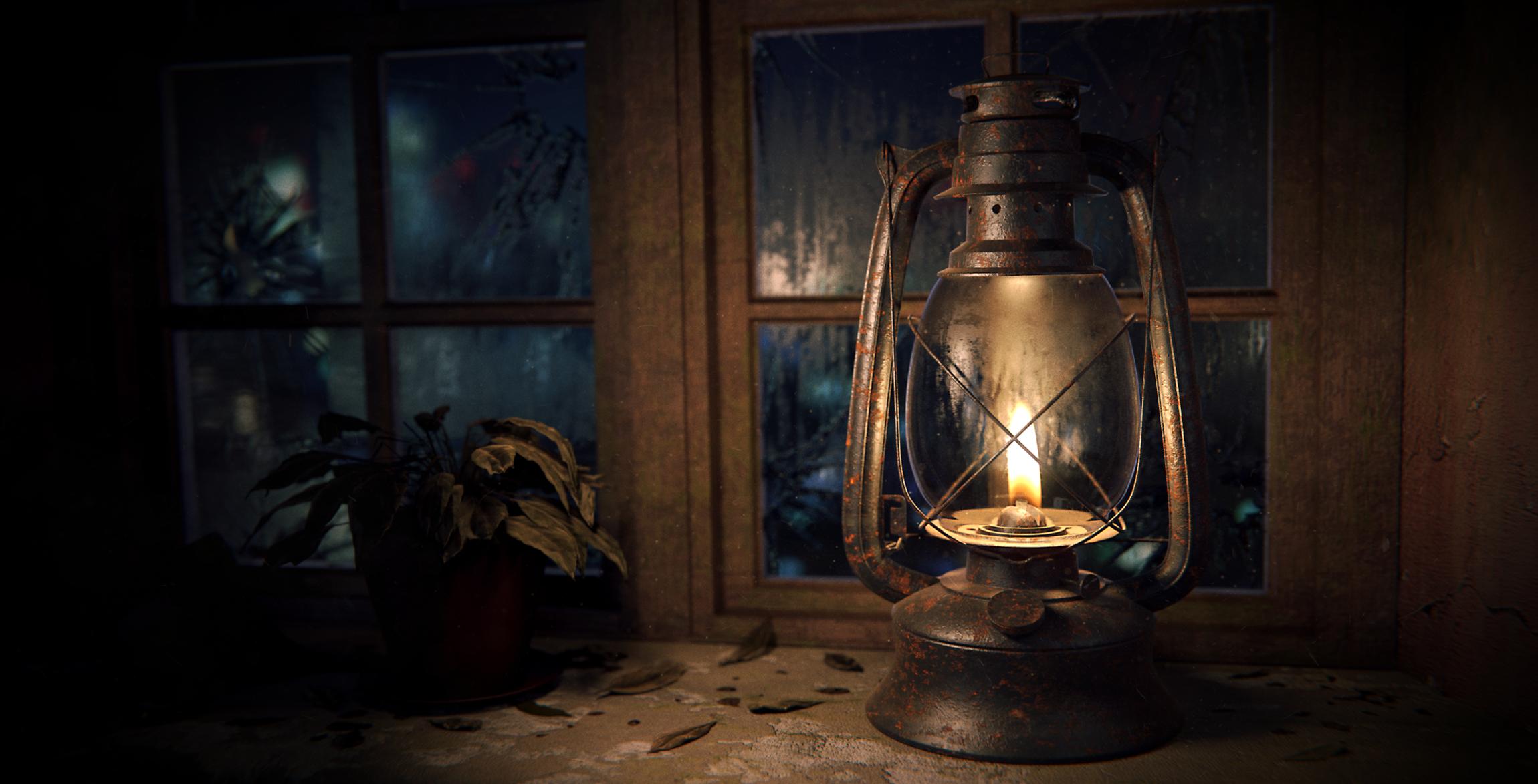
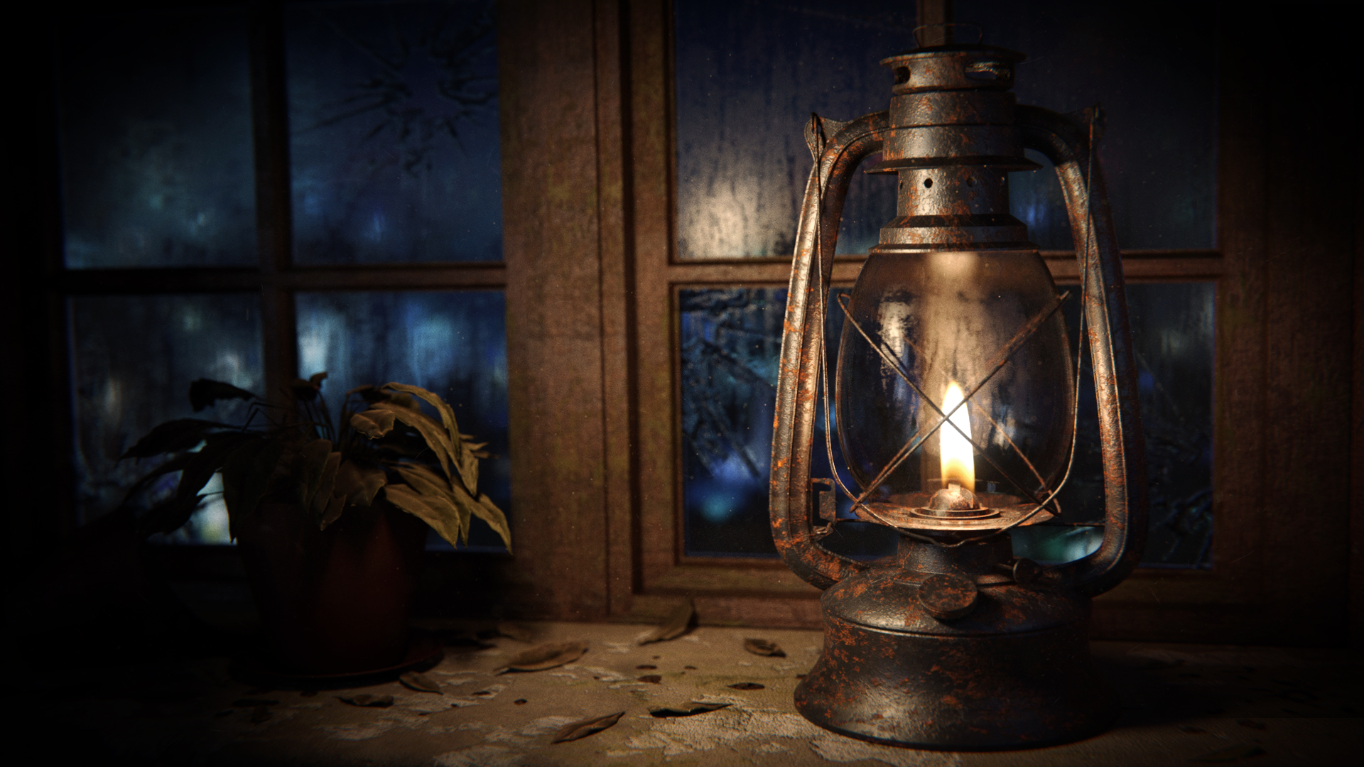
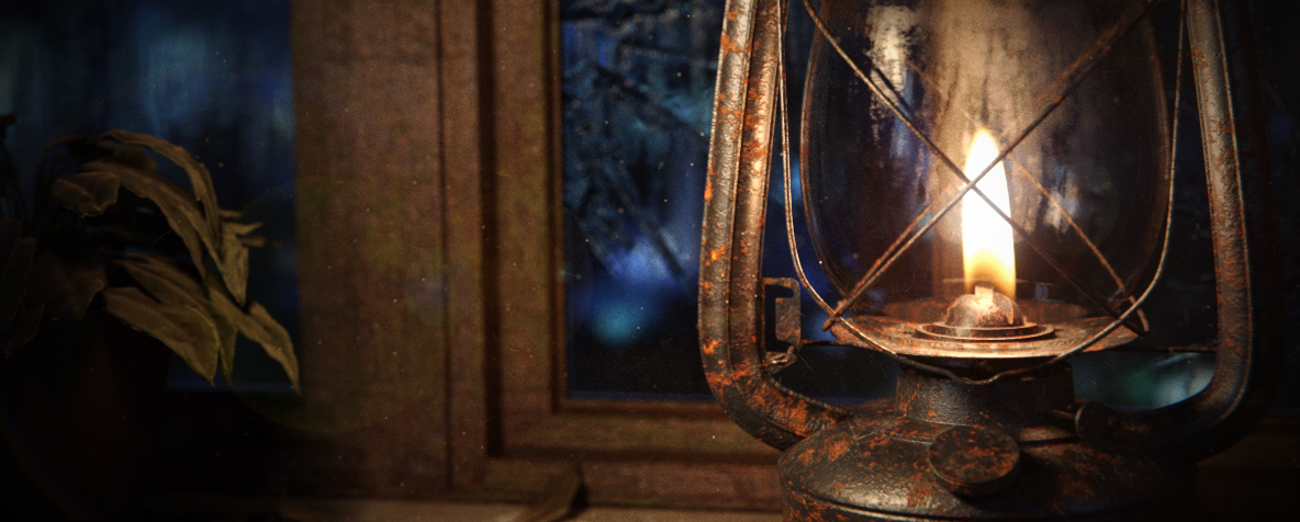
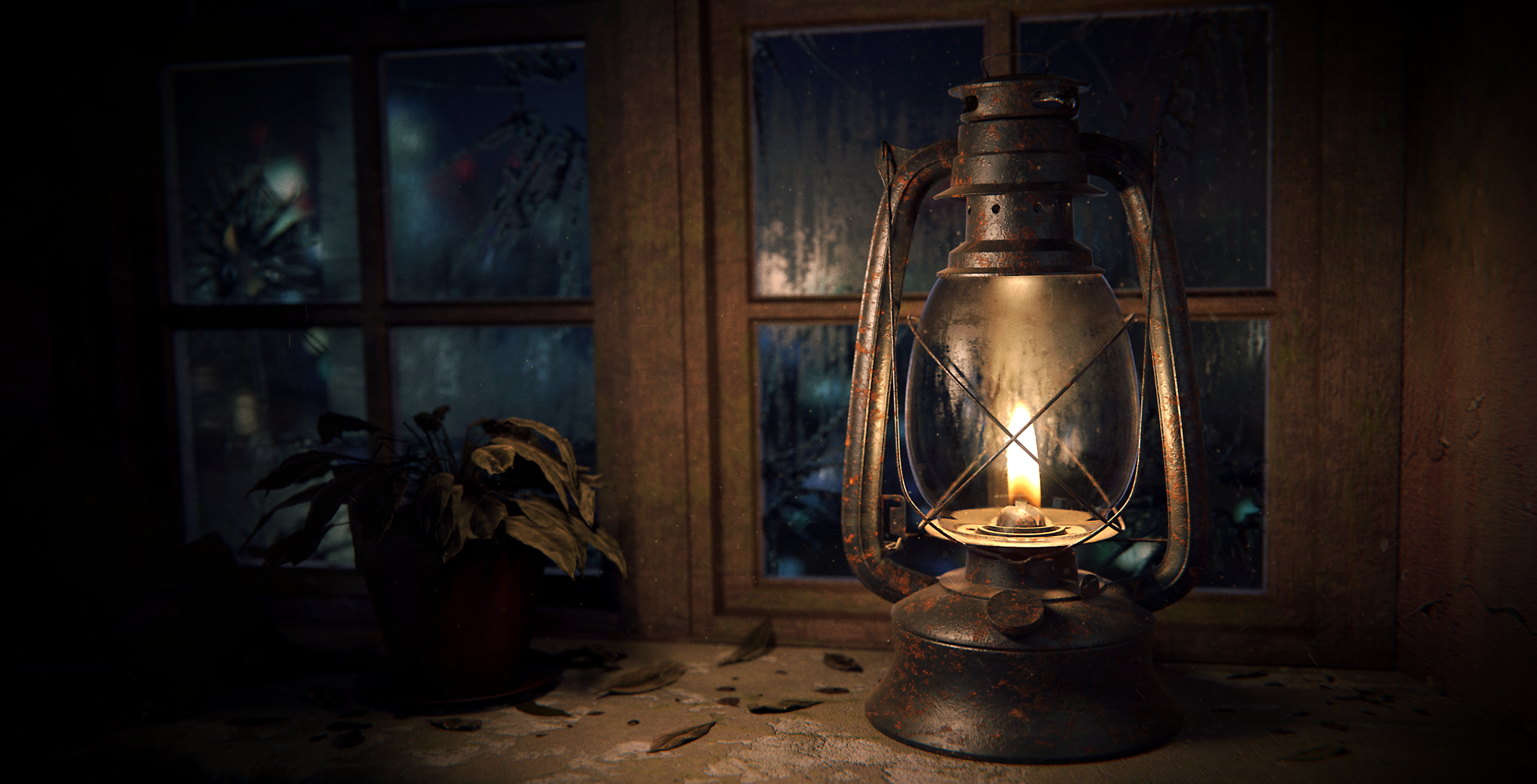
The original idea was just to put the hurricane lantern in an old, abandoned house, but then I thought a blue, modern city in the background would be a nice, interesting contrast. ^^ - Soooe… - Yea, that is what it is supposed to look like, at least.
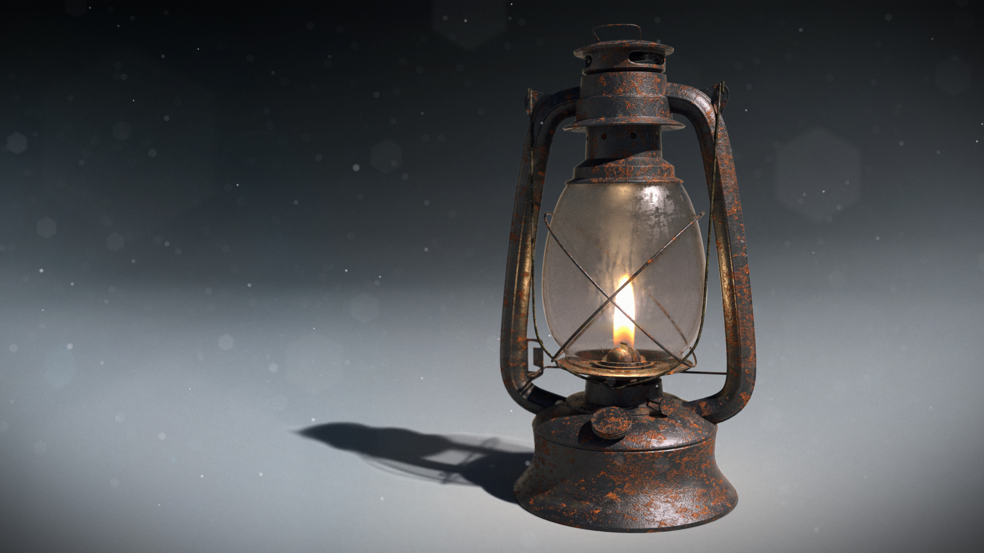
Made in blender with cycles and post processed in the Blender compositer and in Photoshop.
1000 samples, 2034 x 1176 (Idk, why I choose this res…)
Hi,
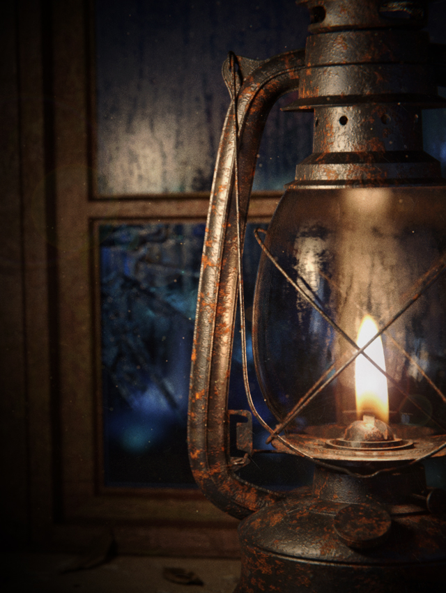
I like this image, this is really well detailed. I find the lighting very good, the warmth of the inside contrast very well with the cold blue outside. Maybe I would have made the picture a little more zoomed (scarcely, just to have a little less empty space on the edges)
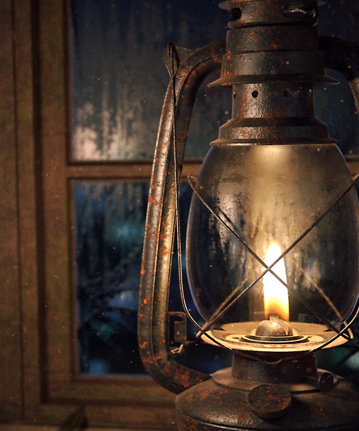
Very nice texturing! I agree with tellurian that croping it in would help the composition. The thumbnail is pretty nice in that regard imo.
Keep it up!
Thanks for your feedback!
When I made the final render i actually thought about adjusting the focal length to get rid of some of the empty space and I have no idea why I didn’t do it… I also think a larger focal length could give the image a better feel. - I might fix it if I get the time.
I watched the tutorial from Blender Guru and got the general idea of how I would build the material, but mine is a bit more complicated than his. Thanks for the feedback!

