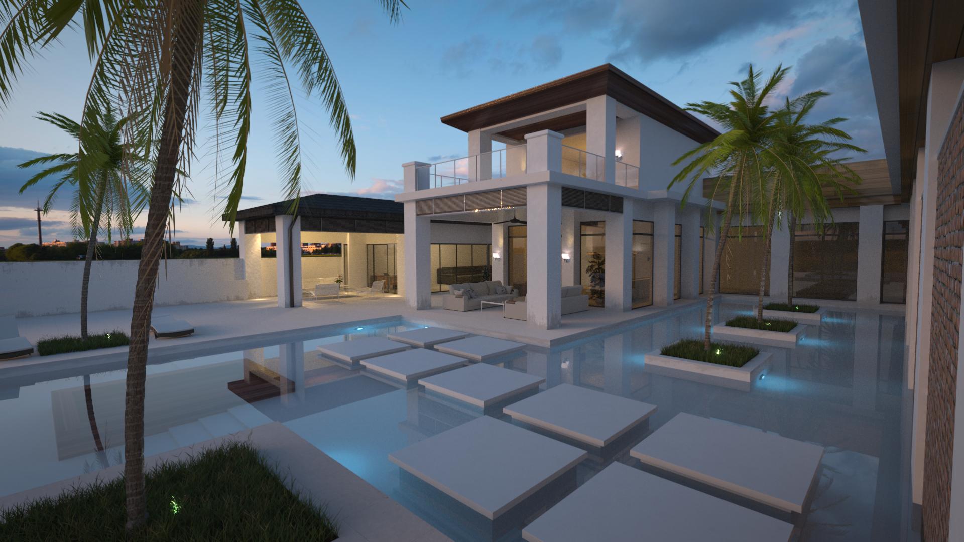
Looks perfect to me. The only thing is that the water is as straight as a mirror. What about mixing in a bit of a normal map into it. ?
Another thing, but that is very personally, is that I am afraid of the glass ( how do you call it, partition? ) at the second level, afraid to fall trough it. Oh yes, what about some bump on the stepping stones on the water, so people wont slip out that easily?
Thanks for the feedback! I totally agree with most of it. The water is way to flat, adding some ripples could make huge improvements. and the stepping stones are also too flat/slippy, the amount of accidents which would occur there
The glass railing is probably something I will keep though.
Thank you for the feedback!
The water is currently using an IOR value of 1.33, (~20*C water), I don’t think I personally would increase it much more. (if that’s what you meant by refraction, if you where pointing out the flatness of the water, then yes, it’s in need of some small ripples).
Some tiles on the bottom is a great idea, should probably make the pool a bit deeper first though, it’s currently only up to around your waist. The volume absorption tip sounds amazing, I have never really made any use of the volume feature in cycles, I’ll definitely try adding it later!
It is looking too perfect and cg. It needs minor displacement everywhere. Grunge everywhere. Mix in procedural or image grunge on virtually evrything using a mxrgb or mix shader, get it strong and old and nasty, then lower the factor until you can barely see it. Same with a displace modifier. The palm fronds need some work they are coming off uncanny an cg.
Artistically I think you get a big bang by lowering the sky/hdri ambient light making it later and darker, and jacking up the pool lights and lightbulbs on the deck. You will probably have to go very high samples to clean it up but it could work nicely. The eye is usually drawn to the brightest spot first, and so I’m always heading towards the sunset. By darkening the sky and increasing the emission on the white parts of the house you draw the viewer into the house and away from the sky and increase the contrast in a physically accurate way – the volumetric pool lights could be be really nice. Great start!
Along the lines of being too perfect, I think the palm trees need more variation. Maybe even just rotating them different angles would help. You might also add a pool toy or something to see if that could break up the perfectly clean look (assuming that isn’t what you’re going for). But basically it looks pretty good.
he lights on the palm tree look like you just made a lamp and pointed it up. you need to model so meting that the light comes out of. also the brightness might need to be tweaked
I agree, this is the first thing that jumped out at me. As a landscape architect I tend to focus on the plants/grass in the scene, which are typically thrown in as an afterthought. I would rotate each one (all 5 appear to be exact duplicates, which is far from realistic), also scale each (some can be up to 40’ tall) and skew/straighten the trunks. Also, palms shed a lot of debris, so I would make a few dead “leaves” or plant material and use a particle system to sprinkle out across the water, grass, and stepping stones that are close to each tree. Also, grass won’t typically grow right up to a tree trunk like shown…I would weight paint the grass out from around the tree base. Other than that, its a nice looking scene. Good luck
Thank you all for all the feedback and tips I’ve been getting.
I just started collage so I’ve had a rather busy couple of weeks, But I can’t wait to fix all these things you all have been suggesting.
I just really wanted to say thanks for all the feedback, it’s really appreciated!