How about this?
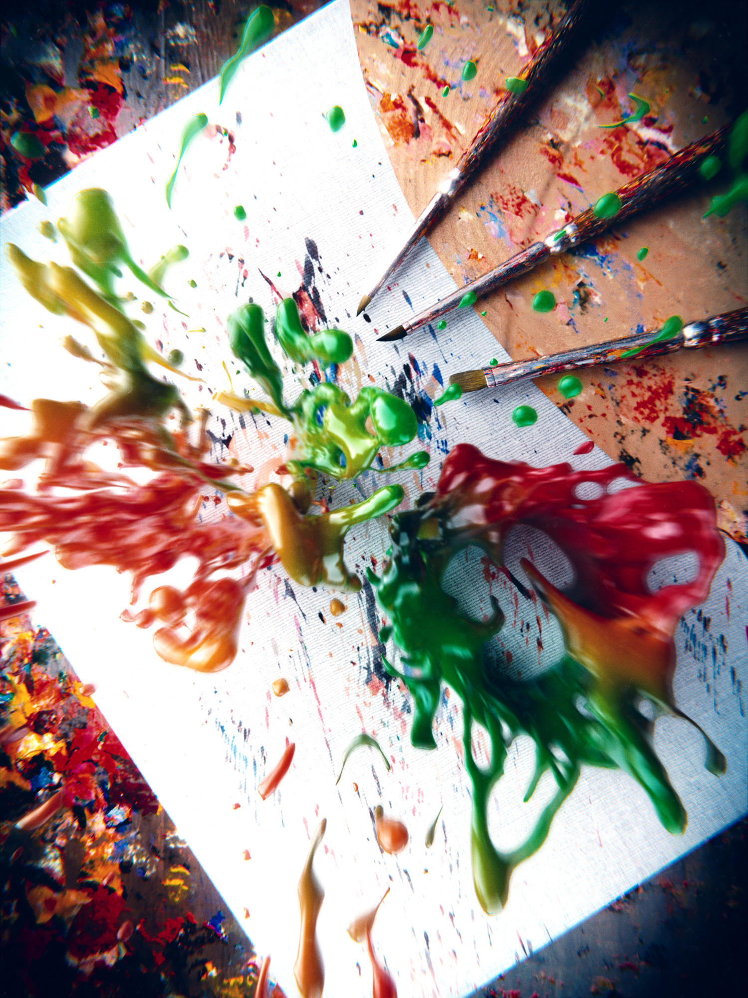
Really like the composition! Only thing I would change, are maybe the two main colors!
Good job anyways!
I disagree with Brudigem. I love the colors they are very eye-catching. The position of the three paint brushes are confusing however. They seem to ble placed very carefully instead of just lying there randomly.
This would be really interesting to see in a 3D movie, but as is, I’d prefer some indication of how close the paint is, (like a slight view change). Also more flat splatters on the paper around the 3D one would make it feel less like a fountain spurting up from the paper, and more like a splatter. Still, a good looking piece.
I like the idea behind your picture but from my point of view it’s a little bit to blur-ish. What do you think about just blur the top most parts of the color splash a bit? This would lead the focus more to the well done splashing colors and not so much to the rest of the scene.