Hi all, I have a fairly large number of images I want you guys to tear apart critically, but I’ll start with these. Please tell me what you dislike about my images. Don’t worry I wont be offended and I honestly appreciate any time you guys dedicate to helping me become a better artist. To make sure I don’t miss out on any criticism I’ll give this post some time to gain responses (I have no idea how long that’ll be) before I post the next batch of images. TTFN (TaTaForNow)
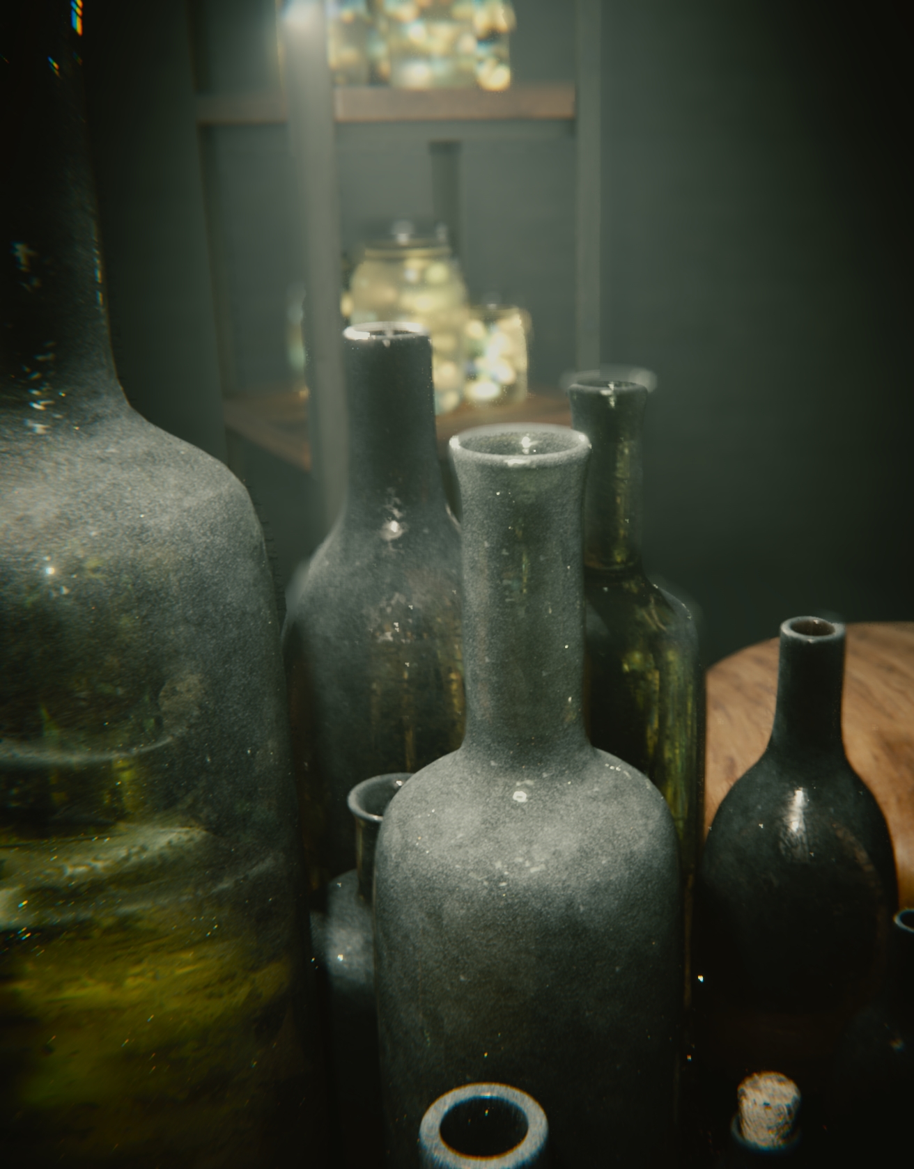
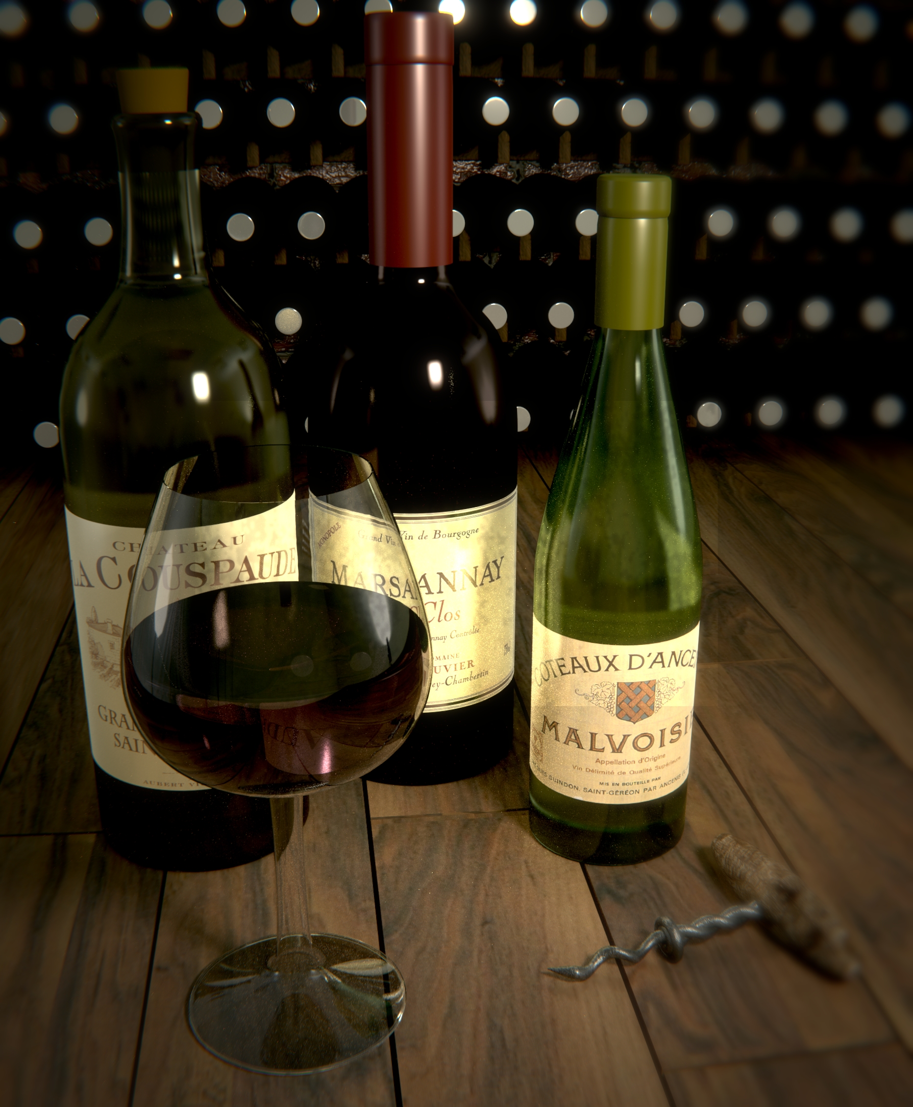
It’s pretty solid. My first thought was, not another wine bottle scene! That said, it’s well beyond most wine bottles. It’s unclear what the material is supposed to be on the main bottle in the center (towards the top of the bottle), is it dust gathered? it’s coming off more like granite. Overall I like it, it has a feel and a mood.
The lense distortion, chromatic abberrrationg seems to strong, in the corners it’s not helping. The cork in the lower right of top image looks wrong, and the distortion is hurting. Most bottle also have rings around the top where the glass gets thicker.
The vignette is coming off odd because of how the scene is lit. You shoudl be carefull using a vaginette when it can be interpreted as shadow on on a object, in this case the satnd in the background has lost depth clues due the upper left vignette.
top image, largest bottle on left, the curve you can see the low subsurf angles. And it looks to have some black hairs?
It is looking slight set up too, with only bottles and the surface they sit on, nothing else. I’d model some hint of story, an idea of where we might be. Is is a cellar, a house, a restaurant. Some trace of origin and location to help the viewer connect more. Doesn’y need to be much.
But overall it’s a solid and promising start. I like it.
No, this is another wine scene. (very old) 
Thanks a ton for taking the time to write up that brilliant image review.
Some of the filters are definitely too strong, I rendered these out in a batch of renders so I didn’t apply each filter myself, I put together one set and the computer applied it to all the images. The bottles are a little simple, mainly because at first they weren’t supposed to be the focus of the image, but the idea altered along the way. Hmmm, I didn’t notice those black hairs, it must be a render error.
Again thanks for the review.
I am both impatient and received an excellent image review, so here’s the next couple of images.
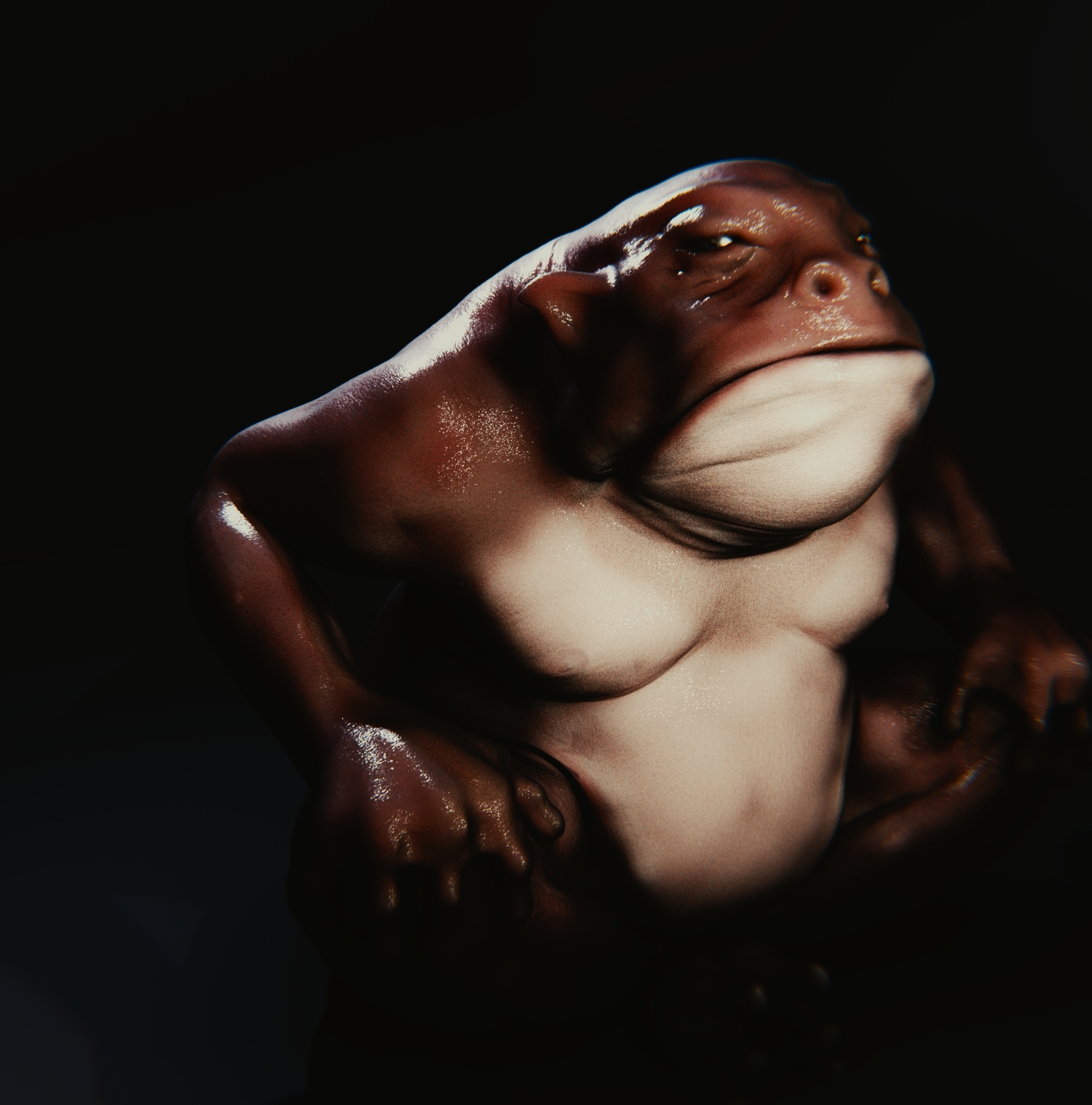
First image, Speed sculpt.
Second image, Speed sculpt.
Third image, Animation ready model (including rigged). The leaves aren’t my favorite and it probably would have looked better to use alphas, but I thought they kind of matched his style.
Attachments


Agree with Photox assessment. The bottles, unless all hand blown glass, would not look the way they do. An edge loop on the top of the bottles would give them a more realistic look. Also, the many, many small white dots on the bottles don’t really come off as reflections. Colors are good, as is the arrangement of the bottles. Not sure about the lighted glass case in the background. Wondering if you just got stuck on that idea because it seems forced rather than natural. Great start overall though.
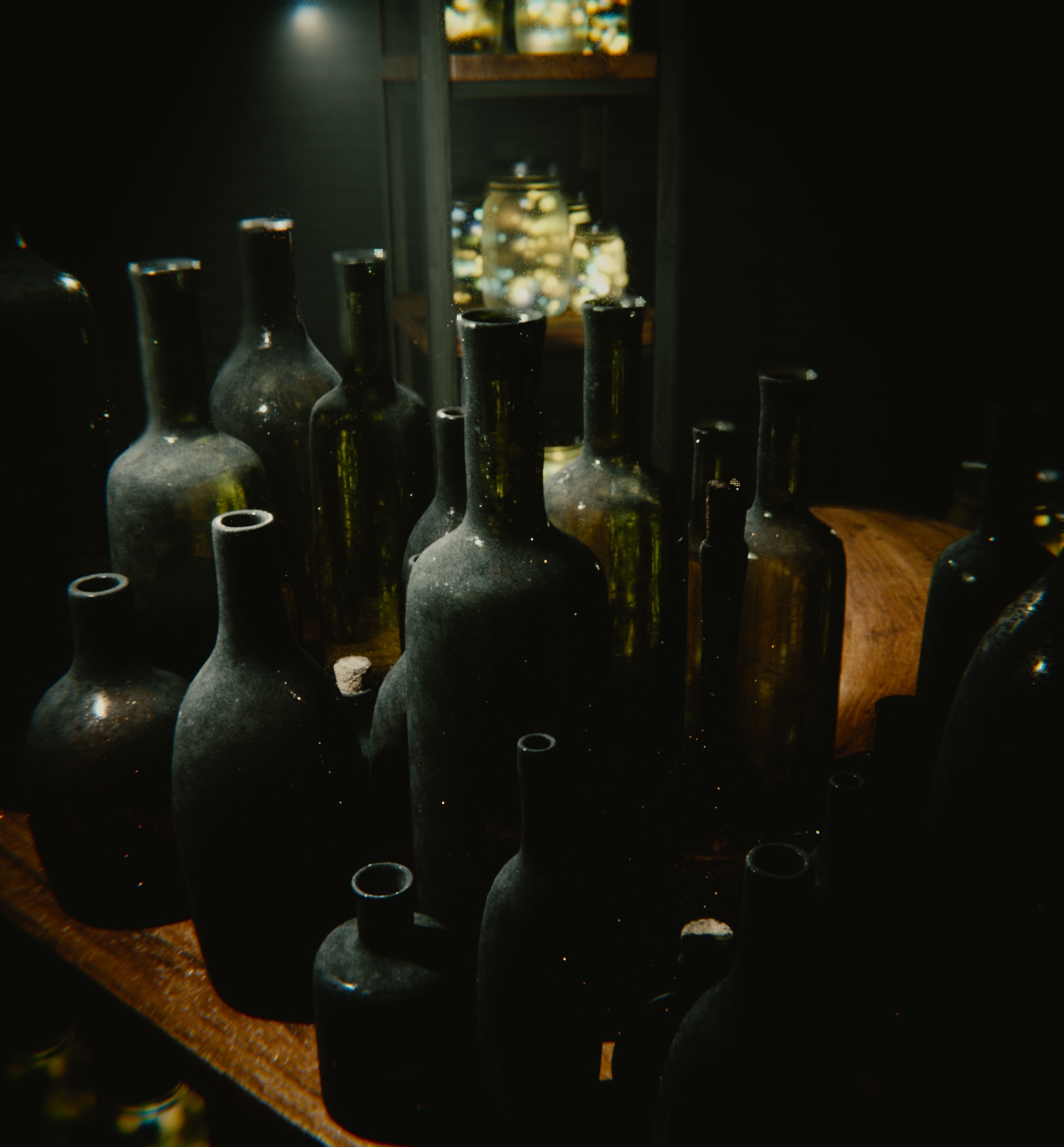
Candidly, methinks you kinda-sorta have a choice here:
(1) If the intended subject is the fireflies in the jars, then get rid of the wine bottles.
(2) If the intended subject is the wine bottles, then get rid of the fireflies, the jars, and the shelves the bugs are sitting on.
The image simply does not work, in either interpretation, with both of these powerful elements competing with one another.
What in the world what was the point of your opening post asking for a no holds barred critique? You made no attempt to address any of the issues brought up here, and posted a finished project with zero changes. Great critique session mate!
Mostly learning, that particular project is rather old. I wanted to put it up for people to see so I can learn what you guys say and apply the knowledge I get from here to future images which I will actually be able to address issues as I go along. Imagine you draw a picture and then show to your professor, then he tells you your lighting suck (or whatever) next time you draw you will pay special attention to those issues and create a better image.
Besides the fact I can’t fix it due to the fact my computer crashed awhile back and I don’t even have the Blend File anymore.
Plus, the finished images gallery is just that, a gallery. So I posted it there for peoples viewing experience just like I also posted this in my sketchbook. However this thread is for critic specifically so I posted it here to see what people think of it. You guys say the bottles are to simplistic? I research bottle types and I practice making more complex bottles storing that knowledge for future use. (and sometimes the assets). You guy say the lighting is crap I go and do some tutorials on lighting and attempt to better my understanding of the subject.
Same concept applies to the creatures, if you say I hate the leaves the next time I make leaves I’ll do it differently.
Again, I sincerely appreciate your review and it brought many valid points I will be able to put into practice, also if I am posting incorrectly please cut me a little slack as I am new to the forums. If there is somewhere else I can post to have my images reviewed and learn from those reviews please let me know and I will move to that thread.