I decided to fall in line and start posting my projects. If you good folk want me to post my files I’ll happily oblige… Just let me know!
Feel free to give criticism, post images for comparison, take inspiration, reuse my work and discuss.
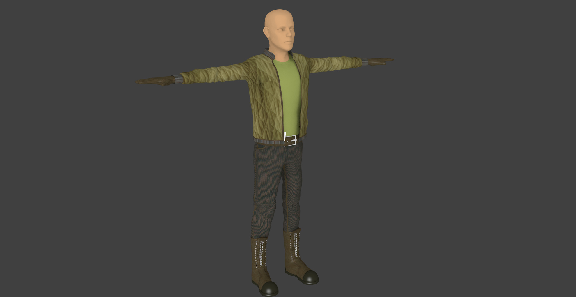
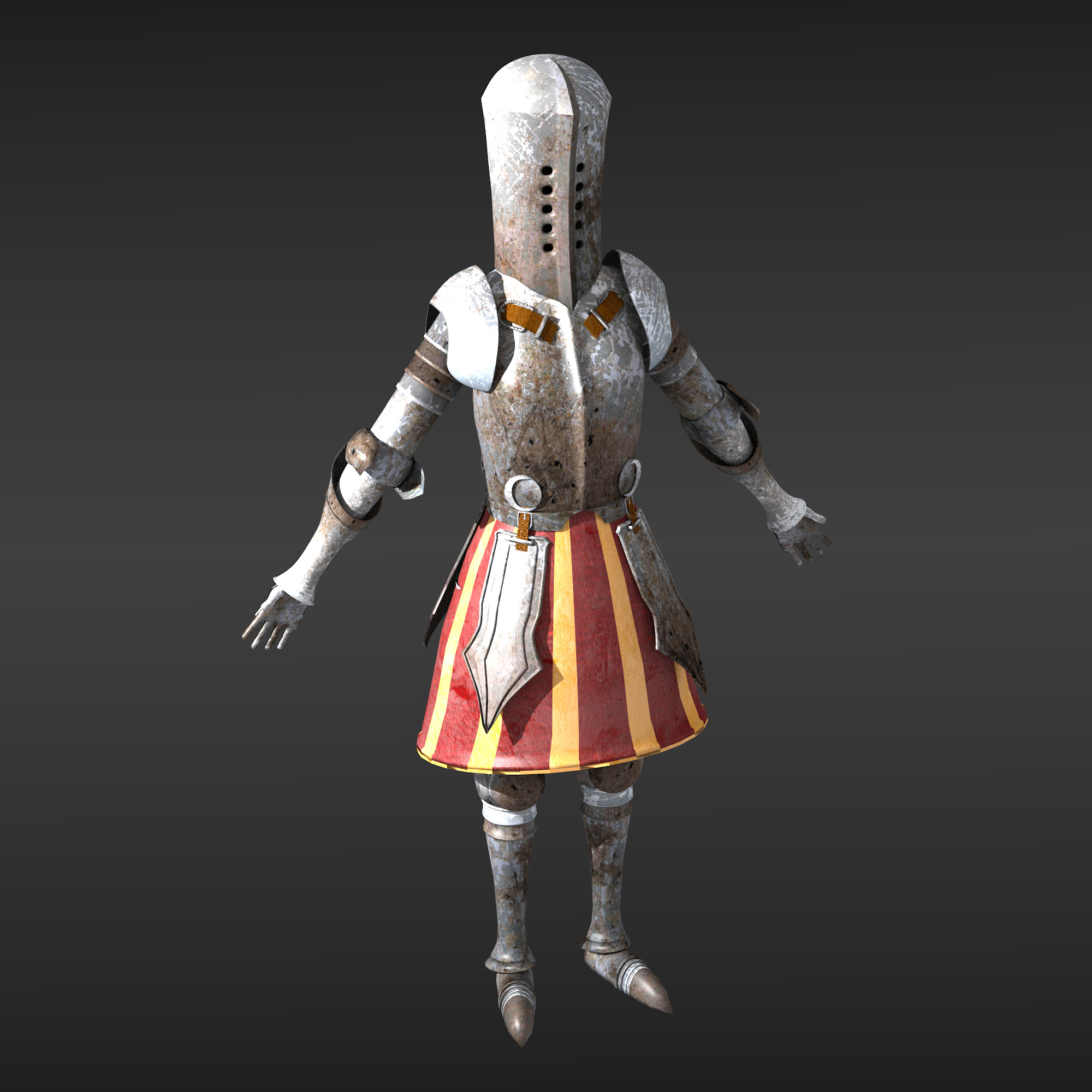
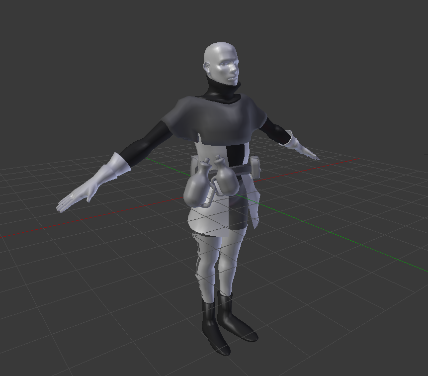
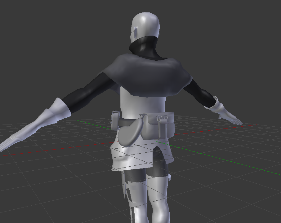
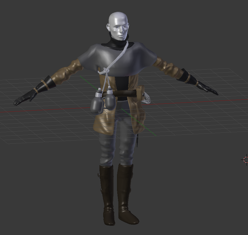
Here is my first somewhat completed model. It’s also the model I used to learn application of textures. the face was slapped on for the sake of having one… I have yet to try painting skin.
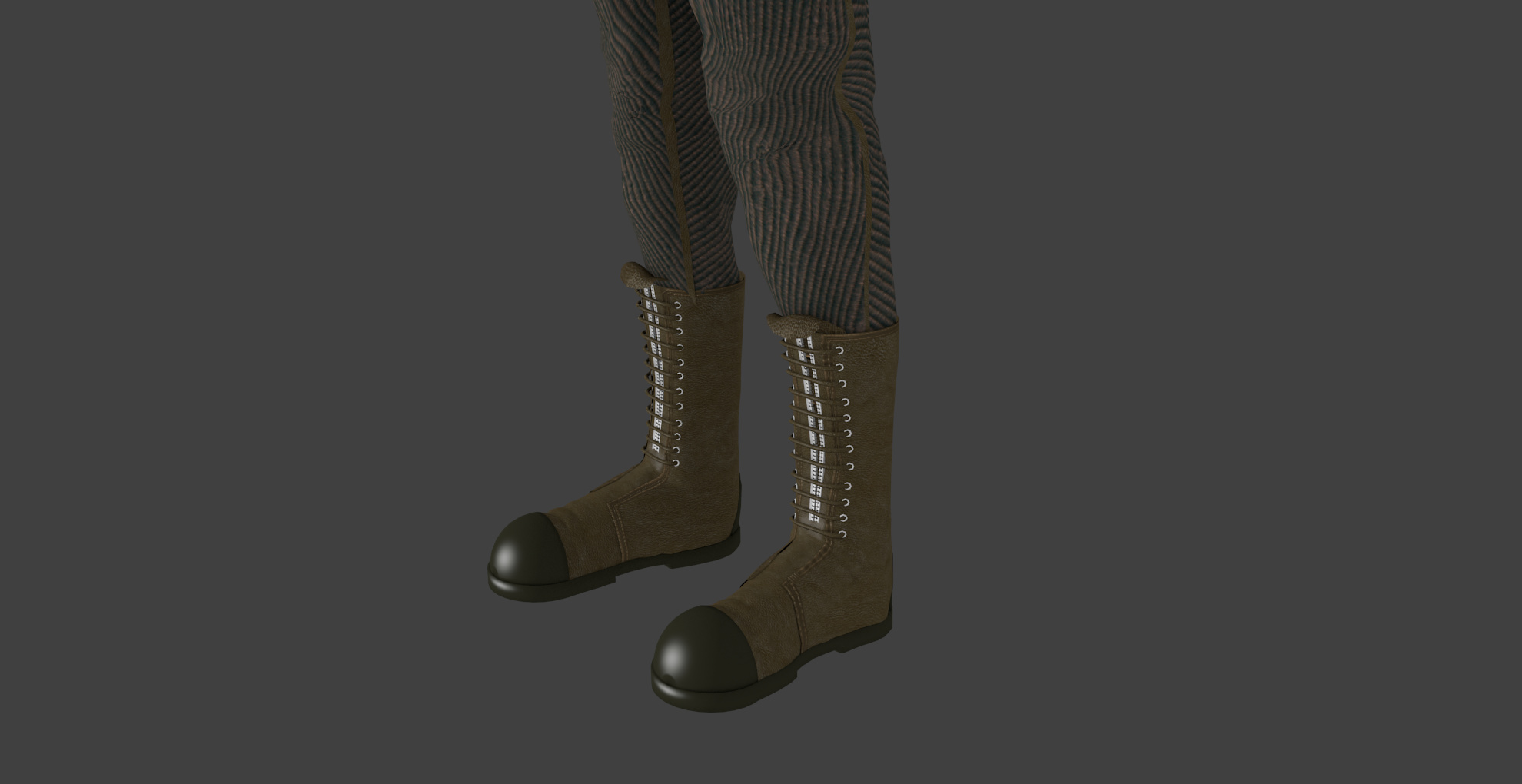
And a close-up on the boots. They’re quite simple XD
I’m excited to hear what my fellow artists think of what I post. Whether it reminds you of another image, something you’ve seen, a game or a movie, etc, tell me about it!
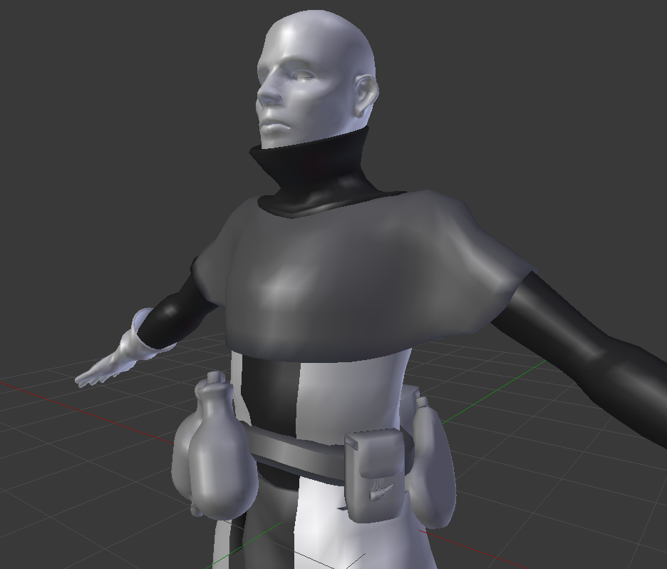
This looks cool. Especially the face. Did you model it? the only critiques I have, are that the head seems to be too big in comparison to the body. Also, the feet/shins seem a bit too skinny.
Scotchtape, yes I did model the face. It was a quick self portrait. It’s funny you say the head is a bit big because I have a large head IRL too XD Thank you for saying it is cool heh
Also, I understand why you would say the shins are a bit thin. I was looking at the model and another one I had recently done and thought the same thing. I noticed when I have been playing The Witcher 3 that the models they made have quite thick limbs and superhero proportions (seven heads tall) for just about every character. That is also the case for a lot of film and games in general…
I think I will start making note of this when making my characters from now on.
heddheld - ty! I think the issue is that I didn’t curve the toe inwards on either boot. They jut straight out from the heel, and the outer edge doesn’t taper at the toe. I hadn’t really noticed this until you mentioned it.
They aren’t much to look at, I know
I am very much inspired by ruinous landscapes, particularly by this book I have titled “Deathtopia”, by whom I can’t say (all the text is japanese), which is a collecion of photos from an abandoned resort/themepark island (from what i understand).
Other work I like that follows in this vein are Dark Souls and Marvel’s/King’s rendition of the The Dark Tower series.
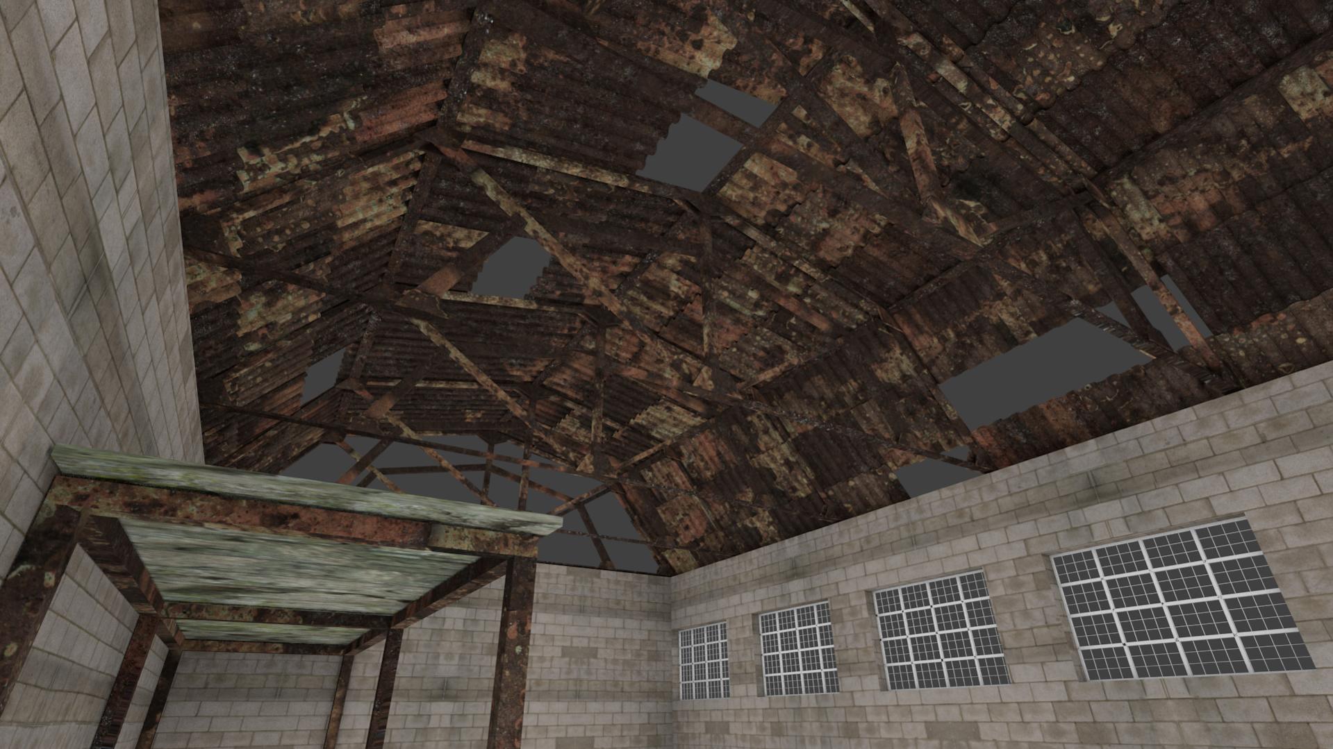
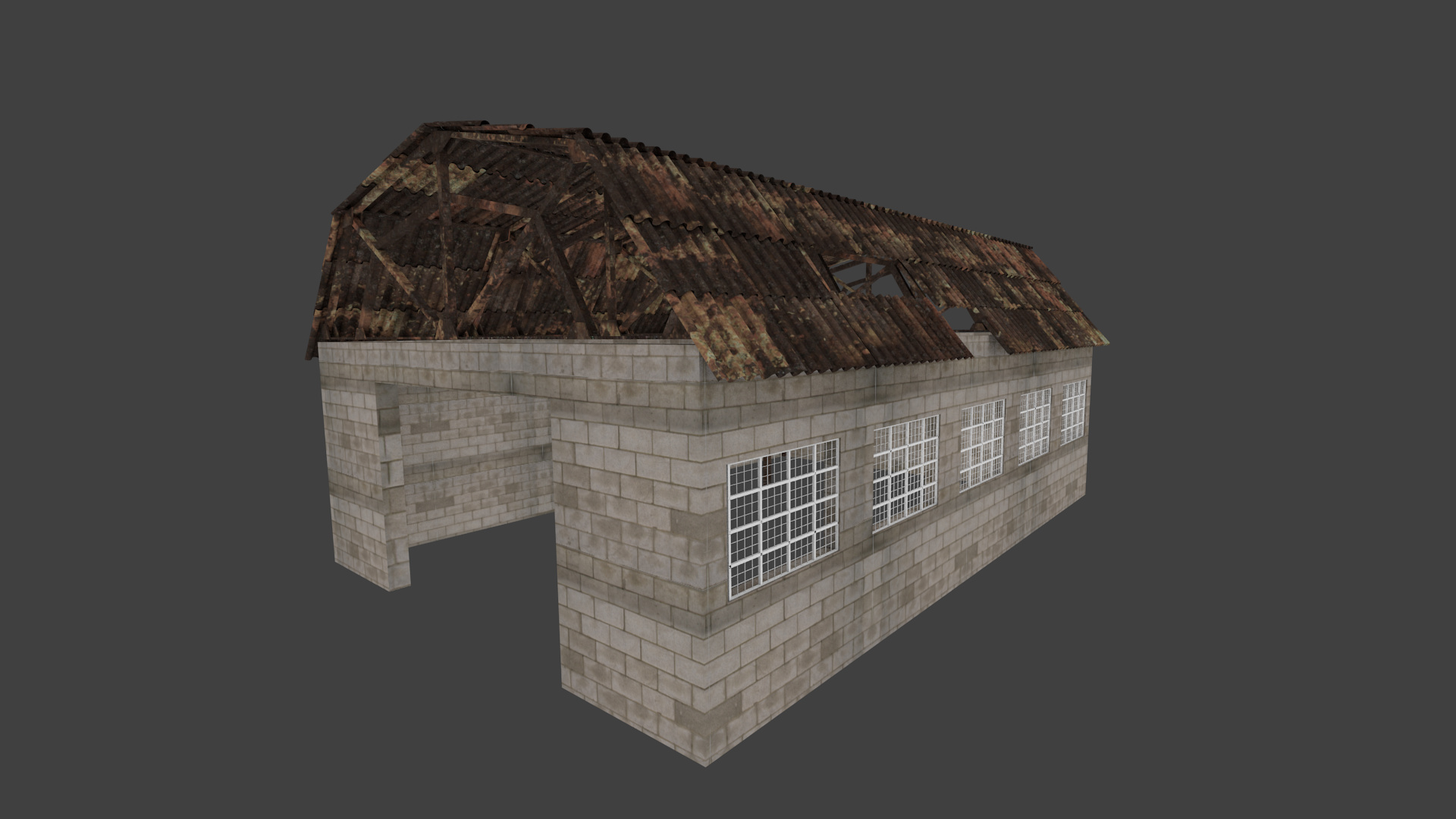
The building in post 5 is simple, but it looks good. for textures, watch out for tiling (which there are a lot of. One way to help out with that is to overlay some different textures over it at a different size (or better yet, a 2nd UV Map) just to break it up in some spots. Another thing to keep in mind, is try to use textures that tile evenly without too many noticeable details. You can add details with the extra maps (details such as really dark bricks)
Thanks, Scothtapeworm, for the advice - I’ll do that. So to clarify, texture A should be low on detail repeated whereas texture B should be more defined and layed overtop… makes perfect sense!
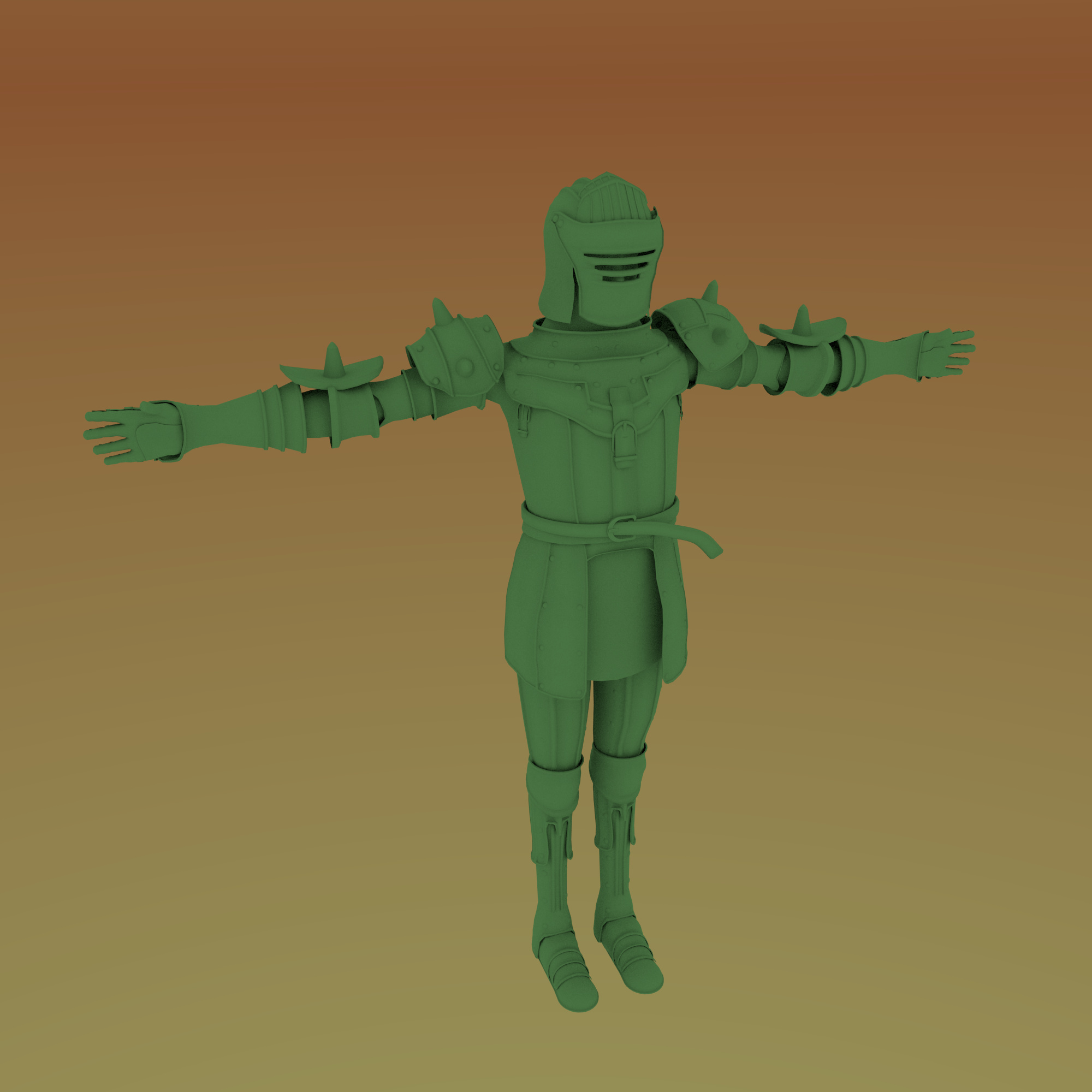
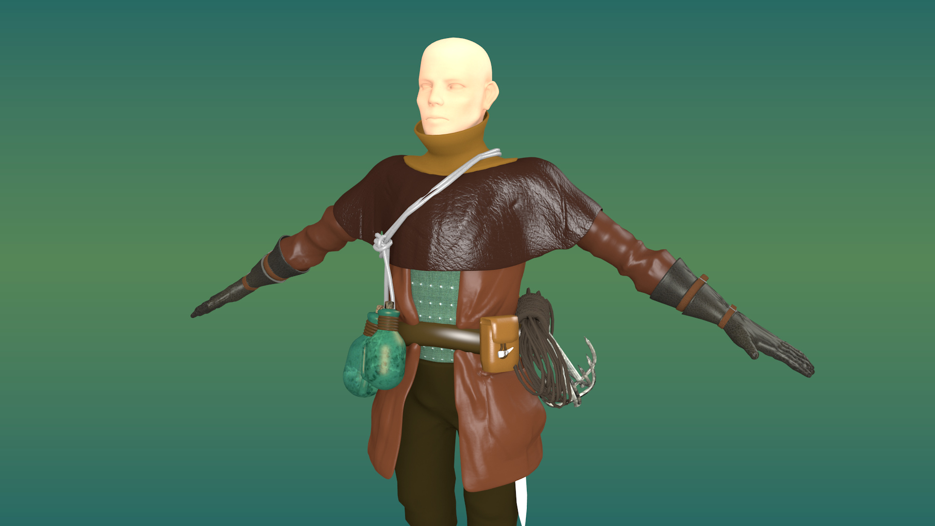
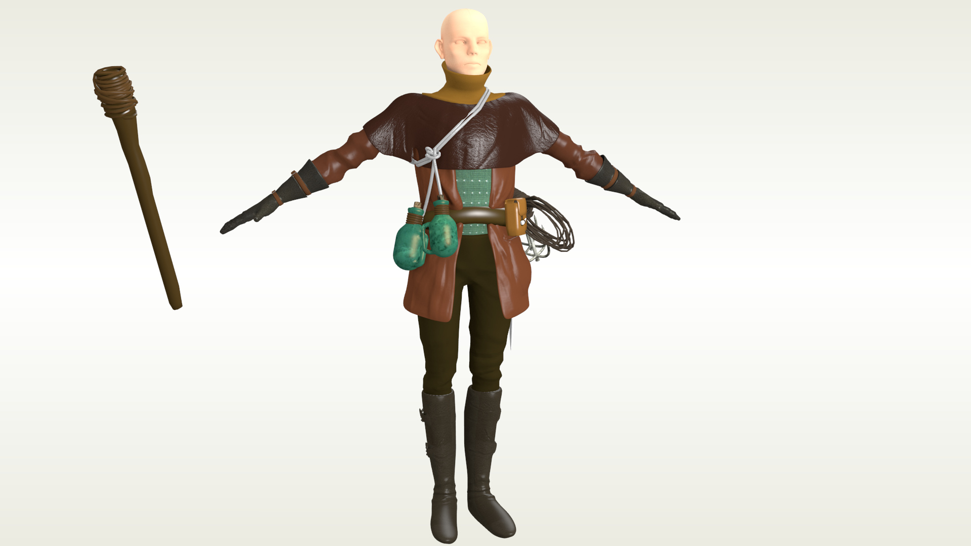
Here is another knight model I made. Again, I seem to have left the shins a bit diminuitive, heh.
Gotta get on that texturing tho! I’ll post it when I’m finished and write up a contrast&compare with the previous model I posted.
Thanks for reading!
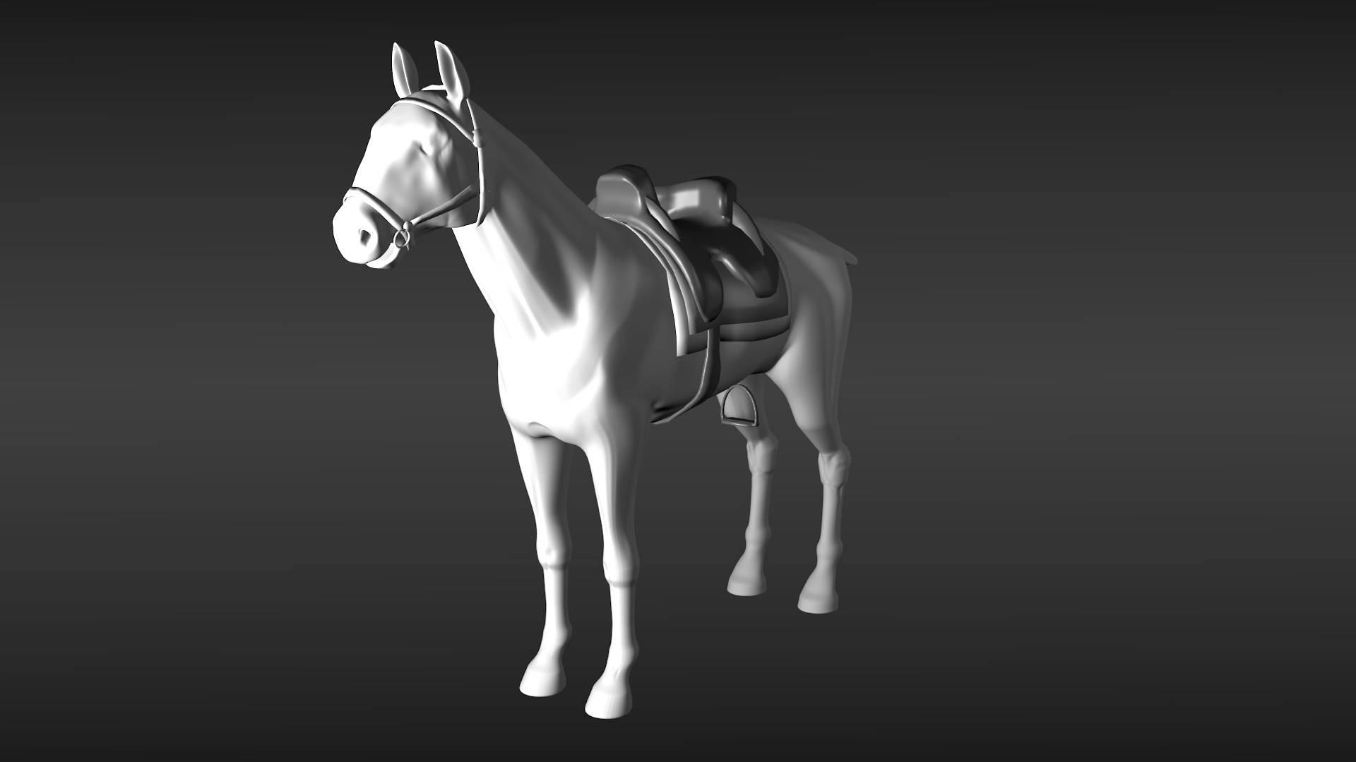
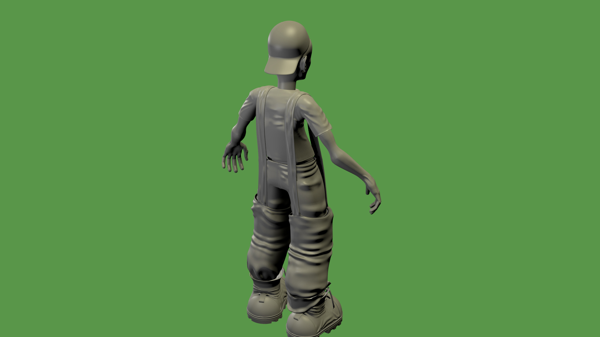
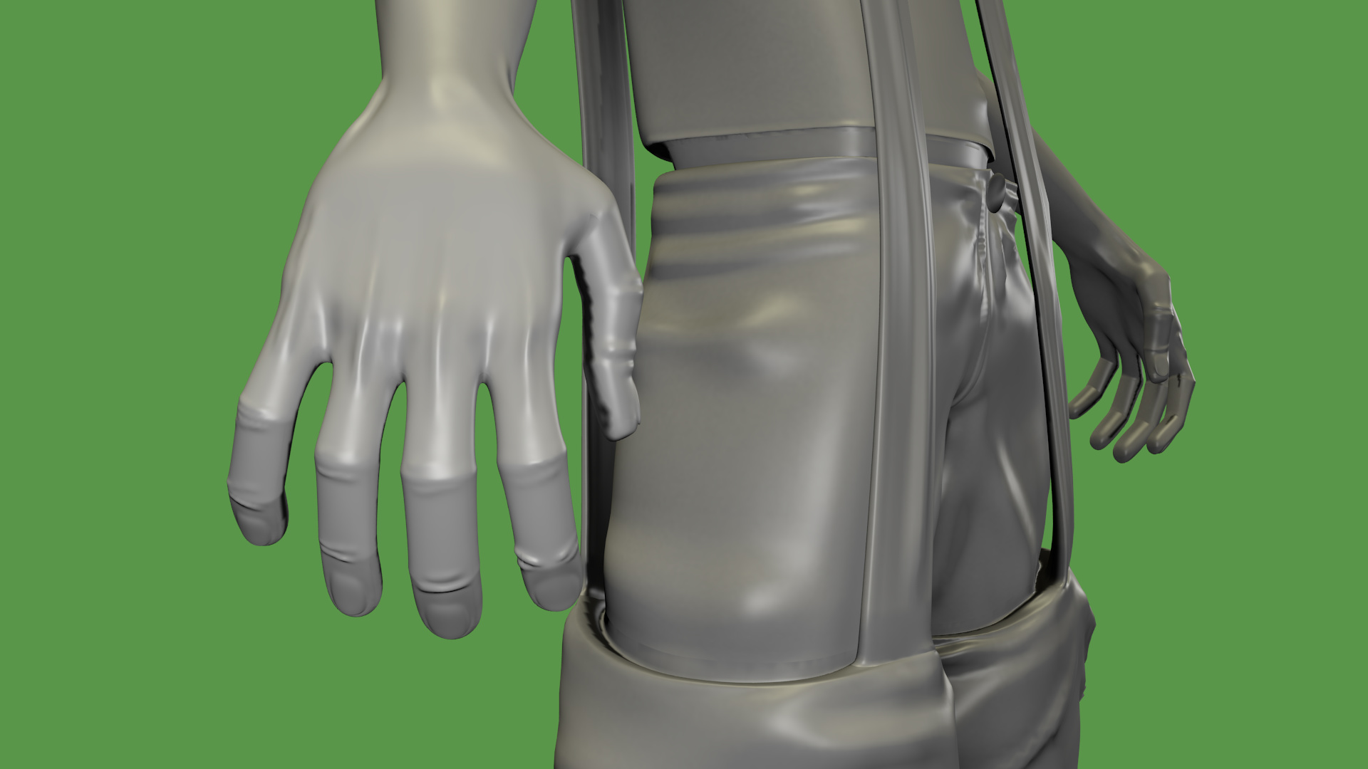
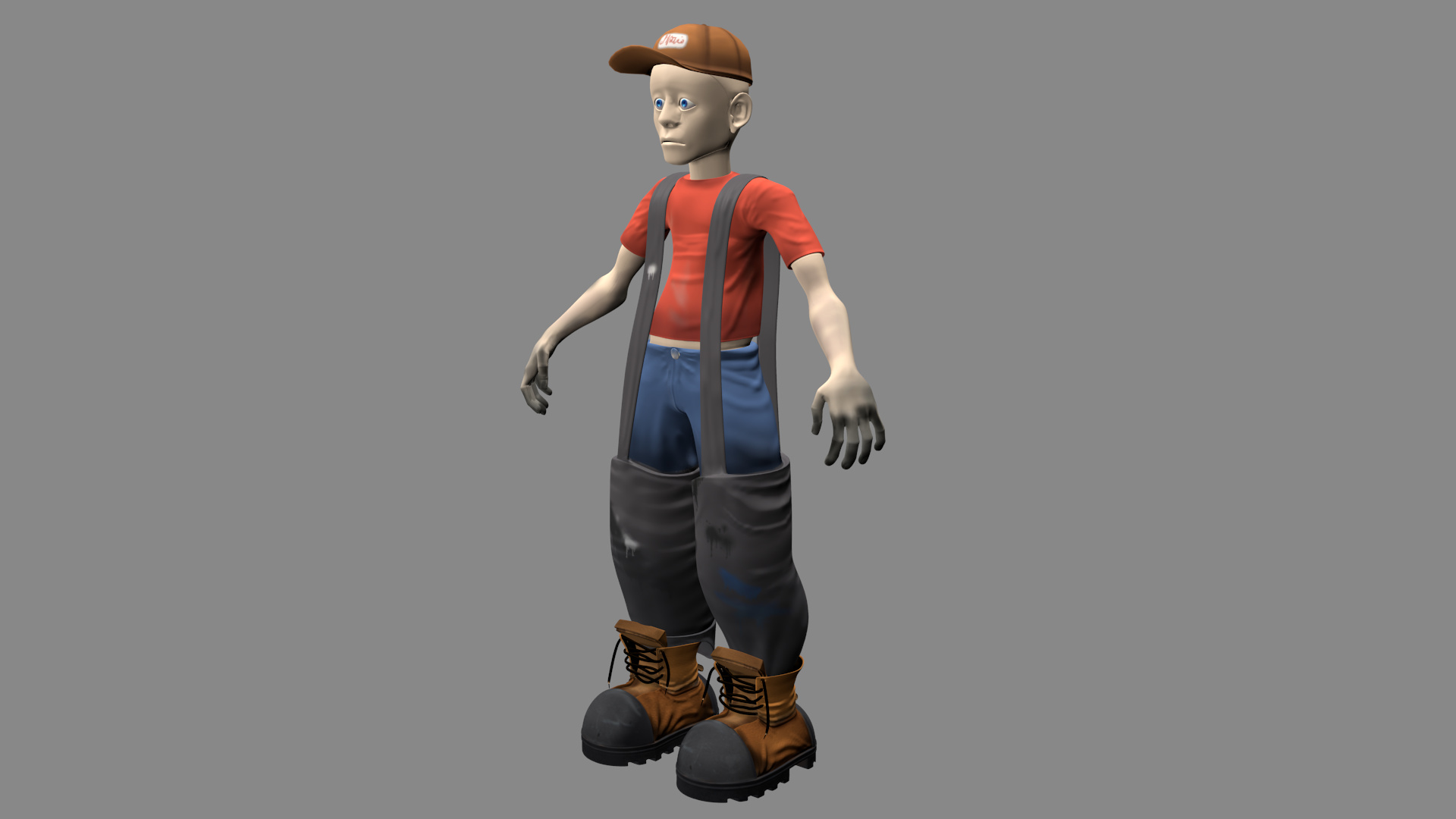
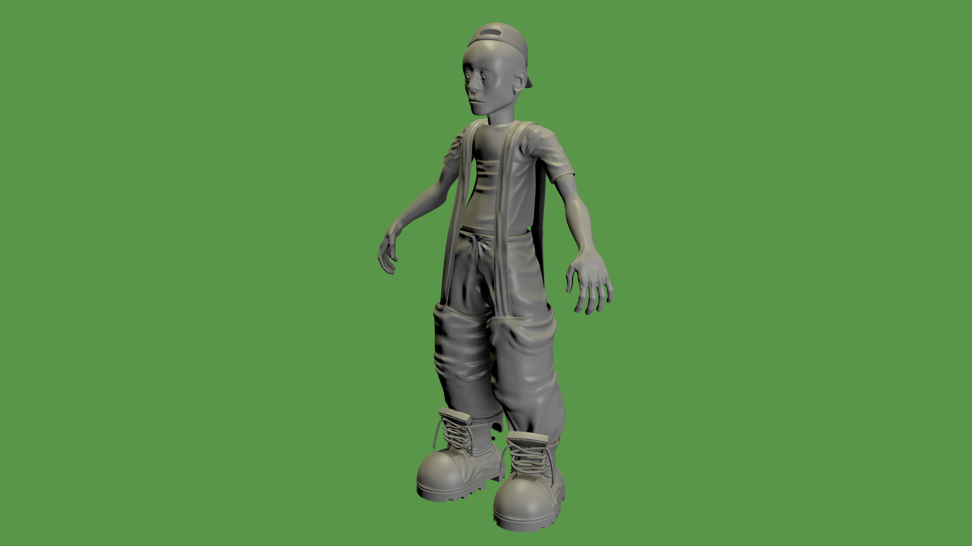
So I decided to start modelling other work. I haven’t gotten back to texturing the knight as I said I would in the last post… so below is what I had been doing instead!
It’s still quite rough, and the lighting really isn’t too impressive. I’ll include the model if anyone wants to take a crack at showing me a good light setup (either internal or cycles). I did have fun with this though! I did a quick rigging as well.
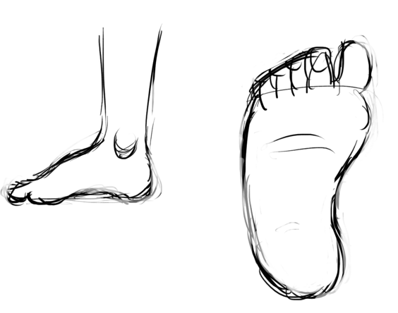
it looks like your feet are too uniformly shaped. imo, you should start with the shape of the sole of the foot. also, feet tend to point slightly to the outside.
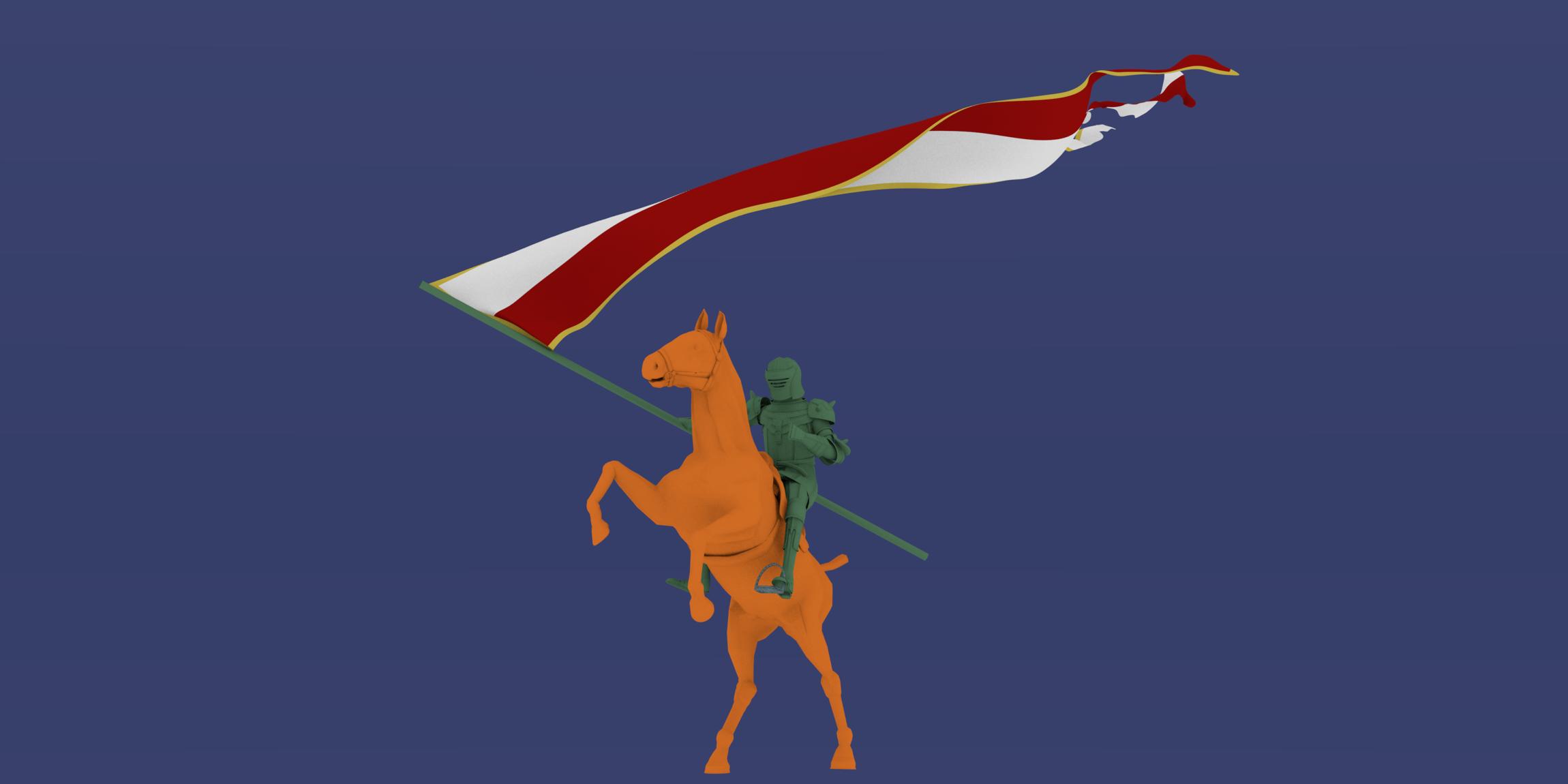
Here is the model with some more detail added. Now I feel I should add some paint and texture!
I can’t seem to decide on a hat for him, however. Also going to add a torch prop, and maybe a trained crow upon his shoulder?
I just learned how to work with the fire particle system. exciting stuff!!
However I am having issues with my AO bake. The shadows seem really pixelated… Anyone know how to solve this? I have tried playing with the passes and with the map resolution.
 Welcome!