Interior Living Room

Hey guys… I’m looking for critique on this unfinished scene I’ve got here :smiley: It’s got a long way to go, but I think it’s far enough now to get some good critique on it… I’ve been told there are problems with the wood shader, but I those problems are personal preference… They’re saying it’s too dark and crap, but at least in my area, floors are rather dark like so… Anyhow, all C&C is appreciated… Thanks :smiley:
Cycles
600 samples


Closeup of the couch’s sculpting:


My message needs to contain at least 10 characters…

It looks pretty good, but it looks like the far side of the glass in the table is just hovering. It looks very bare. Try adding some signs of life, such as a cup on the table, or a toy. I think a rug would also improve the picture. The wall has to much gloss.

There is a post on there, and a cup of coffee is a brilliant idea :smiley:
Also, A rug will be added, but due to the dreadful particles, I’m adding it last :stuck_out_tongue:


The message you have entered is too short. Please lengthen your message to at least 10 characters.

Man this is dead…

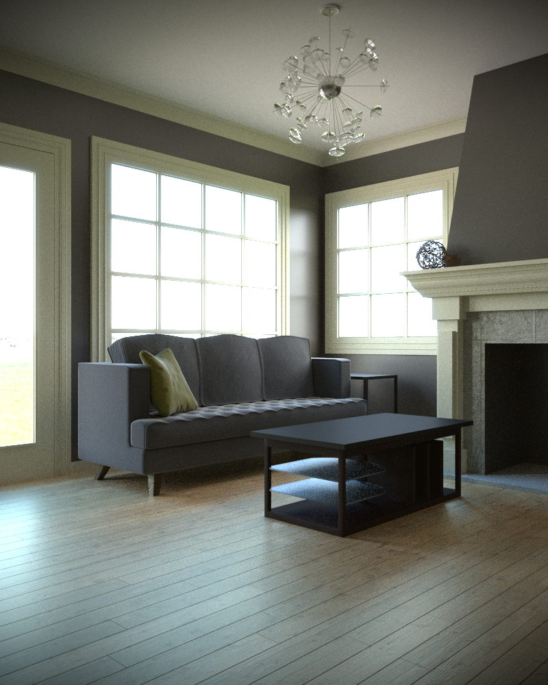
Good to see you fixed the scale on the floor. First of all, I would recommend just taking off all materials, so that we can just look and the geometry and composition of the scene. Maybe find a way to show the floor also because the lines on it will have a huge impact on the composition.

So, first thoughts, the floor looks good, I love the quality of the reflections on it, (although I think they could be toned back a tiny bit), but it feels a bit flat. It looks a bit like there isn’t any bump mapping, or specular/roughness mapping. I think just adding a bit more variation could do a lot. Maybe a bit of dust would help to. Maybe a much more toned down version of Blenderguru’s dust tutorial.

The glass on the table feels a bit like it’s floating. Maybe a few more noticeable brackets wouldn’t help a lot.

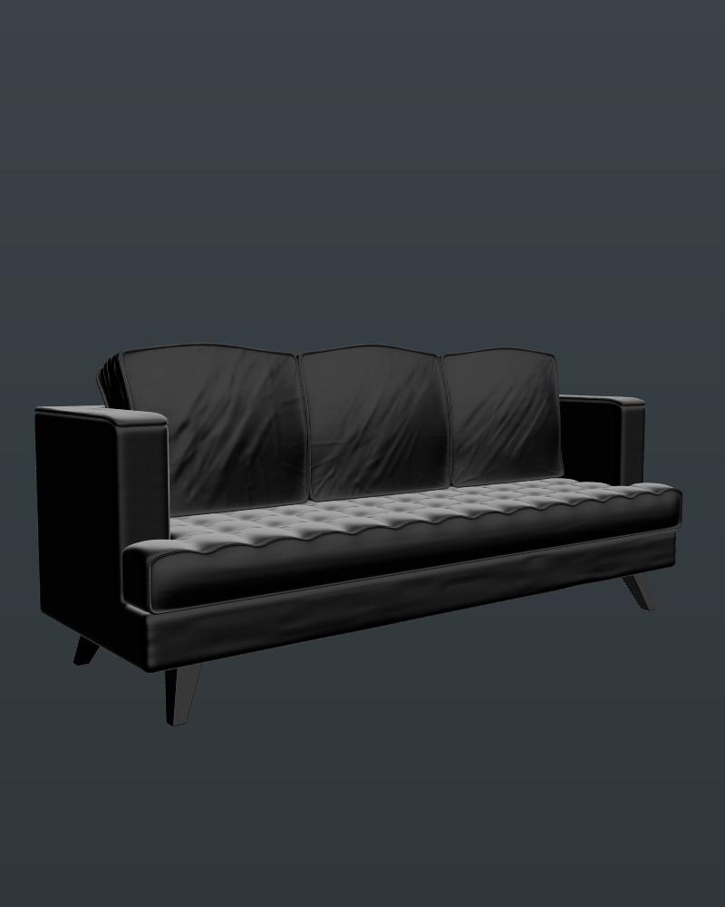
The pillow on the couch feels a bit off. I think it’s the sculpting. I think it needs to be a bit less thin, and sculpted less like it’s been beat up for hours at a time. The couch looks decent, but the pillows on the top don’t match the bottom very well (and could also use a bit of creasing), and the material seems to me like it should be more of a leather material. Do you have reference for what you’re trying to achieve?

Everything else is looking pretty good to me. I like the over exposed look of the exterior (although maybe it should be brought down a little bit?).

My last thing, what is supposed to be the focus here, and what kind of person lives here? Focus first. I’m seeing several points of focus. First there’s the couch, second there’s the table, third there’s the fireplace, and lastly, there’s the chandelier. I’m personally attracted more to the table and the fire place because of their extreme contrast against everything else. I would just try to figure out exactly what you want the focal point(s) to be, and make it work based off of that.

Now, who lives here? It’s a bit hard for me to tell, because there isn’t much stuff here, but it looks to me like it’s someone of the mid-middle class. The house it’s self looks to me like it belongs to a family (especially the quality of the floor seems like that to me), but I’m not sure that everything else follows that. The couch seems like it should be facing a TV or something, but it’s so close the wall, and it looks like on the far end that it’s being covered up by the fireplace, so that that doesn’t make much sense. The chandelier seems more like something that someone who’s fairly rich would have. I guess mainly what I’m trying to say, is that I don’t think all this furniture really fits in the same type of architecture. Try to come up with a character who lives here, and then base what they have on that person, and I think you’ll be more successful.

Anyway, it looks good, and I can see a lot of improvement since some of your older work. I hope this was helpful.
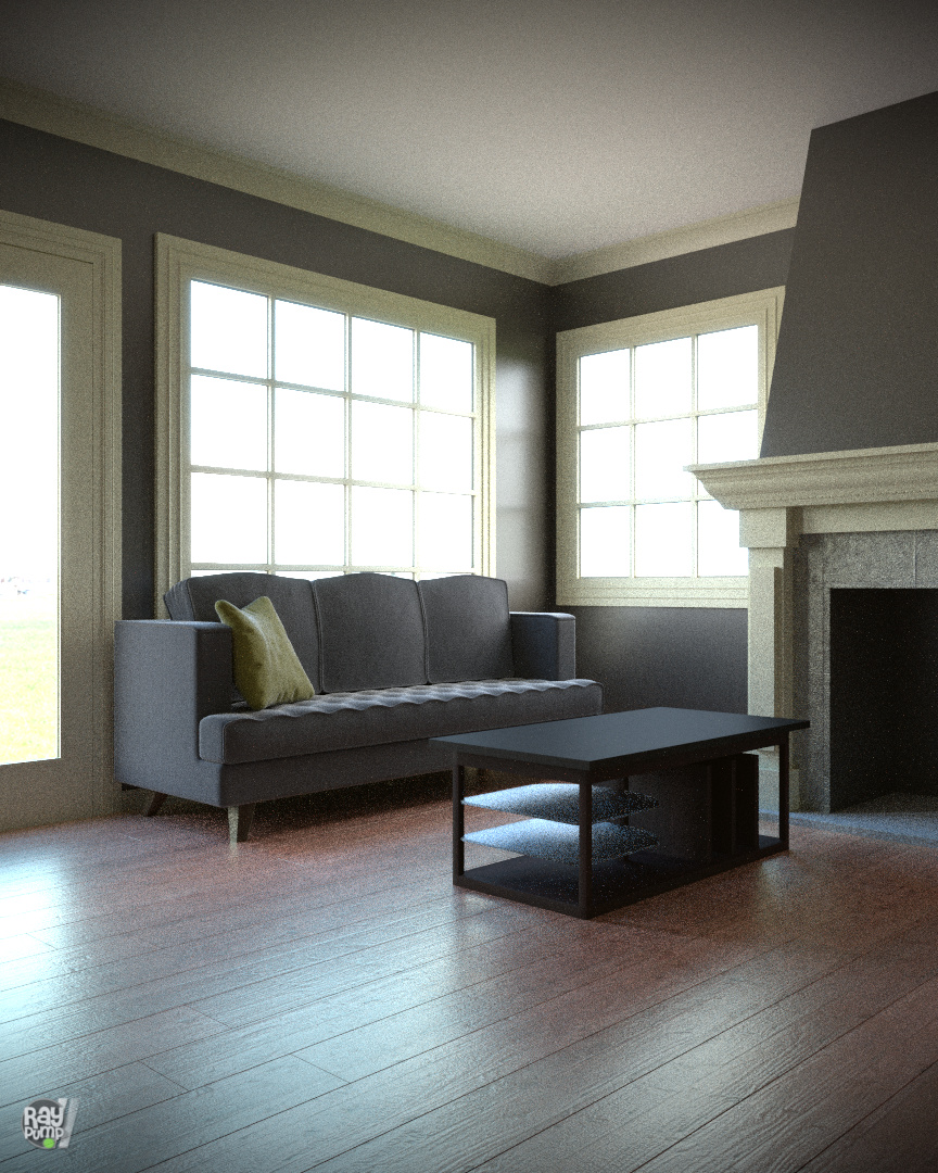
Okay… Wow… Most of the critique is completely off… I’m gonna have to do my next scene according to ONLY what people think, with no reference… My reference so far is almost exactly like my render… EXACT same couch, and chandelier… And the coffee table will be the focus…
Here’s a clay render of it right now:


I took almost all the bump out of the floor, as I thought it was too much, but I can easy throw it back in there :smiley:
And this is more of a middle-higher income family of 2-3s’ home…
If I bring down the overexposure any, it shows the UGLY outdoors too much… x_x
Anyhow, I have next to no decorations in atm, but that’s what I’m working on putting in now… But for now, I need to find some… :stuck_out_tongue:

Oh, okay, you’re building the entire scene off of reference. Would have been nice to know that ahead of time. Could you post a link to it?

Coming along nicely!

Well, so much for your appreciation…

@TARDIS Maker Not the entire scene… I’m beginning to learn I have to stop using reference so much…
@NID Graphics Thanks Man! I actually have to pause this project while I work on a few others for a competition with heavy prizes! :smiley:
@@IkariShinji Not fair bro… I had a goal I was going for, and I was asking more for critique on the quality of the scene, not trying to convert it into something different.

Hmm, I think it’s spot on (considering what he quoted). You didn’t mention anything about trying to match a reference. Personally, I don’t really care if a reference has been met, it the resulting “art” doesn’t look artistic or interesting. I don’t usually critique “boring interiors”, which is what most of them are. Even if they are technically great, they tend to be “boring” wrt trying to be “art”.

My critique, and I’m talking about trying to make something interesting to look at rather than matching an uninteresting reference:

  • Could use a rug/carpet partly under sofa and coffee table. Makes it a bit more busy, and I personally like to rest my feet/heels on something soft compared to hard wood.
  • Tone down the outside. If outside looks like crap, then fix it?
  • Using a square format you could get the full door and fireplace.
  • Windows looks like they could be a decent light gobo. I’d make us of it to create some broken up shadows on the floor/objects.
  • Windows could also use some curtains, maybe with an open window adding some wind into those curtains also adding to nicer shadows.
  • If coffee table is going to be your focus, then make it stand out. Make it bright glowing red, lol - with stuff on it also have red shades, and it will be the only thing red in the room, making it unique and standing out for the sake of making it more of a focal point.

Thanks. All is correct, but it was a little too boring, and now I’m modelling the Fallingwater House O.o Nothing boring about that! LOL! To make it worse, it’s gonna be 3d Printable :open_mouth:

Your light sources are telling different stories. The light coming in from the window at the right is nearly horizontal, as shown by the projected light on the wall. That would suggest sunset or sunrise, which has a different lighting than you are using. On the other hand, the furniture shadows on the floor indicate a higher light source coming from the left.

I think an interior designer would move that couch out from the wall a little to add depth to the room. But it’s your scene. :slight_smile:

Not touching this any more :stuck_out_tongue:
However an hdri was my only light source :wink:

Really nice render! I really like the effect that the chandelier gave the render when you added it.

Thanks man! :smiley: