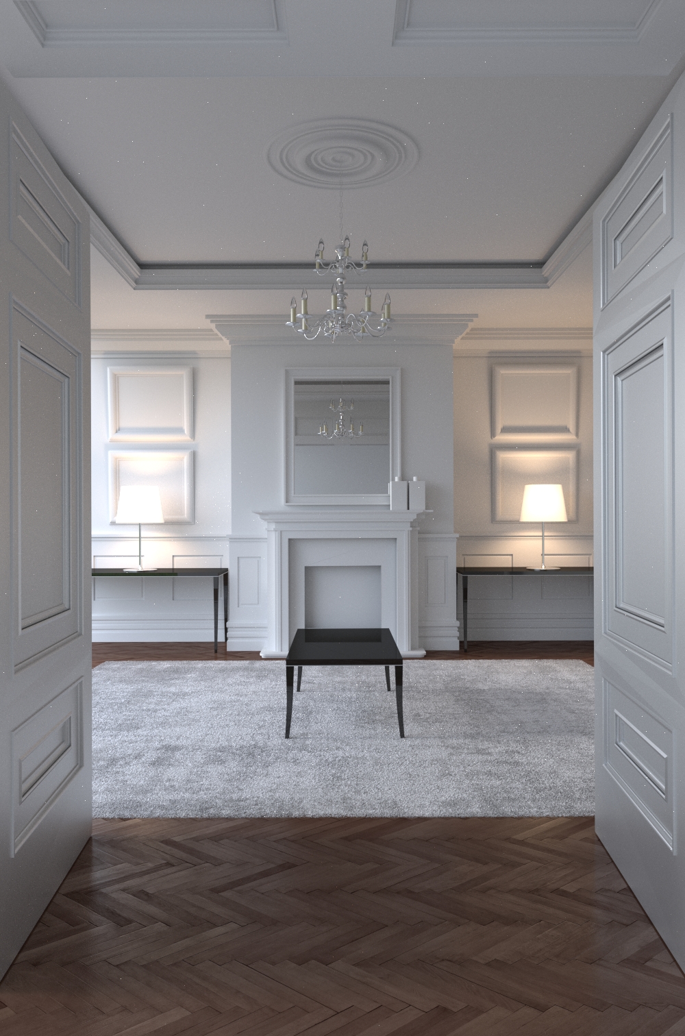
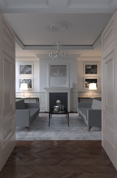
Still needs more textures and furniture.
Looks to be a great start… I’m curious on the table lamps as to how you are lighting them and what your material set up looks like for the lamp shade. I have a large arch viz project going on and have had nothing but problems with getting realistic lighted lamps.
I’ll look forward to watching your progress.
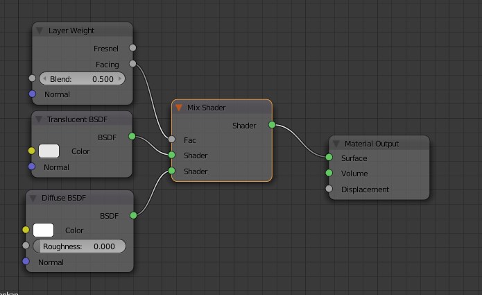
Sharing is caring! So here’s my setup. This is also in progress.
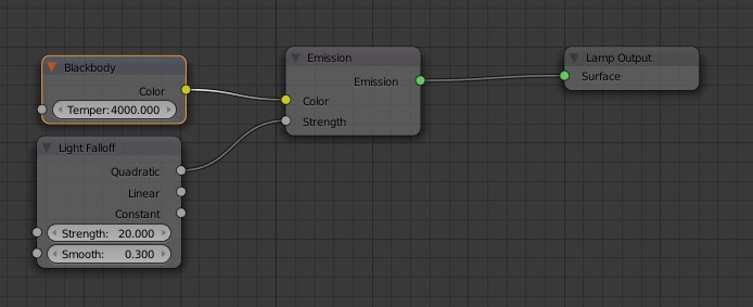
Basically I mix a diffuse shader with a translucent shader. The factor is being controlled by a layer weight, making the facing polys more translucent, and to the side more opaque. In the lamp shade there is a point light with a quadratic falloff and a blackbody color temperature of 4000K . ( I’ll post the light setup for that too. )
The lampshade node setup:
And this is the light setup:
Thanks for taking the time to post the setups, I’m definitely going to try them out… just a quick question are you using solidify on your lamp shade mesh?
The Relapse link in my signature is the arch viz project I am working on, if you want to check it out at your convenience.
No, it’s just a hollow tube with only the one face. Because they’re far enough, I don’t think I need to solidify them. Of course I will change this when they show in detail shots. But for now, they’ll do. 
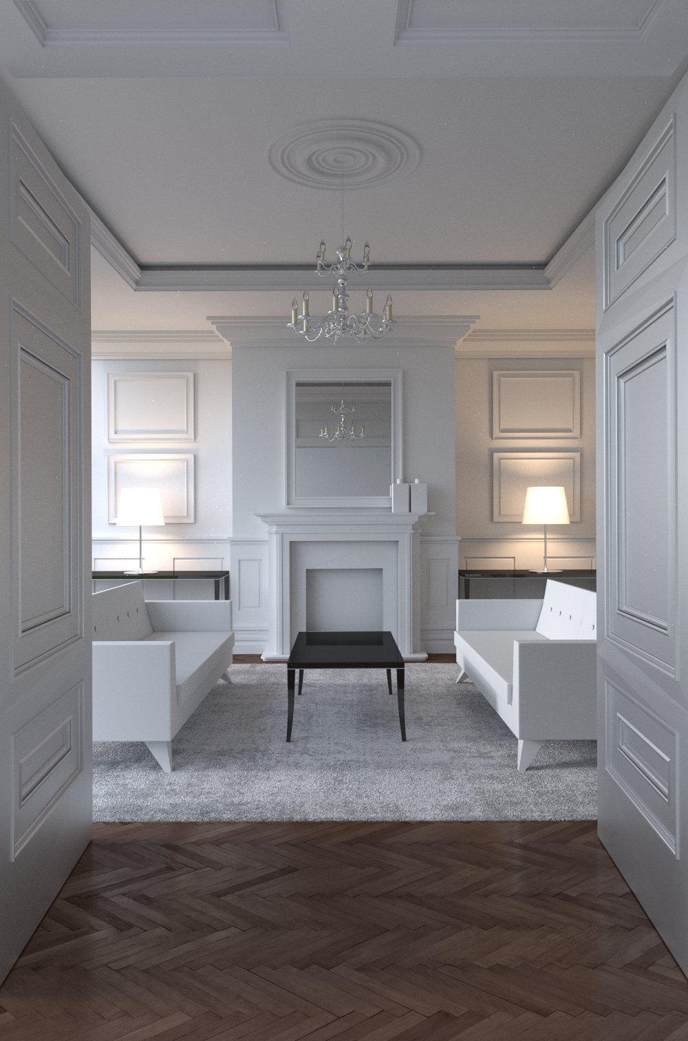
A small update. I was home late and just modeled the sofas. I also changed the frames in the back. They were too thick.
Another update. I’ve changed the frames, added and tweaked some textures and materials. I also fluffed the carpet,…
The UV mapping of the sofas gave me a hard time, but they’re acceptable.
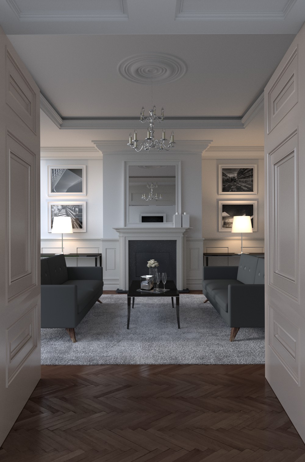
The rug is looking really good. In some ways I think you should try and soften the edges / cushions of the couches some.
Yeah, I see what you mean. I’ll have a look at that tonight. Not looking forward to it, to be honest. I had a bad time UV texturing those sofas.
Sofas feel like they are boxes
the bevels and what not on the close walls feel like they have no depth, no shadows…
weird ceiling join line at the top
chandeler cord is too thin, looks like its floating
mirror reflection is nothing
overall feels very monotone… throw a few splashes of colour in different areas… think about it like this, if this was your house, you want the stuff which is hard to replace in real life (walls, couches) to be as neutral as possible so that over time it doesnt go in / out of fashion… the smaller objects which are easier to replace you want the splashes of colour on them.
throw some cushions on the couches
the back tables feel a bit empty
overall the framing feels very confined and flat… the symmetry is over done and i feel like a wider lens angle could over all give a better shot.
Sofas feel like they are boxes
Yes, I will address that in the next image, this was a constant comment from lots of peers.
the bevels and what not on the close walls feel like they have no depth, no shadows…
The light is coming from the side, maybe that has something to do with it?
weird ceiling join line at the top
That is intentional.
chandeler cord is too thin, looks like its floating
True, will have a look at it.
mirror reflection is nothing
Also true, I might tip the mirror to reflect more.
overall feels very monotone… throw a few splashes of colour in different areas… think about it like this, if this was your house, you want the stuff which is hard to replace in real life (walls, couches) to be as neutral as possible so that over time it doesnt go in / out of fashion… the smaller objects which are easier to replace you want the splashes of colour on them.
throw some cushions on the couches
the back tables feel a bit empty
overall the framing feels very confined and flat… the symmetry is over done and i feel like a wider lens angle could over all give a better shot.
As I said, this is still WIP. I need to fill the room with more furniture and accessories. Also, very little shading and texturing has been done at this point. The monotone look is actually what I’m going for.
Update:
Didn’t have a lot of time today, so I just got to redo the sofas. No textures are applied. Only the buttons and the legs of the sofa are textures, because is reused them from the previous one.
The seat cushion are looking much better, but I wonder if your having some kind of problem with the texture due to using mirror modifier… did you mirror them? It could be shadows but it seems like both cushions have the same markings (that darker stripe).
I would consider doing something similar to the back cushions.
Tell me a little about your glassware, because it looks fantastic… I am having fits right now with glassware I am using in one of my scenes. Someone told me today to increase bounces and transmission, but I went ahead and did full GI and they still look like crap. Are you using any special lighting for the glasses?
Neat.
But remember, nothing is uniform, always use a texture or at least a procedural texture for everything,
I can instantly tell the scene is fake because the wall is not bumpy at all and the glossiness is too uniform.
Great tip. I’ll have to do some more work on it.
Hi llBit
I am actually searching the answers for the “streaks” of usage on the carpet, how did you make these? You can sort of see how some of the hairs are laying down.
Thanks
Fantastic! You’ve got the potential from the start!
Looks great! I would change one thing: rotate the parquet so that the pattern is pointing towards the center of the image, the table.