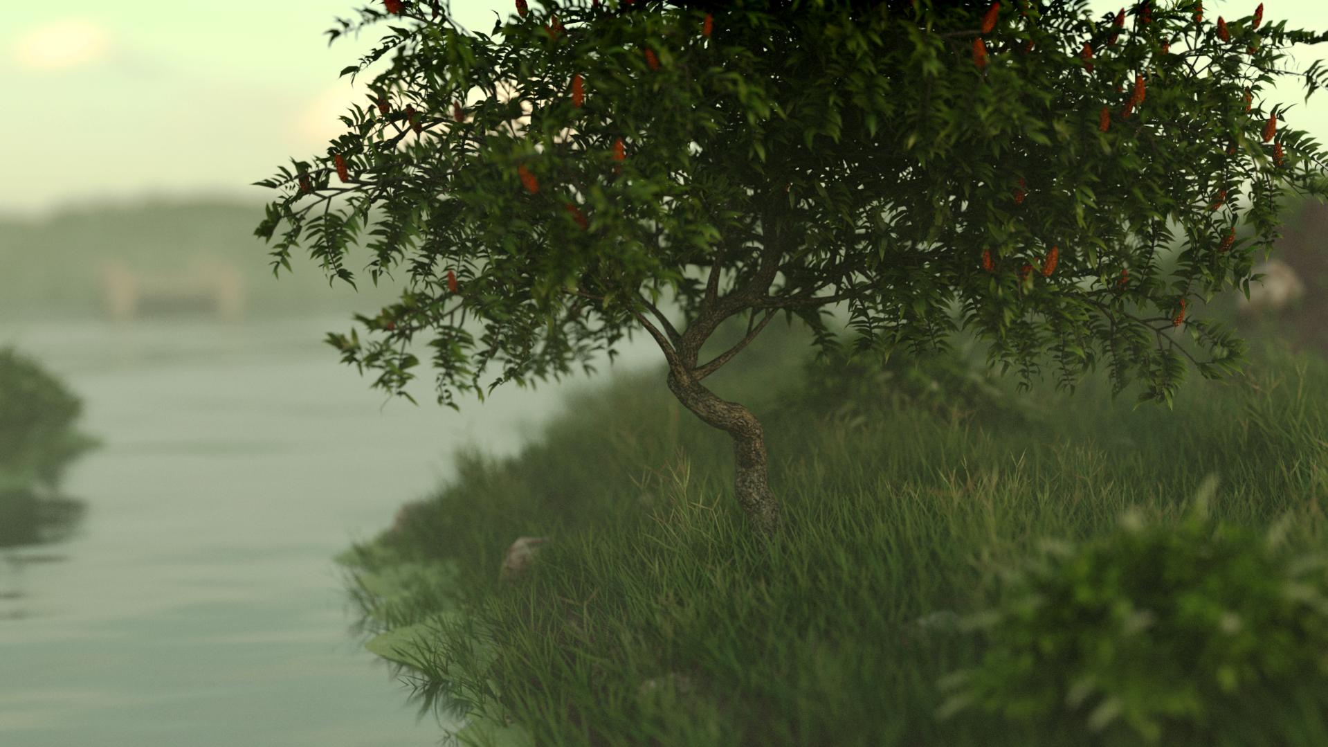
Here is a scene that I have been working on for a while. I have come to the utmost of my ability and would a appreciate any critiques.
First Render:
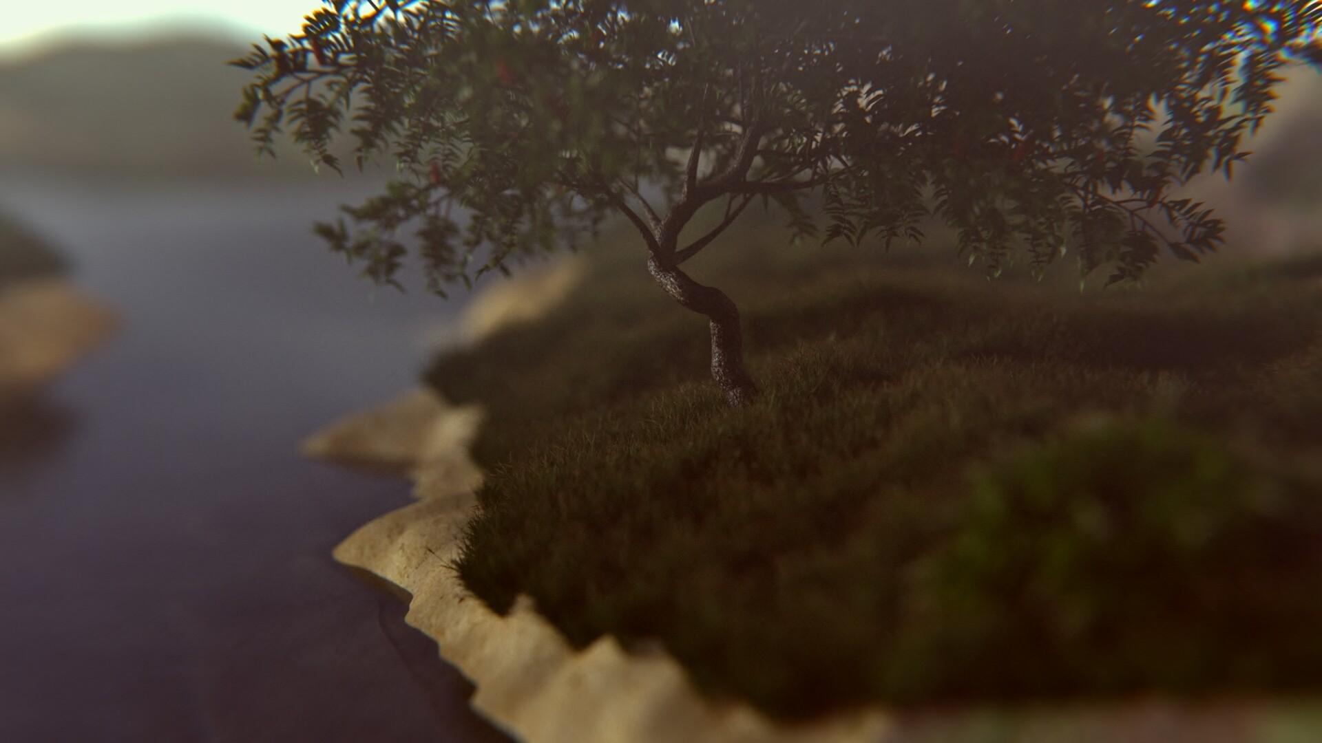
Latest Render:
Here is a scene that I have been working on for a while. I have come to the utmost of my ability and would a appreciate any critiques.
First Render:
Latest Render:
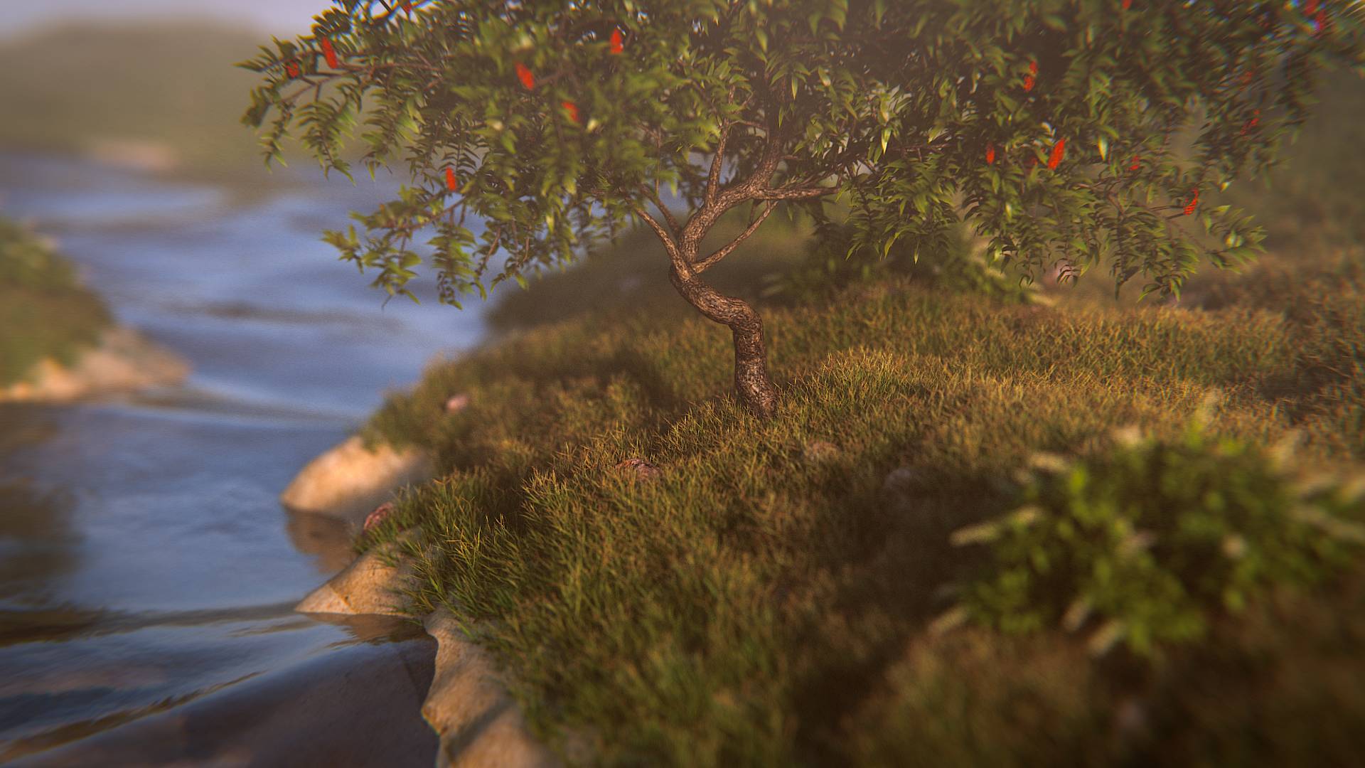
I don’t know where the focus is supposed to be on this image. There are two objects, the bush and the tree, and the eye constantly jumps between them, unable to focus on one. The tree is blurred, so I guess I should focus on the bush, but it’s impossible to look at it for longer than a few seconds, which is not ideal because of the really nice modeling and amount of detail. Maybe you should try using a “flatter” camera angle so the tree isn’t in the top right corner anymore and the bush is directly in front of the water (Might give a nice contrast and subtle bloom effect too).
Modeling and materials are very good! I wouldn’t change anything here.
The DoF is pretty obviously post processed (correct me if I’m wrong), which usually isn’t much of a problem, but it looks incorrect on the grass. Try using real DoF.
I would add some more objects. Doesn’t have to be a lot, just maybe some smaller plants between the bush and the tree. Or lily pads or some floating sticks or a duck in the top left corner, just something that balances the other two objects a little. If you add the duck, I think the camera angle would be fine as it is now, because this empty space on the left would be filled.
I’m not sure how you wanted the lighting to look. Right now, it looks like a cloudy late afternoon scene to me. I think the light is a bit too warm and there’s not much contrast - I think cooler and more intense (sun) light would bring out the shapes more nicely. But if you intended this look, it’s good, just maybe a little too warm.
This is all just my amateur opinion. The picture looks great already, almost photorealistic - especially the grass - and it’s way better than everything I’ve produced so far, I just wanted to tell you what I noticed. Very good work!
Put a subject in it. A butterfly on the leaf. A fisherman in the pond.
Thanks @Mourllie the Dof is real but I did used radius instead of F-stop I have been having a problem getting a good blurred background with f-stop
As for the materials I can not take the credit because they were from Blendergugu.com with the grass essentials. These are freebies because I can not buy the full pack. I will take your points into consideration and come back with my resaults
Looking at this strictly “as a photograph,” I see that you put the bush on a rule-of-thirds point. That’s good. Now, let’s consider another principle: that the eye goes for the brightest area in a picture, follows a circular path and wants to wind up near where it started. Here we go! (Klunk …) We ran smack into that (dark!) tree … with nowhere to go … and we never really found a subject for the picture. We’re also mired in haze and murk. (Too little DOF, in my view.)
So … dream up a little story here, then visually tell that story. Could be anything at all. Doesn’t have to be lots of modeling. Give me something for my eye to settle on, a path to follow, and a little conclusion to reach as I do so.
This is a “sweet little photo,” a nice, bucolic scene … well executed, as far as it goes … but, where do you want for it to go?
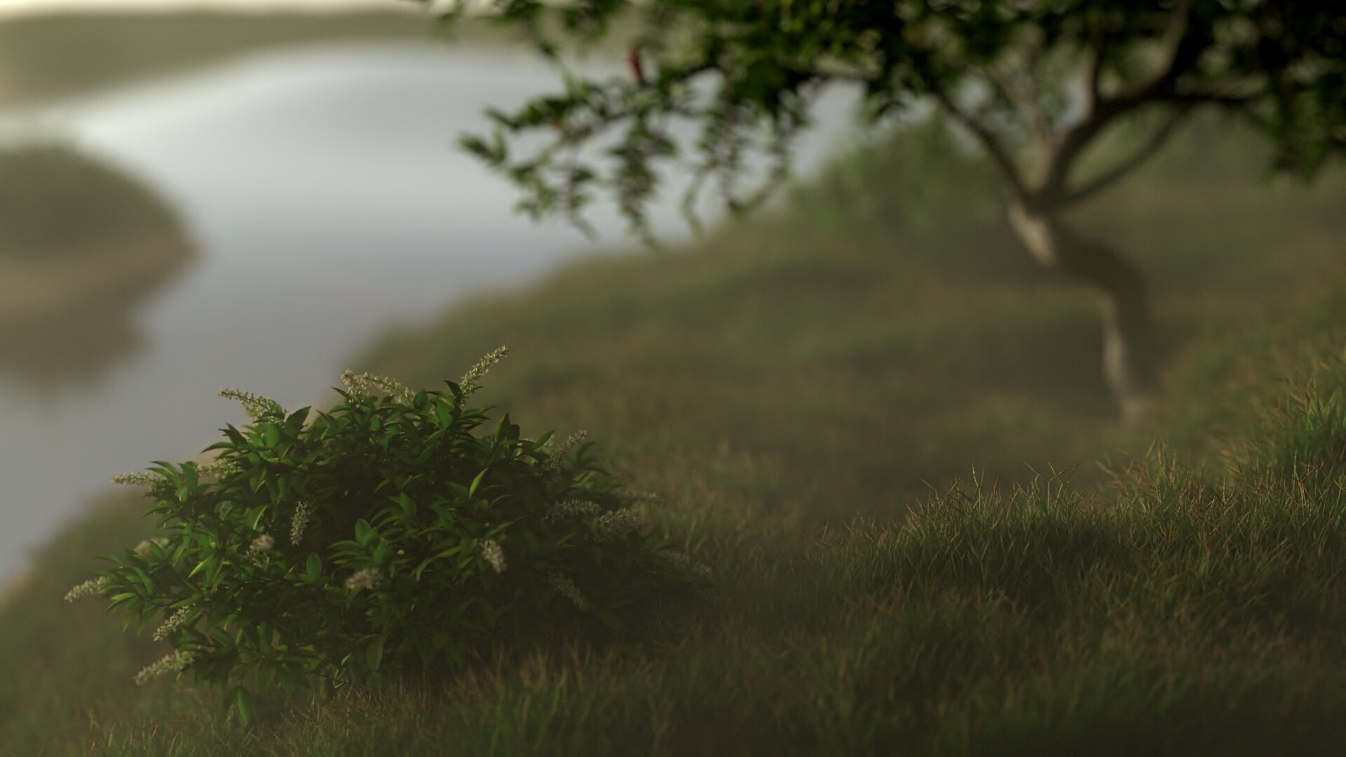
The first image is far better. The bank on the second looks sterile.
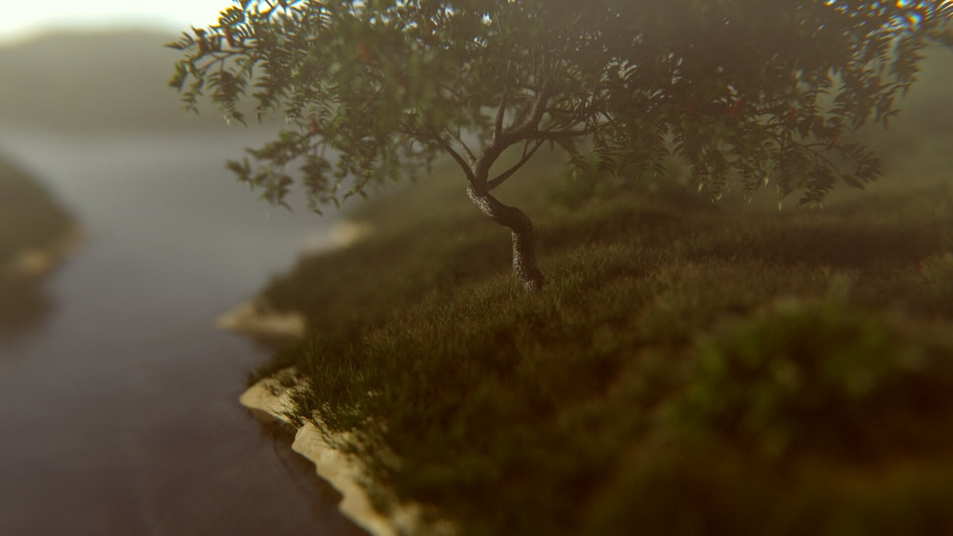
Yeah I for got to update my vertex group expect a new image soon
I think that the materials and atmospherics are looking good, but there doesn’t seem to be much for the eye to focus on. I think the biggest problem with both images is that the DOF is too strong and that too much of both images are out of focus, even if you are trying to go for a tilt focus effect. The first image in particular could use more differentiation between the foreground and the background elements since the detail of the foreground grass is just too small to draw attention to the foreground. Also, the greens of the grass are a bit too similar between the foreground and the background making it look a tad flat. For the colors of the second image, I think the banks are a bit too bright and draw too much attention from the tree, which I’m guessing is the element you want people to focus on.
The DoF is too much. Looks like a miniature. Like a model not bigger than box of shoes.
I agree, too much DoF, but I like the color scheme in the composite.
The water is way too smooth. Add some ripples. There should also be some small plants growing next to the water, and some rocks sticking up out of it. Some leaves would have fallen off the tree and they should be scattered around, with some in the water. add some small weeds to the grass, and maybe some pebbles.
Thanks for the suggestions i will work on them as soon as I get my computer fixed
My new render after alot of work. It was in a render query for a while so more changes are coming.
The rocks could be a little bigger they are getting losed in the rocks
I like it, But I’m not sure where you’re going. The layout and lighting look peaceful, while the water is quite violent, and the lense distortion around the edges is very active looking. I was thinking of smaller ripples.
Yes thats one of the thing i fixed im going to do another render when i have more credits and work on some foam for the water
I want to but something at the base of the tree since that’s were my eyes seem to go any ideas?
you could try a fawn or a rabbit.
How about a smail with a shiny Gold Shell. It looks very good. The ripples on the water re-enforces the miniture look.