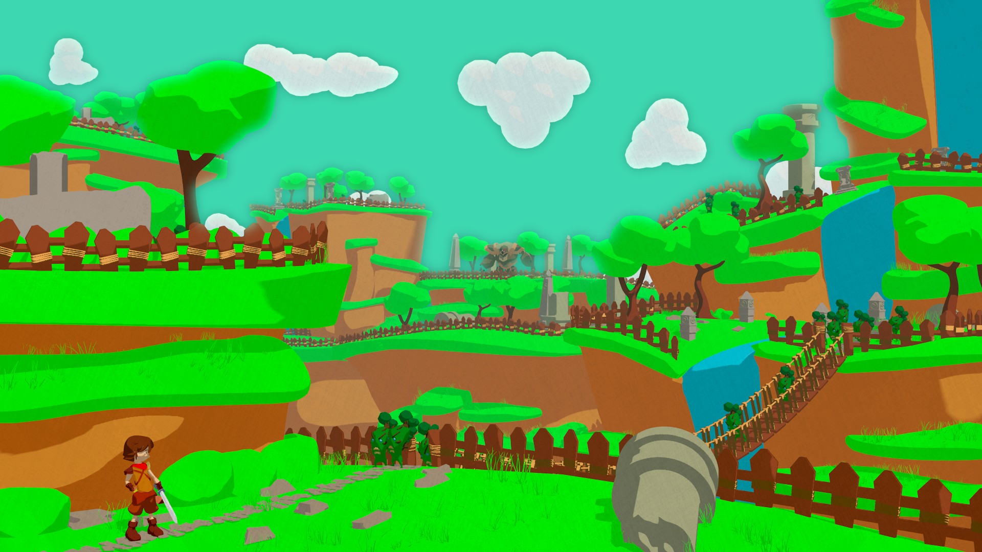
Hello again guys.
This time i bring you a little work i have done.
As always tell me what you guys think and anything you seem wrong so i can get better.
Hello again guys.
This time i bring you a little work i have done.
As always tell me what you guys think and anything you seem wrong so i can get better.
Hey there!
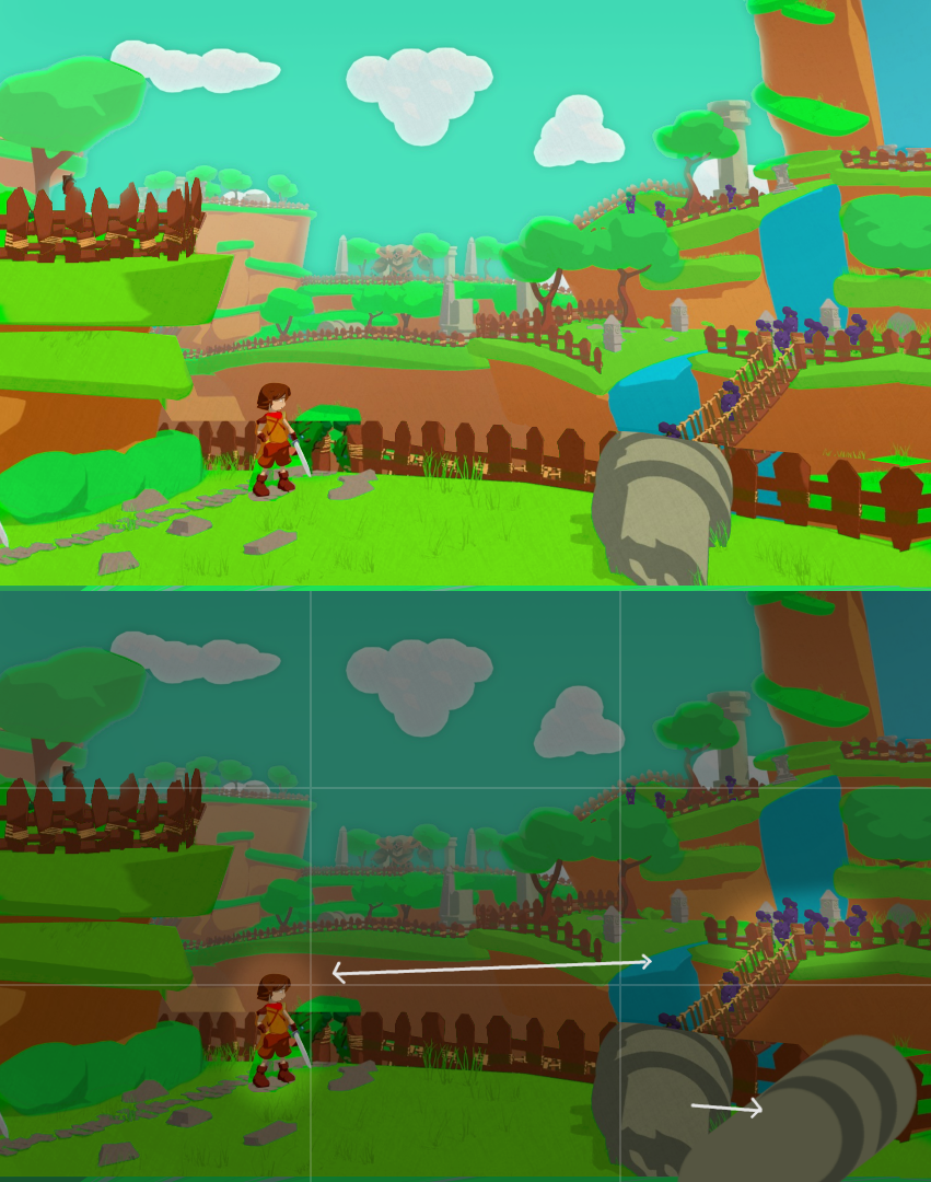
So, as I can seen the colors are too much saturated, and its kind of complex to understand the layers of composition of your work.
DO you think that and aerial perspective with the mist effect would be too far from your initial concept?
The title is Swordman but it’s more of a landscape shot and less about the main character. Storytelling suggests action for/from an animation or a game but the main character has a relaxed and a static pose. Perhaps some changes
Pushed some things around
For that the composition could place the main character and the enemy near the lower corners of thirds. There’s too much green that is the same, having different hue/value change for grass/tree/bushes would separate them from each other. The bad guys are much darker but they could also have some cold color (bright, warm = good/friendly. dark, cold = bad/enemy).
Other strategic changes could include moving the pillar thing to the side for the new framing which would give a better view in the middle and cut viewer’s eyes from moving off the frame. The fence, bridge, path, bush, and the lines on the hill would provide leading lines towards the main character.
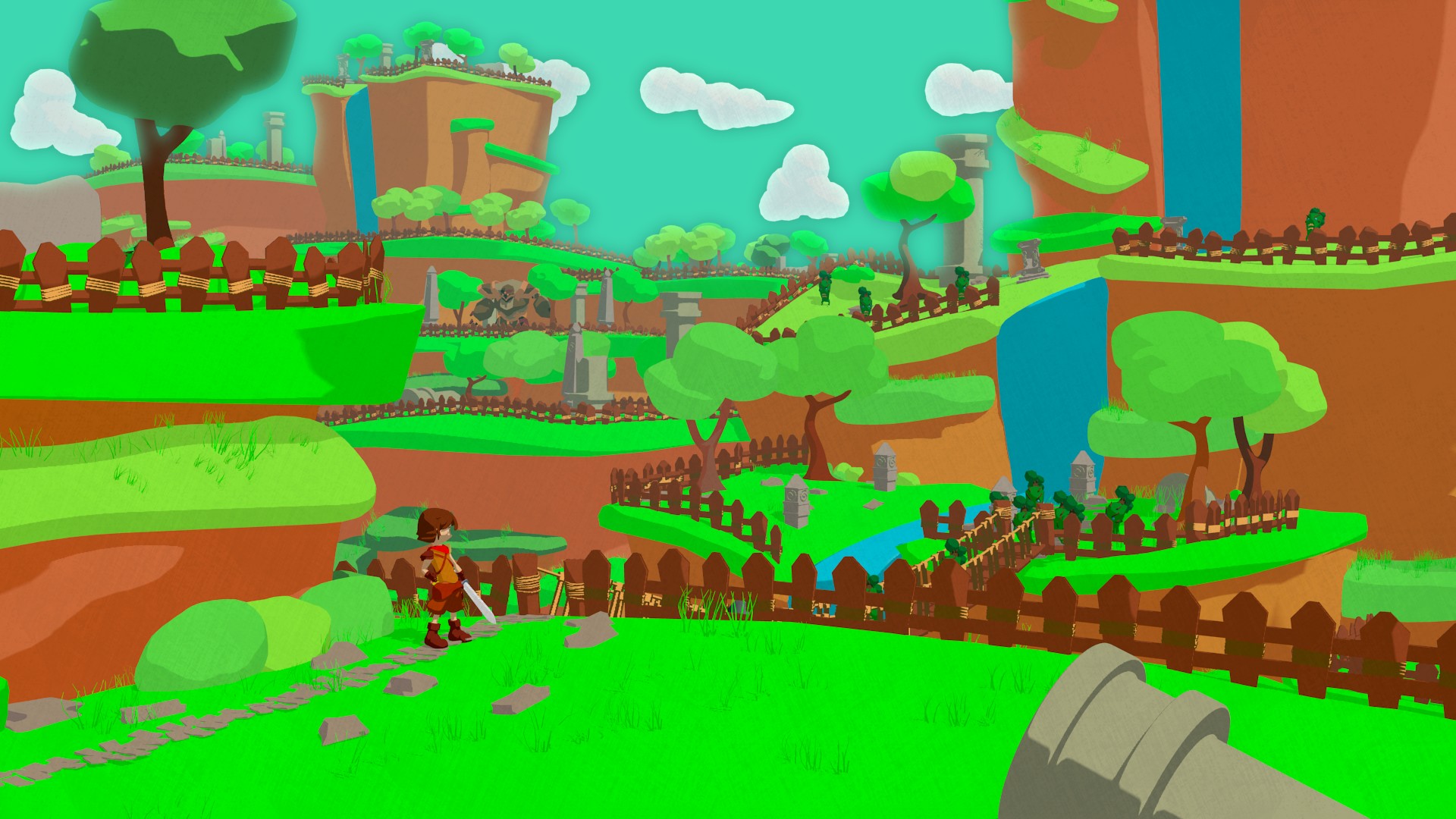
Hello again.
I have fix some of the issues that you guys have told me
Let me know if i am missing one.
And you guys are right it was suppose to be just the landscape, i decided to put the character at the last minute.
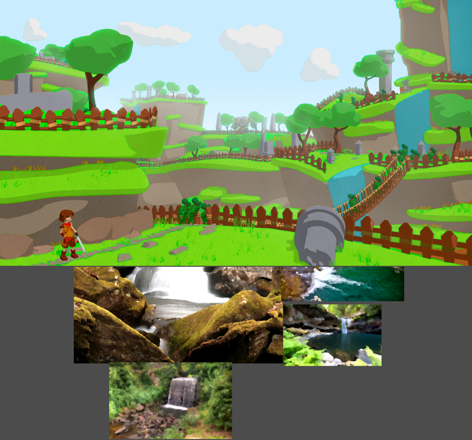
I wasn’t very clear what I meant with the colors in my previous critique. Sorry about that.
What I meant was that you have very little color variation between different elements in the image. Trees should be different from grass, grass should be different from rocks, etc. That gives separation between the elements and makes them more identifiable when such limited range of colors is used.
I made some color changes to show what I mean
The characters should probably have different colors so they are easier to recognize and separate from the rest of the scene. The swordman gets separated in the example but all that brown would again mix with the brown in the fence when moved closer to it. The bad guys should probably be more prominent too.
The pictures below are semi-random images I took from the internet. They’re low-res and I ran oilify filter on them in Gimp. I used those to look for suitable colors, color picked one, filled areas then shifted that color to what I thought might suit the image. Could maybe use that technique if you use multiple tones in your shading and aren’t quite sure what colors to use.
WOW thanks dude
I am really grateful for all of this, is like a personal class on art.
I will keep making this better i did not reply before because i had some issues with my Computer, but i think i can soon start working on it one more time.
once again Thank you very much.
You’re welcome. Hopefully it helps or gives ideas. Sorry to hear about your computer problems but thanks for telling that and not being one of many who ask for critique and then ignore the whole thread.