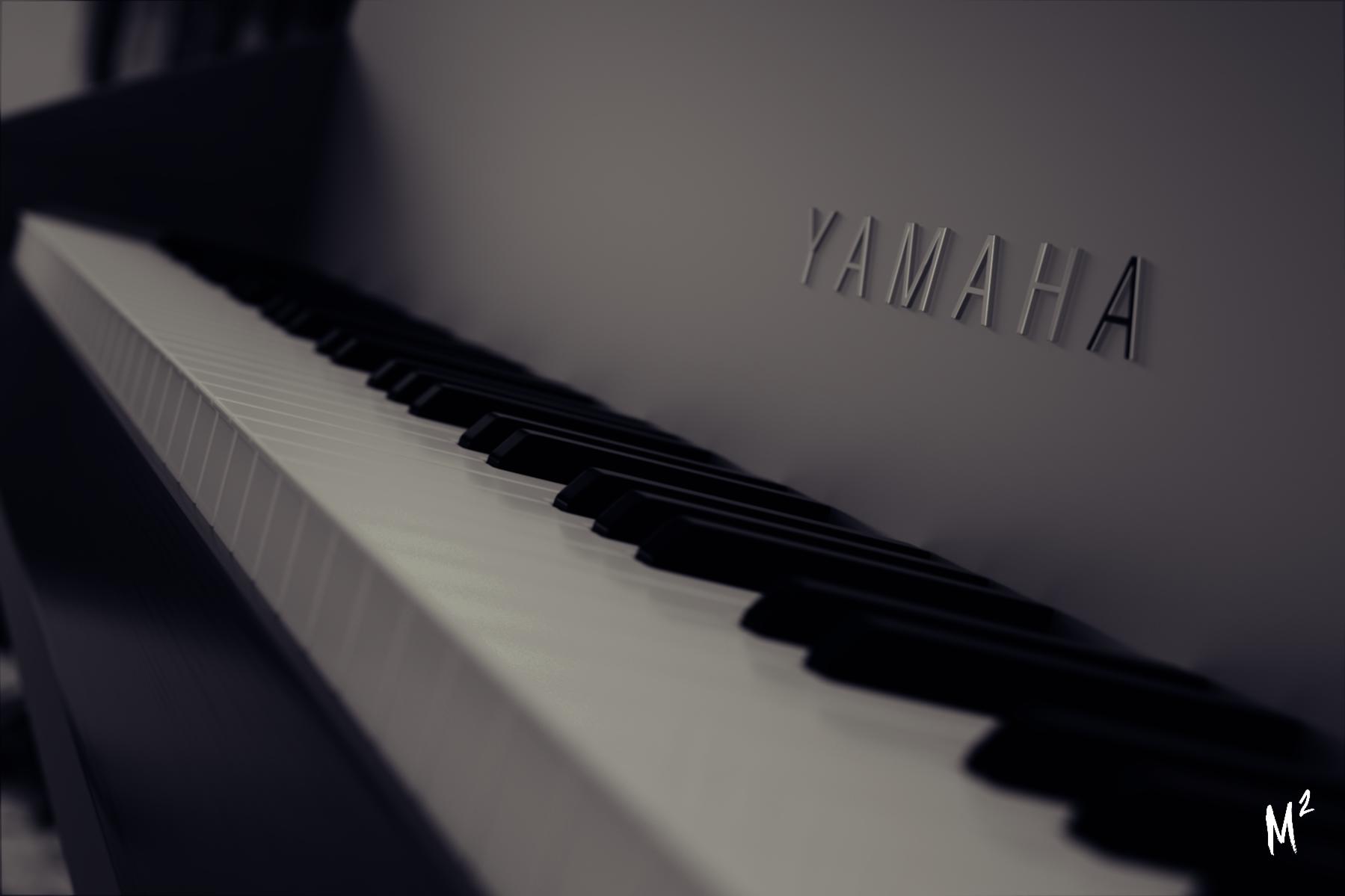
Last night, I thought of a render to make with the piano I recently made, and here’s the final render.
Special thanks to sizzler for the wood texture.
Last night, I thought of a render to make with the piano I recently made, and here’s the final render.
Special thanks to sizzler for the wood texture.
Nice model! - It looks really clean!
The DoF works really good and the Yamaha-logo is placed very convenient based on rule of thirds.
Anywho, I think you need to do some post processing to help draw the focus to the logo or the keys. ![]() I might have gone a little crazy with the effects and adjustments and I’m not sure if this is the kind of image you want to make, but here is an example of how you could improve the image a little. ^^
I might have gone a little crazy with the effects and adjustments and I’m not sure if this is the kind of image you want to make, but here is an example of how you could improve the image a little. ^^
I added a vignette to draw the focus to the logo and made some color adjustments to get the blue vs. orange feel. (Very slight)
I Adjusted the levels to get a lot more contrast and added some scratches and dirty lens overlays just for fun. At last I also sharpened the image slightly to make the text and the details “pop” a little more. ![]()
I hope you can use my feedback - And have a great day!
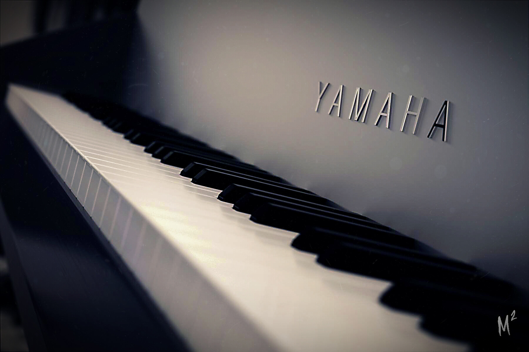
Hey! Sorry it’s taken me so long to reply, I’ve been pretty busy with another model. Thanks for your feedback! I really like what you did there. I think the sharpness might be a bit too much, but other than that I love what you changed! I’ll update my version soon once I get some time for it.
Thanks again!
Nice! I would love to see a new version - I really think the image have a lot of potential.
Well, I recently got Photoshop so last night I edited several renders and this was one of them.
~
Very nice!
Now the image has a much better focal point.  - I still think it is a little dark, but to much brightness would probably make the keys and the logo ‘fight’ for the viewers attention though. Great work!