Rendered in cycles with only 50 samples because it takes a very long time to render volumetrics:
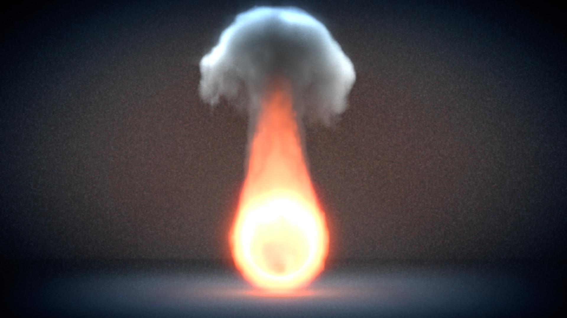
Here’s a version with alternate compositing:

It would be nice if you could tell me what can be improved and which of the pictures look better.
Thanks!
Rendered in cycles with only 50 samples because it takes a very long time to render volumetrics:
Here’s a version with alternate compositing:
It would be nice if you could tell me what can be improved and which of the pictures look better.
Thanks!
the second one looks a bit better to me IMH and kinda looks like a match head burning, where the first one looks a bit too hot in comparrison with the effect
Thanks for the reply! I also thought the second one looked better but for different reasons. I just thought that the blue contrasted well with the fire but I think the first one is a bit too bright as well
looks good, I like the second one better too, good contrast
Thanks! I thought the contrast worked in the second picture too. It makes the fire stand out even more