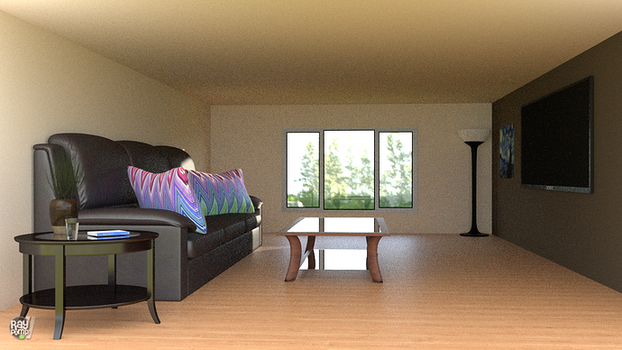
Hi, I’m a noob (2 months) at Blender, but I was looking for some tips on how to improve this scene that I am working on right now.
Also, if anyone has to comment on anything else, please do so. Thank you very much.
Hi, the proportions are off, raise the ceiling and windows, or decrease the size of the couch and side table.
I see that the two tables and the couch are barely casting shadow. Therefore, the table looks almost like copied and pasted.
There is a sunlight shining through the window and that one give a harder shadow. Maybe you could use a bit more of that.
One wall, the one in the front is open and the HDRI enviroment map lights the room up bright but diffuse; there are barely shadows.
I think there are quite some bounces. What if you reduce that, and even try once direct light in the render tab > lightpaths. To much bounces. What if you use a front wall as well with a window in it? Did you use the new portal light to reduce noise ?
More light and more samples to clean up some of that noise 
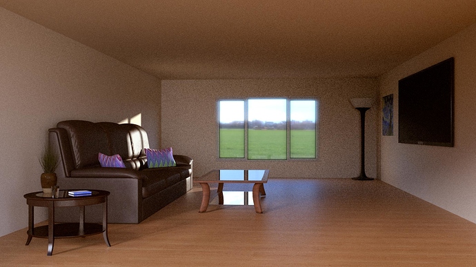
I made the shadows more apparent and scaled the couch and tables down do a more appropriate size. I’m thinking of adding something on top of the table and under the TV. That side seems rather empty. I’ve also made some other adjustments in the compositor. Thank you very much for your feedback.
Good idea re: more stuff on the TV side. I recommend a cabinet or credenza full of A/V equipment or games consoles that the TV could be hooked into. You might also consider a shelf full of media, though I guess DVD/Blu-Ray collections are not as common anymore as they used to be. Also a good idea to put something on the coffee table. If you’re going for the Open House look, I recommend magazines, possibly a scented candle. If you’re going for lived in, open beverage containers and food. I would also recommend putting something against the back wall–it looks rather plain right now. Perhaps a love seat, or a pair of chairs? Maybe book shelves? Or shelves full of tchotchkes? It depends on the story you’re trying to tell about the owners of this space. You’ll definitely want some kind of window dressings, like curtains or blinds–again depending on your impression of the owners and what they are trying to do with this space.
Now this is getting into nit-picking territory, the torchiere seems too thick. It’s about the right height, but the thickness of the stand makes it look like it should be shorter. Maybe try slimming it up? Unless that was the look you were going for, in which case I won’t judge. In addition, I recommend putting another torchiere in the opposite corner, since that one alone doesn’t seem like it would light the whole room.
Fantastic work on the couch and the pillows. I really like that plant, too. I think you’ve got about the right amount of clutter on the side table. I also like the way the light reflects off the coffee table. I like the scene overall. Keep it up!
you improved it quiet a bit, looks much better now!
What still bothers me are the shadows which seem to go in the wrong direction if the window is the main source of your light.
I still think the scale looks a little off, though obviously much improved. My suggestion, real world values. This is something I used to ignore and roll my eyes at a lot, preffering instead to ‘judge it by eye’ … wrong wrong wrong is what I learnt over time. Measure everything accurately, the height of the room, the exact dimensions of the couch and tables, the height and thickness of the skirting (When you add it). Google is your friend here, and once you get in the habit of it you’ll never look back.
This is progressing nicely, but may I suggest that you create your own assets rather than the ones from the Architecture Academy freebie pack. You’ll learn a lot from modelling your own sofa and table etc.
Good luck!
Starting to look better, some skirting panels on the floor and ceiling will also break the box/cube effect.

