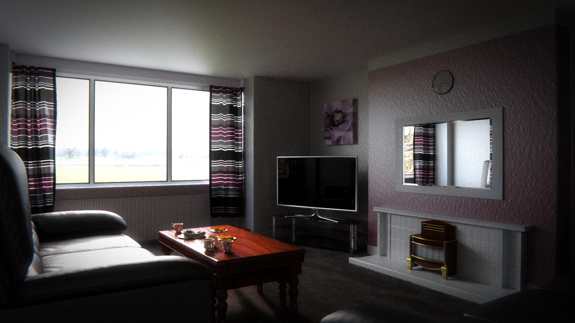
What you see is several days of work (total time spent working on it) spread out through the course of several months. I actually started it last year but got caught up in other stuff. This was created purely for fun as I use Blender as a hobby. I am extremely close to calling this the final render. I’d just like to say that I haven’t done any work on this since the beginning of the year.
I’d like to hear what you have to say about it (I am aware of the noise). Be as friendly or brutal as you like with your feedback - I look forward to hearing it :).
For anyone who cares:
All the models were either manually created by myself, from Blendswap (under creative commons 0 licenses), created with addons or are from Blender Guru’s Architecture Academy starter pack.
All the textures were either manually created or from CG Textures.
Post processing was done with Blender’s Compositor.
I think if possible you should put some light in the room or reduce the strength of the window, it is too sharp. Other than that something looks off about the stove. Great work so far though!
Wall texture looks too big. Scale it down a few notches.
too dark. Window looks fine, but you need to get more light in the room itself.
Add a rug? Cheesy, but makes the floor a bit more interesting
Stove. reminds me of my Grandma’s 25 years ago… looks fine, but bring back memories I would rather forget (the smell of old people…)
the fireplace behind the stove (not sure what it is called) looks way too wide. Would reduce it by 20-30%.
-where is the ceiling light. A room like that would definitely have something, even if it was only just visible at the top of the image.
more curtains. Seriously, they are smaller than a bikini on a whale…
-Hmm… You may be right about the wall texture now that you mention it.
-I seriously don’t know why the room isn’t lighter - will have to do some tweaking with the nodes.
-The floor is actually a carpet but if you didn’t notice it I may have to increase the amount of strands as well as the length.
-The stove is actually meant to contrast with everything else - an old gas fireplace alongside modern furniture. I’ll have to see whether a modern heater will benefit the image.
-With you on the width of the mantle piece (I think that’s what it’s called).
-With you on the curtains.